Coral vs Peach: Comparing Warm Tones
Look closely and the coral vs peach distinction is mostly about brightness, not hue. Both sit in the pink-orange zone, but coral is saturated, energetic, and reads as a statement color, while peach is desaturated, pale, and reads almost like a tinted neutral. They’re effectively the same family at two very different volumes.
What is coral?
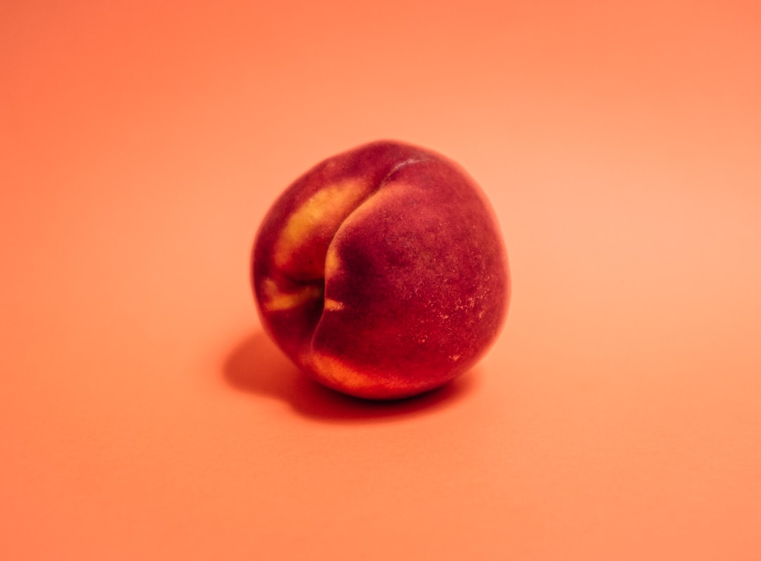
Coral is a vivid pink-orange named after the marine organism. A representative value sits around #FF7F50 (the classic “coral” web color), with “living coral” — Pantone’s 2019 Color of the Year — a touch warmer. Coral combines the energy of orange with the friendliness of pink, landing as bright, tropical, and confident. It has high saturation and medium lightness, so it pops against neutrals and demands attention.
Designers reach for coral as an accent: call-to-action buttons, summer and beach branding, beauty products, and palettes that want warmth with a jolt of energy. It’s the loud sibling in this comparison. If you want to see how coral behaves against its pinker, more salmon-leaning neighbors, our salmon versus coral guide breaks that pairing down in detail.
What is peach?
Peach is the soft, pale pastel in this pairing — a light pinkish-orange that reads as gentle and delicate. A representative value lands around #FFE5B4. Where coral is loud, peach is quiet: it’s low in saturation and high in lightness, which makes it function almost like a warm neutral that can fill large areas without overwhelming a layout.
Peach is the go-to for skin-flattering backgrounds, weddings, wellness, and soft editorial design. It’s warm and inviting without ever competing for attention. For a finer split between peach and its more golden cousin, see our peach versus apricot comparison in this batch.
What’s the difference between coral and peach?
The difference is saturation and brightness, not hue family. Coral is a bright, intense pink-orange; peach is a pale, muted version of the same warmth. Here’s a side-by-side using representative values — these are descriptive color names, not standardized inks, so exact hexes vary by brand and product.
| Property | Coral | Peach |
|---|---|---|
| Hex code | #FF7F50 | #FFE5B4 |
| RGB | 255, 127, 80 | 255, 229, 180 |
| CMYK | 0, 50, 69, 0 | 0, 10, 29, 0 |
| Undertone | Warm, balanced pink-orange | Warm with soft pink lean |
| Hue family | Vivid pink-orange | Pale pinkish-orange pastel |
| Best used for | Accents, CTAs, summer/beach branding, beauty | Backgrounds, weddings, wellness, soft layouts |
| Mood/feel | Vibrant, energetic, friendly, tropical | Soft, gentle, delicate, romantic |
When should you use each?
Choose coral when you need energy and contrast. It works beautifully as an accent or call-to-action against neutral or cool backgrounds, and it carries summer, beach, beauty, and youthful lifestyle branding with confidence. Because it’s saturated, a little coral goes a long way — use it for emphasis rather than large fields.
Choose peach when you want warmth that recedes. Peach is ideal as a background, a large brand surface, or a soft wash behind type, where coral would feel overwhelming. It’s the better choice for romantic, calm, or premium-soft moods, and it flatters photography of people and food.
A practical pairing trick: use peach for the large areas and coral for the accents within the same design. Because they share a hue family, they harmonize automatically while giving you clear hierarchy. Our guide to warm versus cool colors explains why this warm-on-warm layering reads as cohesive.
Do coral and peach go together?
Yes — they’re one of the most natural warm pairings precisely because they’re the same color at different intensities. Pairing them creates an effortless tonal palette: peach as the base, coral as the highlight. The built-in difference in saturation gives you contrast and hierarchy without any risk of clashing.
To round out the palette, add a cream or off-white to lighten it and a teal or navy for cool contrast that makes the coral sing. If you’re choosing between coral and its slightly pinker relatives first, the salmon versus coral breakdown will help you lock in the exact accent before you build around it.
How do coral and peach behave in digital design?
On screen, the two colors play very different roles, and accessibility is the deciding factor. Coral’s mid-range saturation and lightness mean it rarely passes contrast checks for small body text on white, so it works best as a button fill, a banner, or an icon color where you control the foreground. Peach, being so light, almost never works as a text color at all — its job is to be the surface that other elements sit on, and it pairs cleanly with dark charcoal or near-black type.
This split makes them an efficient pair for interface design: peach as a soft section background, coral as the interactive accent that signals “click here.” Because they share a hue, the coral call-to-action feels native to the peach environment rather than bolted on, which is exactly the kind of quiet cohesion good UI relies on. Just verify the contrast ratio of any coral text or icon against its background — aim for at least 4.5:1 for body-sized elements and 3:1 for large text or UI components.
One more digital note: both colors shift under different screen calibrations and in dark mode. Coral can look noticeably more orange on warmer displays, and peach can wash out almost entirely against off-white backgrounds. Test your palette on more than one device, and define each color by hex rather than by eye so it stays consistent across the build.
Frequently Asked Questions
Is coral brighter than peach?
Yes. Coral is far more saturated and vivid than peach, while peach is a pale, muted pastel version of the same pink-orange. Side by side, coral reads as a bold accent color and peach reads as a soft, almost-neutral background tone.
Are coral and peach the same color?
They’re the same family but not the same color. Both are pink-orange, but coral is bright and saturated while peach is pale and desaturated. Think of peach as a lightened, softened version of coral — which is exactly why the two pair together so naturally.
What is the hex code for coral?
The classic web hex for coral is #FF7F50, with RGB values of 255, 127, 80. “Living coral,” Pantone’s 2019 Color of the Year, sits slightly warmer. Treat #FF7F50 as a reliable representative value, since coral describes a range rather than one fixed standard.
Which is better for a background, coral or peach?
Peach is usually the better background because its low saturation lets text and imagery sit comfortably on top. Coral’s high intensity makes it better as an accent or call-to-action. A common pattern is peach for large surfaces and coral for small, high-emphasis elements.
Do coral and peach work in the same palette?
Yes, and they pair effortlessly because they share a hue family. Using peach for large areas and coral for accents gives you instant harmony plus clear hierarchy. Add a cream to soften the scheme or a cool teal to make the coral stand out more.


