Packaging Design Principles Explained
Strong packaging design principles solve a brutal problem: your product has roughly a few seconds on a crowded shelf—or a thumbnail in a marketplace grid—to be noticed, understood, and chosen. Packaging is the only design medium that is also the product’s physical container, so it must perform aesthetically, structurally, and legally at once. This guide covers the eight principles that make packaging work.
For the cross-discipline foundations these build on, see our master guide to design principles. What sets packaging apart from every other graphic medium is that it is three-dimensional, tactile, and regulated: it must look good as a flat artwork file, fold and stand as a structure, survive shipping, satisfy legal requirements, and still feel desirable in the hand. The eight principles below address that full reality, not just the front-panel graphics.
1. Shelf impact
Shelf impact is the ability to be seen and recognized at a glance among dozens of competitors. It is built from a distinctive silhouette, a dominant brand color, and a single bold focal element rather than a crowded front face. Squint at a mockup of your design lined up beside competitors—if it disappears, it lacks impact. Ownable color (think a category-defining hue) and a clear brand block do more for standout than intricate detail nobody sees from three feet away. Remember that shelves are increasingly digital, too: the same front panel must survive being shrunk to a postage-stamp thumbnail in an online grid, where fine type and busy backgrounds disappear entirely. Designing for the worst-case viewing condition—small, fast, and surrounded by rivals—forces the clarity that also wins in the aisle.
2. Legibility at distance
Legibility at distance means the product name and key benefit are readable from across an aisle, not just in hand. Use large, high-contrast type for the primary identifier, avoid thin scripts or low-contrast color-on-color for critical words, and keep the front panel focused on the few things a shopper needs to identify the product. What reads perfectly on your monitor at 100% can be illegible at retail scale—always test type at real-world viewing distance.
3. Information hierarchy
Information hierarchy ranks what the package communicates so the eye travels in the right order: brand, product name, variant/flavor, key benefit, then supporting details and mandatory copy. Most packs need a clear primary, secondary, and tertiary tier. Size, weight, color, and position do the ranking. A common failure is treating every claim as equally important—when everything shouts, nothing is heard. Decide the one thing a shopper must grasp first and design around it.
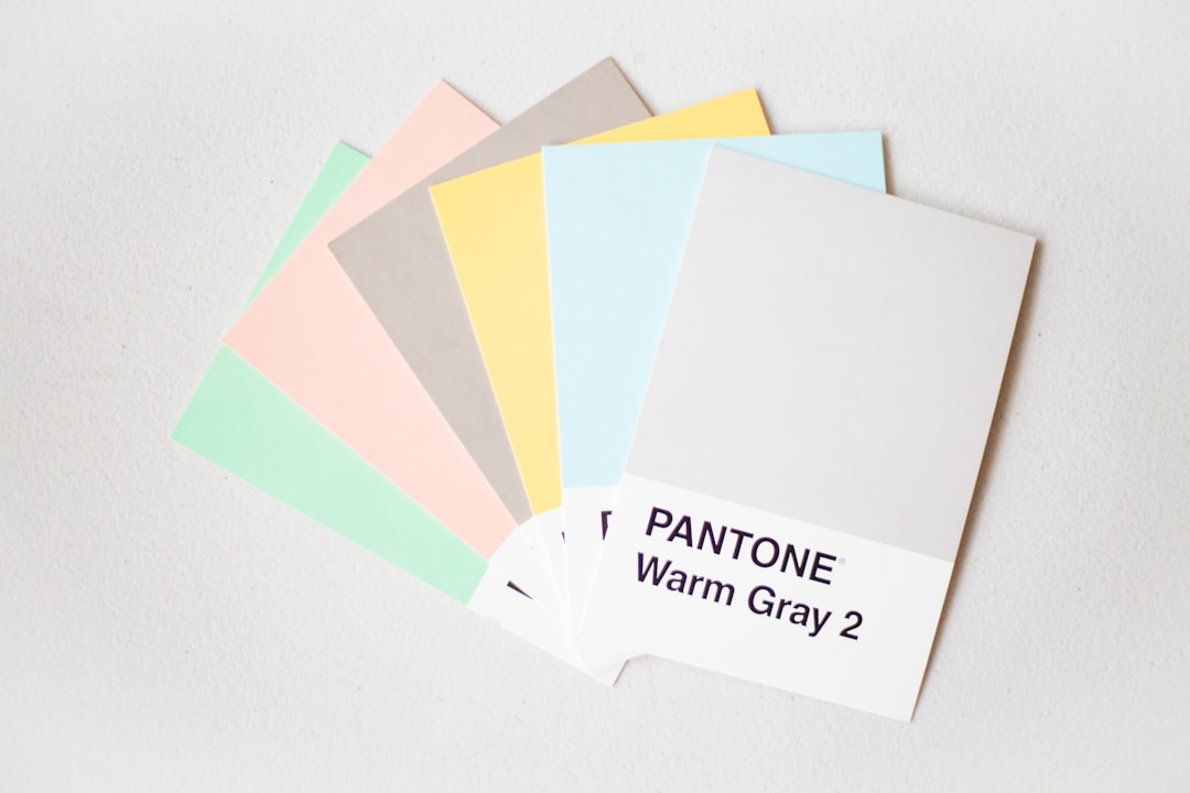
4. Brand consistency
Brand consistency ties a product to its line and its maker. A range should share a visual system—logo placement, color logic, typography, and layout grid—so variants read as a family while staying individually distinguishable (often via a single color or flavor cue). Consistency builds recognition and trust across repeat purchases and lets a strong parent brand lend equity to new SKUs. Document the system so every new variant slots in cleanly.
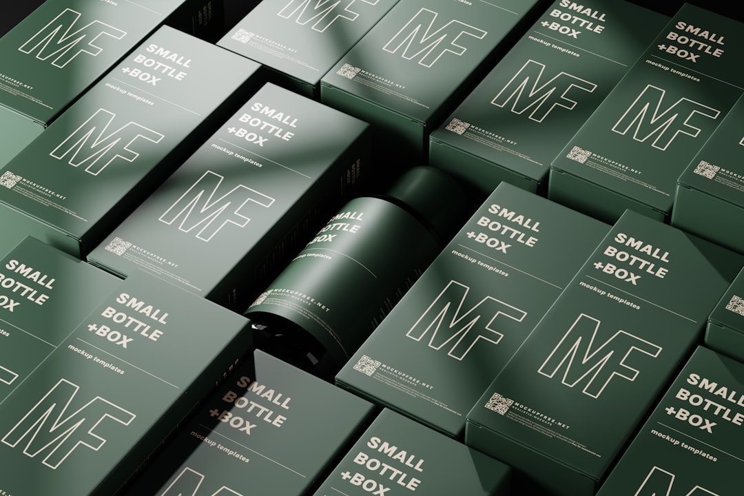
5. Material and structure
Material and structure are where packaging differs most from flat design. The substrate (matte vs gloss carton, kraft, glass, flexible film), finishes (foil, emboss, spot UV, soft-touch), and the physical form all shape perception and cost. Structure must also protect the product, stack and ship efficiently, and open intuitively. Premium cues like uncoated stock and tactile finishes can justify price; flimsy structure undermines an otherwise great graphic. Design the dieline and the artwork together, never in isolation. Our packaging design process guide walks through dielines and prototyping in detail.
6. Regulatory and mandatory information
Regulatory information—ingredients, net weight, nutrition or facts panels, warnings, barcodes, country-specific marks, and recycling icons—is non-negotiable and must be present, accurate, and legibly sized. Many categories mandate minimum type sizes and specific placements. Plan this content early: designers who treat compliance as an afterthought end up cramming it onto a back panel at the last minute. Give mandatory copy a clean, organized home so it reads clearly and never compromises the front-of-pack story.
7. Sustainability
Sustainability is now a design constraint shoppers actively look for. Reducing material, choosing recyclable or recycled substrates, minimizing inks and laminates that hinder recycling, and designing for refill or reuse all matter—and so does communicating them honestly. Avoid vague “eco” claims that aren’t backed up; specific, truthful messaging (“widely recyclable carton, plant-based ink”) builds credibility. Genuine material reduction often lowers cost and shipping weight at the same time.
8. The unboxing experience
The unboxing experience extends design past the shelf into the moment the customer opens the product—especially important for e-commerce and premium goods. Thoughtful inner structure, a branded reveal, tactile materials, and a small surprise (an insert card, a clean tear strip) turn a transaction into a memorable, shareable moment. It need not be expensive; intentional sequencing and a tidy interior often beat lavish but wasteful filler. The most-shared unboxings tend to be the ones that feel considered—a snug fit, a clear order of discovery, a printed message on the inside lid—rather than the ones that simply use the most packaging. Done well, the open becomes free marketing: a moment customers photograph and post without being asked.
Packaging principles: do and don’t
| Principle | Do | Don’t |
|---|---|---|
| Shelf impact | Use ownable color and a single focal element | Crowd the front with competing details |
| Legibility | Test type at real shelf distance | Set the product name in thin low-contrast script |
| Hierarchy | Pick one primary message | Make every claim equally loud |
| Consistency | Share a system across the range | Redesign every SKU from scratch |
| Material | Design artwork and dieline together | Apply flat artwork to a form you haven’t tested |
| Regulatory | Plan mandatory copy early | Cram compliance text in at the end |
| Sustainability | Make specific, honest claims | Use vague unverified “eco” labels |
| Unboxing | Sequence a clean, branded reveal | Pad the box with wasteful filler |
Bringing the principles together
Effective packaging balances all eight at once: shelf impact gets attention, hierarchy and legibility deliver the message, material and structure make it feel right and arrive intact, compliance keeps it legal, sustainability earns goodwill, and unboxing closes the loop. A useful order of operations is to lock the structure and dieline first, plan where mandatory information will live, then design the front panel for impact, and finally pressure-test the whole thing at real size and against real competitors. The graphic system that holds it together follows the same logic as flat work—compare the persuasion mechanics in our advertising design principles guide, which packaging fronts effectively borrow.
Frequently Asked Questions
What are the main packaging design principles?
The main principles are shelf impact, legibility at distance, information hierarchy, brand consistency, material and structure, regulatory clarity, sustainability, and the unboxing experience. They ensure a package is noticed on a crowded shelf, communicates clearly, protects the product, meets legal requirements, and feels worth buying.
Why is hierarchy important in packaging design?
Hierarchy controls the order in which a shopper reads the brand, product name, benefit, and supporting details. With only seconds of attention on shelf, a clear hierarchy ensures the most important message lands first. Without it, competing claims cancel each other out and the product fails to communicate what it is.
How do you make packaging stand out on a shelf?
Build shelf impact with a distinctive silhouette, an ownable dominant color, and a single bold focal element, then keep the front panel uncluttered. Test the design lined up beside real competitors and viewed from a distance. Standout comes from clarity and contrast, not from adding more detail.
Does packaging design need to follow regulations?
Yes. Most product categories legally require specific mandatory information—ingredients, net weight, nutrition or facts panels, warnings, and barcodes—often at minimum sizes and placements. Designers must plan this content early so it is present, accurate, and legible without compromising the front-of-pack design or risking a costly reprint.
What is the role of the unboxing experience?
The unboxing experience extends design into the moment a customer opens the product. For e-commerce and premium goods, thoughtful inner structure, a branded reveal, and tactile materials create a memorable, shareable impression that builds loyalty. It relies more on intentional sequencing than on expensive materials or wasteful filler.