Colors That Go With Gray: The Complete Pairing Guide
The best colors that go with gray use it as a flexible neutral canvas and add one well-chosen accent. Because gray is neither warm nor cool by default, almost any color works against it — the craft is in matching undertones and contrast. Below are exact hex codes, three ready palettes, and guidance for branding versus interiors.
What colors go with gray?
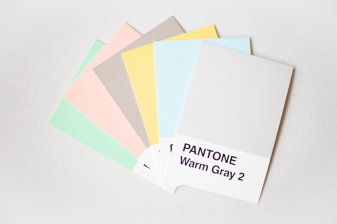
Gray (#9E9E9E here as a mid-gray) is a pure neutral that ranges from near-white to near-black. Neutrals pair with everything, so decide first whether your gray is warm or cool, then choose an accent in the same temperature family. A warm accent (yellow, blush, mustard) lifts a cool gray; a cool accent (teal, navy) sharpens a warm gray. Our neutral color palette guide explains reading gray undertones.
- Yellow — the classic, cheerful pop that warms cool gray.
#F4C430 - Blush — soft pink warmth for an elegant, modern feel.
#E8B4B8 - Navy — deep contrast for a sharp, professional scheme.
#1B2A4A - Teal — a jewel-tone accent that reads rich against gray (see colors that go with teal).
#008080 - Mustard — earthy warm accent for a confident, retro palette.
#E1B12C - White — brightens gray and keeps the scheme clean.
#FFFFFF
Best gray color combinations
Match the pairing to your goal:
- Gray + yellow — the most-loved warm/neutral combo; fresh, optimistic, and balanced.
- Gray + blush + white — soft and contemporary; great for beauty and lifestyle brands.
- Gray + navy + white — corporate, trustworthy, and crisp; the SaaS default.
- Gray + teal or mustard — adds a single jewel or earth tone for personality.
Use gray as 60–70% of the layout and let one accent do the heavy lifting. Two saturated accents can work, but only if one clearly dominates.
How to build a balanced gray palette
Gray is the easiest color to apply the 60-30-10 rule to because it is a true neutral: 60% dominant, 30% secondary, 10% accent. Two common setups:
- Gray-led: 60% gray, 30% white or charcoal, 10% color accent (yellow, blush, or teal). The accent supplies all the personality against a calm field.
- Accent-led: 60% white, 30% gray, 10% saturated accent. Gray becomes the supporting structural tone for borders, dividers, and secondary text.
A useful refinement is to build a small gray scale — a light, a mid, and a dark — rather than relying on a single gray. Using value contrast within the grays gives a design depth and hierarchy before you even introduce color, which is exactly how clean UI systems are built.
Gray color meaning and when to use it
Gray signals neutrality, balance, professionalism, and timeless restraint. It is the color of infrastructure — steel, concrete, screens — so it reads as practical and modern. Because it makes no strong emotional claim of its own, it lets the colors and content around it speak, which is why it dominates interface design and minimalist branding.
Reach for gray when you want a sophisticated, low-key foundation that will not date and will not fight your accent color. Warm it with yellow, blush, or mustard when a scheme feels cold; sharpen it with navy or teal when you need crisp, corporate contrast. Just commit to a clear temperature so your accents harmonize rather than clash.
Gray palettes with hex codes
Three copy-ready palettes, each anchored on gray.
| Pairing color | Hex | Why it works |
|---|---|---|
| Gray (anchor) | #9E9E9E | Pure neutral that supports any accent cleanly. |
| Yellow | #F4C430 | Cheerful warm pop that lifts and balances gray. |
| Blush | #E8B4B8 | Soft warmth for an elegant, contemporary feel. |
| Navy | #1B2A4A | Deep contrast for a crisp, professional scheme. |
| Teal | #008080 | Jewel-tone accent that reads rich against gray. |
| White | #FFFFFF | Brightens the palette and adds breathing room. |
Palette 1 — Sunny modern: Gray #9E9E9E, Yellow #F4C430, White #FFFFFF, Charcoal #36454F.
Palette 2 — Soft contemporary: Gray #9E9E9E, Blush #E8B4B8, Warm white #FFF8F0, Navy #1B2A4A.
Palette 3 — Crisp corporate: Gray #9E9E9E, Navy #1B2A4A, White #FFFFFF, Teal #008080.
Colors to avoid with gray
Gray is nearly foolproof, but watch for:
- An undertone clash — a warm, beige-leaning gray beside a cool, blue accent can look muddy. Keep accent and gray in the same temperature family.
- Too many grays at once — stacking three or four close grays reads flat and indecisive; commit to one or two with clear value contrast.
- Low-contrast pastels only — pairing mid-gray with very pale pastels can wash out; add a dark anchor for definition.
Gray’s temperature is the deciding factor; if you cannot tell whether yours is warm or cool, compare it to navy and to beige. Our warm vs cool colors guide walks through it.
Gray in branding vs interiors
In branding and web design, gray is the workhorse of UI: backgrounds, borders, secondary text, and disabled states. Build a small gray scale (light, mid, dark) and reserve one brand accent for action. For text, only mid-to-dark grays meet contrast on white — light gray body copy fails accessibility. See how to choose brand colors to structure the scale.
In interiors, gray is a popular wall color that can tip cold without a warm accent. Layer in wood, brass, blush, or mustard to add life, and choose a “greige” if you want a cozier, warmer base. Gray and greige are frequently confused, so our greige vs gray comparison helps you pick the right warmth.
Frequently Asked Questions
What color goes best with gray?
Yellow (#F4C430) is the classic best match for gray — the warm pop balances gray’s neutrality and reads fresh and optimistic. For a more elegant route, blush (#E8B4B8) or navy (#1B2A4A) are reliable, widely used alternatives.
Does gray go with every color?
Nearly. As a true neutral, gray pairs with almost any hue, but undertones matter: a warm gray suits warm accents (yellow, mustard), and a cool gray suits cool accents (navy, teal). Match temperatures and gray becomes an effortless backdrop.
Is gray a warm or cool color?
Pure gray is neutral, but most real-world grays lean slightly warm or cool. Cool grays carry a blue undertone; warm grays (“greige”) carry beige. Identifying that lean determines which accents will harmonize, so test your gray against white before choosing partners.
What is the difference between gray and grey?
None in meaning — “gray” is the American spelling and “grey” the British. Both name the same neutral color. Our grey vs gray note covers the spelling history and when each is conventional.


