Greige vs Gray: What’s the Difference?
If you’ve ever held two “neutral” paint chips side by side and one looked slightly warmer, you’ve already met the greige vs gray distinction. Greige is a portmanteau of gray and beige, so it inherits warmth from the beige; gray is a balanced mix of black and white that stays neutral or tips cool. Knowing which one you’re looking at changes how a whole room — or brand palette — feels.
What is greige?
Greige is a hybrid neutral that sits between gray and beige. It reads as a soft, sophisticated taupe-gray — warm enough to feel cozy, muted enough to stay restrained. Designers reach for greige when a pure beige feels too yellow and a pure gray feels too cold. Representative values land around #B7AFA3, though greige spans a wide range depending on how much beige is mixed in.
Because it leans warm, greige flatters wood tones, brass, and natural textures. It’s the dominant “new neutral” in interiors and increasingly in branding for wellness, beauty, and lifestyle products that want to feel calm and premium without committing to a color. If you like greige, you’ll likely also like the taupe-versus-beige comparison, since greige overlaps heavily with taupe.
What is gray?
Gray is the achromatic neutral — created by mixing black and white, with no hue of its own when “pure.” A representative mid-gray is around #9A9A9A. In practice most grays carry a slight undertone: cool grays lean blue, violet, or green, while “warm grays” edge toward greige territory. True neutral gray is the workhorse of modern UI design, minimalist branding, and architectural interiors that want a crisp, contemporary edge.
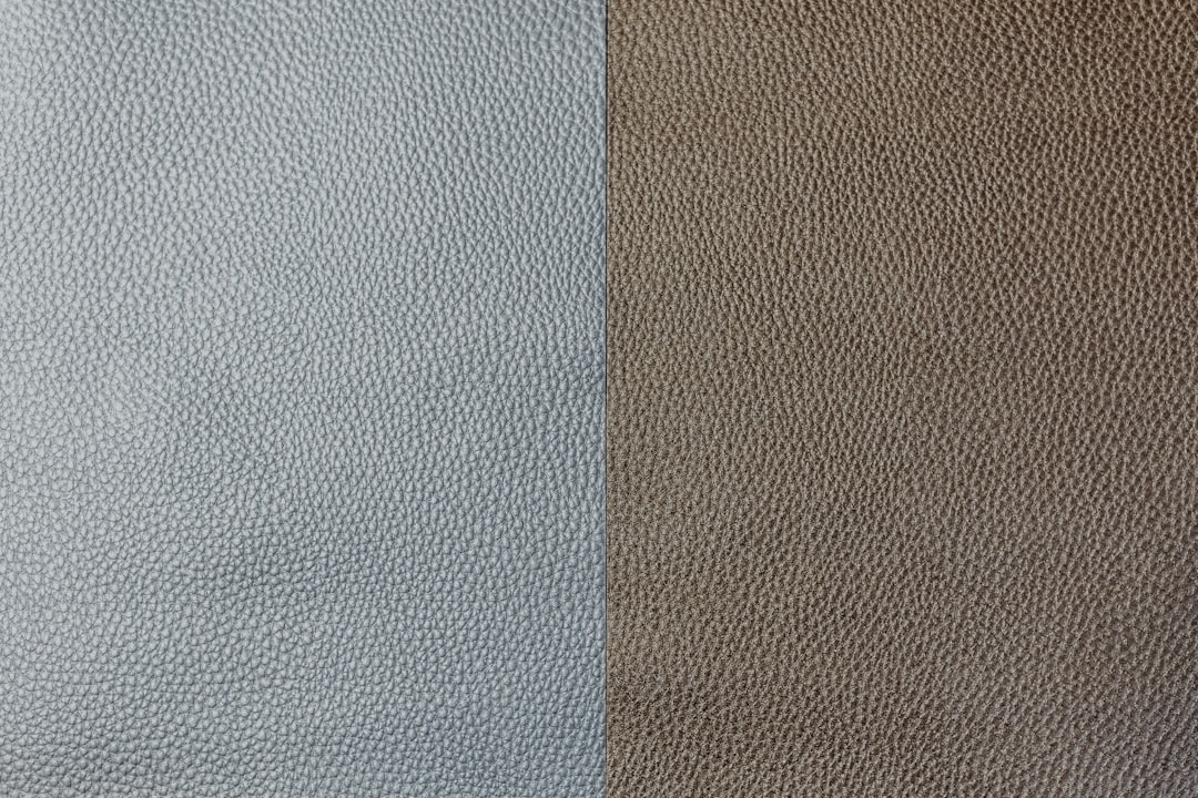
The key behavioral difference: gray is cooler and more clinical, greige is warmer and more inviting. That single property drives almost every “which should I use” decision.
What’s the difference between greige and gray?
The difference is undertone and temperature. Greige contains beige, so it always carries a measurable warmth; gray is neutral and frequently cool. Here’s a side-by-side breakdown using representative values — remember these are descriptive color names, not standardized inks, so exact hexes vary by brand and product.
| Property | Greige | Gray |
|---|---|---|
| Hex code | #B7AFA3 | #9A9A9A |
| RGB | 183, 175, 163 | 154, 154, 154 |
| CMYK | 0, 4, 11, 28 | 0, 0, 0, 40 |
| Undertone | Warm (beige/taupe) | Neutral to cool (can lean blue) |
| Hue family | Warm neutral | Achromatic neutral |
| Best used for | Cozy interiors, lifestyle/wellness branding, soft backgrounds | Modern UI, minimalist branding, architectural spaces |
| Mood/feel | Warm, calm, organic, premium | Clean, neutral, contemporary, sometimes cool |
When should you use each?
Choose greige when you want warmth without color commitment — open-plan living spaces, packaging for natural products, or web backgrounds that should feel soft rather than stark. It pairs beautifully with wood, linen, and warm metals, and it stops a neutral scheme from feeling sterile.
Choose gray when you want a crisp, modern, or technical feel. Gray is ideal for UI surfaces, dashboards, editorial layouts, and brands that want to read as precise and contemporary. A cool gray next to white and a single accent color is one of the most reliable looks in digital design.
One practical test: place your swatch next to a sheet of pure white paper in daylight. If a subtle warmth or “dirtiness” appears, it’s greige; if it stays clean and slate-like, it’s gray. For more on temperature, our guide to warm versus cool colors explains why this matters across an entire palette.
How are greige and gray used across design?
In interiors, greige has largely replaced cool gray as the default wall neutral because it makes spaces feel warmer and more livable, especially in north-facing or low-light rooms where a cool gray can turn flat and gloomy. Gray still dominates contemporary and industrial interiors where a crisp, architectural feel is the goal.
In branding, greige signals calm, natural, and premium — you’ll see it across wellness, skincare, and slow-fashion identities. Gray signals precision, neutrality, and modernity, which is why technology and professional-services brands lean on it. The same logic carries into web and UI: a greige background warms up an editorial or lifestyle site, while neutral gray surfaces keep dashboards and product interfaces feeling clean and unobtrusive.
In fashion and product, greige reads as understated luxury (think undyed linen and natural leather), while gray reads as sharp and modern (think tailored wool and tech accessories). Matching the neutral to the emotional register of the product is the whole game.
Do greige and gray go together?
Yes — and the combination is a designer favorite. Layering greige with a true gray creates a tonal, monochromatic scheme that has depth without contrast. The trick is keeping them clearly distinct in value (lightness) so the warm and cool neutrals read as intentional rather than as a mismatch. Use greige on large warm surfaces and gray for accents, hardware, or type, or vice versa.
If you’re building a wider neutral palette, it helps to see how the warmer side behaves too — compare with beige versus cream for the yellow-leaning neutrals and pewter versus gray for the metallic grays in this same batch.
Frequently Asked Questions
Is greige warmer than gray?
Yes. Greige contains beige, which gives it a warm taupe undertone, while gray is a neutral black-and-white mix that often leans cool or even slightly blue. Side by side, greige consistently reads as the warmer, softer of the two colors.
What colors make greige?
Greige is made by blending gray and beige — essentially adding a warm, earthy beige to a neutral gray base. The exact result depends on the ratio: more beige gives a warmer, browner greige, while more gray keeps it cooler and closer to a warm gray.
Is greige still in style?
Greige remains highly popular as a “new neutral” in interiors, branding, and web design. Its warmth makes it feel more current and welcoming than the cooler grays that dominated the 2010s, and it pairs easily with wood, natural textures, and warm metals.
How do I tell greige from gray on a paint chip?
Hold the chip against a sheet of pure white paper in natural daylight. Greige will show a subtle warm, tan, or “muddy” cast; a true gray stays clean and neutral. Comparing two chips together makes the warm undertone in greige much easier to spot.
Can I use greige and gray in the same room?
Absolutely. Pairing greige and gray creates a layered, tonal neutral scheme with quiet depth. Keep them clearly different in lightness so the warm and cool neutrals read as a deliberate combination rather than an accidental clash, and anchor the look with one accent color.


