Pewter vs Gray: What’s the Difference?
The pewter vs gray comparison is really “a specific gray versus grays in general.” Gray is the entire achromatic family — any blend of black and white. Pewter is one particular member: a medium-to-dark gray named after the tin alloy, carrying a soft, satiny metallic quality and a subtle warm or brownish undertone. Pewter is a flavor of gray, not a separate color family — but a distinctive one.
What is gray?
Gray is the neutral made by mixing black and white, with a representative mid value of #9A9A9A. Pure gray has no hue, though most grays in practice lean slightly warm or cool. It’s the most versatile neutral in design — the backbone of UI systems, minimalist branding, and modern interiors. “Gray” describes a vast range of values from pale silver to near-black charcoal.
Because gray is a category, comparing it to pewter means comparing the whole family to one specific, characterful member. For the darker and cooler end of the gray family, see our slate versus charcoal comparison from this same batch.
What is pewter?
Pewter is a medium-dark gray named after the dull, silvery tin alloy used for tableware. A representative value is around #8E8B82. Two things distinguish it from a plain neutral gray: a soft metallic sheen (especially on physical materials and in finishes) and a faint warm, brownish, or taupe undertone. That subtle warmth keeps pewter from feeling cold, giving it an antique, refined character.
In digital and print work, where you can’t render an actual metallic finish, pewter is rendered as a warm-leaning mid-gray. Its slight warmth is what sets it apart from a cool or neutral gray of the same value, nudging it toward greige territory — compare with greige versus gray for the warmest grays.
What’s the difference between pewter and gray?
Gray is the broad neutral category; pewter is a specific medium-dark gray with a metallic association and a faint warm undertone. A plain gray of the same value would look flatter and more neutral, while pewter reads as warmer and more “material.” Here’s a side-by-side with representative values — both names cover ranges, so treat the hexes as illustrative.
| Property | Pewter | Gray |
|---|---|---|
| Hex code | #8E8B82 | #9A9A9A |
| RGB | 142, 139, 130 | 154, 154, 154 |
| CMYK | 0, 2, 8, 44 | 0, 0, 0, 40 |
| Undertone | Faint warm / brown-taupe | Neutral (can lean warm or cool) |
| Hue family | Warm metallic gray | Achromatic neutral |
| Best used for | Metallic finishes, premium/heritage branding, hardware, jewelry | UI surfaces, minimalist branding, broad neutral backgrounds |
| Mood/feel | Refined, antique, warm-metallic, understated | Clean, neutral, versatile, contemporary |
When should you use each?
Use gray when you want a flexible, neutral foundation — UI components, modern minimalist branding, editorial layouts, and any palette that needs a clean, hueless base. Gray’s neutrality is its strength: it gets out of the way and lets accent colors lead.
Use pewter when you want a gray with character and a hint of warmth or metallic richness. It’s ideal for premium and heritage branding, product finishes, hardware, jewelry, and interiors that want a sophisticated, slightly antique gray rather than a flat one. Pewter pairs well with cream, warm woods, and other metals.
To distinguish them, look for warmth and depth: pewter reveals a faint brown-taupe cast and (on real materials) a satiny sheen, while a neutral gray stays flat and hueless. If your “gray” looks noticeably warm, it may actually be drifting toward pewter or greige. Our guide to warm versus cool colors covers how that undertone shift reshapes a palette.
How are pewter and gray used across design?
In branding, neutral gray is the universal supporting neutral — it underpins type scales, UI surfaces, and minimalist logos because it stays out of the way. Pewter, by contrast, is a statement neutral: its faint warmth and metallic association make it a deliberate choice for heritage, luxury, and craft identities that want a gray with history and richness rather than a flat, hueless one.
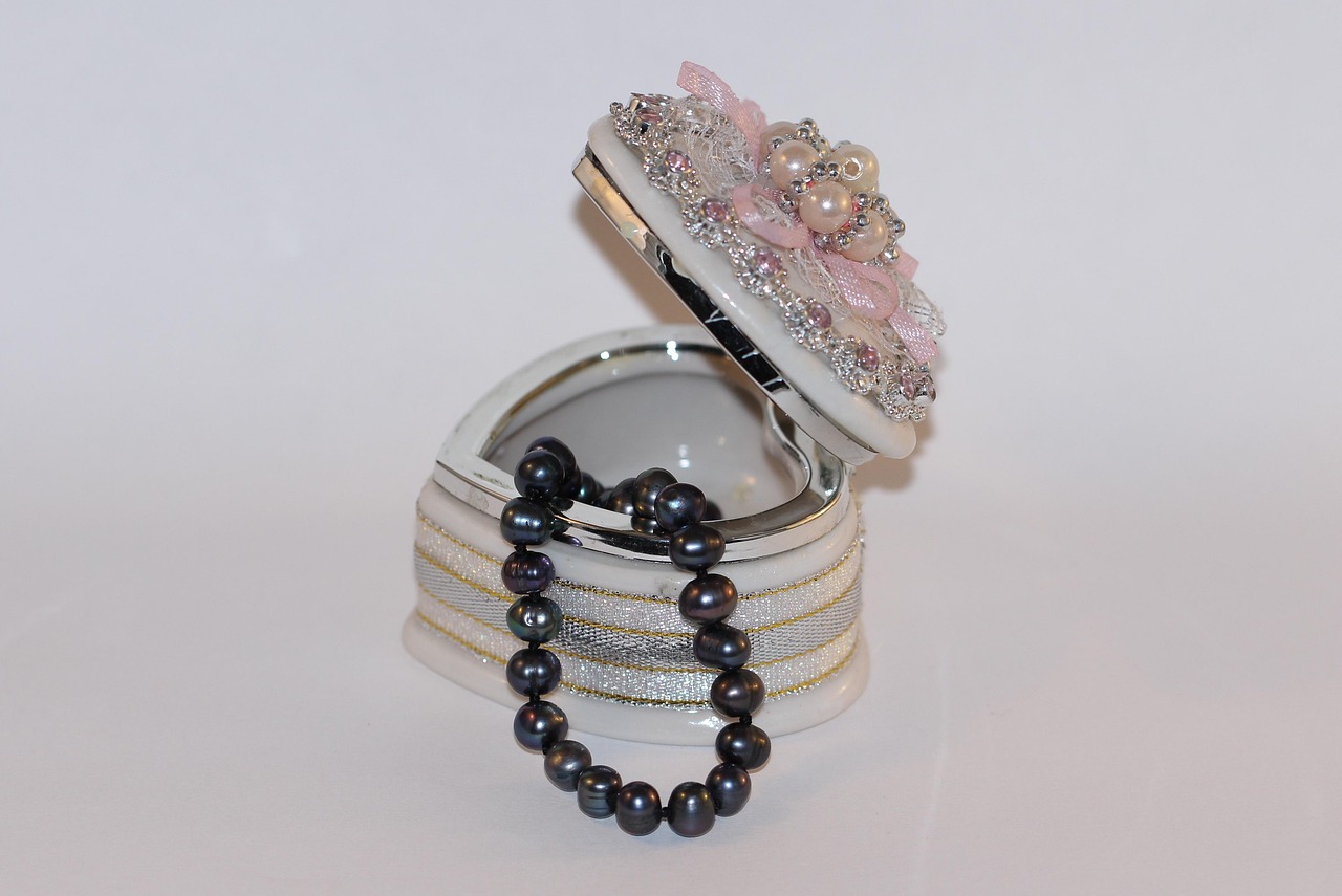
In product and material design, pewter genuinely shines because the name evokes a real finish. Hardware, faucets, jewelry, and tableware specified as “pewter” carry a soft satin sheen and warm cast that a flat painted gray can’t replicate. Designers choosing finishes use “pewter” to signal that warm, antique-metal quality specifically.
In web and interiors, neutral gray provides flexible backgrounds and structure, while pewter adds warmth as an accent — a feature wall, a metallic UI detail, or a hardware tone — that keeps a gray scheme from feeling cold. Pairing the two lets you get the versatility of gray with a touch of pewter’s character where it counts.
Do pewter and gray go together?
Yes — they pair naturally because pewter is a member of the gray family. Combining a warm pewter with a cooler or more neutral gray creates a layered, tonal scheme with quiet temperature contrast. Use neutral gray for broad surfaces and pewter for accents, hardware, or details where its warmth and richness can shine. Add cream or a warm metal to tie the warm side together. The result is a refined, understated palette that feels more considered than a single flat gray.
Frequently Asked Questions
Is pewter a warm or cool gray?
Pewter is generally a warm gray. It carries a faint brown or taupe undertone that keeps it from feeling cold, giving it an antique, refined quality. Some pewters are more neutral, but the warmth is what typically distinguishes pewter from a plain cool or neutral gray.
What is the hex code for pewter?
Pewter isn’t standardized, but representative values cluster around #8E8B82, #96989B, or similar medium-dark warm grays. Because pewter describes a metal-inspired color rather than a fixed ink, the exact hex varies by brand, finish, and whether it’s rendered with a metallic sheen.
Is pewter the same as gray?
Not exactly. Pewter is a specific type of gray — a medium-dark, slightly warm, metallic-looking gray — while “gray” is the broad neutral category that includes everything from pale silver to charcoal. Pewter is a characterful member of the gray family, not a separate color.
What colors go with pewter?
Pewter pairs well with cream, ivory, navy, blush, warm woods, and other metals like brass or copper, which complement its faint warm undertone. It also layers nicely with neutral and cool grays for a tonal scheme, and it grounds jewel-tone accents in premium palettes.
Is pewter darker than regular gray?
Pewter is usually a medium-to-dark gray, so it tends to be darker than a light or mid neutral gray but lighter than charcoal. Its defining traits are the metallic association and faint warmth rather than a fixed darkness, so value can vary across different pewters.


