Slate vs Charcoal: Which Gray to Use
Both are go-to “serious” grays, but the slate vs charcoal choice changes a design’s depth and temperature. Slate is a mid-tone gray with a noticeable cool, blue cast — named after the natural stone. Charcoal is a deep, near-black gray that reads as a softer alternative to pure black. Picking the right one depends on how dark and how cool you want the result to feel.
What is slate?
Slate is a cool, medium gray with a blue (sometimes blue-green) undertone, taking its name from the layered gray stone. The classic web value “slate gray” is #708090. Because it’s lighter than charcoal and carries that blue cast, slate feels calmer, more atmospheric, and more refined than a flat neutral gray. It’s popular in UI design, interiors, and branding that want sophistication with a hint of cool color.
Slate’s blue undertone is its signature. It’s what makes slate feel like a color rather than a pure neutral, and it’s why slate pairs so naturally with navy, teal, and other cool tones.
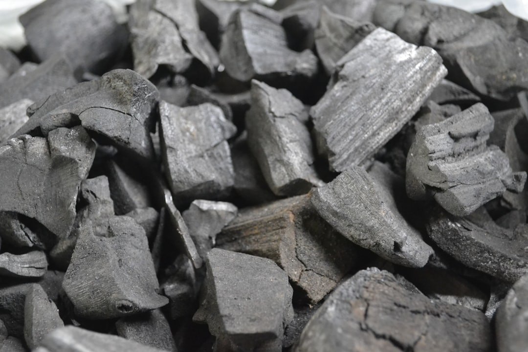
What is charcoal?
Charcoal is a very dark gray that sits just short of black — named after burnt charcoal. A representative value is around #36454F, though charcoal ranges from a neutral dark gray to one with a faint blue undertone. Its main characteristic is depth: charcoal delivers the gravity and contrast of black while feeling slightly softer and less absolute. It’s a workhorse for type, dark UI themes, and premium branding.
If you’re weighing charcoal against true black, our charcoal versus black comparison explains why charcoal often reads as more sophisticated and easier on the eyes than #000000.
What’s the difference between slate and charcoal?
The two differences are value (lightness) and undertone. Slate is a medium gray with a clear blue cast; charcoal is a near-black dark gray that’s more neutral. Put simply: charcoal is darker and more neutral, slate is lighter and cooler. Here’s the side-by-side with representative values, since neither name is standardized.
| Property | Slate | Charcoal |
|---|---|---|
| Hex code | #708090 | #36454F |
| RGB | 112, 128, 144 | 54, 69, 79 |
| CMYK | 22, 11, 0, 44 | 32, 13, 0, 69 |
| Undertone | Cool blue (sometimes blue-green) | Neutral to slightly cool blue |
| Hue family | Cool gray (mid-tone) | Dark neutral gray (near-black) |
| Best used for | UI surfaces, calm interiors, cool sophisticated branding | Body type, dark themes, premium/serious branding |
| Mood/feel | Calm, refined, atmospheric, cool | Grounded, strong, premium, softer than black |
When should you use each?
Use slate when you want a sophisticated mid-gray with a touch of cool color. It works beautifully as a UI surface or secondary text color, in calm interior schemes, and in brand palettes aiming for understated, modern refinement. Slate is light enough to use across large areas without feeling heavy.
Use charcoal when you need depth and contrast without the harshness of pure black. Charcoal is the smarter default for body text (it’s easier on the eyes than #000000), dark-mode backgrounds, and premium branding that wants weight and seriousness. It pairs cleanly with almost any accent color.
A simple way to choose: if you want the gray to feel like a quiet color, pick slate; if you want it to feel like a softened black, pick charcoal. For the lighter and warmer grays in this same family, compare with pewter versus gray and greige versus gray from this batch.
How are slate and charcoal used across design?
In web and UI design, charcoal is the smart default for primary text and dark-mode backgrounds — its near-black depth delivers strong contrast while being gentler than #000000, which can cause harsh haloing on bright screens. Slate, being lighter and cooler, works well for secondary text, borders, and surface tints that need to recede without disappearing. Together they form a clean, readable grayscale hierarchy.
In branding, charcoal communicates weight, seriousness, and premium quality, which is why it anchors so many luxury and professional identities as a softer stand-in for black. Slate communicates calm, intelligence, and modern restraint, with its blue undertone adding a subtle cool sophistication. Brands often use charcoal for the logo and slate for supporting UI or secondary palette roles.
In interiors, slate is a popular cool wall or cabinetry color that feels atmospheric without going dark, while charcoal shows up on feature walls, joinery, and accents where dramatic depth is the goal. Both pair naturally with brass, navy, and white to balance their coolness with warmth or brightness.
Do slate and charcoal go together?
Yes — they’re an excellent monochromatic pairing. Slate as a lighter mid-tone and charcoal as the deep anchor creates a layered gray scheme with clear value contrast and a shared cool temperature. Use charcoal for type and primary structure, slate for secondary surfaces or accents, and add white plus one accent color (navy, teal, or a warm metallic) to complete the palette. The combination reads as modern, calm, and professional.
Frequently Asked Questions
Is slate darker than charcoal?
No — charcoal is darker. Slate is a medium gray (around #708090), while charcoal is a deep, near-black dark gray (around #36454F). The clear value gap between them is one of the main reasons the two grays pair so well together in a layered scheme.
Is slate a blue or a gray?
Slate is a gray with a cool blue undertone, so it’s best described as a blue-gray. The blue cast is subtle enough that slate still reads as a neutral in most contexts, but it’s pronounced enough to make slate feel cooler and more refined than a pure neutral gray.
Is charcoal better than black for text?
Often, yes. Charcoal (around #36454F) provides strong contrast while being slightly softer than pure black (#000000), which can feel harsh on bright white backgrounds. Many designers use charcoal for body text to reduce eye strain while keeping excellent readability and a premium feel.
What undertone does charcoal have?
Charcoal is mostly neutral, but many charcoals carry a faint cool blue undertone, which is why they read as “cool” dark grays rather than warm ones. Some charcoals lean very slightly warm instead. Because the name isn’t standardized, the exact undertone varies by product and brand.
What colors go with slate?
Slate pairs well with white, cream, navy, teal, and warm metals like brass or copper, which contrast nicely with its cool blue undertone. It also works in tonal schemes alongside charcoal and other grays, creating a calm, sophisticated, monochromatic palette.


