Visual Hierarchy in Design Explained
Hierarchy in design is the principle that decides what a viewer sees first, second, and last. Every layout — a poster, a homepage, a slide — carries an implied reading order, and hierarchy is how you control it on purpose rather than leaving it to chance. When the ranking is clear, the eye glides; when it isn’t, the viewer stalls and starts hunting.
Hierarchy is one of the core principles of design, and it is arguably the one that holds the others together. This article covers what hierarchy is, the tools that create it, how reading patterns shape it, and the mistakes that quietly flatten a layout.
What is hierarchy in design?
Hierarchy is the arrangement of elements to show their relative importance. It answers a simple question for the reader: which of these things should I deal with first? A headline outranks a subhead, which outranks body text, which outranks fine print. That descending order is not accidental — it is engineered through visual difference.
The clearest way to think about it is as a ranked path. Level one is the focal point, the loudest element on the page. Each level below it is quieter than the one above. When those levels are spaced clearly, a reader can scan the structure of a page in under a second, before reading a single word in full. For the broader, step-by-step treatment, see our dedicated guide to visual hierarchy.
Why does hierarchy matter?
People do not read layouts top to bottom like a novel. They scan, jumping between whatever stands out, and they decide within moments whether a page is worth their attention. Hierarchy is what makes that scan productive. A strong hierarchy delivers the core message even to someone who reads nothing but the largest three elements.
Without hierarchy, every element competes equally, and competition with no winner reads as noise. The viewer’s brain has to do the sorting that the designer should have done, and most viewers simply leave instead. Good hierarchy is, in effect, an act of respect: it does the prioritizing so the audience doesn’t have to.
How do you create hierarchy in design?
Hierarchy is built by making important elements visually different from less important ones. The reliable levers are below; strong layouts usually combine two or three of them on each tier rather than relying on one.
- Size and scale. Bigger reads as more important. Scaling the headline well above the body is the single most direct hierarchy cue.
- Weight. Bold type advances; light type recedes. Weight separates tiers without changing size.
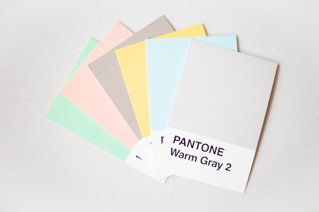
- Color and value. A saturated or high-contrast element jumps forward; muted tones sink back.
- Position. Top and left positions carry natural prominence in left-to-right cultures, and the area above the fold is read first.
- Spacing. Generous space around an element promotes it; tight grouping signals lower-tier supporting detail.
- Contrast. The bigger the difference between a tier and its neighbors, the clearer its rank.
Because hierarchy depends on difference, it is closely tied to emphasis in design — emphasis creates the level-one focal point, and hierarchy organizes every level beneath it. The two work as a pair: emphasis sets the loudest voice, hierarchy arranges the chorus.
What are the types of hierarchy?
Designers usually talk about three overlapping kinds. They aren’t mutually exclusive; a finished layout uses all three at once.
| Type | What it ranks | Primary tool |
|---|---|---|
| Visual hierarchy | All elements on the page | Size, color, contrast, position |
| Typographic hierarchy | Levels of text (H1, H2, body, caption) | Type size, weight, case, spacing |
| Spatial hierarchy | Groups and their relationships | Position, proximity, white space |
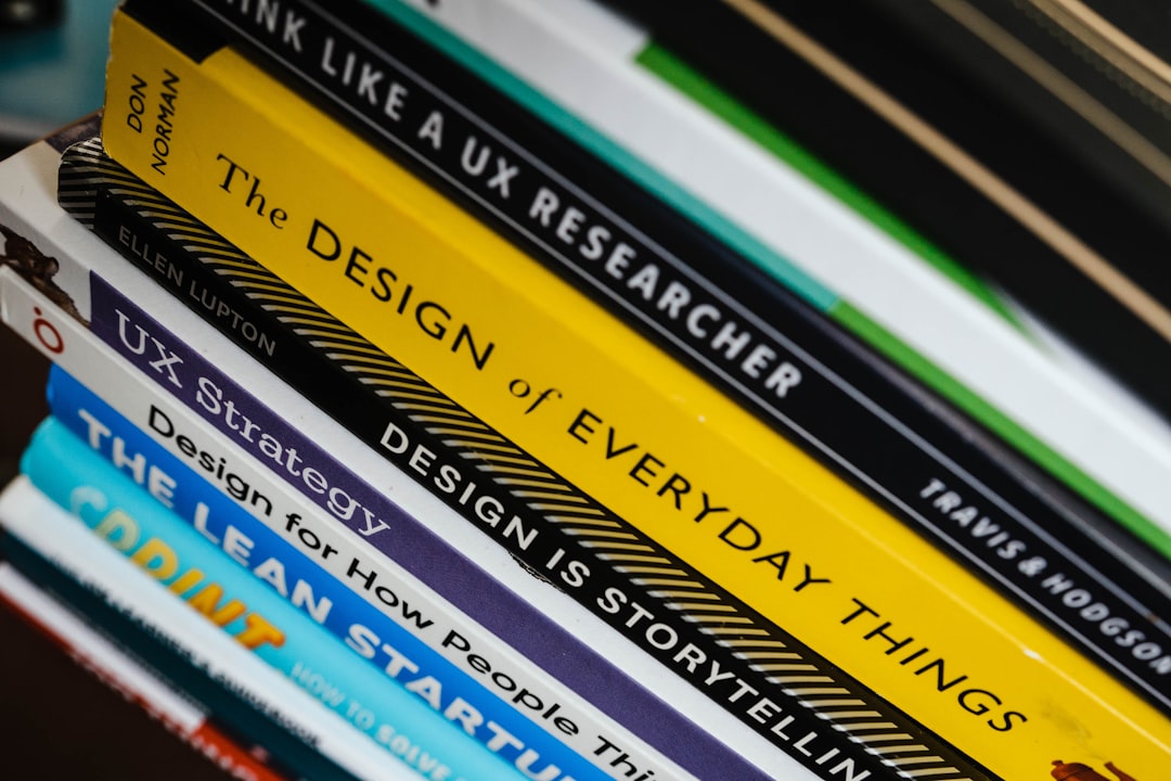
Typographic hierarchy deserves special mention because so much design is text. A clean type system needs only a few distinct steps — a large heading, a clear subhead, readable body, and quiet captions — with enough difference between each that no two read as the same level.
How do reading patterns shape hierarchy?
Eye-tracking research has shown that people scan dense pages in predictable shapes. The two most cited are the F-pattern and the Z-pattern. Understanding them lets you place high-priority elements where the eye already wants to go.
The F-pattern appears on text-heavy pages: readers scan across the top, drop down, scan across again in a shorter sweep, then run their eye down the left edge. It rewards front-loaded headings and short, scannable openings. The Z-pattern suits sparser, more visual layouts: the eye travels top-left to top-right, diagonally down to bottom-left, then across to bottom-right — a natural route for a logo, a hero, and a closing call to action. Neither is a rule to obey rigidly; they describe tendencies you can design with rather than against.
Common hierarchy mistakes
- Too many levels. Five competing tiers read as no hierarchy at all. Most layouts need three or four clear levels, not seven.
- Levels too close together. A 16px body and an 18px “heading” look like a mistake. Make each step an obvious jump.
- No clear first. If two elements tie for the top spot, the reader has no entry point. Promote one decisively.
- Ranking by decoration, not importance. The boldest element should be the most important message — not just the prettiest.
- Ignoring spacing. Size and color get all the attention, but space is half of hierarchy. Crowded tiers blur their own ranks.
A quick workflow for building hierarchy
Start by listing what’s on the page in priority order — what must be seen first, second, third. Assign your strongest cues (large size, bold weight, an accent color) to the top item and progressively quieter cues to each item below. Then run the squint test: blur your eyes and check that the elements still resolve into clear tiers. If everything turns to grey mush, your differences aren’t strong enough. Pushing scale and spacing further is almost always the fix. For a sibling lever that reinforces every tier, see how scale in design sets the size relationships that hierarchy depends on.
Frequently Asked Questions
What is hierarchy in design?
Hierarchy in design is the deliberate ranking of elements by importance so a viewer reads them in the intended order. It is created with size, weight, color, position, spacing, and contrast. A clear hierarchy lets someone grasp a layout’s structure and message at a glance, before reading any of it in full.
What is the difference between hierarchy and emphasis?
Emphasis creates a single focal point — the one element that stands out most. Hierarchy is the full ranked order of every element, from that focal point down to the smallest caption. Emphasis sets level one; hierarchy organizes all the levels beneath it. You need emphasis to start a hierarchy and hierarchy to make emphasis useful.
What are the F-pattern and Z-pattern?
They are common ways people scan a page. The F-pattern, seen on text-heavy layouts, traces horizontal sweeps and a vertical run down the left. The Z-pattern, suited to sparser visual layouts, moves top-left to top-right then diagonally to bottom-right. Placing key elements along these routes aligns your hierarchy with how eyes actually move.
How many levels should a hierarchy have?
Most layouts work best with three to four clear levels — for example a headline, subhead, body, and caption. More than that and the levels start to blur, because each one becomes harder to distinguish. The goal is obvious steps between tiers, not a long ladder of nearly identical sizes.