Best Calligraphy Fonts for Every Design Project
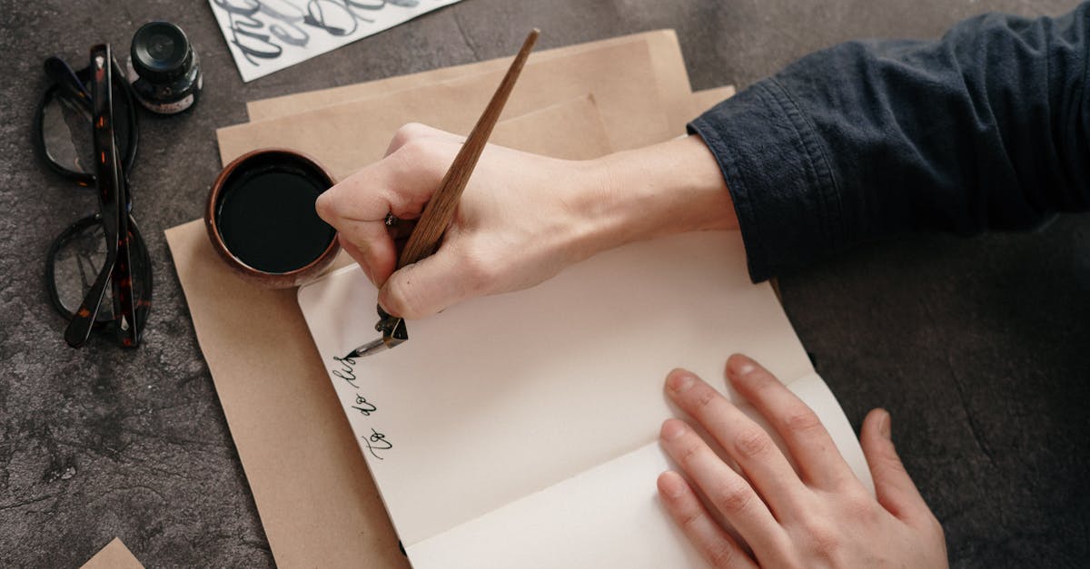
There is a meaningful difference between actual calligraphy and a calligraphy font. Real calligraphy is a handcraft: each stroke is shaped in the moment by pressure, angle, and the physical qualities of the tool. A calligraphy font is a digital approximation of that process, a typeface designed to mimic the look of pen or brush lettering while offering the convenience and consistency of type. Neither is inherently better than the other. They serve different purposes. When you need scalable, repeatable, precisely spaced lettering that evokes the warmth and artistry of calligraphic writing, a well-designed calligraphy font is the right tool.
This guide covers more than thirty of the best calligraphy fonts available today, organized by style. Whether you are designing wedding invitations, luxury packaging, editorial headlines, or a brand identity that needs a personal, handcrafted feel, you will find options here ranging from free Google Fonts to premium scripts with hundreds of alternate characters and swash forms.
What Makes a Calligraphy Font
Not every script or handwritten typeface qualifies as a calligraphy font. True calligraphy fonts share a set of defining characteristics rooted in the traditions of pen and brush lettering.
Stroke modulation. The most essential quality. Calligraphy fonts exhibit visible variation in stroke thickness that mimics the effect of a broad-edged nib, pointed pen, or brush. Downstrokes are typically heavier; upstrokes and connecting strokes are thinner. This thick-thin contrast is what gives calligraphy fonts their rhythm and elegance. Without it, you have a script font, but not necessarily a calligraphic one.
Connected or semi-connected letterforms. Most calligraphy fonts feature letters that flow into one another, replicating the continuous movement of a hand across the page. Some styles, particularly chancery italics, may have only partial connections, with certain letters standing independently while others link naturally.
Swash alternates and flourishes. Well-crafted calligraphy fonts include alternate versions of letters, especially capitals, with decorative extensions and flourishes. These swash characters allow designers to add ornamental touches to the beginning or end of words without breaking the calligraphic illusion. The best calligraphy fonts offer dozens or even hundreds of alternates accessible through OpenType features.
Contextual ligatures. In real calligraphy letters, the shape of one letter often influences the next. Premium calligraphy fonts replicate this behavior through contextual alternates and ligatures, automatically adjusting letterforms based on their neighbors. This prevents the mechanical repetition that makes lesser script fonts look artificial.
Formal and Copperplate Style Calligraphy Fonts
Formal calligraphy fonts draw from the tradition of copperplate writing, which flourished in the seventeenth and eighteenth centuries. These scripts are characterized by extreme stroke contrast (thin hairlines and swelling shades), a consistent slant angle, and a refined elegance that has made them the standard for formal occasions for centuries. If you picture the lettering on a traditional wedding invitation or a university diploma, you are picturing copperplate-style calligraphy.
Burgues Script
Burgues Script, designed by Alejandro Paul of Sudtipos, is among the most virtuosic digital calligraphy fonts ever created. It is modeled on the engrossing scripts of nineteenth-century American calligraphers, with extraordinary swash capitals, decorative flourishes, and multiple alternate forms for virtually every letter. The level of detail in Burgues Script is staggering: OpenType features allow you to build compositions that look genuinely hand-lettered, with each word appearing unique.
Burgues Script works best for short, prominent text where its ornamentation can be fully appreciated: names on invitations, monograms, wine labels, luxury packaging, and certificate headings. Extended passages will overwhelm the reader. It is a commercial font available through MyFonts and other distributors.
Best for: Wedding invitations, luxury packaging, certificates, monograms.
Price: Commercial license from MyFonts.
Bickham Script
Bickham Script, designed by Richard Lipton for Adobe, is based on the lettering of eighteenth-century English writing master George Bickham. It is one of the most widely recognized formal calligraphy fonts in the world, appearing on everything from high-end wine labels to corporate event invitations. Bickham Script comes in three weight variations and includes extensive swash alternates, ornamental characters, and ligatures that give designers considerable flexibility.
Where Burgues Script is maximally decorative, Bickham Script strikes a balance between ornamentation and usability. It is legible enough for slightly longer passages, such as invitation body text or a short paragraph on packaging, while still carrying unmistakable formal elegance.
Best for: Formal invitations, wine and spirits labels, premium stationery, event branding.
Price: Included with Adobe Fonts (Creative Cloud subscription).
Edwardian Script
Edwardian Script ITC, designed by Edward Benguiat, is a calligraphy font that bridges formal and accessible. It draws on copperplate traditions but with smoother, more flowing connections and less extreme contrast than Burgues or Bickham. The result is a script that reads as elegant and refined without the intense formality of pure copperplate styles. Edwardian Script is bundled with Microsoft Office, making it one of the most widely available calligraphy fonts.
Its ubiquity is both an asset and a limitation. It is immediately accessible for anyone working in Word or PowerPoint, but its overuse in amateur designs has somewhat diluted its perceived elegance. In the hands of a skilled designer, with careful kerning, generous spacing, and a restrained layout, Edwardian Script still delivers genuine sophistication.
Best for: Invitations, greeting cards, certificates, elegant display text.
Price: Bundled with Microsoft Office; also available through ITC.
Palace Script
Palace Script is a classic copperplate calligraphy font with a long history in formal typography. Its letterforms are restrained and dignified, with consistent slant, delicate hairlines, and minimal flourishing compared to more ornate alternatives. Palace Script reads as quietly elegant, the typographic equivalent of a well-cut suit rather than a costume.
This restraint makes Palace Script particularly effective for applications where legibility is important but a calligraphic touch is desired: formal correspondence, business cards for premium brands, and understated luxury packaging.
Best for: Formal correspondence, business cards, understated luxury branding.
Price: Commercial license; available through Linotype and distributors.
Snell Roundhand
Snell Roundhand, designed by Matthew Carter based on the eighteenth-century writing of Charles Snell, is a copperplate script with rounder, more generous letterforms than the angular precision of Bickham or Palace. Its curves are smooth and confident, with a rhythm that feels more accessible than austere formal scripts while retaining clear calligraphic heritage. Snell Roundhand is included with macOS, giving it wide availability on Apple systems.
The font comes in three weights, from the delicate Regular to the bold Black, each with connected, flowing characters. The heavier weights, while less traditionally calligraphic, work well for headlines and logos where a script feel is desired at larger sizes.
Best for: Invitations, editorial accents, logo wordmarks, Apple-platform projects.
Price: Bundled with macOS; also available commercially.
Modern Calligraphy Fonts
Modern calligraphy breaks the rigid rules of copperplate tradition. The baseline bounces. The slant varies. The connections between letters feel spontaneous rather than mechanical. This style exploded in popularity through Instagram and the wedding industry in the 2010s, and its influence on type design has produced a wave of fonts that capture the organic, imperfect beauty of contemporary pointed-pen calligraphy.
Asterism
Asterism is a modern calligraphy font with graceful, organic letterforms that feel genuinely handwritten. Its baseline variation is subtle enough to maintain legibility while creating the lively, natural rhythm that defines the modern calligraphy aesthetic. The font includes stylistic alternates, swash characters, and ligatures that prevent repetitive letter combinations from breaking the handcrafted illusion.
Asterism works beautifully for wedding stationery, feminine branding, social media graphics, and any project that needs to feel personal and artful without the stiffness of formal scripts.
Best for: Wedding stationery, feminine branding, social media, editorial accent text.
Price: Commercial license from Creative Market and similar platforms.
Mardian
Mardian is a calligraphy typeface with historical roots, drawing on the blackletter and bastarda traditions but interpreted through a modern, flowing lens. Its letterforms have a dramatic, medieval-meets-contemporary quality that stands out from the pointed-pen aesthetic of most modern calligraphy fonts. Mardian includes decorative alternates and swash forms that amplify its ornamental character.
This distinctiveness makes Mardian a strong choice for branding, beer and spirits labels, music industry design, and editorial projects where a calligraphic font with historical gravitas is more appropriate than a delicate pointed-pen script.
Best for: Branding with historical character, beverage labels, editorial headlines, event posters.
Price: Free for personal use; commercial license available.
Adelicia Script
Adelicia Script is a refined modern calligraphy font with smooth, flowing letterforms and a slightly elevated baseline rhythm. It strikes a careful balance between the organic spontaneity of modern calligraphy and the polished consistency needed for professional design work. The character set includes both standard and ornamental alternates, giving designers control over how casual or formal the result appears.
Adelicia Script is particularly effective for luxury wedding stationery, boutique branding, product packaging, and editorial layouts that call for elegant script text.
Best for: Luxury wedding suites, boutique branding, upscale packaging.
Price: Commercial license from MyFonts and Creative Market.
Better Together
Better Together is a casual modern calligraphy font with a warm, approachable personality. Its letterforms are rounder and less formal than many calligraphy scripts, with a gentle bounce and natural variation that suggests a relaxed, confident hand. The font is designed for readability even at moderate sizes, making it more versatile than highly decorative alternatives.
This accessibility makes Better Together a popular choice for lifestyle branding, greeting cards, social media content, and blog graphics where calligraphic elegance is wanted without the formality of traditional scripts.
Best for: Lifestyle branding, greeting cards, social media graphics, blog headers.
Price: Commercial license from Creative Market.
Rachela
Rachela is a bold modern calligraphy font with thick, confident strokes and dramatic baseline movement. Unlike the delicate hairlines of copperplate-inspired scripts, Rachela’s weight gives it a strong visual presence that works well at headline sizes and for logos. The font includes swash alternates and ligatures, and its exuberant personality makes it immediately eye-catching.
Rachela is best suited for projects that need calligraphic energy and impact: event posters, brand wordmarks, packaging headlines, and social media content where the type needs to command attention.
Best for: Bold headlines, brand wordmarks, event posters, packaging.
Price: Free for personal use; commercial license available.
Brush Calligraphy Fonts
Brush calligraphy fonts replicate the look of lettering made with a brush rather than a pointed pen or broad-edged nib. The strokes are typically bolder and more textured, with visible brush marks, dry-brush effects, and a dynamic energy that pointed-pen scripts cannot achieve. Brush calligraphy fonts bring an artisanal, handcrafted quality to designs and work especially well for brands that want to feel creative, organic, and approachable.
Bromello
Bromello is a brush calligraphy font with a dry, textured quality that makes it look like it was lettered with an actual brush on rough paper. The edges of the strokes are slightly rough and irregular, giving the font an authentically handmade character. Despite this texture, the letterforms are well-designed and legible, with connections that flow naturally between characters.
Bromello is excellent for artisanal food branding, craft beverage labels, rustic wedding invitations, and creative projects that benefit from a tangible, tactile quality in the type.
Best for: Artisanal branding, craft beverage labels, rustic invitations, creative packaging.
Price: Free for personal use; commercial license available.
Playlist Script
Playlist Script is a brush-lettering font with a casual, upbeat energy. Its strokes are fluid and confident, with the natural thick-thin variation that comes from a brush held at a consistent angle. The font family includes three styles, Script, Caps, and Ornament, that work together to create cohesive lettering compositions. The Caps provides a printed, hand-lettered companion to the flowing Script, while the Ornament set adds decorative elements.
This versatility makes Playlist particularly useful for branding projects, where designers need multiple type styles that share a consistent visual language. It works well for cafe and restaurant branding, lifestyle products, and creative agency identities.
Best for: Cafe and restaurant branding, lifestyle products, creative identities, social media.
Price: Free for personal use; commercial license available.
Authentica
Authentica is a brush calligraphy font that balances energy with refinement. Its letterforms are smoother and more controlled than heavily textured brush fonts, with confident strokes that feel deliberate rather than wild. The result is a brush script that carries the warmth and movement of hand-lettering while remaining polished enough for professional branding and editorial use.
Authentica includes stylistic alternates and ligatures that prevent the repetitive patterns common in script fonts. It works well for beauty branding, wedding stationery, editorial headlines, and any context where a brush calligraphy aesthetic is desired without a rough or unfinished feel.
Best for: Beauty branding, refined wedding stationery, editorial accents, product packaging.
Price: Commercial license from Creative Market and MyFonts.
Blooming Elegant
Blooming Elegant is a brush calligraphy font with a lush, flourishing character. Its swash alternates and decorative extensions are generous and dramatic, creating a sense of abundance and celebration in the lettering. The base letterforms are well-crafted and legible, but the real strength of Blooming Elegant lies in its ornamental options, which allow designers to create highly decorative, unique text compositions.
This font shines in contexts where visual richness is welcome: luxury event invitations, boutique packaging, floral branding, and editorial features where the type serves as decoration as much as communication.
Best for: Event invitations, boutique packaging, floral and beauty branding, decorative headlines.
Price: Commercial license from Creative Market.
Chalky Brush
Chalky Brush captures the look of lettering done with chalk or a dry brush on a rough surface. The strokes have a distinctive gritty texture, with gaps and irregularities that give the font a raw, artisanal character. This textured quality sets it apart from smoother brush scripts and gives it a specific aesthetic that works in particular contexts.
Chalky Brush is ideal for chalkboard-style menus, farm-to-table restaurant branding, craft market signage, and any design that aims for a handmade, approachable, slightly rustic quality. It pairs well with hand-drawn illustrations and natural textures.
Best for: Chalkboard menus, rustic branding, craft market signage, farm-to-table aesthetics.
Price: Commercial license from Creative Market and similar platforms.
Italic and Chancery Calligraphy Fonts
Chancery scripts and italic calligraphy fonts are rooted in the writing traditions of the Italian Renaissance. Unlike copperplate scripts, which are built on hairlines and swelling shades, chancery styles are constructed with a broad-edged pen held at a consistent angle. The resulting letterforms have a different kind of stroke contrast, determined by pen angle rather than pressure, and a more upright, architectural quality than flowing copperplate.
Zapfino
Zapfino, designed by Hermann Zapf and digitized with Apple’s support, is one of the most ambitious calligraphy fonts ever produced. It contains multiple sets of alternate letterforms, contextual substitutions, and ligatures that allow the same text to be rendered in different ways, mimicking the natural variation of real calligraphy. Zapfino’s letterforms are dramatic, with sweeping ascenders, deep descenders, and elaborate flourishes that can create stunning visual compositions.
Zapfino is bundled with macOS and has been widely used (and occasionally overused) in everything from restaurant menus to wedding invitations to corporate presentations. In skilled hands, with careful selection of alternates and appropriate restraint, Zapfino remains a powerful tool. The key is to use it for short, prominent text and to take advantage of its alternate character sets to avoid repetitive letterforms.
Best for: Display headlines, invitations, menu headers, short decorative text.
Price: Bundled with macOS; extended version (Zapfino Extra) available commercially from Linotype.
Apple Chancery
Apple Chancery is a chancery italic script included with macOS. Its letterforms are based on the Italian Renaissance writing tradition, with a moderate slant, visible broad-pen construction, and elegant but restrained flourishes. Compared to Zapfino’s drama, Apple Chancery feels more reserved and classical, with a scholarly quality that connects it to the humanist calligraphy of the fifteenth and sixteenth centuries.
Apple Chancery is a serviceable choice for projects that need a calligraphic touch without extreme ornamentation: invitations, certificates, decorative body text, and historical or academic design contexts.
Best for: Certificates, classical invitations, academic design, decorative body text.
Price: Bundled with macOS.
Poetica
Poetica, designed by Robert Slimbach for Adobe, is a masterwork of digital chancery calligraphy. Based on the letterforms of Renaissance writing masters, Poetica includes an extraordinary range of swash capitals, alternate lowercase forms, ligatures, ornaments, and small caps across multiple stylistic sets. It was one of the first fonts to fully exploit the possibilities of OpenType layout features, and its character set remains among the most comprehensive of any calligraphy font.
Poetica’s breadth makes it suitable for a wide range of formal and decorative applications. It can be used for subtle, restrained settings or for highly ornamental compositions, depending on which alternates the designer activates. It is available through Adobe Fonts.
Best for: High-end invitations, book titles, certificates, editorial display, ornamental compositions.
Price: Included with Adobe Fonts (Creative Cloud subscription).
Cancelleresca Script
Cancelleresca Script is a chancery italic typeface with a clean, structured character that reflects the disciplined calligraphy of Italian Renaissance scribes. Its letterforms are more regularized and less flourished than Poetica or Zapfino, with a consistent pen angle and moderate stroke contrast. This restraint gives Cancelleresca a calm elegance that works in contexts where more exuberant scripts would feel out of place.
The font is a solid choice for formal documents, letterheads, and applications where the calligraphic tradition should be present but understated, complementing rather than dominating the design.
Best for: Formal documents, letterheads, understated calligraphic applications.
Price: Commercial license available through type distributors.
Free Calligraphy Fonts from Google Fonts
Not every project has a budget for premium typefaces. Fortunately, Google Fonts offers several calligraphy fonts that are genuinely well-designed, completely free, and easy to implement on the web. These fonts are licensed under the SIL Open Font License, meaning you can use them freely for both personal and commercial projects. For a broader look at what Google Fonts offers, see our guide to the best Google Fonts.
Great Vibes
Great Vibes, designed by Robert Leuschke of TypeSETit, is the strongest free calligraphy font available. Its letterforms are modeled on copperplate calligraphy, with smooth connections, elegant stroke contrast, and a confident slant that creates a cohesive, flowing rhythm. The character set includes a solid range of swash alternates and ligatures that bring it closer to premium script fonts than most free alternatives manage.
Great Vibes has become extremely popular for wedding websites, invitations, and any web project that needs calligraphic elegance without a licensing cost. Its quality holds up well at display sizes, though like all script fonts it should not be used for body text.
Best for: Wedding websites, digital invitations, elegant web headings, social media.
Price: Free (Google Fonts, SIL Open Font License).
Dancing Script
Dancing Script, designed by Pablo Impallari, is a lively, casual calligraphy font inspired by popular script lettering styles of the 1950s. Its letterforms bounce and dance along the baseline with a cheerful, spontaneous energy. The font comes in four weights, from Regular to Bold, giving designers the flexibility to adjust the visual presence of the type for different contexts.
Dancing Script is more casual than Great Vibes, making it suitable for projects that want calligraphic warmth without formality: cafe websites, personal blogs, greeting cards, and friendly brand identities.
Best for: Casual branding, blog headings, greeting cards, cafe and restaurant websites.
Price: Free (Google Fonts, SIL Open Font License).
Alex Brush
Alex Brush, also by Robert Leuschke, is a flowing calligraphy font with a formal bearing. Its letterforms are more restrained than Great Vibes, with less variation in stroke contrast and smoother, more uniform connections. This consistency gives Alex Brush a cleaner, more predictable appearance that some designers prefer for professional applications.
Alex Brush works well as a free alternative for wedding stationery, elegant headings, and any context where a polished script is needed without the budget for a premium typeface.
Best for: Wedding stationery, elegant headings, formal web typography.
Price: Free (Google Fonts, SIL Open Font License).
Sacramento
Sacramento, designed by Astigmatic, is a monoline calligraphy font, meaning its strokes have a relatively consistent thickness rather than the dramatic thick-thin contrast of pointed-pen scripts. This monoline quality gives Sacramento a clean, modern feel that distinguishes it from more traditional calligraphy fonts. The letterforms are connected and flowing but with a lightness and simplicity that makes the font versatile.
Sacramento is an effective choice for modern branding, lifestyle blogs, menu headings, and web projects that need a calligraphic touch without heavy ornamentation.
Best for: Modern branding, lifestyle blogs, menu headings, clean web layouts.
Price: Free (Google Fonts, SIL Open Font License).
Parisienne
Parisienne, designed by Astigmatic, is a calligraphy font with a distinctly French character. Its letterforms are upright and elegant, with a moderate stroke contrast and graceful curves that suggest the lettering on a Parisian shop sign or a vintage perfume label. Parisienne occupies a middle ground between the formality of copperplate scripts and the casualness of modern calligraphy.
This balanced personality makes Parisienne useful for fashion-adjacent branding, boutique websites, beauty packaging, and projects that want to evoke European elegance without overt formality.
Best for: Boutique branding, fashion-adjacent design, beauty packaging, European-style elegance.
Price: Free (Google Fonts, SIL Open Font License).
When to Use Calligraphy Fonts
Calligraphy fonts excel in specific contexts where their elegance and personality enhance the design. Understanding where they work and where they do not will save you from common misapplications.
Weddings and formal events. This is the natural home of calligraphy fonts. Invitations, save-the-dates, place cards, menus, and wedding websites all benefit from the personal, handcrafted quality that calligraphy fonts provide. Formal copperplate styles suit traditional weddings; modern calligraphy fonts suit contemporary celebrations. For inspiration on individual letterforms, see our guide to calligraphy letters and the related resource on hand lettering.
Luxury and premium branding. Calligraphy fonts signal craftsmanship, tradition, and attention to detail. They work well for luxury brands in categories like fine fragrance, artisanal food and spirits, boutique hospitality, and jewelry, where the brand story emphasizes heritage and handmade quality. Use them for logos, packaging accents, and taglines rather than extensive body copy.
Editorial and publishing accents. A calligraphy font used sparingly for drop caps, section titles, pull quotes, or chapter headings can add warmth and distinction to editorial layouts. The key is restraint: one calligraphic element per spread is usually sufficient.
Packaging. Calligraphy fonts are widely used in packaging for products that want to feel artisanal, premium, or handmade: wines, spirits, chocolates, candles, cosmetics, and specialty foods. The calligraphic script typically appears on the product name or a key descriptive phrase, paired with cleaner type for supporting information.
When Not to Use Calligraphy Fonts
Body text. Calligraphy fonts are display typefaces. They are designed to be read in short bursts, not in paragraphs. Setting body text in a calligraphy font guarantees poor readability and a design that feels amateurish. Use them for headlines, names, and accents only.
User interfaces and digital products. Calligraphy fonts fail in UI contexts. They are difficult to read at small sizes, their ornamental details get lost on screen, and they conflict with the clean functionality that digital interfaces demand. A calligraphy font on a button or in a navigation menu is almost always a mistake.
Small sizes. The delicate stroke contrast and fine details that make calligraphy fonts beautiful at large sizes become illegible noise at small sizes. Never set a calligraphy font below approximately 18 pixels on screen or 14 points in print. Below those thresholds, thin strokes disappear and letter connections become muddy.
Pairing Calligraphy Fonts with Other Typefaces
Calligraphy fonts are inherently complex, with ornamental details, stroke variation, and flowing connections. They need a calm, clean companion to avoid visual chaos. The principle is simple: pair complexity with simplicity. For a comprehensive approach to combining typefaces, see our font pairing guide.
Pair with clean serifs. A restrained serif like Garamond, Caslon, or Playfair Display provides a harmonious companion for calligraphy fonts. The shared heritage of pen-and-ink construction creates a natural affinity between calligraphic scripts and traditional serifs. Use the calligraphy font for the headline or accent text and the serif for body copy and supporting information. This combination is the standard for wedding stationery and luxury print design. For more serif options, see our guide to the best serif fonts.
Pair with geometric sans-serifs. A clean geometric sans-serif like Futura, Montserrat, or Proxima Nova creates an effective contrast pairing with calligraphy fonts. The sans-serif’s simplicity and regularity provide a stable foundation that allows the calligraphy font to serve as the star. This combination works well for modern branding, packaging, and web design where a calligraphic touch is desired but the overall aesthetic is contemporary and clean.
Avoid pairing with other decorative fonts. Never pair a calligraphy font with another script, a blackletter, a heavily stylized display face, or any typeface that competes for attention. Two decorative fonts in the same design create confusion and visual noise. The calligraphy font should be the sole ornamental voice; everything else should be quiet and supportive.
Frequently Asked Questions
What is the best calligraphy font for wedding invitations?
For traditional, formal weddings, Burgues Script and Bickham Script are the strongest choices. Both are copperplate-style calligraphy fonts with extensive swash alternates and ornamental characters that create the sense of occasion that formal invitations demand. For modern, contemporary weddings, a modern calligraphy font like Asterism or Adelicia Script offers a more relaxed, current aesthetic. If budget is a constraint, Great Vibes from Google Fonts provides genuine calligraphic elegance at no cost. The best calligraphy font for your invitation depends on the overall style and formality of the event.
Are free calligraphy fonts good enough for professional use?
The free calligraphy fonts on Google Fonts, particularly Great Vibes and Alex Brush, are well-designed and suitable for many professional applications, including wedding websites, social media content, and small business branding. However, they have limitations compared to premium alternatives. Free calligraphy fonts typically offer fewer alternate characters, fewer ligatures, and less sophisticated contextual substitution, which means text set in them can look more repetitive and less natural. For high-end print work, luxury branding, or any project where the calligraphy font is the central design element, investing in a premium typeface with extensive OpenType features is worthwhile.
How do I access swash alternates and ligatures in a calligraphy font?
Swash alternates, stylistic sets, and ligatures in calligraphy fonts are accessed through OpenType features. In Adobe InDesign and Illustrator, open the Glyphs panel (Type, then Glyphs) to browse and insert alternate characters, or use the OpenType panel to activate stylistic sets and contextual alternates globally. In Photoshop, the Glyphs panel offers similar functionality. In Canva, some OpenType features are accessible but the support is more limited. In CSS for web use, the font-feature-settings property controls OpenType features, though browser support varies. The key is to work in software that supports OpenType layout features; without them, you see only the default forms and miss the full potential of the font.
Can I use a calligraphy font for a logo?
Yes, calligraphy fonts are widely used for logos, particularly in industries like beauty, fashion, food, hospitality, and event planning. However, there are important considerations. First, always convert the text to outlines (vector paths) in your final logo file so the logo renders correctly regardless of whether the font is installed. Second, customize the letterforms: adjust spacing, modify individual letters, and add or remove swash elements to make the logo feel unique rather than typed. Third, ensure the logo remains legible at small sizes; many calligraphy fonts have fine details that disappear when reduced to a favicon or social media profile picture size. A calligraphy font logo should be a starting point for custom lettering, not a finished product straight from the keyboard.


