Best Handwriting Fonts That Look Natural
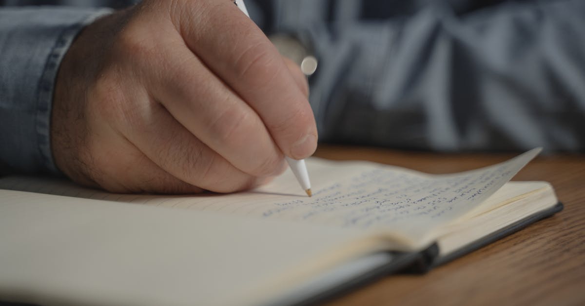
A good handwriting font makes type feel like it was written by a real person. That sounds simple, but it is surprisingly difficult to achieve. Most handwritten fonts fall into the uncanny valley of type design: close enough to real handwriting to trigger expectations of authenticity, but too uniform to deliver on that promise. The letters repeat identically, the spacing is mechanically even, and the result looks less like a note written by hand and more like a computer trying to impersonate one.
The best handwriting fonts solve this problem through careful irregularity, natural variation in stroke weight, and thoughtful alternates that prevent obvious repetition. This guide presents more than twenty-five handwriting fonts organized by style, from casual everyday handwriting to elegant penmanship to childlike scrawl, with notes on where each works best and what it costs. Whether you are designing wedding invitations, children’s book covers, or social media posts that need a personal touch, there is a handwritten font here that fits.
Handwriting Fonts vs Script Fonts
Before diving into specific typefaces, it is worth clarifying the distinction between handwriting fonts and script fonts. The two categories overlap, but they serve different purposes and create very different impressions.
Handwriting fonts mimic the way ordinary people write with a pen or pencil. The letters are typically disconnected or only loosely connected, the strokes are informal, and the overall feel is personal and casual. Think of the handwriting on a grocery list, a journal entry, or a note left on a kitchen counter. The goal is authenticity and warmth, not polish.
Script fonts, by contrast, emulate formal or semi-formal writing traditions. The letters are usually connected with flowing strokes, the curves are smooth and deliberate, and the overall feel is polished and elegant. Script fonts draw on calligraphic traditions and penmanship training, while handwriting fonts draw on everyday writing as it actually looks.
A useful rule of thumb: if it looks like someone practiced it, it is a script font. If it looks like someone just wrote it, it is a handwritten font. Both have their place, but this guide focuses on the latter, the fonts that feel genuinely personal rather than decoratively beautiful. For script options, see our companion guide to script fonts. For the calligraphic end of the spectrum, see calligraphy fonts.
What Makes a Good Handwriting Font
Not all handwriting fonts are created equal. The difference between a convincing handwritten typeface and a cheap imitation comes down to a few key qualities.
Irregularity in the right places. Real handwriting is never perfectly consistent. Letters sit slightly above or below the baseline, ascenders and descenders vary in height, and strokes thicken and thin depending on pressure and speed. A good handwriting font introduces these micro-variations deliberately, making the type feel organic without becoming illegible.
Natural variation through alternates. When you write the letter “e” twenty times by hand, no two look identical. The best handwriting fonts address this by including contextual alternates or stylistic sets that swap in different letterforms depending on position. OpenType-savvy fonts can change the shape of a letter based on what comes before or after it, dramatically reducing the mechanical repetition that betrays a font as digital.
Authentic stroke quality. The strokes in a handwriting font should look like they were made by a specific writing instrument. A ballpoint pen produces different marks than a felt-tip marker, which produces different marks than a pencil. The best handwriting fonts commit to a consistent tool and faithfully reproduce its character, including the imperfections, skips, and bleed that real tools leave on real paper.
Considered spacing. Handwriting has a natural rhythm that differs from typographic convention. Letters cluster together in some combinations and drift apart in others. A well-designed handwriting font builds this rhythm into its metrics and kerning, so the spacing feels natural rather than mathematically rigid.
Casual and Everyday Handwriting Fonts
These fonts capture the look of relaxed, everyday handwriting. They are the workhorse category: versatile enough for a wide range of projects, informal enough to feel genuinely personal, and readable enough to function at various sizes.
Caveat
Caveat, designed by Impallari Type, is one of the most natural-looking free handwriting fonts available. The letterforms have a breezy, unhurried quality that suggests someone jotting down a quick note with a smooth-writing pen. The strokes are thin but confident, with subtle variations in weight that keep the rhythm alive across long passages of text.
Caveat comes in Regular and Bold weights through Google Fonts, which gives it more flexibility than many free handwriting options. It includes a brush variant called Caveat Brush for bolder, more emphatic applications. The font works well for annotations, pull quotes, personal blog headers, and any context where you want to layer a handwritten comment over more formal type. It is free on Google Fonts.
Patrick Hand
Patrick Hand, designed by Patrick Wagesreiter, recreates the designer’s own handwriting as a digital typeface. The result is remarkably convincing: the letters have the easy, slightly rounded quality of neat everyday handwriting, with consistent sizing that keeps it legible at small sizes without sacrificing personality.
Patrick Hand is a single-weight font available on Google Fonts. Its clean, upright posture makes it one of the more readable options in the casual handwriting category, suitable for longer text passages like personal letters, informal invitations, and recipe cards. It pairs well with geometric sans-serifs that provide a clean contrast to its organic warmth. Best for stationery, personal branding, and informal web content. Free on Google Fonts. [LINK: /best-google-fonts/]
Kalam
Kalam, designed by Indian Type Foundry, draws on the handwriting style commonly seen in Indian schools and everyday writing. The letters have a slightly forward lean, gentle curves, and a pen-on-paper quality that feels warm and genuine. What sets Kalam apart is its multicultural character: it was designed for both Latin and Devanagari scripts, making it one of the few handwriting fonts that work across these writing systems.
Kalam comes in three weights, Light, Regular, and Bold, on Google Fonts. The weight range is unusual for a free handwriting font and makes Kalam suitable for creating visual hierarchy within a single typeface. Best for educational materials, multicultural projects, and designs aimed at South Asian audiences. Free on Google Fonts.
Indie Flower
Indie Flower, designed by Kimberly Geswein, is a bubbly, open handwriting font with a personality that sits between casual and playful. The letterforms are round and slightly oversized, with a generous x-height that makes them feel approachable and youthful. The strokes are thin and consistent, giving the font a pen-drawn quality that reads clearly at various sizes.
Indie Flower is a single-weight font available on Google Fonts. It has become one of the most widely used free handwriting fonts on the web, appearing in educational content, craft projects, and social media graphics. Its popularity means it may feel familiar to frequent internet users, but its quality justifies its ubiquity. Best for creative projects, greeting cards, and youth-oriented design. Free on Google Fonts.
Architects Daughter
Architects Daughter, designed by Kimberly Geswein, captures the neat, slightly angular handwriting style that architects and engineers develop through years of technical drawing. The letters are upright, evenly spaced, and have a precision that sets this font apart from more freeform handwriting options. There is a charming tension between the human warmth of handwriting and the disciplined structure of technical lettering.
Architects Daughter is a single-weight font on Google Fonts. It works well for infographics, technical annotations, wireframe mockups, and any context where you want handwriting that reads as competent and organized rather than loose and casual. Best for tech presentations, architectural mood boards, and design documentation. Free on Google Fonts.
Nothing You Could Do
Nothing You Could Do, designed by Kimberly Geswein, is a loose, relaxed handwriting font that feels like someone writing quickly with a ballpoint pen. The letterforms are tall and slightly compressed, with a forward lean and a scratchy, thin stroke that conveys speed and spontaneity. It has more character and attitude than most casual handwriting fonts.
This is a single-weight font on Google Fonts. Its tall, narrow proportions make it efficient with horizontal space, which can be useful for fitting handwritten notes into tight layouts. The thin strokes mean it works best at larger sizes where the details remain visible. Best for editorial pull quotes, creative headers, and social media overlays. Free on Google Fonts.
Elegant Handwriting Fonts
These fonts bring refinement to the handwriting category. They look like they were written by someone with beautiful penmanship, perhaps using a quality pen on good paper. They bridge the gap between casual handwriting and formal script fonts.
Allison
Allison, designed by Robert Leuschke, is a graceful handwriting font with long, sweeping strokes and a natural flow that suggests someone writing with care and attention. The letters are connected in places and disconnected in others, creating the kind of natural variation that real elegant handwriting produces. The contrast between thick and thin strokes is subtle but present, adding depth to the letterforms.
Allison is a single-weight font available on Google Fonts. Despite its elegance, it retains enough informality to feel handwritten rather than calligraphic. It works beautifully for wedding materials, high-end personal branding, luxury packaging accents, and elegant social media content. Best for invitations, feminine branding, and editorial design. Free on Google Fonts. [LINK: /font-pairing/]
La Belle Aurore
La Belle Aurore, designed by Kimberly Geswein, evokes the handwriting of someone who writes with a fountain pen and takes pride in their penmanship. The letters are upright, well-formed, and slightly formal, with a vintage quality that suggests letters written in the mid-twentieth century. The strokes have a pleasant variation in weight that comes from the natural pressure changes of fountain pen writing.
La Belle Aurore is a single-weight font on Google Fonts. Its vintage character makes it an excellent choice for period-inspired design, nostalgic branding, and projects that want to evoke personal correspondence from an earlier era. Best for vintage branding, love letters, literary projects, and boutique packaging. Free on Google Fonts.
Amatic SC
Amatic SC, designed by Vernon Adams, is a condensed, uppercase-focused handwriting font with a distinctive hand-drawn quality. The “SC” stands for small caps: the font renders lowercase letters as smaller versions of the uppercase forms, which gives it a consistent, poster-like quality while retaining the irregularity of hand lettering. The strokes are thin and slightly wobbly, as if drawn with a fine-tipped pen.
Amatic SC comes in Regular and Bold weights on Google Fonts. Its condensed proportions and all-caps structure make it excellent for headlines, poster text, menu designs, and display applications where you want handwritten charm without the informality of mixed-case handwriting. Best for restaurant menus, craft branding, and bohemian design aesthetics. Free on Google Fonts. [LINK: /hand-lettering/]
Mrs Saint Delafield
Mrs Saint Delafield, designed by Alejandro Paul of Sudtipos, is a sophisticated handwriting font that hovers at the border between elegant handwriting and formal script. The letters are connected with flowing strokes, the baseline undulates naturally, and the overall impression is of someone who writes beautifully without thinking about it. The font has a distinctly European flair, evoking handwritten correspondence from a well-traveled, cultured person.
Mrs Saint Delafield is a single-weight font on Google Fonts. Its flowing connections and dramatic ascenders and descenders mean it needs generous line spacing and works best for short text: names, titles, and accent phrases rather than paragraphs. Best for wedding stationery, luxury branding, and formal event design. Free on Google Fonts.
Rouge Script
Rouge Script, designed by Nicole Fally of Typesenses, is a warm, rounded handwriting font with a gentle slant and soft stroke terminals. It has the quality of handwriting produced by a broad-nibbed felt-tip pen: the strokes are relatively consistent in width, with slight thickening on downstrokes that adds just enough contrast to feel natural.
Rouge Script is a single-weight font on Google Fonts. It is more restrained than Mrs Saint Delafield, making it a safer choice for designs that need elegance without drama. It works well for food and beverage branding, personal blog headers, and boutique retail. Best for feminine branding, organic product packaging, and lifestyle content. Free on Google Fonts.
Childlike and Playful Handwriting Fonts
These fonts capture the uninhibited energy of how children and young people write. They are imperfect by design, with oversized letters, inconsistent sizing, and a cheerful disregard for typographic convention that makes them perfect for youthful, creative projects.
Pangolin
Pangolin, designed by Kevin Burke, is a friendly, rounded handwriting font with a gently playful character. The letters are well-formed but casual, with a consistent stroke width and a buoyant baseline rhythm that gives the text a cheerful energy. It avoids the extremes of childishness while still feeling young and approachable.
Pangolin is a single-weight font on Google Fonts. Its readability at small sizes sets it apart from more aggressively playful options, making it suitable for body text in children’s content, educational apps, and family-oriented products. Best for children’s books, toy packaging, and educational materials. Free on Google Fonts.
Coming Soon
Coming Soon, from Open Window, is a neat, upright handwriting font that looks like it was written by a diligent student. The letters are carefully formed with a slight wobble that prevents them from feeling mechanical. The overall impression is youthful and earnest, like handwriting that is trying to be neat but cannot help being a little imperfect.
Coming Soon is a single-weight font on Google Fonts. It is one of the more legible options in the playful category, making it practical for longer text blocks in children’s content and informal communications. Best for school-themed projects, casual invitations, and comic lettering. Free on Google Fonts.
Schoolbell
Schoolbell, designed by Font Diner, captures the handwriting of a child writing with a pencil on lined paper. The strokes are thin and slightly shaky, the letters vary in size, and the baseline wobbles in a way that feels authentically childlike. It is the typographic equivalent of a crayon drawing on the refrigerator.
Schoolbell is a single-weight font on Google Fonts. Its deliberate imperfection makes it ideal for designs aimed at very young audiences or projects that want to evoke childhood nostalgia. It works best at larger sizes where its charming irregularities are visible. Best for elementary school materials, children’s party invitations, and playful branding. Free on Google Fonts.
Just Me Again Down Here
Just Me Again Down Here, designed by Kimberly Geswein, is a bouncy, exuberant handwriting font with letters that dance above and below the baseline. Each character has a slightly different size and angle, creating a kinetic energy that makes static text feel like it is in motion. The strokes are thin and confident, with a ballpoint-pen quality that keeps the font grounded despite its playfulness.
This is a single-weight font on Google Fonts. The extreme baseline variation limits its use to short text where readability is not the primary concern: headlines, labels, social media captions, and decorative elements. Attempting body text with this font would exhaust the reader. Best for greeting cards, craft projects, and whimsical display text. Free on Google Fonts.
Reenie Beanie
Reenie Beanie, designed by James Grieshaber, is a tall, skinny handwriting font with a distinctive angular quality. The letters lean forward and crowd together, creating the impression of someone writing quickly in a cramped notebook. The thin strokes and compressed proportions give it an urban, doodle-like character that feels spontaneous and unpretentious.
Reenie Beanie is a single-weight font on Google Fonts. Its compressed width makes it space-efficient for layouts that need a handwritten feel without the generous horizontal space that most handwriting fonts demand. Best for journaling apps, note-taking interfaces, and indie creative projects. Free on Google Fonts.
Marker and Felt-Tip Style Fonts
These fonts replicate the look of writing instruments with broader, more textured strokes. Where the fonts above suggest pens and pencils, these evoke markers, felt-tip pens, and paint pens, tools that leave bolder, more tactile marks on the page.
Permanent Marker
Permanent Marker, designed by Font Diner, does exactly what its name promises: it looks like someone wrote confidently with a broad-tip permanent marker. The strokes are thick and slightly irregular, with the subtle texture and edge bleed that real markers produce. The letters are bold, slightly condensed, and have a forward lean that conveys energy and urgency.
Permanent Marker is a single-weight font on Google Fonts. Its bold weight and high contrast against backgrounds make it excellent for protest-style graphics, sale announcements, handmade signage, and any design that needs to grab attention with raw, unpolished energy. It is one of the most popular free display fonts for a reason. Best for posters, sale banners, and bold headlines. Free on Google Fonts.
Rock Salt
Rock Salt, designed by Sideshow, is a rough, textured handwriting font that looks like it was written with a worn-out marker on slightly coarse paper. The strokes are uneven, with visible gaps and texture that give every line of text a gritty, authentic feel. The letters are loosely spaced and casually formed, with an attitude that is equal parts punk rock and hand-painted sign.
Rock Salt is a single-weight font on Google Fonts. Its heavy texture means it works best at large sizes where the stroke details are visible; at small sizes, the roughness can interfere with legibility. Best for band posters, street-style branding, food truck signage, and designs that benefit from a raw, handmade aesthetic. Free on Google Fonts.
Covered By Your Grace
Covered By Your Grace, designed by Kimberly Geswein, is a marker-style handwriting font with a softer, more rounded character than Rock Salt or Permanent Marker. The strokes are medium-weight and slightly irregular, with a gentle baseline wobble that feels casual and approachable rather than aggressive. It is the handwriting of someone doodling in a notebook with a felt-tip pen during a lazy afternoon.
Covered By Your Grace is a single-weight font on Google Fonts. Its moderate weight and friendly character make it one of the more versatile marker-style fonts, working for everything from blog graphics to product packaging to hand-lettered social media quotes. Best for lifestyle branding, recipe designs, and casual creative content. Free on Google Fonts.
Walter Turncoat
Walter Turncoat, designed by Sideshow, falls between a traditional handwriting font and a marker font. The strokes have the texture of a medium-point felt-tip pen, with enough irregularity to feel authentic but enough consistency to remain readable. The letters are slightly quirky, with unexpected angles and proportions that give the font a distinctive personality without becoming gimmicky.
Walter Turncoat is a single-weight font on Google Fonts. Its balanced character, not too rough, not too polished, makes it a useful middle-ground option when you need a handwritten feel that is more substantial than a pen but less aggressive than a marker. Best for independent publishing, comic-style layouts, and personal project branding. Free on Google Fonts.
Premium Standout Handwriting Fonts
The free fonts above cover a wide range of styles, but premium handwriting fonts offer features that justify their price: extensive alternate sets, ligatures, multilingual support, and the kind of obsessive attention to natural variation that transforms a font from “looks handwritten” to “looks genuinely written by hand.”
Cotoris
Cotoris is a premium handwriting font that stands out for its extensive set of contextual alternates and ligatures. The base letterforms have the easy, flowing quality of relaxed cursive handwriting, but the real magic is in the variation: the font includes hundreds of alternate characters that swap automatically based on context, so repeated letters never look the same. The effect is startlingly close to genuine handwriting.
Cotoris is available from various font marketplaces at a moderate price point. Its investment in contextual variation makes it one of the best choices for projects where the illusion of real handwriting is critical: personalized stationery, book inscriptions, and packaging that should feel hand-addressed. Best for premium branding, personalized products, and editorial design. Paid, typically under thirty dollars.
Ristretto Pro
Ristretto Pro, from Mika Melvas, is a sophisticated handwriting font that mimics the look of quick, confident handwriting produced by a fine-point pen. The strokes are thin and precise, with a natural variation in weight that comes from authentic hand movement rather than digital manipulation. The letters have a slight forward lean and an elegant economy of form that suggests someone who writes beautifully out of habit rather than effort.
Ristretto Pro includes multiple weights and an extensive character set with contextual alternates that reduce repetition in running text. It is available from font distributors as a commercial license. The font excels in editorial contexts, luxury packaging, and any design where handwriting needs to feel effortless and refined rather than casual or childlike. Best for editorial layouts, luxury branding, and high-end packaging. Paid, mid-range pricing.
Emily Austin
Emily Austin is a warm, expressive handwriting font that captures the look of relaxed feminine handwriting with a slightly vintage feel. The letters are well-proportioned with a gentle slant, generous loops on ascenders and descenders, and a flowing rhythm that makes it feel like reading a personal letter from a friend. The font includes swash alternates for capital letters that add flourish without tipping into formality.
Emily Austin is available from various font marketplaces. It works particularly well for wedding-adjacent design, feminine personal branding, lifestyle blogs, and social media templates. The swash capitals make it effective for monograms and short display text where a decorative touch is welcome. Best for wedding design, personal branding, and lifestyle content. Paid, typically under twenty dollars.
Janda
The Janda font collection, designed by Kimberly Geswein of Fonts by Kimberly, encompasses a range of handwriting styles that rank among the most authentic-looking handwritten fonts available. Janda Stylish Script, Janda Elegant Handwriting, and Janda Celebration Script each capture a different facet of natural handwriting, from casual to refined. What unites them is meticulous attention to how real pen strokes behave.
The Janda fonts are available in both free-for-personal-use and commercial license versions from Kimberly Geswein’s site. The commercial licenses are affordably priced. These fonts are popular among teachers, crafters, and small business owners for their warmth and authenticity, and they hold up well in professional design contexts too. Best for small business branding, teacher resources, and craft design. Free for personal use, paid commercial license.
Handwriting vs Script vs Calligraphy: Understanding the Spectrum
These three categories exist on a spectrum of formality and intentionality, and understanding where each sits helps you choose the right font for your project. [LINK: /what-is-typography/]
Handwriting fonts sit at the casual end. They represent everyday writing: informal, personal, and unpolished. The strokes are produced naturally, without conscious attention to form. The appeal is authenticity and warmth. Use handwriting fonts when you want your design to feel human and approachable.
Script fonts occupy the middle ground. They represent practiced, skilled writing where the letterforms are intentionally beautiful. The strokes flow and connect with deliberate elegance. Script fonts feel polished and refined, suitable for formal invitations, luxury branding, and editorial headlines. For a detailed breakdown, see our guide to script fonts.
Calligraphy fonts sit at the formal end. They replicate the marks made by specialized tools, broad-edged nibs, pointed pens, and brushes, wielded with training and intention. Calligraphy is an art form, and calligraphy fonts carry that artistic weight. They are best reserved for display use where their beauty can be appreciated. For background on the art form itself, see our guide to hand lettering.
The boundaries between these categories are blurry. Mrs Saint Delafield, listed in our elegant handwriting section above, could reasonably be called a script font. Amatic SC could be classified as hand lettering. Do not worry too much about taxonomy. Focus instead on whether a font communicates the level of formality and personality your project requires.
When to Use Handwriting Fonts
Handwriting fonts are not universal. They excel in specific contexts and fail in others. Here is where they work and where they do not.
Where Handwriting Fonts Shine
Invitations and personal correspondence. Wedding invitations, birthday party cards, thank-you notes, and personal letters benefit enormously from a handwritten feel. The font signals that the communication is personal and heartfelt rather than mass-produced. Elegant handwriting fonts like Allison or Mrs Saint Delafield are particularly effective here.
Personal branding. Freelancers, artists, coaches, and small business owners often use handwriting fonts in their logos and marketing materials to convey authenticity and approachability. A natural handwriting font can humanize a personal brand in a way that no corporate typeface can match.
Children’s products and education. Children’s books, educational apps, toy packaging, and school materials benefit from the warmth and friendliness of handwriting fonts. Playful options like Pangolin, Coming Soon, and Schoolbell create an inviting environment for young readers.
Packaging and food branding. Handmade products, artisanal food brands, organic goods, and craft beverages frequently use handwriting fonts to signal that the product is made with personal care and attention. The handwritten quality implies a human maker behind the product.
Social media and content creation. Instagram stories, Pinterest graphics, YouTube thumbnails, and blog headers use handwriting fonts to cut through the visual noise of polished, corporate content. A handwritten overlay on a photograph immediately feels more personal and engaging than a standard sans-serif.
Where Handwriting Fonts Fail
Body text at small sizes. Most handwriting fonts become difficult to read below about fourteen pixels on screen or ten points in print. Their irregular forms, which create charm at display sizes, become obstacles to reading in dense paragraphs. Reserve handwriting fonts for headlines, short passages, and accent text.
Corporate and institutional contexts. Banks, law firms, government agencies, and large corporations should generally avoid handwriting fonts in their primary communications. The informality reads as unprofessional in contexts where authority and reliability are paramount.
Data-heavy design. Tables, charts, navigation menus, and interfaces that require quick scanning are poorly served by handwriting fonts. The irregular letterforms slow down recognition and create friction where speed is needed.
Pairing Handwriting Fonts with Other Typefaces
A handwriting font rarely works in isolation. Most designs pair it with one or two other typefaces that provide contrast, structure, and readability. Here are principles that produce effective pairings. [LINK: /font-pairing/]
Pair casual handwriting with clean sans-serifs. The most reliable pairing in this category is a casual handwriting font for headlines or accents combined with a neutral sans-serif for body text. Caveat plus Inter, Patrick Hand plus Open Sans, or Indie Flower plus Lato all create an approachable, modern look. The sans-serif provides the readability and structure that the handwriting font lacks.
Pair elegant handwriting with refined serifs. For more formal applications, combine an elegant handwriting font with a classic serif. Allison plus Libre Baskerville, La Belle Aurore plus Cormorant Garamond, or Mrs Saint Delafield plus EB Garamond create combinations that feel sophisticated and personal. The serif carries the body text while the handwriting adds personality at display sizes.
Use size contrast aggressively. Handwriting fonts work best when they are noticeably larger or smaller than their companion typefaces. A large handwritten headline over small sans-serif body text creates a clear hierarchy and allows each font to play to its strengths. Avoid using handwriting and body-text fonts at similar sizes, which creates visual competition.
Limit yourself to one handwriting font per design. Using two or more handwriting fonts together almost always creates chaos. Each handwriting font represents a different “voice,” and multiple voices talking at once is confusing. Pick one handwriting font and let it carry all the handwritten personality your design needs. [LINK: /best-google-fonts/]
Match the formality level. A childlike handwriting font paired with a serious serif creates a jarring disconnect. A marker-style font paired with a delicate thin sans-serif feels mismatched in weight. The best pairings share a similar level of formality and visual weight, even as they contrast in style.
Frequently Asked Questions
What is the most realistic handwriting font?
The most realistic handwriting fonts are premium typefaces with extensive contextual alternates that prevent letter repetition, such as Cotoris and the Janda collection. Among free options, Caveat and Patrick Hand are the most convincing because their letterforms faithfully reproduce the micro-variations of real pen strokes. Realism in a handwriting font depends less on any single letterform and more on how the font handles repetition: if the same letter looks identical every time it appears, the illusion breaks down. Look for fonts with OpenType alternates or multiple stylistic sets for the best results.
Are handwriting fonts good for logos?
Handwriting fonts can work well for logos in specific contexts: personal brands, artisanal products, creative businesses, and children’s companies. They signal warmth, authenticity, and a human touch. However, they are risky for logos that need to convey authority, precision, or corporate scale. Before using a handwriting font in a logo, test it at very small sizes (favicons, social media avatars) to ensure it remains legible. Many handwriting fonts that look beautiful at headline sizes become unreadable blobs when reduced to icon dimensions. Also verify that the font license permits logo use, as some free fonts restrict commercial trademark applications.
Can I use handwriting fonts for wedding invitations?
Handwriting fonts are a popular choice for wedding invitations, and several options in this guide work beautifully in that context. Allison, Mrs Saint Delafield, and La Belle Aurore from the elegant handwriting category are particularly well-suited. For a more casual, modern wedding aesthetic, Caveat or Patrick Hand can work when paired with a refined serif for the detail text. Keep in mind that handwriting fonts for weddings should be set at generous sizes with ample line spacing, and critical information like dates, times, and addresses should be set in a more legible companion typeface to ensure guests can read the details without effort. [LINK: /calligraphy-fonts/]
What is the difference between a handwriting font and a cursive font?
Cursive is a subset of handwriting where the letters are connected in a flowing, continuous stroke. All cursive fonts are handwriting fonts, but not all handwriting fonts are cursive. Many of the fonts in this guide, such as Architects Daughter, Indie Flower, and Permanent Marker, feature disconnected letters that look handwritten without being cursive. The term “cursive font” is often used interchangeably with “script font” in casual conversation, but technically, cursive refers specifically to connected handwriting, while script fonts encompass a broader range of flowing, connected typefaces including formal calligraphic styles that go well beyond everyday cursive handwriting.


