Types of Color Schemes Explained
The types of color schemes are all derived from positions on the color wheel, which is why they are also called color harmonies. Pick a starting hue, then the scheme tells you which other hues to pair with it for a balanced result. Below we define the seven classic schemes, show how each is built on the wheel, and explain where each one works best.
For the foundations behind these, read our color theory overview, then compare two of the most-used schemes directly in analogous vs complementary colors and explore temperature in warm vs cool colors.
1. Monochromatic
A monochromatic scheme uses a single hue and varies only its tints, shades, and tones (lightness and saturation). Because there is no hue contrast, the result feels cohesive, calm, and elegant — think an all-blue palette running from pale sky to deep navy. Use monochromatic schemes for minimalist branding, clean UI, and any design where unity matters more than visual tension.
2. Analogous
An analogous scheme uses three to five colors that sit next to each other on the wheel, such as yellow, yellow-green, and green. The colors share a common undertone, so the palette feels harmonious and natural — it is the logic behind sunsets and forests. Pick one dominant hue and use the neighbors as support. Use analogous schemes for serene, organic, or low-contrast designs.
3. Complementary
A complementary scheme pairs two colors directly opposite each other on the wheel — like blue and orange, or red and green. Opposites create maximum contrast and vibrancy, making each color appear more intense. It is high-energy and great for grabbing attention, but using both at full saturation can be jarring. Use one as dominant and the other as an accent for calls to action.
4. Split-complementary
A split-complementary scheme takes a base color, then uses the two colors adjacent to its complement rather than the complement itself — for example blue with yellow-orange and red-orange. This keeps strong contrast but softens the tension of a straight complementary pair, making it more forgiving for beginners. Use it when you want bold contrast with a little more harmony and flexibility.
5. Triadic
A triadic scheme uses three colors evenly spaced around the wheel, forming a triangle — such as the primaries red, yellow, and blue. It is vibrant and balanced even when the colors are muted, offering strong contrast while staying harmonious. Triadic palettes feel lively and playful. Let one color dominate and use the other two as accents. Use it for energetic, balanced, attention-grabbing designs.
6. Tetradic (double-complementary)
A tetradic scheme, also called double-complementary, uses four colors arranged as two complementary pairs — forming a rectangle on the wheel. It offers the richest variety and the most color contrast, but it is the hardest to balance. The fix is the same as always: choose one dominant hue and let the others support it, and watch the warm/cool balance. Use it for rich, complex palettes when you can manage them carefully.
7. Square
A square scheme is a variant of tetradic that uses four colors spaced evenly around the wheel at 90-degree intervals, forming a square. Like tetradic, it gives bold variety and works best when one color leads and the rest accent. The even spacing makes it slightly more balanced than a rectangular tetradic layout. Use it for dynamic, full-spectrum designs that still need a clear hierarchy.
Types of color schemes at a glance
| Scheme | How it’s built on the wheel | Best for |
|---|---|---|
| Monochromatic | One hue, varied light/saturation | Minimal, calm, cohesive designs |
| Analogous | Neighboring hues | Serene, natural, low-contrast looks |
| Complementary | Two opposite hues | High contrast, accents, CTAs |
| Split-complementary | Base plus two beside its opposite | Bold but softer contrast |
| Triadic | Three evenly spaced hues | Vibrant, balanced, playful palettes |
| Tetradic | Two complementary pairs | Rich, complex palettes |
| Square | Four hues at 90° intervals | Dynamic, full-spectrum designs |
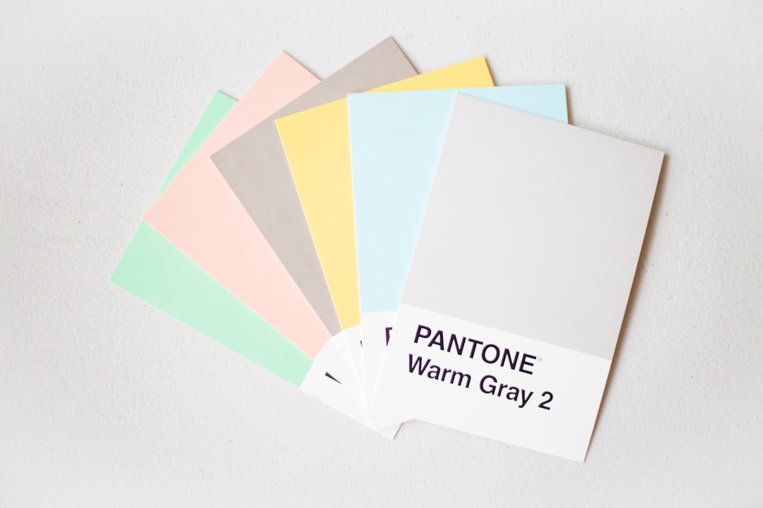
Warm, cool, and neutral schemes
Alongside the wheel-based harmonies, designers also group schemes by temperature. A warm scheme draws from reds, oranges, and yellows and feels energetic, cozy, and inviting, which is why food and lifestyle brands lean on it. A cool scheme draws from blues, greens, and purples and reads calm, professional, and trustworthy — common in tech, finance, and healthcare. A neutral scheme leans on grays, beiges, blacks, and whites for an understated, sophisticated, timeless feel. These temperature groupings overlap with the harmonies above: you can build a warm analogous palette or a cool monochromatic one. Temperature sets the emotional tone, while the harmony sets the structure.
How to choose a color scheme
Start with mood and contrast needs. Want calm and unified? Go monochromatic or analogous. Want punch and attention? Use complementary or triadic with one dominant color and restrained accents. For all multi-hue schemes, the same rule applies: pick a single dominant color (roughly 60% of the design), a secondary (about 30%), and one or two accents (about 10%), rather than giving every hue equal weight. That hierarchy is what separates a polished palette from a noisy one. It also pays to test your scheme for accessibility — check that text and background colors meet contrast standards so the palette works for every reader, not just on a designer’s calibrated screen.
Frequently Asked Questions
What are the main types of color schemes?
The main types are monochromatic, analogous, complementary, split-complementary, triadic, tetradic (double-complementary), and square. Each is a color harmony based on the positions of colors on the color wheel — a single hue, neighboring hues, opposite hues, or evenly spaced sets — and each strikes a different balance between harmony and contrast.
What is the difference between analogous and complementary schemes?
Analogous schemes use colors that sit next to each other on the wheel, sharing an undertone for a harmonious, low-contrast feel. Complementary schemes use two opposite colors for maximum contrast and vibrancy. Analogous is calm and unified; complementary is bold and attention-grabbing. Choose analogous for serenity and complementary for emphasis.
Which color scheme is best for beginners?
Monochromatic and analogous schemes are the most forgiving for beginners because the colors naturally harmonize and are hard to get wrong. If you want more contrast without too much risk, split-complementary is a good next step — it delivers visual punch while softening the tension of a straight complementary pair.
What is a triadic color scheme?
A triadic color scheme uses three colors evenly spaced around the color wheel, forming a triangle — for example red, yellow, and blue. It is vibrant and balanced, offering strong contrast while staying harmonious. For best results, let one color dominate and use the other two as accents rather than weighting all three equally.
How many colors should a color scheme have?
Most effective schemes use two to four hues, then expand through tints and shades of those hues. A common guideline is the 60-30-10 rule: one dominant color at about 60%, a secondary at 30%, and an accent at 10%. Limiting your core hues keeps designs cohesive and prevents a cluttered, competing palette.