What Font Does Chanel Use?
The Chanel font question has a clean answer: the wordmark is a custom geometric sans built in the Futura family, and the famous double-C is a separate bespoke mark. This article explains what the lettering is closest to, what Chanel uses across its branding, and which free fonts get you the elegant, minimal look.
Chanel is a textbook example of luxury minimalism — a brand that says everything with a plain, perfectly proportioned geometric sans. For how this compares with other major logos, see our pillar on famous brand fonts and what the big logos use.
What font is the Chanel logo?
The Chanel wordmark is a custom geometric typeface rooted in the Futura tradition — clean capitals built from near-perfect circles and straight lines. In the design community it’s frequently likened to a typeface called Couture, which captures the same high, elegant proportions and pointed apex on the “A.” The interlocking double-C monogram is a separate bespoke device, not type. So while people say “the Chanel font is Couture” or “the Chanel font is Futura,” the precise answer is custom geometric lettering in that family.
A font-identifier tool will point you toward Futura, Couture, or similar geometric sans faces, but it won’t give you the exact wordmark — the letters were tuned specifically for the brand.
What fonts does Chanel use in its branding?
Across its identity, Chanel stays remarkably consistent: clean, geometric, all-caps sans type with wide letter-spacing for the wordmark and headlines, often paired with a refined serif for editorial body copy in campaigns and print. The geometric capitals carry the brand’s voice; the restraint is the signature. As with most luxury houses, the exact brand faces used in print and digital are controlled internally rather than released publicly.
You can read more about the typeface the wordmark descends from in our guide to Futura, and before using any commercial typeface in your own work, check our font licensing guide.
Can you download the Chanel font?
No. The wordmark is custom and the brand’s exact faces are proprietary, so there’s nothing official to download. Fan-made imitations and lookalikes (including fonts marketed as “Couture”) exist, but reproducing the Chanel wordmark or interlocking-C monogram is a trademark issue regardless of which font you use. For commercial work, use a licensable or free geometric sans rather than a logo clone.
What’s a free Chanel font alternative?
The Chanel look is defined by clean, geometric, evenly weighted capitals with elegant proportions. The best free options are:
- Jost (free) — an open-source Futura-style geometric sans on Google Fonts; the closest free match to the wordmark’s circles-and-lines geometry, and free for commercial use.
- Century Gothic (often bundled with systems) — a geometric sans with the same wide, circular character; its free clone is also called Questrial on Google Fonts.
- Cormorant Garamond (free) — a high-contrast serif for the editorial body text Chanel pairs with its geometric capitals.
Pair any of these using the font pairing guide, and for a sibling luxury comparison see what font Gucci uses.
Chanel fonts vs. the free alternatives
| Use case | Font | Style | Free alternative |
|---|---|---|---|
| Logo wordmark | Custom typeface (Couture / Futura-like) | Geometric sans | Jost |
| Headlines | Geometric all-caps sans | Wide-tracked capitals | Questrial / Century Gothic |
| Editorial body | High-contrast serif | Elegant serif | Cormorant Garamond |
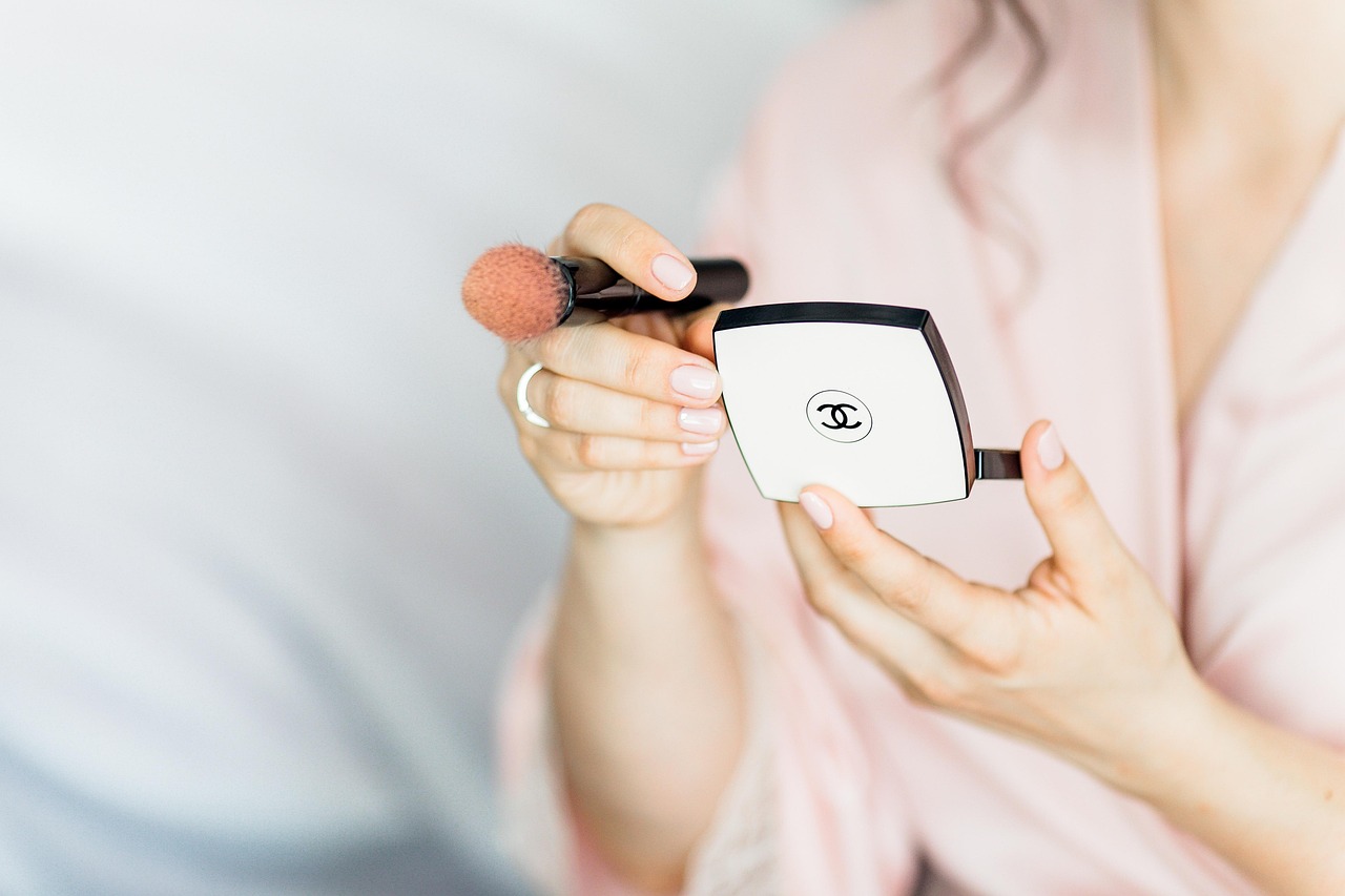
| Monogram | Interlocking double-C | Bespoke mark, not a font | Not applicable |
What makes the Chanel wordmark distinctive?
The wordmark’s personality comes from pure geometry and space. The capitals are built from near-perfect circles and straight strokes, with the pointed apex on the “A” and the wide, open “C” reading as crisp and architectural. Generous letter-spacing makes the five letters feel calm and deliberate rather than crowded. There’s no ornament at all — and that absolute restraint is precisely what signals timeless luxury. The type doesn’t try to be fashionable; it tries to be permanent.
That tuned minimalism is why font-identifier tools point toward Futura, Couture, and Jost but never the exact wordmark. For real projects this is fine: the geometric, even, wide-spaced qualities are all reproducible with a free font, and the wordmark and double-C are trademarks you shouldn’t copy anyway.
How to get the Chanel look on a budget
To capture Chanel’s elegant, minimal type feel without proprietary fonts, follow this approach:
- Start with Jost. As an open-source Futura alternative, it gives you the wordmark’s circles-and-lines geometry for free; set it in all caps.
- Add wide letter-spacing. Generous tracking on capitals is the single biggest cue for luxury minimalism.
- Stick to black and white. Chanel’s monochrome palette and negative space do as much work as the type.
- Pair with a refined serif like Cormorant Garamond for body copy — see our font pairing guide.
This gets you a timeless, high-end look that’s entirely original and safe to use commercially.
Why does Chanel use a Futura-style font?
A clean geometric sans reads as modern, confident, and timeless — and its total lack of ornament is exactly what signals luxury. By building the wordmark in the Futura tradition and pairing it with restraint and a black-and-white palette, Chanel keeps an identity that has barely changed in decades. It’s the same minimalist logic behind Gucci’s geometric wordmark: in luxury, less type does more.
Frequently Asked Questions
What font does the Chanel logo use?
The Chanel logo uses a custom geometric typeface in the Futura tradition, often likened to a face called Couture, and the interlocking double-C is bespoke. Neither is a public font. For a free match, use a Futura-style geometric sans like Jost or Century Gothic with wide letter-spacing.
Is the Chanel font Futura?
Close, but not exactly. The Chanel wordmark is custom geometric lettering built in the Futura family — clean circles and straight lines — which is why people compare it to Futura and to a font called Couture. The actual logo letters were tuned for the brand. A free Futura alternative like Jost is the easiest legal match.
Is the Chanel font free?
No. The wordmark is bespoke and the brand’s exact faces are proprietary, so there’s no official free Chanel font. For a similar look, use Jost, Questrial, or Century Gothic, with Cormorant Garamond for serif body copy. These are free for commercial use, unlike logo-clone fonts.
What font is closest to the Chanel logo?
Jost is the closest free match because it’s an open-source Futura-style geometric sans that mirrors the wordmark’s circles-and-lines geometry. Questrial and Century Gothic also work for the wide, circular capitals. All are free for commercial use, though you should never recreate the Chanel wordmark or double-C monogram.
Can I use the Chanel font for my business?
No. The wordmark is custom and the double-C is a trademark, and imitating either can be infringement. For a similar elegant, geometric look on your own original branding, use a free Futura alternative like Jost with wide tracking and design a distinct mark. Review our font licensing guide first.


