Colors That Go With Gold
Gold is less a color than a finish — a warm metallic that signals luxury, celebration, and quality, and it shines brightest against deep, saturated partners. The best colors that go with gold range from dramatic black and navy to jewel-tone emerald and soft blush. Below you’ll find exact hex codes, ready-to-use palettes, and guidance for using gold in branding versus interiors.
What colors go with gold?
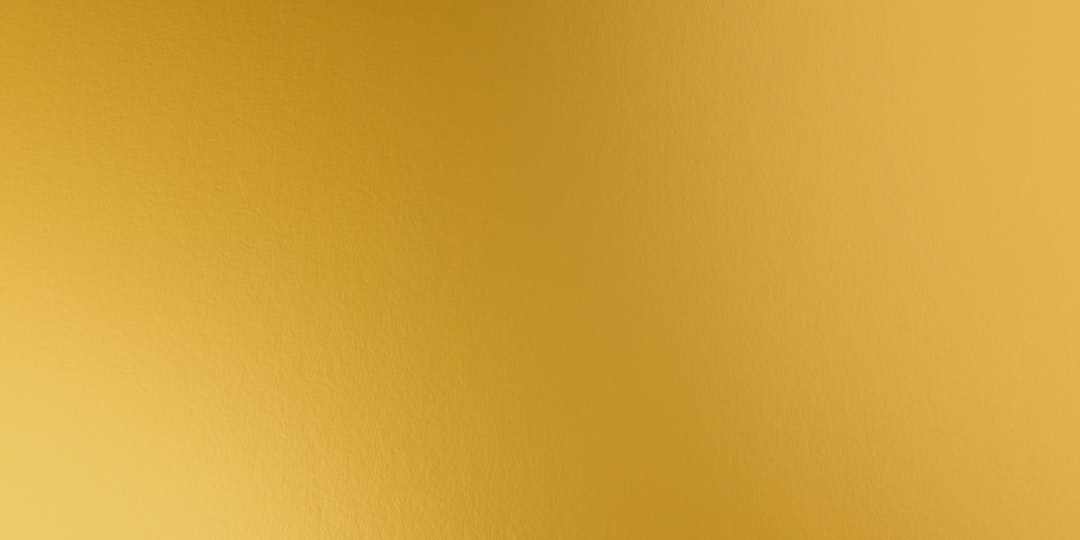
Gold (around #C9A227 as a flat color, or rendered with metallic gradients in print) is a warm, mid-to-deep yellow with brown undertones. It reads premium against dark and rich colors and clean against bright neutrals. Here are the strongest matches:
- Navy (#1B2A4A) — gold’s classic luxury partner. Deep navy makes gold glow and reads editorial and premium.
- Black (#1A1A1A) — maximum drama. Gold on black is the highest-impact luxury pairing in design.
- White (#FFFFFF) — keeps gold clean and modern, lightening it into something fresh and minimal.
- Emerald green (#1F6F54) — a jewel-tone partner that turns gold opulent and rich, the classic emerald-and-gold pairing.
- Blush pink (#F4C9C2) — a soft warm tint that makes gold romantic and contemporary.
- Burgundy (#6E1E2E) — a deep wine red that gives gold warmth and a festive, heritage richness.
- Charcoal (#2E3440) — a softer dark than black, letting gold glow with a little more subtlety.
Best color combinations for gold
Why these work comes down to basic color theory. Gold is a warm metallic in the yellow family, so deep cool partners (navy, charcoal, emerald) create satisfying warm-vs-cool contrast, while black and white control its intensity. Because gold sits near yellow on the wheel, purple and deep blue-greens land near its complement, which is why emerald and navy feel so luxurious against it — see our guide to complementary colors. For more on gold’s symbolism, see our guide to gold color meaning.
Gold + navy + white (premium classic)
The default “luxury and trustworthy” combination. Navy carries depth, white opens space, and gold accents add shine — ideal for finance, weddings, and packaging.
Gold + black + white (high drama)
The boldest option. Black makes gold maximally luxurious, and white keeps the scheme from feeling heavy — a staple of fashion and beauty branding.
Gold + emerald + blush (jewel romance)
The richest, most decorative option. Emerald and gold read opulent, and a touch of blush softens the whole scheme for events and editorial.
Gold palettes with hex codes
| Pairing color | Hex | Why it works / mood |
|---|---|---|
| Navy | #1B2A4A | Classic luxury; gold glows and reads premium |
| Black | #1A1A1A | Max drama; high-impact luxury |
| White | #FFFFFF | Clean space; fresh and minimal |
| Emerald green | #1F6F54 | Jewel tone; opulent and rich |
| Blush pink | #F4C9C2 | Soft, romantic, contemporary warmth |
| Burgundy | #6E1E2E | Festive depth; heritage and warm |
| Charcoal | #2E3440 | Soft dark; subtle, refined glow |
Three ready palettes to copy:
- Premium classic: Gold #C9A227 · Navy #1B2A4A · White #FFFFFF · Charcoal #2E3440
- High drama: Gold #C9A227 · Black #1A1A1A · White #FFFFFF · Charcoal #2E3440
- Jewel romance: Gold #C9A227 · Emerald #1F6F54 · Blush #F4C9C2 · Cream #F5EFE6
How to build a balanced gold palette
Start by deciding how gold will render. As a flat brand color, gold reads as a deep mustard-yellow (#C9A227); as a metallic foil or gradient in print, it catches light and reads far richer. That difference matters: a metallic gold can carry a palette as the star, while a flat gold usually works better as a 10% accent against deeper colors so it doesn’t look like plain yellow.
A reliable rule: deep, saturated partners (navy, black, emerald, burgundy) make gold look luxurious, while bright neutrals (white, cream) keep it clean and modern. Use the darker color as the base, a neutral for space, and gold as the final accent — the classic 60-30-10 split. Gold is at its most effective when it’s the smallest portion of the palette; a little goes a long way, and over-using it tips a design from premium to gaudy.
Be careful pairing gold with other warm metallics or with plain yellow, where it can lose its identity. If you’re unsure whether you want a true metallic or a flat warm yellow, our comparisons of gold vs yellow and champagne vs gold clarify the difference before you build a palette around it.
Colors to avoid with gold
Gold is luxurious but a few combinations cheapen it:
- Bright primary yellow — placed next to gold, it flattens the metallic and makes gold read as muddy yellow rather than premium.
- Silver in equal amounts — mixing gold and silver at the same weight can look indecisive; let one metallic dominate.
- Pale washed-out pastels — without a deep anchor, gold against only light pastels loses its richness and looks dull.
Gold in branding vs interiors
In branding, gold signals luxury, achievement, and celebration, which is why premium, beauty, and finance brands reach for it. Pair it with navy or black and use it sparingly as a metallic accent in logos, foils, and type. If you’re building a system from scratch, our guide on how to choose brand colors walks through anchoring on a deep base and using gold as the spark.
In interiors, gold appears as brass and brushed-metal hardware, lighting, and accents rather than full surfaces. Pair it with navy, emerald, charcoal, and warm woods for a rich, layered room, or with white and blush for something softer. For a flexible base, see our neutral color palette guide. To build a warm, earthy scheme, our piece on colors that go with tan shows how gold and tan layer into a luxurious, sandy palette.
Frequently Asked Questions
What is the best color to pair with gold?
Navy (#1B2A4A) and black are the best colors to pair with gold because their depth makes the warm metallic glow and read genuinely luxurious. White is the strongest light alternative, keeping gold clean and modern. For a richer, jewel-tone effect, emerald green and burgundy are excellent deep partners.
Does gold go with navy blue?
Yes. Gold and navy are a classic, premium pairing used widely in luxury packaging, weddings, and finance branding. The warm metallic glows against deep navy, creating an editorial, high-end look. Use gold sparingly as an accent — in type, foils, or hardware — rather than as a large field of color.
What is the difference between gold and yellow?
Gold is a warm metallic finish that catches light, while yellow is a flat, bright primary color. As a flat hex value, gold reads as a deep mustard (#C9A227), but its defining quality is the metallic sheen of foils and gradients. Yellow is purely a hue; gold implies texture and luxury. See our gold vs yellow guide for details.
What two colors go well with gold?
Navy and white are the two strongest companions for gold: navy supplies the depth that makes gold glow, while white keeps the scheme clean and modern. For maximum drama, swap navy for black. This base of gold plus one deep color and one light neutral works across branding, web, and interiors.


