Gold Color Meaning and Symbolism
The gold color meaning is one of the most consistent in the world: across cultures and millennia, gold has signified wealth, power, and the divine. Unlike most colors, gold carries the weight of the physical metal, an object of value, craftsmanship, and aspiration. That material association is why a touch of gold instantly elevates a design from ordinary to premium. Below we cover what gold symbolizes, how luxury brands use it, how its meaning travels across cultures, and how to apply it well.
What does gold symbolize?
Gold is the color of wealth, luxury, and success. It is the medal awarded to the winner, the trim on a luxury watch, and the leaf on sacred art, all of which reinforce its link to value and achievement. Gold also carries strong associations with divinity, illumination, and the sacred, having been used for centuries in religious icons, halos, and temples to represent the eternal and the heavenly. In design, gold signals prestige, generosity, and celebration. For the broader framework behind these meanings, see our guide to color psychology in design.
Positive and negative associations of gold
Gold is overwhelmingly positive, but it can tip into excess.
- Positive: wealth, luxury, success, prestige, achievement, generosity, warmth, divinity, celebration
- Negative: greed, materialism, excess, gaudiness, pretension when overused
A restrained gold accent reads as refined and valuable; gold layered everywhere can read as ostentatious or cheap. Discipline is what keeps gold elegant.
Gold in branding
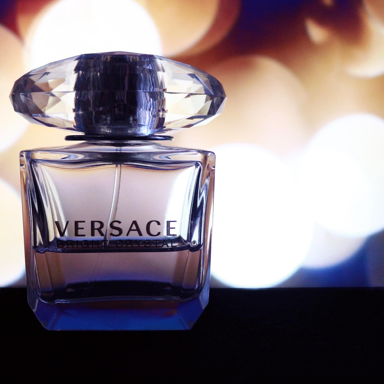
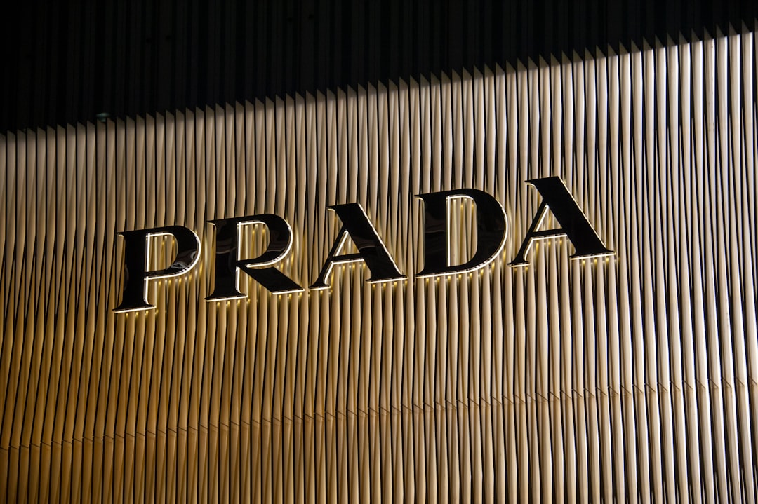
Gold is the signature of brands that sell prestige. Rolex uses its gold crown and metallic accents to embody status, craftsmanship, and timeless luxury. Premium spirits, jewelry, and beauty houses such as Versace and high-end cosmetics lines rely on gold to telegraph exclusivity at a glance. Even mainstream brands deploy gold for special “premium” or anniversary editions because it instantly raises perceived value.
Gold works in branding because it borrows the metal’s credibility. It says this product is worth more, made with more care, and meant to last. Pairing gold with black or deep jewel tones intensifies the luxury read. When you are placing a metallic accent in a wider palette, our walkthrough on how to choose brand colors covers how to keep it from overwhelming.
The execution of gold matters as much as the decision to use it. In physical products and packaging, true gold effects come from foil stamping, metallic inks, or gilded edges, finishes that catch the light and signal craftsmanship. The cost of those processes is itself part of the message: gold that is expensive to produce reads as genuinely premium, whereas a flat printed “gold” that is really just mustard ink can undercut the whole effect. The most disciplined luxury brands use gold sparingly and pair it with restraint, knowing that scarcity is what keeps it feeling precious.
Gold across cultures
Gold’s meaning is unusually stable worldwide, but the nuances differ. In Western cultures, gold signals wealth, success, and high achievement, from gold medals to gold credit cards. In India, gold is deeply tied to prosperity, marriage, and auspiciousness, and is central to weddings and the festival of Diwali. In China, gold (along with red) represents wealth, good fortune, and happiness, and features heavily in celebrations. In many religious traditions worldwide, gold denotes the sacred, divine, and eternal.
Because gold’s link to value is rooted in the metal itself, it is one of the few colors whose core meaning, prosperity and prestige, holds fairly steady across cultures. Still, the specific occasions and intensity of its use vary, so context remains a matter of cultural convention.
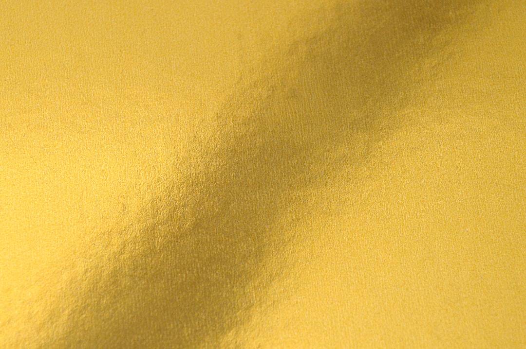
Shades of gold and their meanings
Gold ranges from warm and antique to bright and modern, and the tone sets the mood.
| Shade | Swatch | Hex | Meaning / use |
|---|---|---|---|
| Metallic gold | #D4AF37 | Classic luxury, prestige, the standard “gold” | |
| Antique gold | #B8860B | Warm, vintage, heritage and craftsmanship | |
| Champagne gold | #E6CFA7 | Soft, elegant, understated luxury and weddings | |
| Rose gold | #B76E79 | Modern, warm, romantic; tech and beauty | |
| Bright gold | #FFD700 | Bold, celebratory, high energy; can read brash |
Gold and yellow are easily confused on screen, where gold has to be implied through tone since true metallic sheen requires foil or gradients. Our comparison of gold vs yellow explains the difference, and champagne vs gold covers the softer luxury tones.
Using gold in design
Gold is a high-impact accent that rewards restraint. A few principles:
- Use gold as an accent, not a flood. A thin gold line or logo mark reads as luxury; full gold backgrounds read as gaudy.
- Pair gold with deep neutrals. Black, navy, and emerald make gold look richest.
- Simulate metallic on screen. Gradients from #B8860B to #FFE9A0 imply sheen where flat color can’t.
- Match the tone to the era. Champagne gold feels contemporary; antique gold feels heritage.
- Remember gold is warm. It harmonizes with warm palettes, as covered in our guide to warm vs cool colors.
Context also shapes which kind of luxury gold conveys. Bright, high-saturation gold leans festive and celebratory, ideal for awards, holidays, and special editions. Muted champagne and antique golds lean toward quiet, enduring prestige, the kind of luxury that does not need to announce itself. Choosing between them is really a choice between “look at this moment” and “trust this for years,” and the best designs match the gold’s energy to the message the brand actually wants to send.
As a dominant treatment, gold signals celebration and opulence. As a precise accent, it elevates a brand to premium. The trick is always to let it feel earned rather than excessive.
Frequently Asked Questions
What does the color gold symbolize?
Gold symbolizes wealth, luxury, success, prestige, and divinity. Tied to the precious metal, it represents value and achievement, from gold medals to luxury packaging. It also carries sacred connotations, having long been used in religious art to depict the divine and eternal.
Is gold a positive or negative color?
Gold is overwhelmingly positive, conveying wealth, success, and elegance. Its main negative associations are greed, materialism, and gaudiness, which surface only when gold is overused. A restrained gold accent reads as refined, while gold everywhere can feel ostentatious.
What does gold mean in different cultures?
Gold means wealth and achievement in the West, prosperity and auspiciousness in India where it is central to weddings, and good fortune in China where it pairs with red in celebrations. Because its meaning derives from the metal, prosperity is a fairly universal theme.
Why do luxury brands use gold?
Luxury brands like Rolex and Versace use gold because it borrows the credibility of the precious metal, instantly signaling value, craftsmanship, and exclusivity. A touch of gold raises perceived quality, which is why even mainstream brands use it for premium and anniversary editions.
How do you make gold look real in digital design?
Since flat color can’t reflect light, designers imply gold using gradients, for example blending a darker #B8860B into a lighter #FFE9A0 highlight, plus subtle shadows. Pairing the gold with dark backgrounds like black or navy further enhances the metallic, luminous impression on screen.