What Font Does Dior Use?
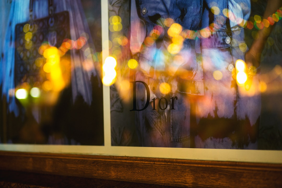
The Dior font is one of the most elegant in fashion, and unlike most luxury logos it has a clear historical reference point: the house’s wordmark is widely understood to be based on the Nicolas Cochin typeface. The exact logo is custom-adapted artwork, not a font you can license. Below we break down the wordmark, the “Christian Dior” lettering, and the free fonts that get closest. For more luxury breakdowns, see our hub on famous brand fonts.
What font is the Dior logo?
The “Dior” wordmark is custom lettering based on Nicolas Cochin — a design from the early 20th century inspired by the engraved type of 18th-century French copperplate. Cochin is known for its tall, narrow capitals, fine hairlines, and small, elegant serifs, which give the Dior logo its unmistakable refinement and old-world Parisian luxury. The house has refined the spacing and proportions into its own trademarked mark, so while the lineage is Cochin, the logo itself is bespoke. This is the most-cited piece of fashion typography lore — and in Dior’s case the Cochin attribution is well established rather than speculative.
What about the “Christian Dior” lettering?
The fuller “Christian Dior” signature and the “Christian Dior Paris” lockups use refined, high-contrast serif lettering in the same family of feeling — tall, elegant capitals with delicate stroke contrast. Across campaigns, packaging, and store signage, Dior keeps to this restrained, high-contrast serif vocabulary, sometimes pairing it with clean sans-serifs for body and product copy. The consistent thread is engraved-style elegance: thin hairlines, generous letter-spacing, and a sense of couture restraint.
Why does Dior use a high-contrast engraved serif?
High-contrast serifs with fine hairlines read as luxurious because they recall engraving, calligraphy, and the printed elegance of 18th- and 19th-century France — exactly the heritage a couture house wants to evoke. The thin strokes signal precision and craft; the tall capitals signal formality and prestige. This is why so many luxury fashion houses converge on Didone and engraved styles. To see the broader category, our deep dive on the Didot font covers the high-contrast Didone family that defines luxury typography, and our font licensing guide explains why brands adapt rather than reuse these faces directly.
Free fonts that look like the Dior font
You cannot use Dior’s custom wordmark, and the original Nicolas Cochin is a licensed commercial typeface — not free. But several free high-contrast serifs capture the same elegant, engraved feel. Match the role: tall, refined capitals for a wordmark look, a readable Didone for body.
| Use case | Dior uses | Free alternative |
|---|---|---|
| Logo / wordmark look | Custom lettering based on Nicolas Cochin | Playfair Display (high-contrast caps) |
| Elegant headlines | High-contrast serif | Cormorant |
| Refined body serif | Brand serif system | EB Garamond |
| Engraved / couture accent | Cochin-style lettering | Cormorant Garamond |
Playfair Display is the most accessible free match — a high-contrast Didone with the tall, elegant capitals that echo the Dior wordmark. Cormorant and Cormorant Garamond offer even more delicate, fashion-forward hairlines for headlines and couture accents, while EB Garamond handles refined body text. All are free on Google Fonts and licensed for commercial use. If you want the genuine engraved character, the original Nicolas Cochin is available as a paid license from type vendors — flag it as historical and proprietary, not free.
How to recreate the Dior look
Dior’s elegance comes from a few precise typographic decisions you can replicate with free fonts. First, set your wordmark in capitals using a high-contrast serif like Playfair Display and add generous letter-spacing — the airy tracking is central to the couture, engraved feel and instantly separates a luxury wordmark from an ordinary one. Second, keep the weight light to medium rather than bold; Dior’s refinement depends on delicate hairlines, and a heavy weight would lose the engraved character entirely.
Below the logo, pair that high-contrast serif with restraint everywhere else. Use a clean, quiet sans or a calm body serif like EB Garamond for product copy so the elegant display type stays the star. Lean on white space, thin rules, and a monochrome or muted palette — luxury type reads as luxurious partly because of what surrounds it. If you want the genuine engraved character that the Dior wordmark descends from, the historical Nicolas Cochin face can be licensed for a fee from type vendors; treat it as a paid, proprietary option rather than something to pull from a free-font site.
Can I use the Dior font for my own project?
No — not the logo. Dior’s wordmark is bespoke, trademarked artwork, and the name itself is protected; reusing the lettering risks both licensing and trademark issues. The underlying Nicolas Cochin typeface can be licensed for a fee, but it is not free, and using it to imitate Dior’s identity still raises trademark concerns. For your own brand, pick a free high-contrast serif above. For more luxury type, see our siblings on what font Prada uses and what font Versace uses.
Frequently Asked Questions
What font does Dior use in its logo?
The Dior logo uses custom lettering based on Nicolas Cochin, an elegant early-20th-century typeface with tall capitals, fine hairlines, and small serifs. The house has refined it into its own trademarked wordmark, so the exact logo is bespoke rather than a downloadable font.
What is the Nicolas Cochin typeface?
Nicolas Cochin is a high-contrast serif inspired by 18th-century French copperplate engraving, known for narrow capitals and delicate hairlines. It is the recognized basis for the Dior wordmark. It is a paid, licensed font — not free — and reflects Dior’s old-world Parisian elegance.
What free font looks like Dior?
Playfair Display is the closest free match — a high-contrast Didone with tall, elegant capitals. Cormorant and Cormorant Garamond offer more delicate, fashion-forward hairlines, and EB Garamond suits refined body text. All are free on Google Fonts for commercial use.
Can I download the Dior font?
No. The Dior wordmark is proprietary, trademarked lettering and is not available to download. The underlying Nicolas Cochin face can be licensed for a fee but is not free. Any “Dior font” on a free-font site is an unofficial imitation.
Why do luxury fashion brands use high-contrast serifs?
High-contrast serifs with fine hairlines evoke engraving, calligraphy, and historical European printing, which read as prestige and craftsmanship. Tall capitals add formality. That is why Dior and many other couture houses favor engraved-style and Didone serifs for their wordmarks and campaigns.