What Font Does Versace Use?
The Versace font pairs a refined, high-contrast serif wordmark with the brand’s unmistakable Medusa head — a combination that has defined the house’s bold, classical glamour since the 1970s. As with most luxury logos, the lettering is custom artwork, most often associated with Bodoni, rather than a downloadable “Versace font.” Below we break down the wordmark, the Medusa mark, and the free alternatives. For more luxury breakdowns, see our hub on famous brand fonts.
What font is the Versace logo?
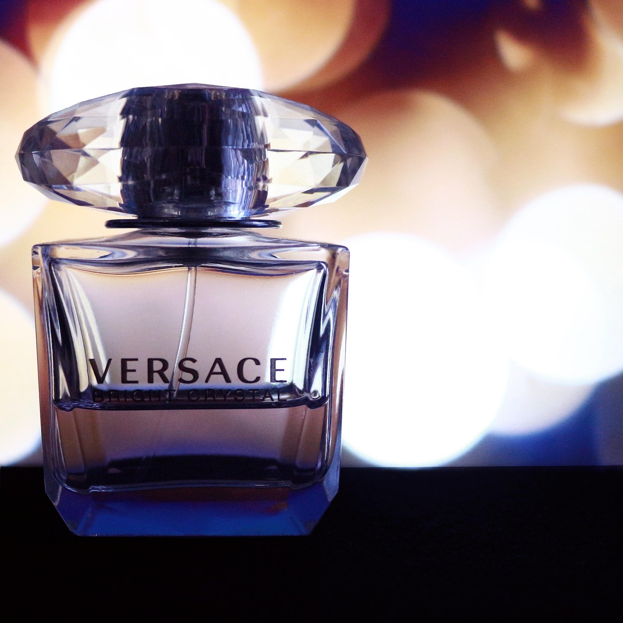
The “VERSACE” wordmark is an elegant custom high-contrast serif, set in widely spaced capitals with the dramatic thick-thin contrast and fine serifs of the Didone style. It is most often likened to Bodoni, which fits the brand’s Italian, classically inspired identity. The generous letter-spacing and crisp verticals give the logo its formal, statuesque presence — a typographic nod to Greco-Roman classicism that runs throughout Versace’s design language. As with other luxury marks, the logo is refined bespoke artwork and a registered trademark, so it is best described as “Bodoni-style” rather than a single licensable font.
What is the Medusa head in the Versace logo?
Above or alongside the wordmark sits the Medusa head, Versace’s emblem since the brand’s founding by Gianni Versace in 1978. Medusa was chosen for her power to make people fall in love beyond return — a fitting symbol for a house built on bold, seductive glamour — and the figure reinforces the Greco-Roman classical theme that the high-contrast serif type echoes. The Medusa is an illustrated mark, fully proprietary and trademarked; it cannot be reused any more than the lettering can.
Why does Versace use a Didone serif?
High-contrast Didone serifs like Bodoni read as elegant, classical, and prestigious — exactly the register a heritage Italian luxury house wants. The vertical stress and sharp contrast recall the refined printing of late-18th-century Europe, and the spaced capitals add formality and grandeur that suit Versace’s opulent, statement-making identity. This is why so many luxury brands converge on the Didone family. Our deep dive on the Bodoni font covers the typeface behind the Versace look, and the broader font licensing guide explains why brands adapt these faces rather than reuse them directly.
Free fonts that look like the Versace font
You cannot use Versace’s custom wordmark or the Medusa mark, and authentic Bodoni cuts are typically paid. But free Didone serifs capture the same elegant, high-contrast feel. Match the role: tall, spaced capitals for a wordmark look, a readable Didone for body.
| Use case | Versace uses | Free / paid alternative |
|---|---|---|
| Logo / wordmark look | Custom Bodoni-style serif (spaced caps) | Playfair Display (free) |
| Closest exact match | Bodoni-style high-contrast serif | Bodoni (paid license) |
| Elegant headlines | High-contrast Didone | Cormorant (free) |
| Refined body serif | Brand serif system | EB Garamond (free) |
Playfair Display is the best free match — a high-contrast Didone whose elegant capitals, set with wide tracking, closely echo the Versace wordmark. Cormorant offers more delicate, fashion-forward hairlines for headlines, and EB Garamond handles refined body text; all are free on Google Fonts for commercial use. For the closest possible likeness, a licensed Bodoni cut is the right choice — flag it as paid and not free.
How to recreate the Versace look
Versace’s identity is louder and more classical than most luxury houses, and its typography reflects that. To echo it, set your wordmark in capitals using a high-contrast serif like Playfair Display, then push the letter-spacing wide — Versace’s generous tracking gives the name a statuesque, monumental presence that reads as grandeur rather than just elegance. Keep the strokes crisp and the contrast high; the Greco-Roman, almost architectural feel depends on those clean verticals and fine serifs.
The other half of the Versace look is the symmetry and the symbolism. The wordmark is typically centered beneath a strong central emblem, and that balanced, heraldic layout is as much a part of the identity as the type itself. For your own brand you would design your own mark rather than borrow the Medusa, but the principle holds: a high-contrast serif in spaced capitals, centered under a bold symbol, against an opulent palette of gold, black, and white. For the closest typographic match to the wordmark, a licensed Bodoni cut is ideal — flag it as paid, not free — while Playfair Display or Cormorant deliver the same Didone drama at no cost.
Can I use the Versace font for my own project?
No — not the logo or the Medusa. Both are bespoke, trademarked assets, and the brand name is protected; reusing them outside official materials risks both licensing and trademark issues. You can legitimately license Bodoni for your own work, but using it to imitate Versace’s identity still raises trademark concerns. For your own brand, choose a free Didone above or pay for Bodoni. For more luxury type, see our siblings on what font Dior uses and what font Prada uses.
Frequently Asked Questions
What font does Versace use in its logo?
Versace uses an elegant custom high-contrast serif, often likened to Bodoni and the Didone family, set in widely spaced capitals beneath the Medusa head. The exact wordmark is bespoke, trademarked artwork rather than a single downloadable font.
Is the Versace logo Bodoni?
It is strongly associated with Bodoni and shares its vertical stress, high contrast, and fine serifs. However, the logo is a customized, Bodoni-inspired mark rather than plain Bodoni off the shelf. Licensing a quality Bodoni cut is the closest legitimate match you can buy.
What free font looks like Versace?
Playfair Display is the closest free match — a high-contrast Didone with elegant capitals that suit wide tracking. Cormorant offers more delicate hairlines for headlines, and EB Garamond suits body text. All are free on Google Fonts for commercial use; for an exact match, license Bodoni (paid).
Can I download the Versace font?
No. The Versace wordmark and Medusa emblem are proprietary, trademarked assets and are not available to download. Bodoni, which the lettering resembles, can be licensed for a fee but is not free. Any “Versace font” on a free-font site is an unofficial imitation.
What does the Medusa head mean in the Versace logo?
The Medusa head has been Versace’s emblem since Gianni Versace founded the house in 1978. It symbolizes a fatal, irresistible attraction and reinforces the brand’s Greco-Roman classical theme, which the high-contrast serif lettering echoes. The Medusa is a proprietary, trademarked illustrated mark.