Spring Color Palette: Hex Codes and Ideas
A spring color palette translates new-season growth into design-ready color: the soft pink of blossom, mint and fresh green of new leaves, lavender of early flowers, and butter yellow of spring light. Below are real hex codes, five copy-and-paste palettes, and a reference table so you can build that gentle, fresh feel into a brand or layout.
Spring palettes are defined by light, low-saturation pastels. Where summer pushes bright and bold, spring stays airy and tints toward white, giving schemes a delicate, hopeful character.
What colors are in a spring color palette?
The spring family is built from pastels — high-value, low-to-medium saturation tints across the wheel. The anchors are soft pink , mint , lavender , butter yellow and sky blue , lifted by fresh green .
Spring spans both warm and cool hues, but the tints are so light that they harmonize easily. See color psychology for why pastels read as calm, youthful, and approachable, and browse shades of green for more of that fresh-growth range.
Core spring colors (with hex codes)
| Color name | Hex | RGB | Role |
|---|---|---|---|
| Soft pink | #F4ACB7 | 244, 172, 183 | Primary |
| Mint | #B5EAD7 | 181, 234, 215 | Primary |
| Lavender | #CDB4DB | 205, 180, 219 | Accent |
| Butter yellow | #FDFFB6 | 253, 255, 182 | Accent |
| Sky blue | #A0E7E5 | 160, 231, 229 | Neutral |
| Fresh green | #9BDE7E | 155, 222, 126 | Accent |
5 spring color palettes (with hex codes)
Blossom
Soft pink #F4ACB7, light pink #FBC4D4, mint #B5EAD7, butter yellow #FDFFB6 and white. The cherry-blossom default — sweet and gentle for beauty, stationery, and weddings.
Meadow
Fresh green #9BDE7E, mint #B5EAD7, butter yellow #FDFFB6, soft pink #F4ACB7 and white. Greenest and most outdoorsy — great for garden, organic, and family brands.
Lavender Fields
Lavender #CDB4DB, lilac #D8C7DE, sky blue #A0E7E5, soft pink #F4ACB7 and white. Cooler and dreamier — ideal for wellness, spa, and lifestyle brands.
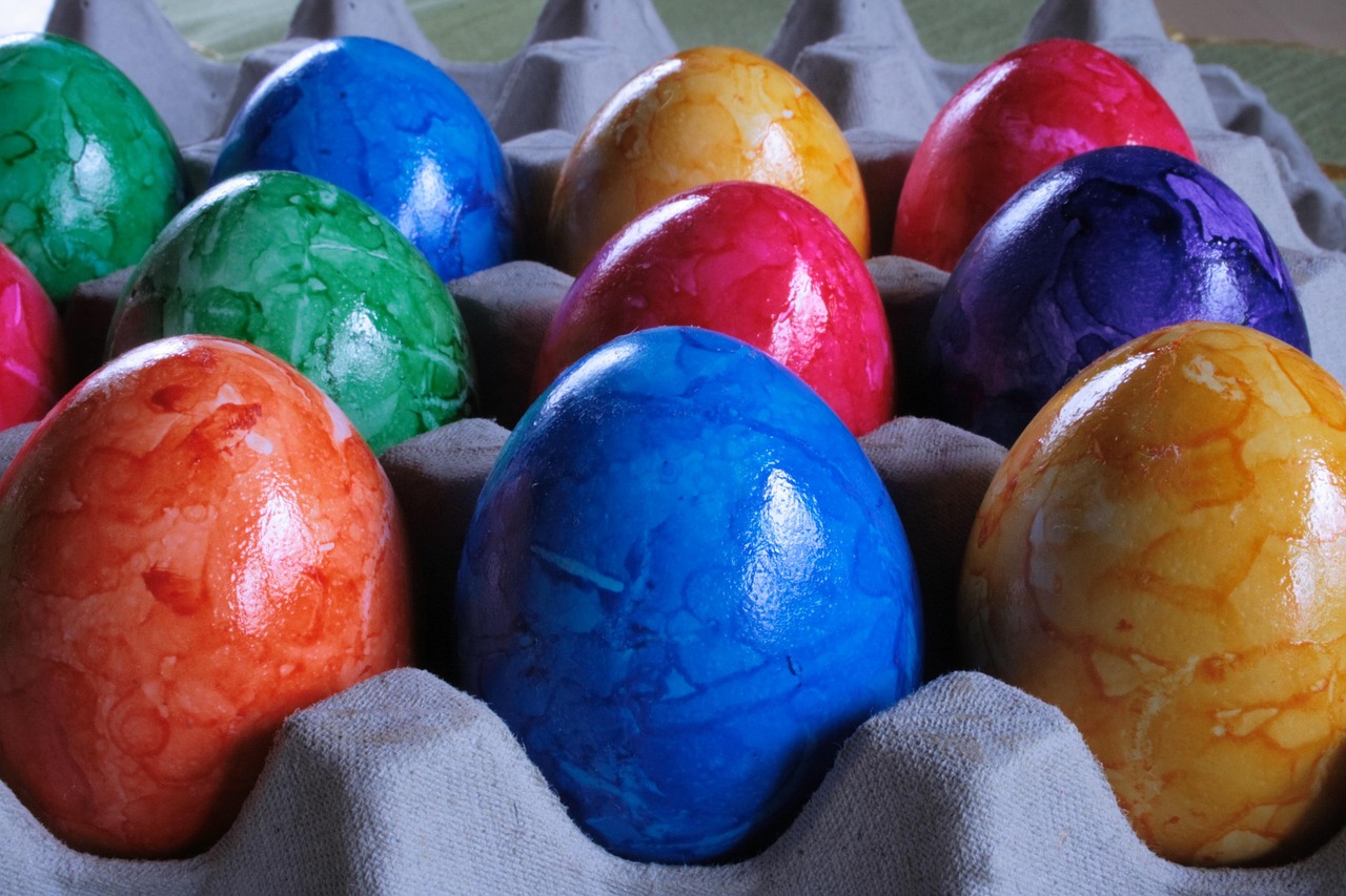
Easter
Butter yellow #FDFFB6, soft pink #F4ACB7, sky blue #A0E7E5, lavender #CDB4DB and mint #B5EAD7. The full pastel rainbow — playful and seasonal for kids, candy, and spring campaigns.
Fresh Mint
Mint #B5EAD7, fresh green #9BDE7E, sky blue #A0E7E5, pale green #E8F4D9 and white. A clean green-and-blue take — strong for skincare, eco brands, and minimalist packaging.
Why these spring colors work together
Spring palettes harmonize for a structural reason: every color is a tint, meaning a pure hue mixed with a large amount of white. Soft pink, mint, lavender, butter yellow, and sky blue come from completely different parts of the color wheel, yet they sit together comfortably because they share the same high value and low saturation. That shared lightness acts like a common accent — it overrides the hue differences and lets unrelated colors read as one airy family. It is the same logic behind a child’s pastel chalk set: any two pieces look fine side by side.
This is also why spring is the easiest seasonal palette to expand. Because the unifying quality is the tint, not the hue, you can add almost any new pastel — peach, periwinkle, pale coral — and it will slot in without disrupting the scheme. The palette is forgiving in a way that saturated schemes like tropical never are. The cost of that flexibility is fragility at the contrast end, which is the next thing to manage.
The psychology follows the lightness. High-value, low-saturation colors feel gentle, safe, and youthful — they are the colors of nurseries, blossom, and new growth precisely because they signal softness and the absence of threat. That makes spring palettes ideal for brands that want to feel approachable and kind, and poorly suited to anything that needs to project authority or urgency, where the lack of strong, dark color reads as timid rather than calm.
How to use a spring palette in design
Because every spring color is a light tint, the usual rules flip: contrast, not harmony, is the challenge. Pair the pastels with white space and a darker anchor — a deep green, charcoal, or navy — for type and structure, since pastel-on-pastel has almost no contrast and fails legibility. Let two pastels dominate and use the others as small accents to avoid a washed-out, undifferentiated look.
Spring palettes reward delicacy. Thin strokes, generous spacing, and light typography suit their character; heavy, dense layouts fight the airy mood. On screen, a near-white background lets the pastels register without graying out.
Spring palette for branding, web and interiors
Branding: spring palettes suit beauty, baby and kids, wellness, florals, confectionery, and seasonal brands. They communicate gentleness, freshness, and optimism. Anchor on one or two pastels — pink and mint are the classic pairing — and add a darker neutral for text and logos. Validate the soft direction with how to choose brand colors.
Web: use white or near-white backgrounds with pastel section blocks, and reserve a dark anchor color for all body text and buttons. None of the pastels provide enough contrast for small text, so keep them decorative — backgrounds, illustrations, and large headings only.
Interiors: spring pastels make light, calming rooms — white walls with soft-pink, mint, or lavender textiles and pale wood. Keep one darker accent in the room so the scheme has a visual anchor.
For a brighter, bolder version of these hues see the summer color palette; for the warm opposite end of the year compare the autumn color palette.
Frequently Asked Questions
What are the main spring colors?
The defining spring colors are soft pink (#F4ACB7), mint (#B5EAD7), lavender (#CDB4DB), butter yellow (#FDFFB6) and sky blue (#A0E7E5), with fresh green (#9BDE7E) for vitality. They are light, low-saturation pastels drawn from blossom, new leaves, and gentle spring light.
What is the hex code for soft pink?
A spring soft pink is commonly written as #F4ACB7 (RGB 244, 172, 183), a gentle rose tint that anchors most spring palettes. It pairs naturally with mint (#B5EAD7) and butter yellow (#FDFFB6), and reads as blossom rather than the hotter pinks of summer.
How do I keep a pastel spring palette from looking washed out?
Add a darker anchor — deep green, navy, or charcoal — for text and key elements, and let two pastels dominate rather than using all of them equally. Generous white space and one slightly more saturated accent give the eye contrast points, so the scheme reads fresh and intentional instead of faded.
What is the difference between spring and summer palettes?
Spring palettes are light pastels — pink, mint, and lavender tinted toward white — for a gentle, blossoming feel. Summer palettes use the same hue families but at much higher saturation, like hot pink and bright aqua, for energy and punch. Spring is soft and airy; summer is bright and bold.
Can I add more pastels to a spring palette?
Yes — spring is the most expandable seasonal palette. Because the colors are unified by being light tints rather than by hue, you can fold in peach, periwinkle, pale coral or any other pastel and it will sit comfortably with the rest. Just keep a single darker anchor for contrast so the growing set of soft colors still has structure and legible text.


