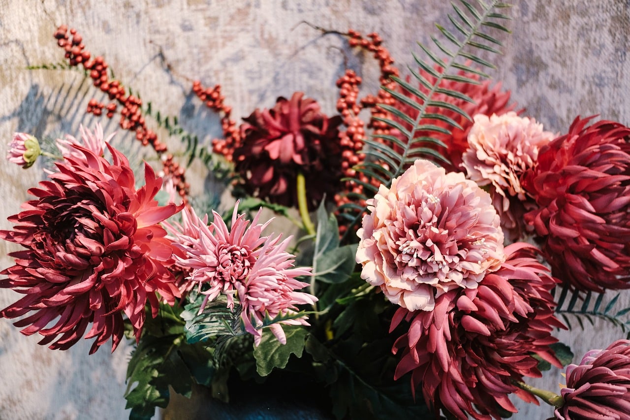
Pink vs Red: How They Differ
In the pink vs red comparison, pink is literally red with white added. That single change — adding lightness — transforms red’s boldness into pink’s softness, which is why the two carry such different emotional signals despite sharing a hue. Red (#FF0000) is the pure color; pink (#FFC0CB) is its light tint. Below are exact hex codes, the undertones, and when to use each.
What is the difference between pink and red?
Red ( #FF0000) is pure red: the red channel maxed out with no green or blue, giving full saturation and intensity. Pink ( #FFC0CB) raises the green and blue channels toward white while keeping red dominant — in other words, red plus white. That’s the definition of a tint. The hue stays in the red family, but pink is far lighter and less saturated. Pink can also shift warm (salmon, coral) or cool (rose, fuchsia) depending on whether it leans orange or blue, while pure red is fixed.
What does each color look like?
Red looks powerful, urgent, and passionate — fire engines, stop signs, lipstick, danger. It’s the most attention-grabbing color and reads as energy and intensity. Pink looks soft, gentle, and approachable — blossoms, cotton candy, blush. Lighter pinks feel sweet and calming; brighter pinks (hot pink, magenta) feel playful and bold but still lack red’s hard urgency. The leap from red to pink is just added white, yet it moves the color from “alert” to “affection.” For the full range of tints, see our shades of pink guide.
Pink vs red: side-by-side comparison
| Attribute | Pink | Red |
|---|---|---|
| Hex (representative) | #FFC0CB | #FF0000 |
| RGB | 255, 192, 203 | 255, 0, 0 |
| CMYK (approx.) | 0, 25, 20, 0 | 0, 100, 100, 0 |
| Undertone | Soft (warm or cool tint) | Pure / slightly warm |
| Hue family | Red (light tint) | Red |
| Best used for | Beauty, romance, kids, wellness, soft branding | Alerts, sales, energy, sports, food |
| Mood | Gentle, sweet, romantic, calming | Bold, urgent, passionate, energetic |
When should you use each?
Choose red when you want maximum energy and attention — calls to action, alerts, sales, sports, and food and entertainment brands that thrive on excitement. Red is the boldest signal in the palette, ideal when you need to provoke action or urgency. Use it as an accent so it stays powerful rather than overwhelming.
Choose pink when you want softness, warmth, or approachability — beauty and wellness, romance, children’s products, and brands that want to feel friendly rather than aggressive. Lighter pinks calm and soothe; hot pinks add playful energy without red’s seriousness. If you need intensity, use red; if you need gentleness or charm, use pink. For the emotional signals behind each, see the meaning of red, the meaning of pink, and our color psychology guide.
Do pink and red go together?
Yes — and pink-and-red has become one of the most fashionable pairings in modern design and style. Because pink is a tint of red, the two are monochromatic relatives, so combining them reads as bold yet harmonious. A deep red anchor with a soft pink (or a hot pink with a true red) feels confident and contemporary, especially in beauty, fashion, and editorial work. Once thought to clash, the combo now signals modern, playful sophistication. Keep enough value difference between the two so each reads clearly. For red’s darker relative, see our red vs maroon comparison.
How to tell pink from red
Judge lightness. If the color is pale, soft, and looks like red with white mixed in, it’s pink. If it’s vivid, fully saturated, and intense, it’s red. On screen, sample the hex — pure red shows green and blue at or near zero, while pink shows elevated green and blue values (pulling it toward white) with red still highest. The higher those green and blue numbers climb, the lighter and pinker the color becomes.
Pink and red in branding and psychology
The pink-vs-red decision is one of the clearest examples of how lightness alone can flip a color’s meaning. Red activates: it’s tied to urgency, hunger, passion, and danger, which is why it powers sale banners, food brands, and calls to action. It raises arousal and grabs attention faster than any other color, but that intensity has to be rationed — too much red feels aggressive or stressful, so it works best as a decisive accent.
Pink softens all of that. By adding white, red’s energy becomes warmth, nurturing, and approachability, which is why pink anchors beauty, wellness, romance, and children’s products. Lighter pinks read as calm, tender, and reassuring, while hot and magenta pinks bring back some of red’s boldness but keep a playful, modern edge rather than red’s seriousness. Pink has also shed much of its purely “feminine” coding in contemporary branding — millennial pink and bright fuchsias now signal confidence, creativity, and inclusivity across all kinds of products. When you choose between them, you’re choosing the emotional dial: red for excitement and action, pink for gentleness, charm, and approachability. Using them together, with a clear value gap, has become a hallmark of fresh, contemporary design.
Frequently Asked Questions
Is pink just light red?
Yes. Pink is a tint of red — red mixed with white — which raises its lightness and lowers its saturation. Pink (#FFC0CB) shares red’s hue but is much paler and gentler. So pink is accurately described as light red, even though it carries very different emotional associations from the pure color.
Why does pink feel so different from red?
Adding white changes more than brightness — it changes mood. Red signals urgency, power, and passion, while pink reads as soft, nurturing, and approachable. The lighter and less saturated a color becomes, the calmer it feels, which is why pink communicates gentleness and charm where red communicates intensity.
Can you wear pink and red together?
Absolutely — it’s a celebrated modern pairing. Because pink is a tint of red, the two are monochromatic relatives that combine into a bold but harmonious look. Keep a clear value difference (soft pink with deep red, or hot pink with true red) so each color reads distinctly and the combination feels intentional.
Is pink a warm or cool color?
It depends on the pink. Warm pinks (salmon, coral, peachy tones) lean toward orange, while cool pinks (rose, fuchsia, magenta) lean toward blue and purple. Pure red is warm, so a pink made by simply adding white stays warm, but pink as a family can swing either direction.