What Font Does Slack Use?
The Slack font question splits into three answers: the logo, the marketing brand type, and the type you actually read inside the app. None of them is a single downloadable “Slack font,” but each role is easy to identify and approximate. Slack rebranded in 2019, replacing its busy multicolor hashtag with a cleaner mark and a more disciplined type system. For more breakdowns like this, see our hub on famous brand fonts.
What font is the Slack logo?
The Slack logo wordmark is custom lettering, not a licensed font you can download. The lowercase “slack” set beside the pinwheel mark uses clean, friendly sans-serif forms with rounded terminals and even strokes. Because it was drawn specifically for the brand and is protected as a trademark, there is no official “Slack font” file. Any result on a free-font site is an unofficial imitation of the wordmark, so you cannot legitimately reuse the actual letterforms in your own work.
What is Slack’s brand typeface?
For marketing — the website, campaigns, and decks — Slack’s brand typeface has been reported as Larsseit, a geometric sans-serif from foundry Type Dynamic. Earlier in the brand’s life, Lato and Hellix were associated with Slack’s marketing materials. We’d hedge slightly here: brand type systems shift over time and exact current specifications are not always published, so treat the precise weight-by-weight stack as approximate. What is consistent is the style — a warm, geometric sans with open counters and a friendly, approachable tone that matches Slack’s playful voice.
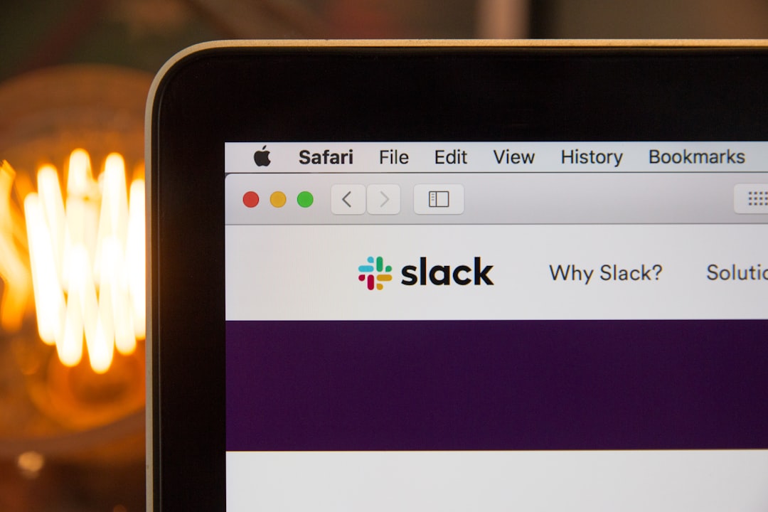
What font does the Slack app use?
Inside the desktop and web app, Slack does not ship a custom UI typeface. Instead it uses a system font stack — the native interface font of whatever device you’re on. That means San Francisco on macOS and iOS, Segoe UI on Windows, and Roboto on Android. This is a deliberate engineering choice: system fonts render crisply at small sizes, load instantly, and feel native to each platform. If you’re rebuilding a Slack-like interface and want one free face that covers every platform consistently, Inter is the standard pick — see our breakdown of the Inter font for why it dominates modern product UI.
Why does Slack use a custom logo and a system UI font?
The split is intentional. A bespoke wordmark can be trademarked and carries a distinct gesture the brand owns; a system font stack in the product guarantees fast, native-feeling text on every device without shipping extra font files. Marketing gets personality (Larsseit’s warmth), the product gets reliability (the system stack). If you want to understand the trade-offs between licensing a typeface and commissioning one, our font licensing guide walks through the costs and rights involved.
Free fonts that look like the Slack font
You can’t use Slack’s wordmark or its exact brand face for free, but you can recreate the look. Match the role first: a warm geometric sans for headlines, and a neutral, highly legible sans for UI and body copy.
| Use case | Slack uses | Free alternative |
|---|---|---|
| Logo / wordmark | Custom lettering | Inter or Lato (bold) |
| Marketing headlines | Larsseit (reported) | Lato or Poppins |
| App UI | System stack (SF / Segoe / Roboto) | Inter |
| Body copy | System sans | Inter or Lato |
Lato is the closest free match to Slack’s warmer, geometric marketing voice — a humanist sans with semi-rounded details and a friendly feel, free under the SIL Open Font License. Inter is the better choice for anything UI-shaped: a neo-grotesque with a tall x-height, wide language coverage, and excellent screen rendering, also free under the SIL Open Font License. Together they cover both halves of Slack’s type system. Poppins is a fun free alternative if you want a more overtly geometric, rounded headline face.
Is the Slack font the same as Lato?
Not exactly, though Lato is a reasonable approximation and was genuinely tied to Slack’s brand at one point. The current marketing face is more likely Larsseit, which is a paid commercial font, while the app uses platform system fonts rather than Lato. So if someone says “Slack uses Lato,” they’re describing a historical truth and a close visual cousin — not the full current picture. For your own project, Lato gives you the warmth for free; just don’t assume it’s a pixel-perfect match to today’s wordmark.
Can I use the Slack font for my own project?
Not the wordmark — it’s custom lettering and a registered trademark owned by Slack Technologies (now part of Salesforce). Larsseit is a commercial font that requires its own license from the foundry if you want to use it legitimately. For your own brand, reach for free faces like Inter or Lato and commission or draw your own distinctive mark. For sibling breakdowns in this cluster, see what font Notion uses and what font Zoom uses.
Frequently Asked Questions
What font does Slack use in its logo?
Slack’s logo uses custom lettering rather than a stock typeface — clean, friendly lowercase sans-serif forms drawn for the 2019 rebrand. It is bespoke artwork registered as a trademark, so it is not downloadable. Inter or Lato are the closest free alternatives for the look.
What is Slack’s brand font?
For marketing, Slack’s brand typeface has been reported as Larsseit, a geometric sans by Type Dynamic, with Lato and Hellix used historically. Exact current specifications are not fully published, so treat the precise stack as approximate. Inside the app, Slack uses system fonts.
What font does the Slack app use?
The Slack app uses a system font stack rather than a custom typeface: San Francisco on macOS and iOS, Segoe UI on Windows, and Roboto on Android. This keeps text fast and native on every device. Inter is the best single free stand-in for a Slack-like interface.
What free font looks most like Slack?
Lato is the closest free match for Slack’s warm marketing tone, while Inter best replicates the app’s clean UI feel. Both are free for commercial use under the SIL Open Font License. Use Lato for friendly headlines and Inter for body text and interface elements.