What Font Does Target Use?
The Target font question splits into the logo and the brand type. The wordmark is bespoke, Helvetica-adjacent lettering, while Target’s wider identity runs on a custom neo-grotesque sans. This article explains what Target actually uses, why a Helvetica-style look defines it, and which free fonts get you closest.
Target is a clean example of a retailer that owns its type rather than licensing something off the shelf. For how this compares with other major logos, see our pillar on famous brand fonts and what the big logos use.
What font is the Target logo?
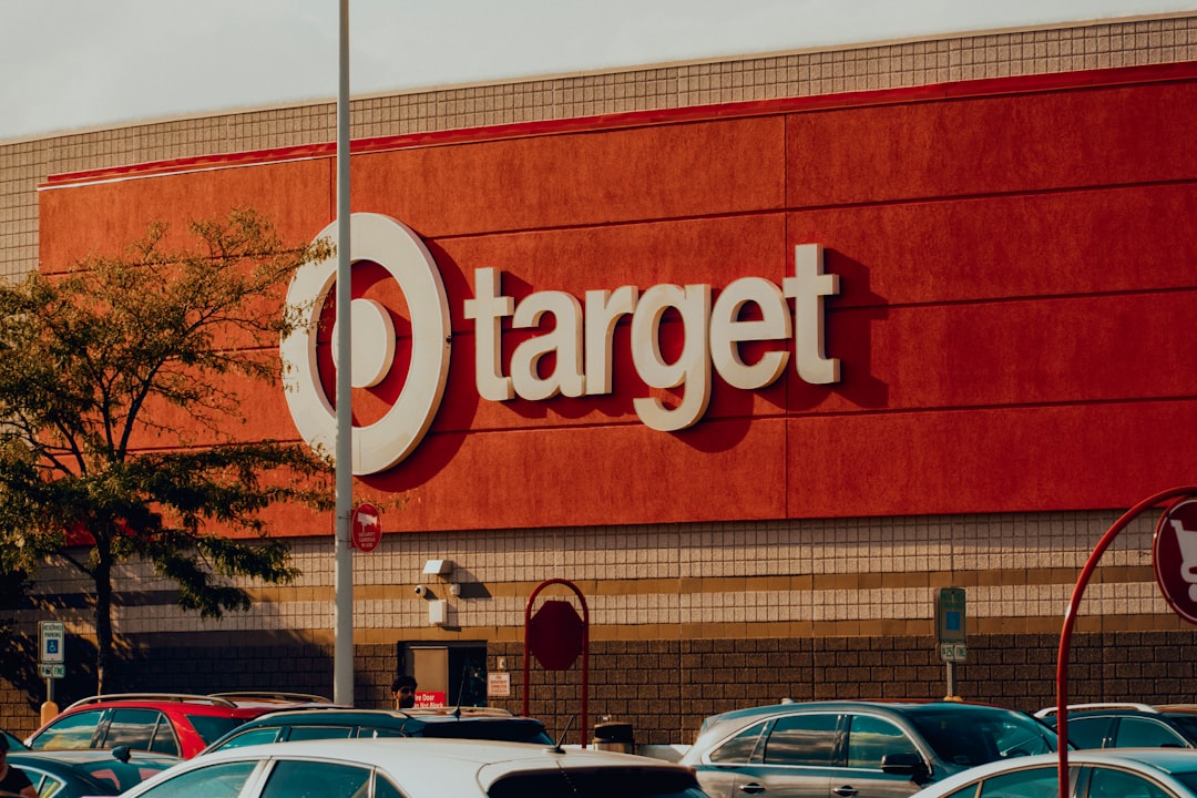
The Target logo wordmark is custom lettering — a bold, slightly condensed sans-serif strongly reminiscent of Helvetica, set in the brand’s signature red beside the bullseye. The letters are even and tightly fitted, with the neutral, no-nonsense character of a classic neo-grotesque. Because the wordmark is custom-drawn, there is no font file that reproduces it exactly, though it sits very close to the Helvetica family in spirit.
So while people often look for a single “Target font,” the precise answer is that the wordmark is bespoke — and if you want the closest reference point, think Helvetica rather than any one downloadable file.
What font does Target use for branding?
For its broader identity Target uses a custom proprietary typeface, a clean neo-grotesque sans frequently referred to as Target Sans. It carries the brand voice across advertising, signage, packaging, and digital with the same crisp, accessible, Helvetica-adjacent feel as the wordmark. Like the logo lettering, this family is proprietary and is not offered for public download.
We should be honest about naming: “Target Sans” is the common label for the brand’s custom face, and the exact internal version details aren’t public. What is clear is the category — a neutral neo-grotesque sans — and that you can’t simply download it.
Can you download the Target font?
No. The wordmark is custom lettering and the brand typeface is proprietary, so there is nothing official to download. Fan-made imitations circulate, but those are clones — fine for personal mockups, not for reproducing the real identity. Recreating the wordmark or bullseye to imply a Target association is a trademark issue separate from any font license, so read our font licensing guide before commercial work.
What’s a free Target font alternative?
The Target look is defined by clean, neutral, Helvetica-style neo-grotesque letterforms. The best free options are:
- Inter (free) — a neo-grotesque sans with a tall x-height and excellent legibility; a strong free stand-in for Target’s clean, modern type, and free for commercial use.
- Arimo (free) — a metrically compatible Helvetica/Arial alternative on Google Fonts, arguably the closest free match for the wordmark’s classic grotesque feel.
- Roboto (free) — a neutral, slightly humanist grotesque that works well for clean retail headlines and UI.
For the deeper background on the wordmark’s reference point, see our guide to the Helvetica font. You can also compare Target’s approach with another big-box retailer in what font Walmart uses.
Target’s fonts vs. the free alternatives
| Use case | Font | Style | Free alternative |
|---|---|---|---|
| Logo wordmark | Custom Target lettering | Helvetica-like bold sans | Arimo (Bold) |
| Brand typeface | Target Sans (proprietary) | Neo-grotesque sans | Inter |
| Headlines | Proprietary brand sans | Clean grotesque | Roboto |
| Body text | Proprietary / licensed sans | Neutral sans | Inter |
Why does Target use a custom font?
A bespoke neo-grotesque gives Target one consistent, ownable voice across stores, packaging, and screens — something no competitor can license. Starting from a Helvetica-like base keeps the brand clean and timeless, while customization lets Target fine-tune weight, spacing, and language coverage for a national retail system. It’s the same ownable-identity strategy used across major retail brands: control the type, and you control the brand’s voice in every aisle and ad.
For your own work, the takeaway is simple: the clean, neutral, Helvetica-style qualities are all reproducible with a free font like Inter or Arimo, and the wordmark and bullseye are trademarks you shouldn’t copy.
How to get the Target look on a budget
To capture Target’s crisp, modern retail type feel without proprietary fonts, follow this approach:
- Start with a Helvetica-style grotesque. Use Arimo or Inter for even strokes and a clean, neutral read.
- Set it bold and tight. The wordmark’s punch comes from heavy weight and snug spacing — match that.
- Let red and the bullseye lead. The color system and symbol do the branding; keep type clean and confident.
- Pair with a neutral body font. Keep supporting text simple — see our font pairing guide.
This gets you a clean, accessible retail look that’s entirely original and safe to use commercially.
Frequently Asked Questions
What font does the Target logo use?
The Target logo uses custom lettering — a bold, Helvetica-like sans set in red beside the bullseye. The brand’s wider typeface is a proprietary neo-grotesque often called Target Sans. Neither is downloadable. For a free match, a Helvetica-style sans like Inter or Arimo is the closest legal option for your own designs.
Is the Target logo Helvetica?
Not exactly. The Target wordmark is custom lettering, but it is strongly Helvetica-like in proportion and feel, which is why people associate the two. For a free, downloadable match to that classic grotesque look, Arimo (a metrically compatible Helvetica alternative) or Inter are the closest options for commercial work.
Is the Target font free?
No. The wordmark is custom and the brand typeface is proprietary, so there is no official free Target font. Fan-made clones exist for personal mockups, but for legal commercial work use a free Helvetica-style sans such as Inter, Arimo, or Roboto and design your own original wordmark.
What font is closest to the Target logo?
Arimo and Inter are the closest free matches to Target’s clean, Helvetica-like style. Arimo mirrors the classic grotesque proportions almost exactly, while Inter offers excellent modern legibility. Both are free for commercial use, but neither recreates the exact wordmark, which remains a Target trademark you should not copy.
Can I use the Target font for my business?
No. The wordmark is custom and the brand fonts are proprietary, and imitating the lettering or bullseye can be trademark infringement. For a similar clean, Helvetica-style look on your own original logo, use a free sans like Inter or Arimo and create a distinct wordmark. Review our font licensing guide first.


