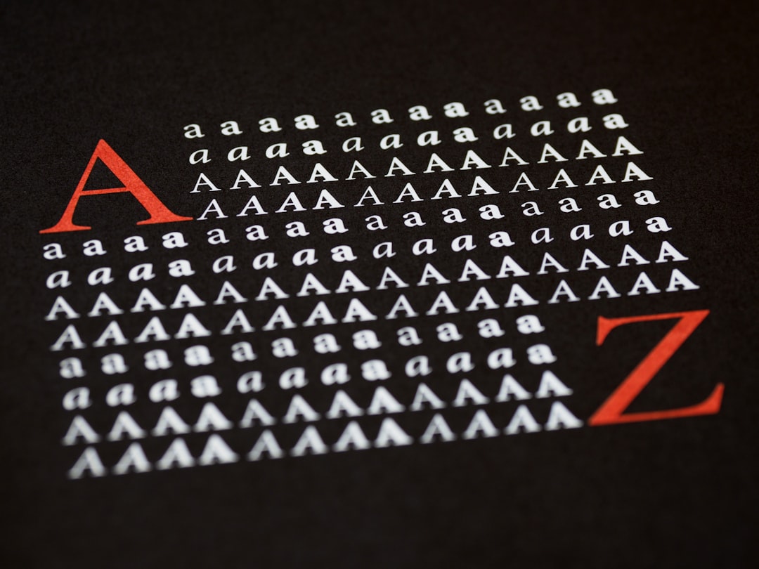
Best Fonts for Print Design
The best fonts for print are chosen on different criteria than web fonts. Once ink hits paper, the screen-rendering problems that dominate web type — hinting, sub-pixel rendering, low-DPI smearing — largely disappear, and high-resolution detail comes through. That frees you to use refined, optically-sized families that look thin or fussy on screen but resolve beautifully at 300+ DPI. This guide covers the serif and sans-serif workhorses print designers trust for books, brochures, packaging copy, and editorial layouts.
For combining a serif body with a sans display (a classic print move), see our font pairing guide. And before sending a job to press, our notes on print finishing cover how varnishes, foils, and stocks affect how fine type reads.
What makes a good font for print?
A good print typeface has the resolution headroom to show detail: crisp serifs, true hairlines, and clean curves that high-DPI printing reproduces faithfully. Optical sizing matters most — a family with caption, text, and display cuts lets you set fine print and large headlines from one voice. You also want complete typographic equipment: text figures, small caps, true italics, and ligatures. Unlike web work, you do not need aggressive hinting or a screen-optimized x-height, so the field of usable faces is far wider, including refined classics that look weak on a monitor.
The substrate matters as much as the typeface. Coated, glossy stock holds fine detail and lets high-contrast Didones and delicate serifs shine; uncoated or absorbent paper causes ink gain that thickens strokes and closes counters, so you compensate by choosing sturdier faces and slightly heavier weights. A typeface that is perfect for a glossy brochure can look clumsy on newsprint. Good print typography always considers the paper, the press, and the finishing together with the font itself.
Best print design fonts
Garamond (free: EB Garamond)
Garamond is the default for elegant print body text — economical, warm, and detailed at high resolution. Free EB Garamond covers self-publishing; Adobe Garamond Pro adds optical sizes for professional press work.
Caslon (paid; free: Libre Caslon)
Caslon gives printed pages a friendly, traditional texture and is a staple of book and editorial design. Adobe Caslon Pro is the paid standard, with Libre Caslon as a free OFL stand-in.
Minion (paid)
Minion is purpose-built for print body text, with four optical sizes that let you typeset footnotes through display headlines cleanly. It is one of the most widely used text faces in commercial publishing and ships with Adobe apps.
Helvetica (paid)
Helvetica is the neutral grotesque that prints cleanly at any size — the default for corporate print, signage copy, and clean editorial sans. It is paid (Linotype/Monotype); the free near-twin is Helvetica Neue alternatives like Inter or the system Arial, though purists prefer the original. See our deep dive on the Helvetica font.
Univers (paid)
Univers by Adrian Frutiger is a systematic sans with a famously coherent weight-and-width matrix, making it superb for complex print systems (tables, forms, multi-level brochures) where consistency across weights matters. Paid via Linotype.
Frutiger (paid)
Frutiger is a humanist sans with open apertures and high legibility, originally drawn for airport signage and equally at home in print body copy and headings. Its warmth makes long sans-serif passages readable. Paid.
Futura (paid)
Futura is the geometric sans for confident, modernist headlines, covers, and labels. Its clean circles and triangles reproduce sharply in print and convey precision. Paid; the closest free geometric alternatives are Jost and Century Gothic-style faces.
Sabon (paid)
Sabon is a Garalde serif engineered for even color across printing methods, making it dependable for body-heavy print like reports and literary work. Paid via Monotype.
Source Serif 4 / Source Sans 3 (free)
Adobe’s open-source Source Serif 4 and Source Sans 3 give you a free, professional serif-plus-sans system with optical sizes and broad language coverage — an excellent zero-cost print toolkit.
| Font | Style | Free/Paid | Why it works |
|---|---|---|---|
| Garamond (EB Garamond) | Old-style serif | Free / Paid | Elegant body text, detailed at high DPI |
| Minion | Old-style serif | Paid | Optical sizes for fine print to headlines |
| Helvetica | Neutral grotesque | Paid | Clean, neutral, prints crisply at any size |
| Univers | Grotesque sans | Paid | Coherent weight/width system for complex jobs |
| Frutiger | Humanist sans | Paid | Open, legible for sans body and headings |
| Futura | Geometric sans | Paid | Sharp modernist headlines and labels |
| Source Serif 4 | Transitional serif | Free | Optical sizes, pro-grade, open source |
| Caslon | Old-style serif | Paid (Libre free) | Warm, traditional editorial texture |
Fonts to avoid in print
Avoid screen-first webfonts and UI faces — Arial, default Verdana, and aggressively hinted Google Fonts can look generic or slightly clumsy at large print sizes. Skip ultra-thin Didone hairlines (Bodoni, Didot) for small body text or on uncoated/absorbent stock, where fine strokes break up. Don’t mix too many families, and never set long print copy in a condensed or display face. Choose dedicated text faces with optical sizes for anything text-heavy.
Tips, sizing and pairing
Use the text or caption optical cut for small sizes and the display cut for headlines — this single habit separates amateur from professional print. Set serif body around 9–11pt with comfortable leading; reserve sans like Futura or Helvetica for heads, decks, and captions. Watch ink gain on uncoated stock — go slightly heavier and avoid hairlines. A reliable print pairing is a Garalde serif body (Garamond, Sabon) with a clean sans display (Helvetica, Futura). Many free options live on Google Fonts; our best Google Fonts roundup notes which include text figures for print.
Frequently Asked Questions
What is the best font for print design?
There is no single best font, but the safest professional choices are Garamond, Minion, or Caslon for serif body text and Helvetica, Univers, or Futura for sans headlines. For text-heavy print, a face with optical sizes (caption, text, display) matters more than any specific name.
Do fonts look different in print versus on screen?
Yes. Print at 300+ DPI shows fine detail like hairlines and serifs that screens smooth away, so refined faces look better on paper. Screen rendering relies on hinting and can thicken or distort thin strokes, which is why some print-favorites look weak on a monitor.
What font size is best for print body text?
Body copy in print typically runs 9–11pt, with brochures and books toward 10pt and dense reports sometimes at 9pt. Pair with leading around 120–140% of the type size and keep line length to 55–75 characters for readability.
Are Google Fonts okay for print?
Yes — many Google Fonts (EB Garamond, Source Serif 4, Lora, Libre Baskerville) are licensed for print and include the text figures and italics print needs. Check that the family has the weights and optical detail your job requires; some web-first faces look plain at large print sizes.
What is optical sizing and why does it matter in print?
Optical sizing means a family includes cuts drawn for specific sizes — heavier, more open shapes for small text and finer detail for large display. In print it ensures footnotes stay legible and headlines stay elegant, all in one consistent voice. Minion and Adobe Garamond are classic examples.


