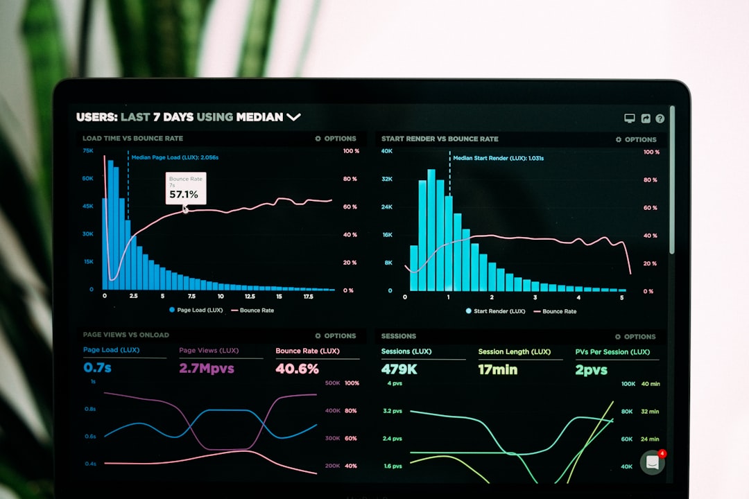
Best Fonts for Dashboards
The best fonts for dashboards have to do two jobs at once: read clearly as labels and axis text at tiny sizes, and present numbers in clean, aligned columns. That points to neutral UI sans-serifs with tabular figures and a high x-height. This guide ranks the typefaces that data teams actually ship, notes free vs paid, and where to get each. For UI work more broadly, see our guide to the best fonts for apps and the principles in dashboard design.
Here is what to look for, the fonts to use, a comparison table, and what to avoid.
What makes a good font for dashboards?
Dashboards are read in glances, often at 11–13px, frequently on dark themes. The traits that matter:
- Tabular figures. KPI numbers and table columns must align digit-for-digit so trends read instantly.
- High x-height, open apertures. Labels stay legible at axis-label sizes and in cramped card layouts.
- Neutral, low-contrast forms. A dashboard font should disappear into the data, not compete with it.
- Wide weight range. Light or regular for body, semibold for metric values, so hierarchy comes from weight not size.
- Broad language and symbol coverage. Currency symbols, percentages, and multilingual labels must all be present.
Many teams use a sans for everything and switch to a monospace only for the large hero metric, where fixed-width digits prevent the number from shifting as it updates live.
Best dashboard fonts
Inter (free, tabular figures)
Inter is the default choice for modern dashboards. It was designed for screens, has a tall x-height, and ships tabular figures plus a “slashed zero” stylistic set you can enable for data. Free and open-source on Google Fonts and rsms.me/inter. If you pick one font for a dashboard, pick this.
Roboto (free)
Roboto is Android and Google’s workhorse UI sans, with excellent rendering and tabular figures. It is familiar, neutral, and pairs with Roboto Mono for metrics out of the box. Free on Google Fonts — the path of least resistance for web and Material-based dashboards.
IBM Plex Sans (free)
IBM Plex Sans brings subtle character without sacrificing clarity, and the Plex superfamily gives you a matching mono (Plex Mono) and serif. Great when a dashboard needs a touch more brand personality. Free and open-source on Google Fonts and github.com/IBM/plex.
Source Sans 3 (free)
Source Sans 3 (formerly Source Sans Pro) is Adobe’s open-source UI sans, clean and highly readable at small sizes with a wide weight range. A dependable, understated choice that pairs with Source Code Pro for numbers. Free on Google Fonts.
Lato (free)
Lato is a warm, semi-rounded sans that softens a dense dashboard without losing legibility. Its many weights make weight-based hierarchy easy. Free on Google Fonts — a good pick when a data product should feel approachable rather than clinical.
Roboto Mono (free, for metrics)
Roboto Mono is the companion for big numbers. Use it on hero KPIs and live-updating counters so the digits hold their position as values change. Free on Google Fonts and pairs seamlessly with Roboto for labels.
Public Sans (free)
Public Sans is a neutral, accessible sans developed for the U.S. government’s design system, built for clarity in data-dense interfaces and forms. Free and open-source. A strong, no-frills option when accessibility is a priority.
Work Sans (free)
Work Sans is optimized for on-screen text at body sizes, with a clean low-contrast design that suits cards and tables. Free on Google Fonts. A good middle ground between the geometric coolness of Inter and the warmth of Lato.
Dashboard font comparison
| Font | Style | Free/Paid | Why it works |
|---|---|---|---|
| Inter | Sans (tabular) | Free | Screen-designed, tabular figures, slashed-zero set |
| Roboto | Sans | Free | Neutral, great rendering, pairs with Roboto Mono |
| IBM Plex Sans | Sans | Free | Character plus matching mono and serif |
| Source Sans 3 | Sans | Free | Clean, readable small, wide weight range |
| Lato | Sans | Free | Warm and approachable, many weights |
| Roboto Mono | Monospace | Free | Fixed-width digits for hero metrics |
| Public Sans | Sans | Free | Accessible, neutral, data-dense friendly |
| Work Sans | Sans | Free | Optimized for on-screen body text |
Fonts to avoid for dashboards
Avoid high-contrast display serifs (Didot, Bodoni) and any thin or hairline weight — fine strokes vanish at small sizes and on dark backgrounds. Skip condensed fonts for data tables; they cramp digits and hurt scanning. Decorative, script, and handwriting fonts have no place in a dashboard. And avoid fonts without tabular figures for any column of numbers, because proportional digits make columns ragged and slow the eye. If a font’s zero and capital O are indistinguishable, do not use it for IDs or codes.
Light theme versus dark theme considerations
Most analytics dashboards offer both a light and a dark theme, and a font that looks crisp on white can feel thin and washed-out on a dark background. On dark themes, the same weight appears visually lighter because the bright strokes bloom against the dark field, so many teams bump body text up one weight — from regular to medium — when the user switches to dark mode. Inter, Roboto, and IBM Plex Sans all hold up well in both modes, but they reward this small adjustment.
Color and weight together carry hierarchy on a dashboard. Reserve your heaviest weight and highest-contrast color for the single most important number on a card, then step down through medium weight and muted gray for supporting labels. Because a dashboard is scanned, not read, this weight-and-tone ladder lets users find the metric that matters in under a second. Keep the type ramp consistent across every card so the whole interface reads as one system rather than a collage.
Tips for dashboard typography
- Enable tabular figures (the
tnumfeature) for every table and KPI; it is the highest-impact change you can make. - Drive hierarchy with weight, not many sizes — regular labels, semibold values, bold totals.
- Limit to one or two families: a UI sans plus an optional mono for metrics. More than that fragments the interface.
- Test on dark mode. Pick a weight that stays solid on dark backgrounds; thin text disappears.
- Keep axis and legend text at 11–12px minimum for legibility; do not shrink below 10px.
If your dashboard surfaces spreadsheet exports or raw tables, our best fonts for spreadsheets guide covers numeric alignment in depth, and live reports built from the same data should follow our best fonts for reports advice. Every pick here is free on Google Fonts; to pair your UI sans with a heading face, see the font pairing guide, and review the font licensing guide before bundling a webfont into a product.
Frequently Asked Questions
What is the best font for a dashboard?
Inter is the best all-round dashboard font: it was designed for screens, has a high x-height for small-size legibility, and includes tabular figures plus a slashed-zero option for data. Roboto and IBM Plex Sans are excellent free alternatives, especially when paired with a monospace for hero metrics.
Why are tabular figures important for dashboards?
Tabular figures give every digit the same width, so numbers in a KPI card or table column align vertically and do not jump when values update live. Without them, a counter ticking from 199 to 200 visibly shifts width, and table columns look ragged — both of which slow comprehension.
Should I use a monospace font on dashboards?
Use a monospace selectively — for large hero metrics and live-updating counters where fixed-width digits keep the number stable. For labels, axes, and body text, a UI sans like Inter or Roboto reads better. Pairing Roboto with Roboto Mono is a clean, common setup.
What font size works best for data visualization?
Keep axis labels and legends at 11–12px minimum, body and table text around 13–14px, and reserve larger sizes for hero KPIs. Avoid going below 10px even for secondary labels. Use weight rather than size to separate values from labels so the layout stays compact.
Are free fonts good enough for professional dashboards?
Yes. Inter, Roboto, IBM Plex Sans, and Source Sans 3 are all free, open-source, and used in production by major data products. They offer tabular figures, wide weight ranges, and broad language coverage — everything a professional dashboard needs without licensing cost.