Plum vs Purple: What’s the Difference?
The plum vs purple question is really about a member versus its family. Purple is the broad hue sitting between red and blue, spanning everything from violet to magenta. Plum is one specific shade within that family: a deep, slightly muted purple that leans toward red, named after the dark fruit. So plum is a kind of purple, just as crimson is a kind of red. That deep, red-leaning, slightly grayed character is what sets plum apart.
What color is purple?
Purple is the hue family sitting between red and blue on the color wheel. A representative hex for “pure” purple is #800080, where red and blue are equal and green is zero, producing a balanced, vivid mix of the two. Purple spans a huge range, from blue-leaning violet to red-leaning magenta, and it carries strong associations of royalty, luxury, creativity, and spirituality. Historically it was the most expensive dye to produce, which is why it became the color of kings and emperors.
Because purple is a whole family, it includes many named shades: lavender, violet, mauve, magenta, eggplant, and plum among them. Pure purple like #800080 reads as bold and balanced rather than dark or muted. For the deeper meaning and symbolism, see our guide to purple color meaning.
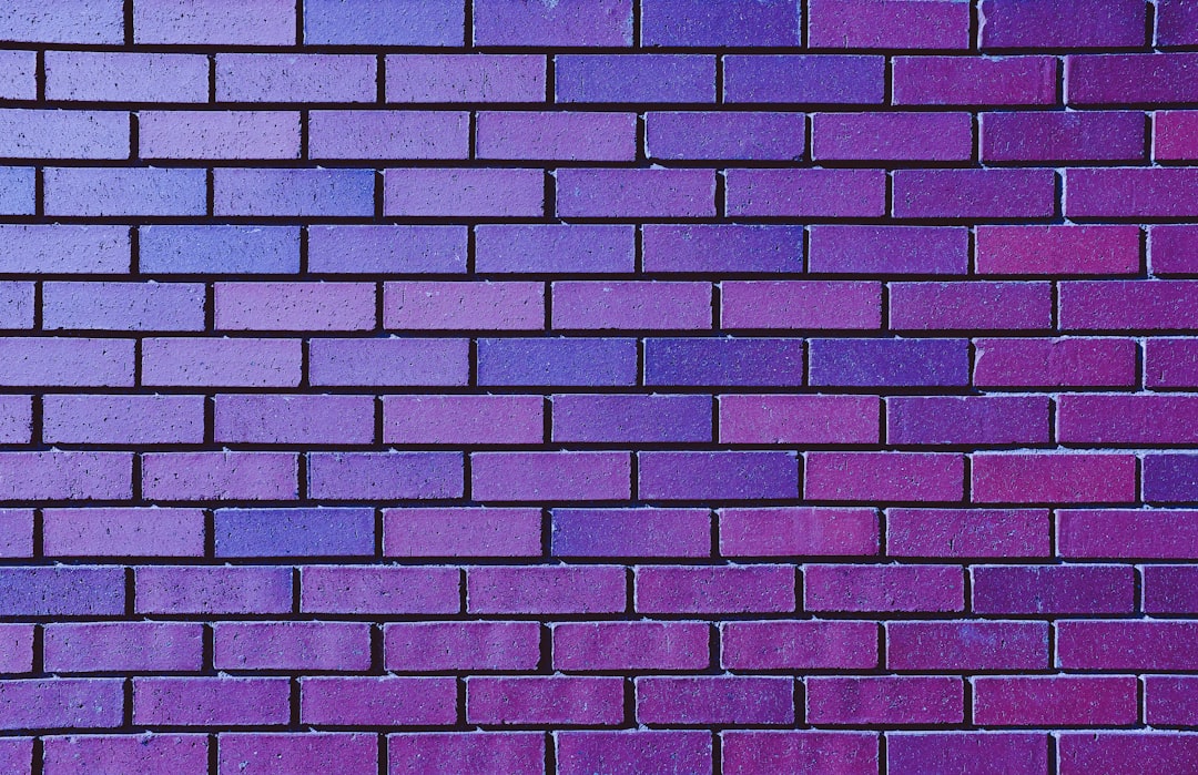
What color is plum?
Plum is a deep, slightly muted purple named after the dark-skinned fruit. A representative hex is #8E4585, where red is fairly high, blue is moderate, and green is present but low, producing a rich red-purple that is darker and softer than pure purple. Compared with bright purple, plum leans toward red and is dialed down in brightness and saturation, which gives it a sophisticated, moody, slightly vintage quality. Plum reads as elegant and refined rather than loud.
Because plum sits between purple, red, and brown depending on the swatch, it drifts between mauve, eggplant, and wine. It is essentially a deep red-purple with a touch of gray. Plum belongs squarely in the purple family while occupying its darker, warmer, more muted corner.
Plum vs purple: side-by-side comparison
Exact values vary across brands and screens, but these representative specs show the deep, red-leaning split clearly.
| Attribute | Plum | Purple |
|---|---|---|
| Hex code | #8E4585 | #800080 |
| RGB | 142, 69, 133 | 128, 0, 128 |
| CMYK (approx) | 0, 51, 6, 44 | 0, 100, 0, 50 |
| Undertone | Warm, red-leaning, slightly muted | Balanced red-blue |
| Hue family | Deep red-purple (a shade) | Purple (the family) |
| Best used for | Luxury, beauty, fashion, autumn | Royalty, creative, premium brands |
| Mood / feel | Rich, moody, elegant, refined | Bold, regal, creative, vivid |
How can you tell plum and purple apart?
The reliable test is to look for depth and red. Hold the swatches together: pure purple stays bright and balanced, while plum looks darker, warmer, and slightly grayed, with a noticeable red lean. If the color reminds you of the dark fruit, red wine, or eggplant, it is plum. If it reads as a bold, clear purple with no obvious darkening, it is pure purple. A second cue is mood: purple feels regal and vivid, while plum feels moody and refined.
The numbers confirm it. Pure purple at 128, 0, 128 has equal red and blue with zero green, producing a clean, balanced hue. Plum at 142, 69, 133 lifts red above blue and adds green, which both warms the color toward red and mutes it slightly. Whenever a purple’s red value pulls ahead of its blue and the whole color darkens and softens, you are looking at plum rather than pure purple.
Where do plum and purple sit on the color wheel?
On the color wheel, purple occupies the whole region between red and blue. Plum sits within that region on the red side, in the red-purple or magenta-purple zone, and then drops in brightness and saturation. So plum is not a separate hue family; it is a deep, muted shade of red-purple inside the purple family. That position explains why plum feels like the sophisticated, darker relative of purple rather than a different color entirely.
The second axis is value and saturation. Pure purple at #800080 is moderately dark but fully saturated and vivid. Plum at #8E4585 is similar in darkness but partly desaturated, which is what produces its muted, elegant quality. This combination, a red rotation plus a drop in saturation, is why plum reads as moody and refined where pure purple reads as bold and regal. For where purple sits relative to temperature, see warm vs cool colors.
How do plum and purple perform in branding and interiors?
In branding, purple signals royalty, creativity, and premium quality, which is why it appears across luxury, beauty, tech, and creative brands that want to feel imaginative and upscale. Its boldness makes it distinctive. Plum takes that richness and matures it, reading as elegant, indulgent, and a little vintage. That refined character is why plum thrives in beauty, fashion, wine, and hospitality branding aimed at a sophisticated audience. Plum signals quiet luxury where bright purple signals creative confidence.
In interiors, bright purple behaves like a bold statement and is used carefully because it can dominate a room. Plum behaves like a rich, livable jewel tone; it works beautifully on accent walls, velvet upholstery, and textiles because its depth feels cozy and luxurious rather than overpowering. A room with bright purple feels creative and energetic, while a room built on plum feels moody, warm, and sophisticated, which is why plum is a favorite for autumn and evening-toned schemes.
When should you use plum vs purple?
Choose purple when you want boldness, creativity, and a sense of premium imagination. Its vivid balance suits creative, beauty, tech, and luxury brands that want to stand out and signal originality. Purple is a confident, regal color. Choose plum when you want richness with restraint: beauty, fashion, wine, and elegant interiors lean on plum because it feels indulgent, refined, and a little moody, especially in deeper palettes.
Plum also works as a more grounded, sophisticated substitute when bright purple feels too loud for a brand or a room. For a related comparison within the family, see lime vs green for how a named shade differs from its parent hue, and to understand why purple feels regal and plum feels refined, read our guide to color psychology.
Frequently Asked Questions
Is plum a shade of purple?
Yes. Plum is a specific shade within the purple family, a deep, slightly muted red-purple named after the fruit. It belongs to purple the way burgundy belongs to red. The relationship is member-to-family: every plum is a purple, but not every purple is a plum, because plum names one particular dark, red-leaning version.
What are the hex codes for plum and purple?
A representative pure purple is #800080 (RGB 128, 0, 128), a balanced red-blue mix. A representative plum is #8E4585 (RGB 142, 69, 133), darker and red-leaning. Note that web color names can differ from common usage: the HTML “plum” keyword is a light mauve, while designers usually mean the deeper fruit tone shown here.
Is plum warmer than purple?
Yes, plum is generally warmer because it leans toward red, with its red channel sitting above its blue channel. Pure purple is more balanced between red and blue, so it reads cooler and more neutral. That warmth, combined with plum’s slight muting, is a big part of why plum feels cozier and more elegant than a bright purple.
What colors go well with plum and purple?
Plum pairs beautifully with blush pink, gold, cream, sage, and deep green for a rich, sophisticated palette. Bright purple works with yellow, teal, gray, and white for bold, modern contrast. Because plum is muted and deep, it sits comfortably in larger amounts, while vivid purple usually shines as a confident accent.
Which is better for a luxury or elegant look?
Plum is often the stronger choice for understated luxury because its deep, muted richness reads as refined and indulgent without shouting. Bright purple conveys a bolder, more creative kind of premium feel. If you want quiet, sophisticated elegance, choose plum; if you want vivid, confident luxury, choose a richer purple.


