Colors That Go With Silver
Silver is a cool, reflective gray metallic, which lets it act as a sleek neutral that leans modern and clean. The best colors that go with silver include navy, blush, charcoal, white, teal, and black. Below are exact hex codes, ready palettes, and notes on using silver in branding and interiors.
What colors go with silver?
Silver (around #C0C0C0) is a cool metallic, so it harmonizes with cool tones and deep neutrals and benefits from a single warm accent for balance. Because it’s essentially a reflective gray, much of how it behaves mirrors gray itself — see our gray color meaning guide for the psychology. The strongest partners are:
- Navy (#1B2A4A) — a deep cool blue that gives silver crisp, trustworthy contrast.
- Blush pink (#F4C9C2) — a soft warm tint that warms silver for a modern, elegant scheme.
- Charcoal (#36454F) — a deep gray anchor that deepens silver tonally for a sleek, monochrome look.
- White (#FFFFFF) — clean and bright for a fresh, high-tech, minimal feel.
- Teal (#008080) — a cool jewel accent that adds color without breaking silver’s cool mood.
- Black (#0A0A0A) — a high-contrast anchor for a bold, luxurious, modern scheme.
Best color combinations for silver
Silver is a cool, near-neutral metallic, so it pairs by tonal harmony (white, charcoal, black) and by cool color accent (navy, teal), with blush providing the one warm note that keeps a palette from feeling icy. It doesn’t have a true complementary color the way a hue does; instead it sets off whatever it’s paired with. Since silver and plain gray are easy to confuse, it’s worth knowing the difference — compare gray vs silver before choosing finishes. Silver also shares many partners with warm off-white bases — see the neutral pairings in our colors that go with ivory guide for a warmer counterpoint.
Silver + navy + white (clean modern)
A crisp, tech-forward pairing. Navy supplies depth and white keeps it bright, with silver as the reflective metallic — ideal for tech, finance, and product branding.
Silver + blush + charcoal (soft luxe)
A more elegant, current scheme. Blush warms silver’s coolness while charcoal grounds it, making this great for beauty, weddings, and contemporary interiors.
Silver + black + teal (bold high-tech)
For maximum contrast. Black makes silver gleam and teal adds a single cool color accent — a confident look for premium electronics and editorial design.
Silver color palettes (with hex codes)
| Pairing color | Hex | Why it works / mood |
|---|---|---|
| Navy | #1B2A4A | Deep cool blue; crisp, trustworthy contrast |
| Blush pink | #F4C9C2 | Soft warm tint; modern and elegant |
| Charcoal | #36454F | Deep gray anchor; sleek and tonal |
| White | #FFFFFF | Clean and bright; high-tech minimal |
| Teal | #008080 | Cool jewel accent; modern color pop |
| Black | #0A0A0A | High-contrast anchor; bold and luxurious |
| Sapphire | #1F3A5F | Rich cool blue; refined jewel accent |
Three ready palettes to copy:
- Clean modern: Silver #C0C0C0 · Navy #1B2A4A · White #FFFFFF · Charcoal #36454F
- Soft luxe: Silver #C0C0C0 · Blush #F4C9C2 · Charcoal #36454F · White #FFFFFF
- Bold high-tech: Silver #C0C0C0 · Black #0A0A0A · Teal #008080 · White #FFFFFF
How to build a balanced silver palette
Because silver is a metallic, it reads best as an accent and a connective neutral rather than a large flat field. A reliable structure is roughly 60% true neutrals (white, charcoal, black), 30% a cool color (navy or teal), and 10% silver as the reflective highlight, with an optional touch of blush for warmth.
Watch silver’s undertone before pairing. A neutral silver (near #C0C0C0) is essentially a light cool gray; some silver finishes lean slightly blue, while brushed and pewter silvers tip darker and warmer. Cooler silvers love navy, white, and teal; warmer pewter tones sit better with charcoal and blush. Comparing it against a neutral gray swatch reveals which way it leans.
For digital and brand work, remember that flat silver hex (#C0C0C0) lacks the shine of real metal, so it can look like plain gray on screen. Use gradients or texture to suggest the metallic effect, and confirm contrast: silver is light, so silver text on white fails accessibility ratios — pair it with charcoal, navy, or black for body copy.
Silver’s biggest strength in a palette is also its trap: it reads as cool and clean, which means it can tip into cold and clinical if every other color is cool too. The fix is one deliberate warm note — a blush, a soft warm gray, or a single warm-wood texture — that humanizes the scheme without breaking its modern feel. Decide that warm accent up front and keep it small. Used this way, silver becomes the connective tissue that lets navy, black, and white feel like a considered system rather than a default gray-scale.
Colors to avoid with silver
Silver is versatile but a few pairings undercut it:
- Muddy warm browns and tan — fight silver’s cool, clean character and can make it look dull or dirty.
- Heavy gold in equal weight — mixing silver and gold evenly muddies a scheme; pick one lead metal or keep the second tiny.
- Bright warm orange or mustard — clash with silver’s coolness; if you want warmth, use a soft blush instead.
Using silver in branding vs interiors
In branding, silver signals technology, precision, modernity, and premium quality, which is why it appears in electronics, automotive, and luxury brands. Pair it with navy or black for legibility and a single cool accent like teal, using blush only when you want softness. Building a system? Our guide on how to choose brand colors explains using a cool metallic neutral like silver.
In interiors, silver appears as hardware, lighting, and accents that add a cool, reflective sparkle. Layer it against navy or charcoal walls, white trim, and gray textiles; add blush cushions for warmth or teal for a jewel accent. For a flexible base to build around silver, see our neutral color palette guide.
Frequently Asked Questions
What is the best color to pair with silver?
Navy (#1B2A4A) is the best all-around partner for silver because it gives crisp, modern contrast that suits silver’s cool, metallic character. For softness, blush pink (#F4C9C2) warms it, while charcoal (#36454F) and black create sleek, high-contrast schemes.
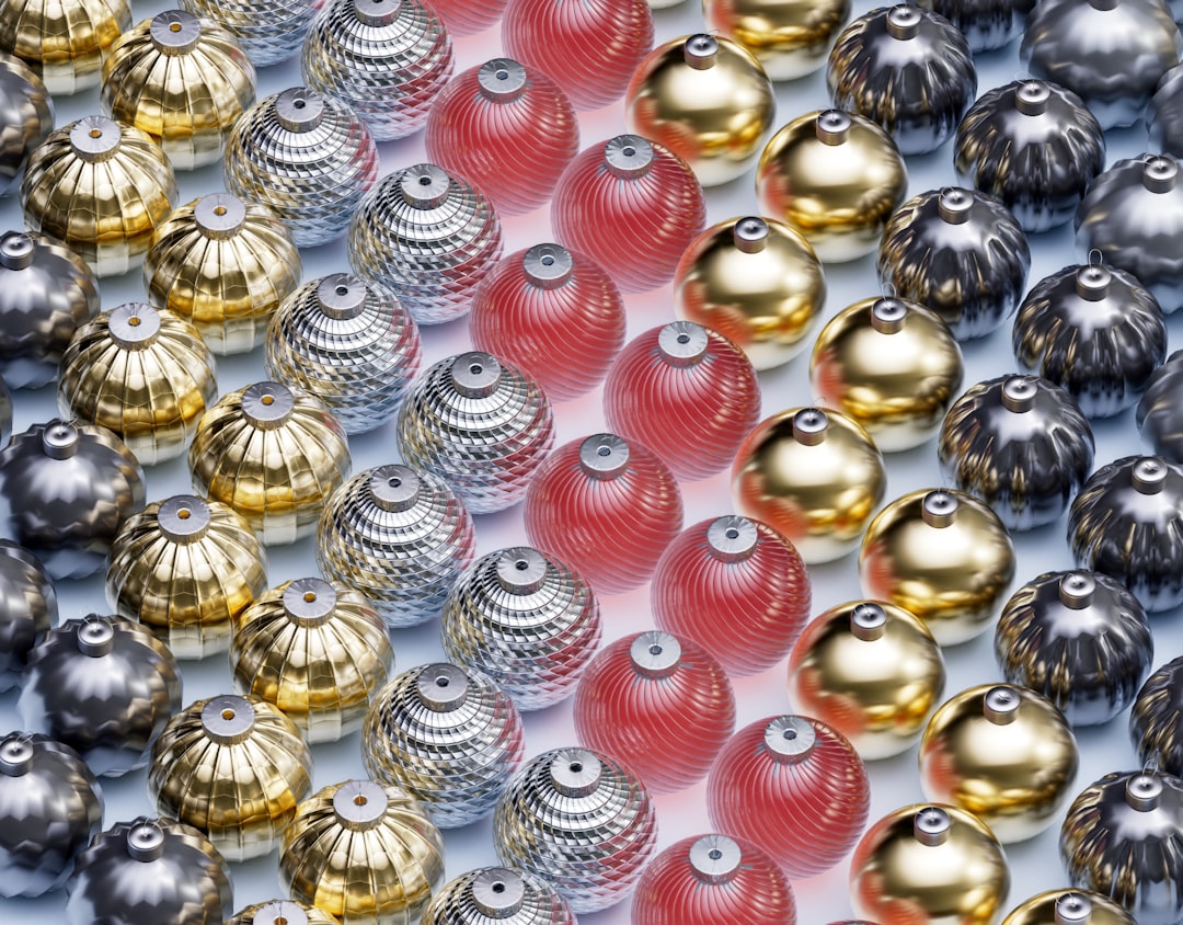
Does silver go with gold?
Yes, but use restraint. Mixing silver and gold can look intentional and luxurious when one metal clearly leads and the other appears as a small accent. Splitting them 50/50 tends to muddy a palette, so choose a dominant metal and keep the second minimal.
What warm color goes with silver?
Blush pink is the best warm color for silver. It softens silver’s coolness for a modern, elegant look without overpowering it, which is why silver-and-blush is popular in beauty and wedding palettes. Keep other warm tones muted to preserve silver’s clean feel.
Is silver a warm or cool color?
Silver is a cool color. It’s a reflective gray with a cool, sometimes faintly blue undertone, which is why it harmonizes so naturally with navy, teal, and white, and why a single warm accent like blush is usually all it needs for balance.