Best Fonts for Movie Titles and Posters
The best fonts for movie titles carry an entire genre and mood in a single line of type, from the inscriptional gravitas of an epic to the tight condensed energy of an action thriller. That rewards strong display faces and punishes anything generic. Below are real typefaces — a mix of free Google Fonts and the famous paid classics — chosen by genre and built for posters, key art and streaming thumbnails alike.
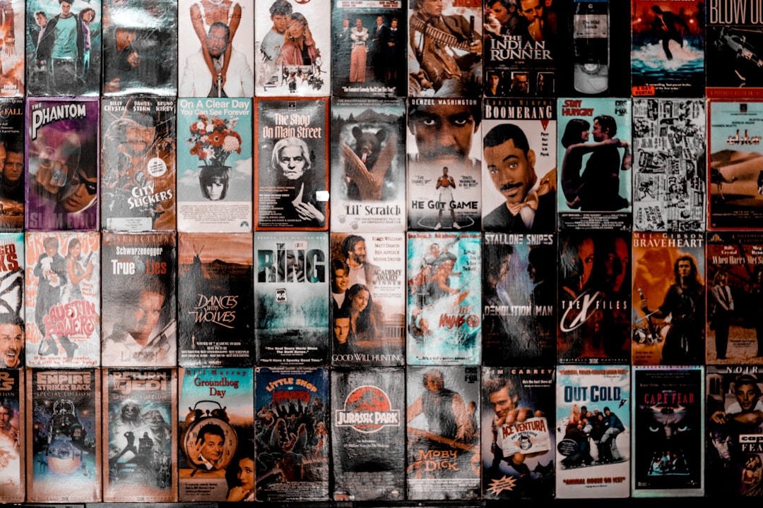
Whether you are designing a one-sheet, a streaming banner or a short-film title card, the picks here read clearly and signal tone instantly. For composition and layout beyond type, see our guides to movie title design and film poster design.
What makes a good font for movie titles?
A movie title font has to do a lot of work in a few letters: establish genre, convey scale and prestige, and stay legible everywhere from a cinema lobby to a phone thumbnail. The best cinematic faces have strong, confident letterforms, a tone matched to the film, and enough weight or presence to anchor key art. Because the title is short, you can use dramatic display faces that body text could never sustain.
Genre drives the choice. Epics and prestige dramas use inscriptional Roman capitals; action and sci-fi lean on tall condensed sans; horror often distorts or distresses custom letterforms. Pick one face for the title and keep the billing block in a clean, narrow sans. Our font pairing guide shows how to combine a statement title with quieter support type.
Best movie title fonts
Trajan — paid (Adobe)
Trajan is the most famous movie title font in history, modelled on the carved capitals of Rome’s Trajan Column. From prestige dramas to epics to thrillers, its authority and elegance made it the default for decades of posters. It is a paid Adobe face, which is why so many designers reach for a free stand-in.
Cinzel — free (Google Fonts)
Cinzel is the go-to free alternative to Trajan, built on the same classical Roman inscriptional model. Its monumental capitals deliver the cinematic, prestige feel of Trajan at no cost, making it the practical choice for indie posters, fan art and title cards.
Bebas Neue — free (Google Fonts / Canva)
Bebas Neue is a tall, all-caps condensed sans that defines the modern action and thriller poster. It stacks into tight, urgent blocks and stays sharp at any size, which is why it appears across countless contemporary one-sheets and streaming banners.
Anton — free (Google Fonts / Canva)
Anton is a single ultra-bold condensed weight that dominates the frame. When a title needs maximum weight and presence — blockbusters, comedies, big genre films — Anton delivers heavyweight impact with no fuss.
Oswald — free (Google Fonts / Canva)
Oswald is a condensed gothic that reworks the classic newspaper headline for screens. It is slightly more refined than Anton, giving dramas, documentaries and thrillers a tall, punchy title block that reads cleanly in a billing layout.
Steelfish — paid (Typodermic)
Steelfish is a tighter, more aggressive condensed sans favoured for blockbuster and action key art. Its narrow, heavy build packs long titles into a single dramatic line. It is a paid Typodermic font; Bebas Neue and Oswald are the closest free relatives.
Cormorant — free (Google Fonts)
Cormorant is a high-contrast display serif for period dramas, romances and art-house films that want elegance over impact. Its tall, graceful capitals suit refined, character-driven posters. Use it large so the fine strokes survive.
Archivo Black — free (Google Fonts)
Archivo Black is a heavy grotesque sans with a wide, modern build. It suits contemporary comedies, indies and documentaries that want bold weight without the condensed, action-movie look. It pairs well with a lighter sans for the credits block.
Movie title fonts comparison table
| Font | Style | Free/Paid | Why it works |
|---|---|---|---|
| Trajan | Inscriptional capitals | Paid | The classic film-poster serif |
| Cinzel | Roman-capitals serif | Free | Free Trajan-style prestige |
| Bebas Neue | Condensed caps | Free | Modern action and thriller blocks |
| Anton | Ultra-bold condensed | Free | Maximum weight and presence |
| Oswald | Condensed gothic | Free | Refined, punchy billing titles |
| Steelfish | Tight condensed sans | Paid | Aggressive blockbuster key art |
| Cormorant | Display serif | Free | Period drama and art-house elegance |
| Archivo Black | Heavy grotesque sans | Free | Modern comedy and indie weight |
Matching fonts to film genre
Type is the fastest genre signal a poster has. Epics, dramas and prestige films use inscriptional Roman capitals — Trajan or its free twin Cinzel — for gravitas. Action, thriller and sci-fi reach for tall condensed sans like Bebas Neue, Anton, Oswald and Steelfish. Period dramas and romances favour elegant serifs such as Cormorant. Horror typically uses custom, distressed or distorted lettering rather than a stock font. Trajan’s enduring legacy is no accident — its carved capitals read as serious and timeless, which is exactly what most prestige posters want to project.
The same cinematic faces translate across related cover work. The condensed sans and inscriptional serifs that anchor a poster also make strong album cover fonts and high-impact book title fonts. For more statement options, browse the best display fonts.
Fonts to avoid for movie titles
Avoid generic body fonts like Times New Roman, Arial or Calibri for the title — they read as a placeholder, not a poster. Skip overused novelty and cliché faces such as Comic Sans, Papyrus and the default Brush Script, which instantly cheapen key art. Do not use thin hairline serifs for the title on a busy poster, where they disappear. And resist piling on fonts; one strong title face plus a clean condensed sans for the billing block is the professional standard.
Tips for movie poster typography
- Lead with the genre. Let the title face signal tone — inscriptional for prestige, condensed for action — before the audience reads anything else.
- Respect the billing block. Set the credits in a tall, narrow sans at small size; it is part of the poster’s authenticity.
- Track your capitals. Inscriptional faces like Trajan and Cinzel need generous letter-spacing to look right.
- Test at every size. The title must read on a cinema one-sheet and a phone thumbnail alike.
- Confirm the license. Trajan and Steelfish are paid; verify commercial terms in our font licensing guide.
Frequently Asked Questions
What font is used on most movie posters?
Trajan is the most iconic movie poster font, a Roman-inscriptional capitals serif used on decades of prestige and epic one-sheets. Modern action and thriller posters increasingly use tall condensed sans like Bebas Neue and Anton. For a free Trajan look, designers use Cinzel.
What is the free alternative to Trajan for movie titles?
Cinzel is the standard free alternative to Trajan, available on Google Fonts. It is built on the same classical Roman inscriptional capitals, giving posters and title cards similar carved, cinematic gravitas without the paid Adobe license that Trajan requires.
Why is Trajan so common in movie titles?
Trajan’s letterforms come from carved Roman monumental capitals, which read as serious, timeless and authoritative — exactly the tone prestige films want. Once a few high-profile posters used it, it became an industry shorthand for importance, and designers have reached for it ever since.
Are these movie title fonts free for commercial use?
The Google Fonts picks — Cinzel, Bebas Neue, Anton, Oswald, Cormorant and Archivo Black — are free for commercial use, including posters and promotional art. Trajan and Steelfish are paid fonts requiring a license. Always confirm terms before publishing commercial key art.
What font is used for the credits block on movie posters?
The billing block at the bottom of a poster traditionally uses an extremely tall, narrow condensed sans, often a face like SteelTongs or a custom condensed type. For a free approximation, designers use Bebas Neue or a heavily condensed weight set very small with tight spacing.


