Shades of Amber: Names and Hex Codes
There are many recognized shades of amber, from the bright traffic-light glow to deep caramels and warm honey golds. Below is a practitioner reference: each shade with its name, hex code, RGB value, and a note on where it works best. Use it as a swatch library when building a palette, and pair it with our guide to color psychology when you need the symbolism behind the swatch.
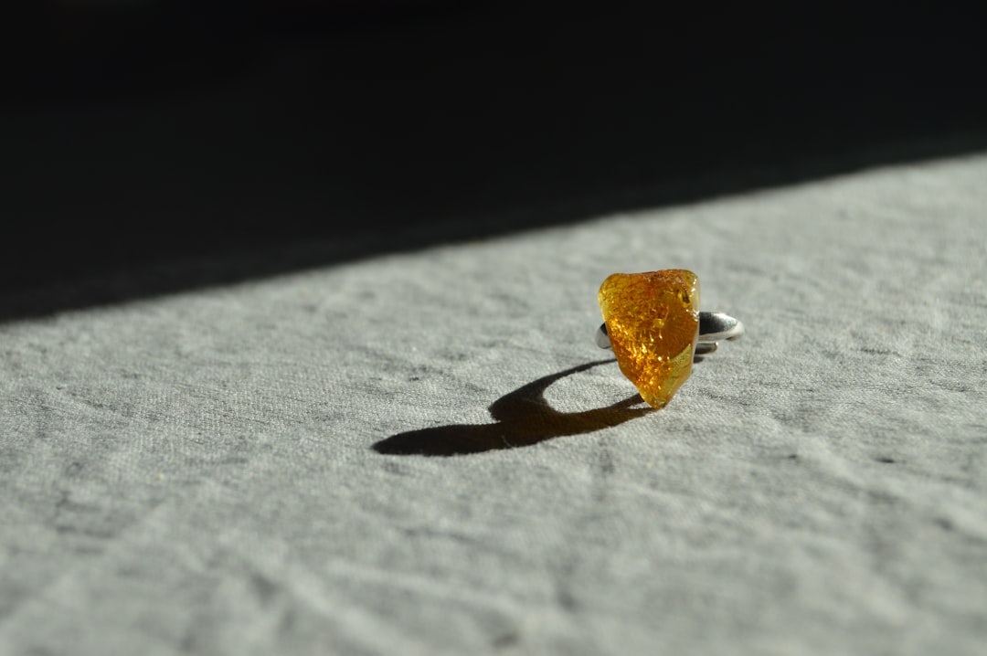
A quick note on terminology, because amber straddles yellow and orange. Amber — commonly cited as #FFBF00 — is a warm golden yellow-orange, named after fossilized tree resin. It is frequently confused with pure orange (redder) and gold (more metallic). If you need those distinctions, see our comparisons of amber vs orange and amber vs gold. Throughout this guide, “shades of amber” covers every named variation in that warm, honey-gold family.
Each entry below gives three values so you can use it anywhere: the hex code (for CSS, HTML, and most design tools), the RGB triplet (for screen-based tools that ask for red, green, and blue channels separately), and a short note on the mood and best use of that shade. If you need CMYK or a Pantone match for print, convert from the hex value in your design software, and always proof — bright golds shift noticeably between screen and press.
Bright ambers
These are the core ambers most people picture — bright, glowing yellow-oranges used in signage, energy, and warm accent branding.
| Shade name | Hex | RGB | Notes / use |
|---|---|---|---|
| Amber | #FFBF00 | 255, 191, 0 | Bright golden yellow; warm, energetic. |
| Bright Amber | #FFC200 | 255, 194, 0 | Vivid pure amber; cheerful, bold. |
| Yellow Orange Amber | #FFAE42 | 255, 174, 66 | Warm orange-amber; lively, friendly. |
| Selective Amber | #FFB300 | 255, 179, 0 | Signal-light amber; high visibility, bold. |
| Sunshine Amber | #FFD700 | 255, 215, 0 | Bright gold-yellow; optimistic, vivid. |
| Marigold Amber | #FBB117 | 251, 177, 23 | Warm marigold-gold; rich, sunny. |
Golden ambers
The richer, more saturated golds — saffron, golden amber, and marmalade — that feel luxurious and warm.
| Shade name | Hex | RGB | Notes / use |
|---|---|---|---|
| Saffron | #F4C430 | 244, 196, 48 | Warm spice-gold; rich, exotic. |
| Golden Amber | #D4A017 | 212, 160, 23 | Deep golden yellow; luxurious, warm. |
| Marmalade | #FF8C00 | 255, 140, 0 | Bright orange-amber; zesty, energetic. |
| Sand Amber | #E1A95F | 225, 169, 95 | Soft golden tan; mellow, natural. |
| Goldenrod Amber | #DAA520 | 218, 165, 32 | Muted antique gold; classic, warm. |
| Old Gold Amber | #CB9D06 | 203, 157, 6 | Deep brass-gold; heritage, refined. |
Honey and caramel ambers
Warm, edible-looking ambers — honey, caramel, and toffee — that feel cozy, natural, and inviting.
| Shade name | Hex | RGB | Notes / use |
|---|---|---|---|
| Honey | #EBA937 | 235, 169, 55 | Warm golden honey; cozy, natural. |
| Caramel | #C68E17 | 198, 142, 23 | Deep golden brown; rich, indulgent. |
| Toffee Amber | #D2691E | 210, 105, 30 | Warm orange-brown; toasty, inviting. |
| Butterscotch | #E3A857 | 227, 168, 87 | Soft warm gold; mellow, sweet. |
| Dark Honey | #B8860B | 184, 134, 11 | Deep amber-gold; rich, antique. |
| Amber Sand | #CD853F | 205, 133, 63 | Warm tan-amber; earthy, natural. |
Deep and dark ambers
Pushed toward brown and bronze, these deep ambers feel resinous and warm — the truest match to actual amber stone.
| Shade name | Hex | RGB | Notes / use |
|---|---|---|---|
| Dark Amber | #A56300 | 165, 99, 0 | Deep resin amber; warm, grounded. |
| Brown Amber | #964B00 | 150, 75, 0 | Rich brown-orange; rustic, deep. |
| Bronze Amber | #B5651D | 181, 101, 29 | Warm metallic brown; antique, rich. |
| Cognac Amber | #8B5A00 | 139, 90, 0 | Deep spirit gold; refined, warm. |
| Burnt Amber | #7E4A00 | 126, 74, 0 | Dark toasted gold; moody, earthy. |
| Antique Amber | #9C6B30 | 156, 107, 48 | Muted vintage gold; heritage, soft. |
What are the most popular shades of amber?
The most-used named ambers in design are amber (#FFBF00), honey (#EBA937), saffron (#F4C430), golden amber (#D4A017), and caramel (#C68E17). Bright amber dominates signage, energy, and warm accent branding; honey and caramel bring cozy, edible warmth; saffron adds spice-rich luxury; and dark ambers feel resinous and antique. Lighter ambers feel cheerful and optimistic, while deeper ambers project heritage and craft.
Amber’s appeal is that it reads as the warmest, most inviting member of the yellow family — it carries yellow’s energy and optimism but trades brightness for richness and depth. That makes it a favorite for food and beverage, craft and artisan brands, autumn palettes, and hospitality, where its honey-gold glow does instant warmth. Because it sits between yellow, orange, and gold, amber flexes from bright and energetic to deep and luxurious. Choosing an amber is really choosing how bright, how golden, or how brown you want that warmth to lean.
Amber is the standard signal color for caution lights and warning indicators, which is the single most useful piece of context when specifying it. In interfaces, an amber like #FFBF00 or #FFB300 reads instantly as “warning” or “in progress,” sitting between green (go) and red (stop). The values in the tables above — amber at #FFBF00, honey at #EBA937, saffron at #F4C430 — are the widely cited references, but always pin the exact hex in your documentation. This matters doubly in food packaging and signage, where amber is often realized in print, foil, or backlit material, and small hue shifts read as completely different colors under store or street lighting.
How to use shades of amber in design
Amber is a warm, attention-grabbing color that signals energy and comfort. Pair bright amber with deep navy or charcoal for a confident, high-contrast palette, or with cream and warm brown for a cozy, artisan feel. Deeper caramel and honey tones make excellent backgrounds for food, craft, and hospitality identities.
Practical guidance: amber’s near-complement is a deep blue or indigo, which gives a striking, energetic contrast — a reliable pairing for sports and tech brands. For type, dark amber and caramel stay readable on light backgrounds, while bright amber works best as an accent rather than body text. To keep amber from feeling like a warning light, ground it with cream, brown, and forest green. Amber also pairs beautifully with metallic tones; see our reference on shades of gold, and explore the warmer end of the spectrum in shades of coral.
Frequently Asked Questions
What is the hex code for amber?
Amber is most commonly cited as #FFBF00, which is RGB 255, 191, 0 — a bright golden yellow-orange named after fossilized resin. It is the standard “amber” used in traffic signals and warning indicators, and the widely accepted reference value in design tools.
What is the difference between amber and orange?
Amber (#FFBF00) is a golden yellow-orange that leans toward yellow, while orange (#FFA500) is redder and more saturated. Amber reads as warm, mellow, and gold-like; orange reads as brighter and more energetic. See our full amber vs orange comparison for examples.
What is the difference between amber and gold?
Amber (#FFBF00) is a warm, slightly orange yellow, while gold (#FFD700 or metallic) is brighter and more reflective. Amber feels like honey or resin; gold feels metallic and luxurious. See our amber vs gold comparison for palette guidance and use cases.
Which shade of amber is best for a brand?
For energy and visibility, bright amber (#FFBF00) is bold and cheerful. For food, craft, or hospitality, honey (#EBA937) or caramel (#C68E17) feel warm and inviting. Saffron (#F4C430) adds a spice-rich, luxurious tone. Choose by how bright versus how deep and cozy you want the identity to feel.
What colors go well with amber?
Amber pairs beautifully with deep navy or indigo — its near-complement — for striking contrast, and with cream, brown, and forest green for a warm, natural palette. Charcoal grounds it for a modern look, while teal creates a fresh, contemporary combination.


