Amber vs Orange: How They Differ
The amber vs orange difference is about where each color sits on the path from yellow to red. Amber is a warm orange-yellow with a honeyed, golden quality, leaning toward yellow. Orange is the pure hue between red and yellow, more balanced and slightly more red-leaning than amber. Amber glows; orange pops.
What is amber?
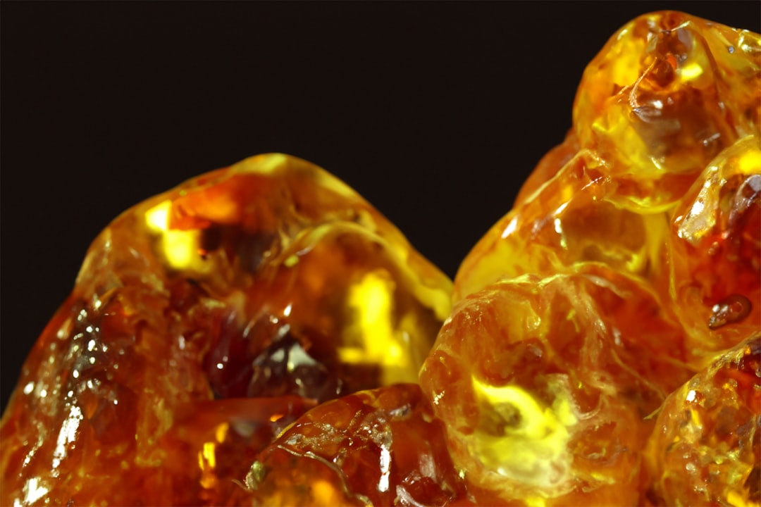
Amber is a warm orange-yellow named after the fossilized resin. A common representative value is #FFBF00, a golden, honeyed tone that leans clearly toward yellow. What defines amber is that glow: it sits between yellow and orange, reading warm, rich, and luminous like honey or a traffic light’s middle signal. Because it carries so much yellow, amber feels softer and warmer than pure orange, and it edges close to gold.
For how this warmth registers emotionally, our orange color meaning guide covers the energy and warmth amber shares with the orange family.
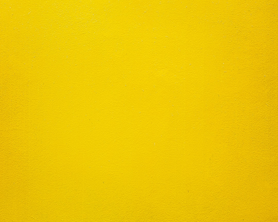
What is orange?
Orange is the pure secondary hue that sits between red and yellow. The CSS web color “orange” is #FFA500, a balanced, vivid orange. Compared with amber, pure orange leans slightly more toward red, so it reads punchier, brighter, and more energetic. It is the color of the fruit it is named for — bold, vibrant, and instantly recognizable. Orange is the broad family that amber edges into on its yellow side.
Where amber feels mellow and golden, pure orange feels loud and energetic, which is why the two read so differently despite their closeness.
What’s the difference between amber and orange?
The defining difference is yellow content. Amber pulls toward yellow, giving it a honeyed, golden glow; pure orange is more balanced and leans slightly red, making it punchier and more vivid. Here is a side-by-side with representative values — both terms span ranges, so these are reference points.
| Property | Amber | Orange |
|---|---|---|
| Hex code | #FFBF00 | #FFA500 |
| RGB | 255, 191, 0 | 255, 165, 0 |
| CMYK | 0, 25, 100, 0 | 0, 35, 100, 0 |
| Undertone | Warm, yellow-leaning (golden) | Warm, slightly red-leaning |
| Hue family | Orange-yellow (amber/gold) | Pure orange |
| Best used for | Warmth, luxury, warning lights, cozy moods | Energy, alerts, sport, bold branding |
| Mood/feel | Glowing, warm, rich, honeyed | Vibrant, energetic, bold, attention-grabbing |
When should you use each?
Use amber when you want warmth and richness with a softer, golden glow. Its honeyed quality suits cozy and premium branding, hospitality, lighting and ambiance, warning and caution signals, and palettes that want warmth without harsh brightness. Amber pairs beautifully with charcoal, navy, cream, and deep brown.
Use orange when you want maximum energy and visibility. Pure orange suits sport, food, and entertainment brands, calls to action, and bold accents that need to grab attention fast. Orange pairs well with blue, navy, white, and black.
To tell them apart in practice, look for yellow versus red: if the color glows golden and honeyed, it is amber; if it reads punchy and edges toward red, it is pure orange. Our guide to warm vs cool colors explains how these warm hues behave against cool accents.
How are amber and orange used across design?
In branding, amber signals warmth, craft, and premium comfort — it appears in spirits, hospitality, and heritage identities that want a golden, inviting glow. Pure orange signals energy, affordability, and fun, dominating sport, tech, and food brands that want to feel bold and accessible. Amber’s yellow lean reads richer and calmer; orange’s balance reads louder.
In interiors and lighting, amber is prized for its cozy, warm-glow quality — it is the color of warm light bulbs, candlelight, and honey-toned wood. Pure orange shows up as a vivid accent that energizes a space. Amber sets a mood; orange makes a statement.
In UI and wayfinding, amber has a specific job: it is the standard caution color, sitting between green (go) and red (stop) on traffic signals and status indicators. Pure orange is used more freely for highlights, buttons, and alerts that need urgency. Because amber carries that warning connotation, designers often choose it deliberately for “proceed with care” states, while reserving orange for general emphasis.
How can you tell amber and orange apart?
The simplest test is to ask whether the color glows yellow or pushes toward red. Amber leans clearly toward yellow, so it reads golden and honeyed — held next to pure orange, amber looks lighter, warmer, and more luminous, like sunlight through honey. Orange sits more balanced and tips slightly toward red, so it reads punchier and more saturated by comparison.
A second reliable check is the association each color triggers. Amber evokes warm light, whisky, and traffic-signal caution — soft, rich, and slightly mellow. Pure orange evokes the fruit, safety cones, and high-energy branding — loud and direct. If a swatch makes you think of glowing light and warm wood tones, it is amber; if it makes you think of citrus and bold alerts, it is pure orange. When the two sit together in a gradient, the transition from amber’s yellow glow to orange’s red-leaning vibrancy is easy to spot, which is exactly why designers use them as a pair to suggest warmth and movement.
Do amber and orange go together?
Yes — they sit right next to each other on the warm spectrum, so they layer into a rich, glowing gradient. An amber base with orange accents (or vice versa) reads cohesive and sun-warmed, especially with brown and cream added for depth. For closely related warm-tone comparisons, see our amber vs gold breakdown, browse the full range in our shades of orange guide, and explore color psychology for why warm tones feel inviting.
Frequently Asked Questions
Is amber the same as orange?
No. Amber is a warm orange-yellow with a honeyed, golden glow (around #FFBF00) that leans toward yellow, while pure orange (commonly #FFA500) is more balanced and leans slightly red. Amber reads mellow and luminous; orange reads punchy and vivid. The extra yellow in amber is the key difference.
Is amber more yellow or more orange?
Amber sits between yellow and orange but leans toward yellow, which gives it its golden, honeyed glow. That yellow content is exactly what separates it from pure orange and edges it close to gold, making amber read warmer and softer than a balanced orange.
What is the hex code for amber?
The common reference is #FFBF00, a golden orange-yellow. Because amber describes a honeyed orange-yellow quality rather than one fixed standard, it spans a range — from brighter, more yellow ambers to deeper, more orange ones that edge toward gold or burnt orange.
What colors go with amber?
Amber pairs beautifully with charcoal, navy, deep brown, cream, and teal. Its golden warmth makes cool tones like navy and teal especially striking as contrast, while neutrals let amber glow as a rich accent without competing for attention.
Is amber the same as gold?
They are close but not identical. Amber is a warm orange-yellow, while gold typically carries a metallic sheen and can lean slightly more yellow or brown. Amber describes the hue itself, whereas gold often implies a reflective, metallic quality on top of a similar warm tone.