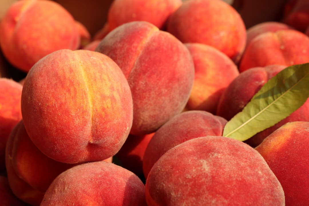
Shades of Peach: Names and Hex Codes
There are many recognized shades of peach, from the soft pastel classic to deep coral peaches and warm apricots. Below is a practitioner reference: each shade with its name, hex code, RGB value, and a note on where it works best. Use it as a swatch library when building a palette, and pair it with our guide to color psychology when you need the symbolism behind the swatch.
A quick note on terminology, because peach sits between pink and orange. Peach — commonly cited as #FFE5B4 (the CSS color “peachpuff” is a close relative) — is a soft, warm pale orange-pink, named after the fruit. It is frequently confused with pink (cooler) and apricot (more orange). If you need those distinctions, see our comparisons of peach vs pink and peach vs apricot. Throughout this guide, “shades of peach” covers every named variation in that soft, fruit-inspired warm pastel family.
Each entry below gives three values so you can use it anywhere: the hex code (for CSS, HTML, and most design tools), the RGB triplet (for screen-based tools that ask for red, green, and blue channels separately), and a short note on the mood and best use of that shade. Peaches are light, warm tones — they make excellent backgrounds, soft accents, and skin-tone-adjacent palettes, and they reproduce well in both screen and print.
Classic peaches
These are the core peaches most people picture — soft, warm pale tones used in beauty, lifestyle, and wedding branding.
| Shade name | Hex | RGB | Notes / use |
|---|---|---|---|
| Peach | #FFE5B4 | 255, 229, 180 | Soft warm pale peach; gentle, inviting. |
| Peach Orange | #FFCC99 | 255, 204, 153 | Warm light orange-peach; cheerful, soft. |
| Peach Puff | #FFDAB9 | 255, 218, 185 | CSS peach puff; delicate, airy. |
| Light Peach | #FFE0BD | 255, 224, 189 | Pale warm cream-peach; subtle, soft. |
| Deep Peach | #FFCBA4 | 255, 203, 164 | Warm mid peach; rich, glowing. |
| Peach Cream | #FADFAD | 250, 223, 173 | Yellow-leaning pale peach; mellow, warm. |
Soft pastel peaches
The palest, most delicate peaches — barely-there warm tints perfect for backgrounds and romantic palettes.
| Shade name | Hex | RGB | Notes / use |
|---|---|---|---|
| Peach Whisper | #FFF0E1 | 255, 240, 225 | Almost-white warm tint; airy, subtle. |
| Peach Mist | #FCEADE | 252, 234, 222 | Pale blush-peach; soft, romantic. |
| Peach Blush | #FFE8D6 | 255, 232, 214 | Light warm pink-peach; gentle, pretty. |
| Powder Peach | #FBE0D0 | 251, 224, 208 | Soft powdery peach; calm, delicate. |
| Peach Linen | #FFEDE0 | 255, 237, 224 | Warm off-white; neutral, soft background. |
| Pale Apricot | #F7D9C4 | 247, 217, 196 | Muted soft peach; understated, warm. |
Apricot peaches
Warmer, more orange peaches — apricot tones that feel sunny, ripe, and energetic.
| Shade name | Hex | RGB | Notes / use |
|---|---|---|---|
| Apricot | #FBCEB1 | 251, 206, 177 | Soft warm orange-peach; ripe, friendly. |
| Light Apricot | #FDD5B1 | 253, 213, 177 | Pale apricot; gentle, sunny. |
| Deep Apricot | #F8B878 | 248, 184, 120 | Rich orange-peach; warm, glowing. |
| Sandy Apricot | #F4A460 | 244, 164, 96 | Warm tan-peach; earthy, sunny. |
| Apricot Glow | #FFB07C | 255, 176, 124 | Bright warm peach; energetic, lively. |
| Dusty Apricot | #E8A87C | 232, 168, 124 | Muted earthy peach; soft, refined. |
Coral and deep peaches
Pinker and deeper peaches that tip toward coral and salmon — the warmest, most saturated of the family.
| Shade name | Hex | RGB | Notes / use |
|---|---|---|---|
| Melon | #FEBAAD | 254, 186, 173 | Soft pink-peach; sweet, fresh. |
| Coral Peach | #FF9E80 | 255, 158, 128 | Warm pink-orange; lively, modern. |
| Salmon Peach | #FF8C69 | 255, 140, 105 | Deep coral-peach; warm, vivid. |
| Coral Pink Peach | #F88379 | 248, 131, 121 | Pink-leaning coral; soft, romantic. |
| Dark Salmon Peach | #E9967A | 233, 150, 122 | Muted warm coral; earthy, rich. |
| Terracotta Peach | #F2A285 | 242, 162, 133 | Warm clay-peach; grounded, natural. |
What are the most popular shades of peach?
The most-used named peaches in design are peach (#FFE5B4), peach puff (#FFDAB9), apricot (#FBCEB1), deep peach (#FFCBA4), and melon (#FEBAAD). Soft classic peach dominates beauty, lifestyle, and wedding branding; peach puff and pastel peaches work as gentle backgrounds; apricot adds sunny warmth; and coral peaches push toward vivid, modern energy. Lighter peaches feel calm and romantic, while deeper ones feel warm and lively.
Peach’s appeal is that it is one of the most flattering, approachable colors in the warm family — it carries orange’s friendliness and pink’s softness without the intensity of either. That makes it a favorite for beauty and skincare, weddings, food, and wellness brands, where its skin-tone-adjacent warmth feels inviting and human. Because it sits between pink, orange, and cream, peach flexes from barely-there pastel to glowing coral. Choosing a peach is really choosing how pale, how orange, or how pink you want that soft warmth to lean.
Peach is one of the most reliable backgrounds for warm, human-centered design, which is the single most useful thing to know when specifying it. A soft peach like #FFE5B4 or #FFDAB9 reads as gentle and welcoming where pure white can feel clinical. The values in the tables above — peach at #FFE5B4, peach puff at #FFDAB9, apricot at #FBCEB1 — are the widely cited references, but always pin the exact hex in your documentation. This matters in beauty and packaging especially, where peach often appears as a large background field and small hue shifts change the entire mood from fresh to dated.
How to use shades of peach in design
Peach is a warm, friendly tone that works beautifully as a soft background or gentle accent. Use classic peach or peach puff as a welcoming background field, and pair it with cream, white, and soft greens for a fresh, natural palette. Deeper coral peach and apricot bring energy and warmth as accent colors in beauty and lifestyle identities.
Practical guidance: peach’s complement is a soft teal or mint green, which gives a fresh, balanced contrast — a reliable pairing for wellness and beauty brands. For type, peach is too light to use as text on white, so reserve it for backgrounds and pair it with charcoal or brown for readable copy. To keep peach feeling modern rather than dated, combine it with crisp white, terracotta, and sage rather than only pastels. Peach also sits beautifully next to its warmer cousins; see our comparison of peach vs apricot, and explore the deeper end of the family in shades of coral.
Frequently Asked Questions
What is the hex code for peach?
Peach is most commonly cited as #FFE5B4, which is RGB 255, 229, 180 — a soft, warm pale orange-pink named after the fruit. The closely related CSS color “peachpuff” is #FFDAB9. Both are widely used references; #FFE5B4 is the classic “peach” value.
What is the difference between peach and pink?
Peach (#FFE5B4) is a warm color with orange and yellow in it, while pink (#FFC0CB) is cooler and leans toward red. Peach feels sunny and skin-tone-adjacent; pink feels cooler and sweeter. See our full peach vs pink comparison for examples and palettes.
What is the difference between peach and apricot?
Peach (#FFE5B4) is a paler, softer warm pastel, while apricot (#FBCEB1) is slightly more orange and saturated. Peach reads as delicate and creamy; apricot reads as warmer and riper. See our peach vs apricot comparison for guidance on which to choose.
Which shade of peach is best for a brand?
For beauty, wellness, or weddings, soft peach (#FFE5B4) or peach puff (#FFDAB9) feel gentle and welcoming as backgrounds. For more energy, coral peach (#FF9E80) or apricot (#FBCEB1) work well as accents. Choose by how calm and romantic versus how warm and lively you want the identity to feel.
What colors go well with peach?
Peach pairs beautifully with soft teal or mint — its complement — for a fresh, balanced look, and with cream, white, and sage for a natural palette. Charcoal and brown make readable text over peach, while terracotta and gold add warmth and a modern, grown-up feel.


