What Font Does Oreo Use?
The oreo font question has a simple answer: the OREO logo is bespoke, rounded bold lettering, so there is no single typeface you can install to recreate it. The brand surrounds that custom wordmark with a clean sans for everyday text. Below we separate the logo from the supporting type, flag what is proprietary, and name the closest free fonts.
Oreo is a good example of a snack brand whose recognizable look comes from custom, friendly lettering rather than a stock font. For how this compares with other big names, see our pillar on famous brand fonts and what the big logos use.
What font is the Oreo logo?
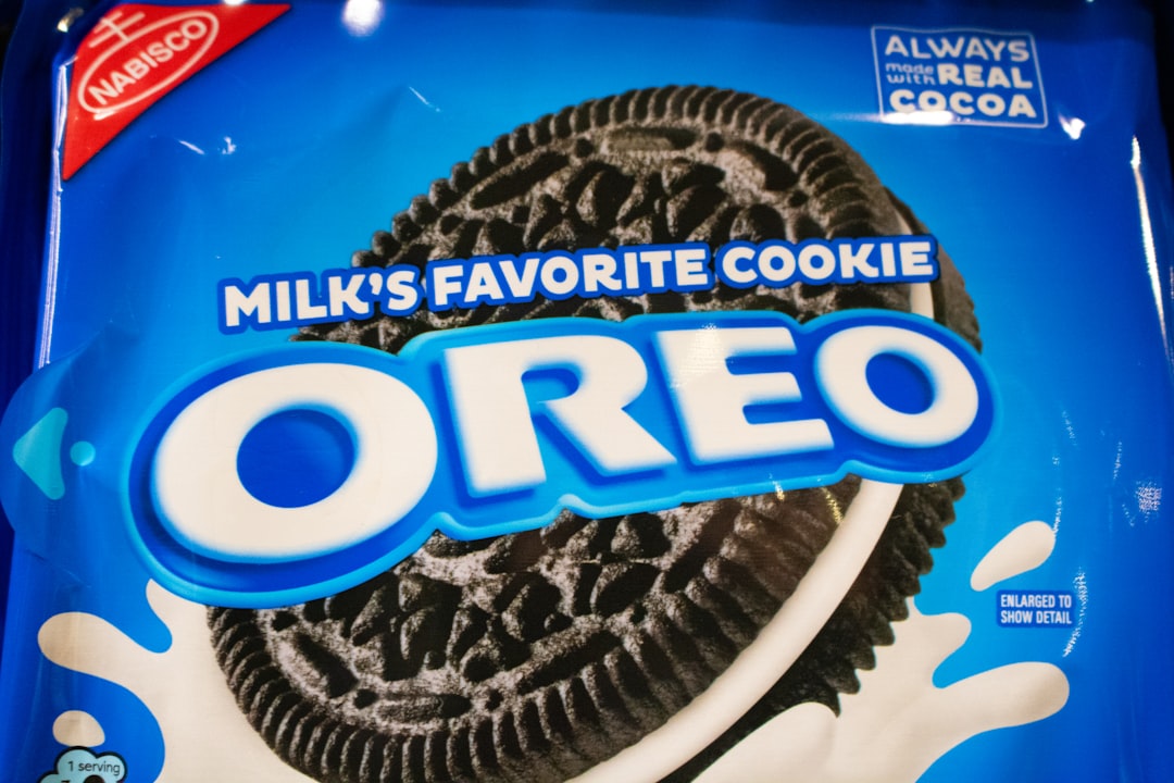
The OREO wordmark is a custom rounded bold sans-serif: chunky, all-caps letters with soft, rounded terminals that give the brand its playful, approachable character. It is bespoke lettering, refined over the brand’s history, and not released as a commercial typeface — so there is no “Oreo font” download that matches it exactly. The rounded geometry is the signature detail; it reads as friendly and snackable rather than corporate.
Because the wordmark is custom and trademarked, any download claiming to be the official Oreo font is an unofficial recreation. Where the exact letterforms have not been published as a specimen, we hedge rather than guess at a name.
What font does the Oreo brand use?
Around the wordmark, Oreo uses a clean sans-serif for product descriptions, variant names, nutrition panels, and digital copy. A simple, legible sans keeps packaging readable while the rounded logo carries the personality. As with most large CPG brands, this supporting type is typically custom or licensed for the brand’s exclusive use rather than a free Google Font.
The dependable facts: the logo is a custom rounded bold sans, and the supporting text is a clean sans-serif — both proprietary. We avoid inventing a specific family name where the brand has not confirmed one.
Is the Oreo font free to download?
No. The rounded wordmark and the supporting sans are proprietary, and the wordmark is a registered trademark. They are not available for public download or licensing. If you are doing commercial or client work, it is worth knowing how a trademarked logo differs from a licensable font — our font licensing guide explains what you can and cannot legally use.
What are free Oreo font alternatives?
To capture the rounded, friendly bold-sans feel of the OREO wordmark, use a free rounded display sans:
- Baloo 2 (free) — a heavy, rounded display sans with soft corners that closely matches the playful OREO character.
- Nunito (free) — a rounded sans with a full weight range; use a heavy weight for a similar friendly, chunky look.
- Fredoka (free) — a rounded, bubbly geometric sans if you want an even more playful display feel.
For supporting body text, pair any of these with a neutral sans like Open Sans. To combine a rounded display font with a clean body face, see our font pairing guide. If you are exploring snack and CPG branding more broadly, our breakdowns of what font Kit Kat uses and what font Snickers uses show how other confectionery brands handle custom lettering.
Oreo fonts vs. the free alternatives
| Use case | Oreo font | Free alternative |
|---|---|---|
| Rounded wordmark | Custom rounded bold sans (proprietary) | Baloo 2 (Google Fonts) |
| Friendly display headlines | Custom lettering (proprietary) | Nunito / Fredoka (Google Fonts) |
| Body & packaging copy | Clean corporate sans (proprietary) | Open Sans (Google Fonts) |
Why does Oreo use a custom font?
A bespoke rounded wordmark gives Oreo an ownable, instantly recognizable identity that signals fun and approachability — exactly the mood a snack brand wants. Custom lettering cannot be copied with a free download, which protects the trademark and keeps the look consistent across countless flavors, limited editions, and global markets. It is the same logic behind most confectionery logos: the distinctive, friendly letterforms are a brand asset worth commissioning. The rounded forms also photograph and animate well, which matters for a brand that lives heavily in social and video, where the logo has to stay legible at small sizes and in motion. If you are designing in this style yourself, lean into generous letter weight, soft corners, and open counters — those three traits do most of the work in reading as playful. A free rounded display sans like Baloo 2 already carries all of them, so you can land the OREO mood legally without any custom drawing.
Frequently Asked Questions
What font does the Oreo logo use?
The Oreo logo uses a custom rounded bold sans-serif — chunky all-caps letters with soft, rounded terminals. It is bespoke lettering, not a downloadable typeface, so there is no exact font to install. For a similar playful, rounded look, free fonts like Baloo 2 or Nunito come closest.
Is the Oreo font a real downloadable font?
No. The OREO wordmark is custom, trademarked lettering created for the brand, not a typed font available to the public. Any “Oreo font” download you find is an unofficial recreation. For a free, legal alternative, use a rounded bold sans such as Baloo 2 or Fredoka.
Is the Oreo font free to download?
No. The rounded wordmark and the supporting sans-serif are proprietary, and the logo is trademarked. They are not available to license. For a free approximation, pair a rounded display sans like Baloo 2 or Nunito with a clean body sans such as Open Sans.
What free font looks like the Oreo font?
Baloo 2 is the closest free match to the OREO wordmark, with heavy, rounded letterforms and soft corners. Nunito and Fredoka are good alternatives for the same friendly feel. All are free on Google Fonts and licensed for commercial use, unlike the proprietary Oreo lettering.
Can I use the Oreo font for my project?
You cannot use the actual Oreo wordmark, which is proprietary and trademarked, and you should not reproduce it. You can legally create a similar rounded, playful look for your own original brand using free fonts like Baloo 2, Nunito, or Fredoka.


