What Font Does Snickers Use?
The snickers font answer is simple: the wordmark is bespoke bold italic lettering, so no single typeface reproduces it exactly. The brand surrounds that custom logo with a clean sans for everyday text. Below we separate the logo from the supporting type, flag what is proprietary, and name the closest free fonts.
Snickers is a strong example of a confectionery brand whose punchy, energetic identity comes from custom bold italic lettering rather than a stock font. For how this compares with other big names, see our pillar on famous brand fonts and what the big logos use.
What font is the Snickers logo?
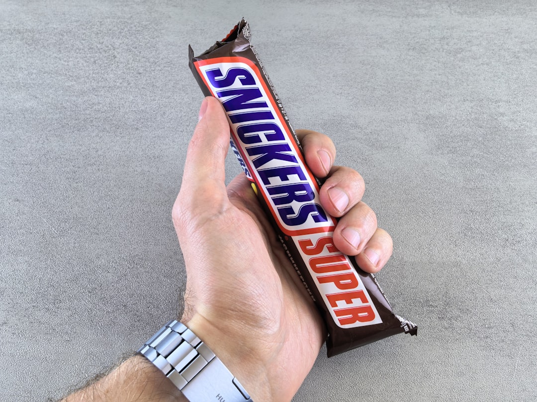
The Snickers wordmark is custom bold italic lettering — heavy, forward-slanting letters that convey energy and momentum, fitting for a brand marketed around hunger and action. It is bespoke artwork, refined over the brand’s history, and not released as a commercial typeface, so there is no “Snickers font” download that matches it exactly. The strong italic slant and weight are the signature details.
Because the wordmark is custom and trademarked, any download claiming to be the official Snickers font is an unofficial recreation. Where the exact letterforms have not been published as a specimen, we hedge rather than guess at a name.
What font does the Snickers brand use?
Around the wordmark, Snickers uses a clean sans-serif for taglines, variant names, nutrition information, and digital copy. A simple, legible sans balances the bold italic logo and keeps packaging readable across the brand’s many sizes and editions. As with most large CPG brands, this supporting type is generally custom or licensed for the brand’s exclusive use rather than a free Google Font.
The reliable facts: the logo is custom bold italic lettering, and the supporting text is a clean sans-serif — both proprietary. We avoid inventing a specific family name where the brand has not confirmed one.
Is the Snickers font free to download?
No. The wordmark and the supporting sans are proprietary, and the wordmark is a registered trademark. They are not available for public download or licensing. If you are doing commercial or client work, it is worth knowing how a trademarked logo differs from a licensable font — our font licensing guide explains free, commercial, and bespoke type and what you can legally use.
What are free Snickers font alternatives?
To approximate the bold, energetic, italic feel of the Snickers wordmark, use a heavy italic sans:
- Montserrat (free) — use a black or extra-bold italic weight for a heavy, geometric, forward-leaning look.
- Archivo (free) — a sturdy grotesque with strong bold and italic weights, good for a punchy display feel.
- Oswald (free) — a condensed sans that, set bold, gives an energetic, impactful headline; pair with a slant for the italic feel.
For supporting body text, pair any of these with a neutral sans like Open Sans. To combine a bold display font with a clean body face, see our font pairing guide. If you are exploring confectionery branding more broadly, our breakdowns of what font Kit Kat uses and what font Oreo uses show how other snack brands handle custom lettering.
Snickers fonts vs. the free alternatives
| Use case | Snickers font | Free alternative |
|---|---|---|
| Bold italic wordmark | Custom bold italic lettering (proprietary) | Montserrat Black Italic (Google Fonts) |
| Punchy display headlines | Custom lettering (proprietary) | Archivo / Oswald (Google Fonts) |
| Body & packaging copy | Clean corporate sans (proprietary) | Open Sans (Google Fonts) |
Why does Snickers use a custom font?
A bespoke bold italic wordmark gives Snickers an ownable, high-energy identity that stands out on a crowded shelf and reinforces its active, hunger-busting brand voice. Custom lettering cannot be reproduced with a free download, which protects the trademark and keeps the look consistent across sizes, limited editions, and global markets. It is the same logic behind most confectionery logos: the distinctive letterforms are a long-term brand asset worth commissioning. The aggressive italic also pulls double duty as a visual cue for speed and appetite, reinforcing the brand’s messaging before a single word is read. If you want that energy in your own work, the key levers are weight and slant: push the weight to black and add a real or applied italic, and even a neutral grotesque starts to feel urgent. A free face like Montserrat or Archivo in a heavy italic delivers that momentum legally, so you can capture the Snickers attitude without commissioning custom type.
Frequently Asked Questions
What font does the Snickers logo use?
The Snickers logo uses custom bold italic lettering — heavy, forward-slanting letters built for energy. It is bespoke artwork, not a downloadable typeface, so there is no exact font to install. For a similar look, a black italic weight of Montserrat or Archivo comes closest among free fonts.
Is the Snickers font a real downloadable font?
No. The Snickers wordmark is custom, trademarked lettering created for the brand, not a typed font available publicly. Any “Snickers font” download is an unofficial recreation. For a free, legal alternative, use a bold italic sans such as Montserrat Black Italic or Archivo.
Is the Snickers font free to download?
No. The wordmark and the supporting sans-serif are proprietary, and the logo is trademarked. They are not available to license. For a free approximation, pair a heavy italic sans like Montserrat or Archivo with a clean body sans such as Open Sans.
What free font looks like the Snickers font?
A black or extra-bold italic weight of Montserrat is the closest free match to the heavy, slanted Snickers wordmark. Archivo and a bold, skewed Oswald also work for the punchy feel. All are free on Google Fonts and licensed for commercial use.
Can I use the Snickers font for my project?
You cannot use the actual Snickers wordmark, which is proprietary and trademarked, and you should not reproduce it. You can legally create a similar bold, energetic italic look for your own original brand using free fonts like Montserrat, Archivo, or Oswald.


