Fall Color Palette: Hex Codes and Ideas
A fall color palette translates the season’s foliage into design-ready color: the burnt oranges, mustards and deep reds of falling leaves, plus the olive and brown of the forest floor. Below are real hex codes, five copy-and-paste palettes, and a reference table so you can drop these colors straight into a brand, a website, or a print layout.
Because every color here carries a warm undertone, fall palettes feel cohesive almost automatically. The skill is balancing the saturated leaf colors against the quieter neutrals so the result reads rich rather than muddy.
What colors are in a fall color palette?
The fall family is built from warm hues pulled toward red and yellow, kept at medium saturation so they feel sun-faded rather than electric. The core members are burnt orange , mustard , deep red , olive , coffee brown and antique gold .
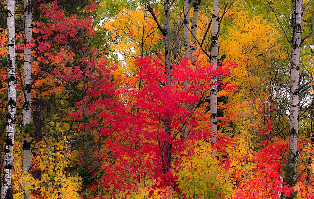
These are all warm colors, which is what gives fall its enveloping, low-energy mood. For why orange and brown feel comforting, see our notes on color psychology. Fall and autumn schemes are near-synonymous — for the leaf-forward variant see our autumn color palette, and for the wider hue range browse shades of orange.
Core fall colors (with hex codes)
| Color name | Hex | RGB | Role |
|---|---|---|---|
| Burnt orange | #CC5500 | 204, 85, 0 | Primary |
| Mustard | #D4A017 | 212, 160, 23 | Accent |
| Deep red | #8B0000 | 139, 0, 0 | Accent |
| Olive | #6B7A3F | 107, 122, 63 | Accent |
| Coffee brown | #6F4E37 | 111, 78, 55 | Neutral |
| Antique gold | #C9A227 | 201, 162, 39 | Accent |
5 fall color palettes (with hex codes)
Cozy Fall
The everyday fall scheme: burnt orange #CC5500, coffee brown #6F4E37, mustard #D4A017, olive #6B7A3F and cream #FFF8DC. Warm, balanced, and the safe default for cafe menus, candle brands, and seasonal campaigns.
Harvest
Burnt orange #CC5500, antique gold #C9A227, deep red #8B0000, olive #6B7A3F and cream. Reads like a farmers’ market in October — ideal for food packaging, craft beer, and produce brands.
Moody Fall
Deep red #8B0000, burnt orange #CC5500, coffee brown #6F4E37, near-black espresso #3B2F2F and parchment #E8DCC0. Darker and more dramatic — good for premium spirits, leather goods, and editorial layouts.
Golden Hour
Mustard #D4A017, burnt orange #CC5500, antique gold #C9A227, coffee brown #6F4E37 and cream. The brightest of the set — energetic, sunlit, and friendly for lifestyle and wellness brands.
Forest Floor
Olive #6B7A3F, coffee brown #6F4E37, deep red #8B0000, walnut #4A3B2A and parchment. The most muted, nature-led option — suits outdoor gear, herbal products, and sustainable brands.
Why these fall colors work together
The cohesion of a fall palette is not an accident — it comes from shared undertone. Burnt orange, mustard, deep red and coffee brown all sit in the red-to-yellow arc of the color wheel, and even the olive green leans warm because of its yellow content. When every hue carries the same warm bias, the eye reads them as one family, the way leaves on a single tree shift through related shades as they turn. This is analogous harmony: colors that are neighbors on the wheel always feel restful together.
The second mechanism is desaturation. Pure orange and pure red are aggressive, but the fall versions are knocked back toward brown and dusty earth. That muting is what makes the palette feel seasonal and mature rather than like a child’s box of crayons. Deep red (#8B0000) is the clearest example: it is red taken almost to its darkest, most dignified point, which is why it anchors a palette instead of shouting over it. Cream and parchment then function as the negative space — the sky behind the leaves — giving the saturated colors room to register one at a time.
Value range is the final ingredient. A good fall palette spans from the near-white of cream down to the near-black of walnut, with the leaf colors filling the middle. That spread is what lets you build legible hierarchy: dark text on cream, mid-tone accents for emphasis, and the occasional deep-red highlight. Without the light and dark anchors, the warm mid-tones blur into a single hazy band.
How to use a fall palette in design
Pick one warm hue to dominate — usually burnt orange — and let it cover the largest areas. Use mustard and deep red as accents on a roughly 60-30-10 split, then keep cream and coffee brown as the neutrals that carry text and backgrounds. Because all the colors share a warm bias, you rarely get clashes; the risk is the opposite, where everything blends into one orange-brown haze. Counter that with strong value contrast: pair a near-black walnut against cream so type stays legible.
Texture amplifies fall palettes. On print, an uncoated or recycled stock reinforces the harvested, tactile feel. On screen, photography of foliage, wood grain or linen lets the palette sit naturally instead of looking flatly digital.
Fall palette for branding, web and interiors
Branding: fall schemes suit coffee roasters, bakeries, craft beverages, and home-fragrance brands, and anything seasonal. They signal warmth, craft and comfort. Anchor the identity on one or two leaf colors and reserve deep red for a logo or call-to-action. If you are choosing a permanent identity rather than a seasonal campaign, work through how to choose brand colors first.
Web: use cream as the page background, coffee brown or walnut for body text, and burnt orange for buttons and links. Test mid-tones like mustard against your background for contrast — warm light hues often fall short of accessibility thresholds, so darken them or reserve them for large elements.
Interiors: fall palettes are perennial for hospitality and residential spaces. Walls in cream or olive, furniture in coffee brown, and deep-red textiles create the cozy effect almost on their own. For the leaf-forward sibling scheme, compare our autumn color palette.
Frequently Asked Questions
What are the main fall colors?
The defining fall colors are burnt orange (#CC5500), mustard (#D4A017), deep red (#8B0000), olive (#6B7A3F), coffee brown (#6F4E37) and antique gold (#C9A227), usually grounded by a cream or parchment neutral. They are warm, medium-saturation hues drawn from turning leaves and the forest floor.
What is the hex code for burnt orange?
Burnt orange is commonly written as #CC5500 (RGB 204, 85, 0), a deep red-leaning orange that anchors most fall palettes. Slightly different versions exist around #CC5500 to #BF5700, but #CC5500 is the widely used reference value and pairs cleanly with mustard and brown.
Are fall and autumn palettes the same thing?
Yes — “fall” and “autumn” name the same season, so the palettes are effectively identical: warm earth tones built from burnt orange, mustard, deep red, olive and brown. “Fall” is the more common US term and “autumn” the more common British one; designers use the two interchangeably.
How many colors should a fall palette have?
Five is the practical sweet spot: two warm dominants, one or two accents, and one neutral. Fewer than four can feel flat, and more than six often muddies the scheme because the warm hues start competing. Use value contrast rather than extra hues to add depth.


