What Font Does Gillette Use?
The Gillette font question usually means one of two things: the lettering inside the famous logo, or the type on the razor packaging. The short answer is that the logo is custom artwork — its signature is the angled cut through the capital “G” — while the surrounding brand system leans on a clean, confident sans-serif. None of the exact letterforms are downloadable as a font, but free faces get you close. For more breakdowns like this, see our hub on famous brand fonts.
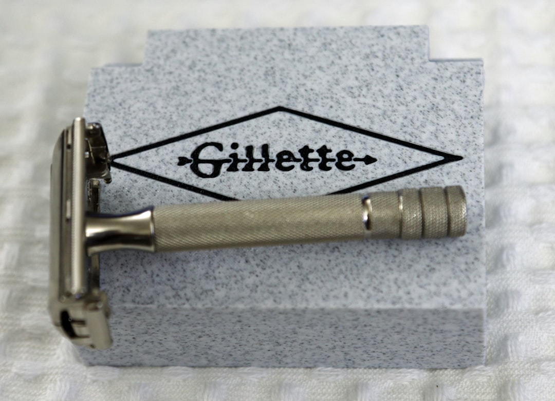
What font is the Gillette logo?
The Gillette logo wordmark is custom lettering, not a licensed typeface. Its most recognizable detail is the capital “G,” which is sliced by a sweeping diagonal that doubles as the brand’s “edge” cue — a fitting visual metaphor for a razor company. The rest of the wordmark uses clean, slightly bold sans-serif forms with even strokes and tight, deliberate spacing. Because the letters were drawn specifically for the brand and are protected as a trademark, there is no official “Gillette font” file you can download. Any result you find on a free-font site is an unofficial imitation of the wordmark.
What typeface does the Gillette brand use?
Across packaging, advertising, and the website, Gillette pairs its custom mark with a clean, modern sans-serif for headlines and body copy — the kind of neutral, high-legibility type that reads as engineered and precise. Publicly documented specimens naming an exact official brand font are limited, so we’d treat any single definitive claim with some caution. What is consistent is the style: a grotesque or neo-grotesque sans with a tall x-height and steady, unfussy letterforms, much in the Helvetica tradition that dominates consumer-goods branding.
Why does Gillette use a custom logo font?
Brands at Gillette’s scale commission custom lettering for two reasons: ownership and distinctiveness. A bespoke wordmark can be trademarked and can carry a unique gesture — here, the cut “G” — that an off-the-shelf font never could. It also guarantees the mark looks identical on a razor handle, a billboard, and a phone screen. If you want to understand the trade-offs between licensing a typeface and commissioning one, our font licensing guide walks through the costs and rights involved.
Free fonts that look like the Gillette font
You can’t use the Gillette wordmark itself, but you can recreate its clean, precise feel with free fonts. Match the role first: a bold, even sans for the logotype and headlines, and a neutral sans for body copy.
| Use case | Gillette uses | Free alternative |
|---|---|---|
| Logo / wordmark | Custom lettering (cut “G”) | Inter (bold) or Arimo (bold) |
| Headlines | Clean bold sans | Inter or Archivo |
| Body / packaging copy | Neutral sans | Arimo or Inter (regular) |
| UI & fine print | Neutral sans | Inter (regular) |
Inter is the closest free, do-it-all match — a neo-grotesque with a tall x-height, wide language coverage, and a confident bold weight that mirrors Gillette’s engineered tone. Arimo is metric-compatible with Arial/Helvetica, so it nails the neutral, corporate feel if you want something even more classic. Both are free for commercial use under the SIL Open Font License (Inter) and Apache License (Arimo). For the logo gesture itself, you’d need to draw the cut “G” by hand — the type alone won’t reproduce it.
Is the Gillette font a known typeface like Helvetica?
It’s a reasonable guess, because the supporting letterforms sit firmly in the neo-grotesque family that Helvetica defines — but the wordmark itself is custom, not Helvetica or any single licensed face. The distinction matters: a brand can reference a well-known style (clean, neutral, engineered) while drawing its own letters so the mark stays unique and trademarkable. If you study our breakdown of the Helvetica font, you’ll see the same neutral grotesque DNA — even strokes, closed apertures, tall x-height — that Gillette’s brand type echoes. The cut “G,” though, is pure custom artwork and has no equivalent in any off-the-shelf font.
How to recreate the Gillette look
If you’re building a precise, masculine grooming identity in the same spirit, set your wordmark in a bold neutral sans like Inter or Arimo, tighten the tracking slightly, and add a single custom gesture — Gillette’s lesson is that one sharp detail (the sliced letter) carries the whole brand. Keep the palette restrained: dark navy, silver, and white read as clean and technical. For sibling brand breakdowns in personal care, see what font Old Spice uses and what font Nivea uses.
For digital and packaging, set body copy in the same neutral sans at a comfortable size with generous line spacing — grooming products live or die on legibility at small sizes, so prioritize clarity over personality in the small print. Use the bold weight sparingly for emphasis, and reserve the custom gesture for the logo alone. A common mistake is over-styling everything; Gillette succeeds because the wordmark is distinctive precisely because everything around it is restrained and consistent.
Can I use the Gillette font for my own project?
No — not the real wordmark. The Gillette logo is custom lettering and a registered trademark owned by Procter & Gamble. Using it outside official Gillette materials risks both trademark and licensing problems. For your own brand, set a free sans like Inter or Arimo and commission or draw your own distinctive mark. Any “Gillette font” download you find online is an unofficial imitation, not the genuine wordmark.
Frequently Asked Questions
What font does Gillette use in its logo?
Gillette’s logo uses custom lettering rather than a stock typeface, defined by the sliced capital “G” with its sweeping diagonal cut. It is bespoke artwork registered as a trademark, so it is not downloadable. Inter or Arimo are the closest free alternatives for the clean sans-serif feel.
Is the Gillette font available to download?
No. The Gillette wordmark is proprietary custom lettering and a registered trademark, not a font you can download. Any “Gillette font” listed on a free-font site is an unofficial imitation. For a similar clean look, use a legitimate free sans such as Inter or Arimo instead.
What free font looks most like Gillette?
Inter is the closest free match — a neutral neo-grotesque with a confident bold weight that echoes Gillette’s precise, engineered tone. Arimo is another strong option because it is metric-compatible with Helvetica and Arial. Both are free for commercial use.
What is the cut in the Gillette G?
The diagonal slice through the capital “G” is a deliberate brand gesture suggesting a sharp, clean cut — a visual nod to the company’s razors. It is part of the custom wordmark and is one of the most recognizable details in personal-care branding.


