Aquamarine vs Turquoise Compared
The aquamarine vs turquoise question comes down to lightness and intensity within the blue-green range. Aquamarine is a pale, delicate blue-green named after the gemstone — soft enough to feel almost translucent, like shallow seawater. Turquoise is brighter and more saturated, a confident mid-tone tied to the opaque mineral of the same name. Both sit in the cyan zone, but turquoise carries far more punch.
What is aquamarine?
Aquamarine is a light, airy blue-green named after the pale blue beryl gemstone — the name literally means “sea water.” A widely cited web value is #7FFFD4, a soft, high-lightness tint with a gentle green lean. It reads calm, clean, and watery rather than vivid, which is why it feels refreshing and spa-like. Because it is so light, aquamarine works beautifully as a background, a pastel accent, or a wash of color, but it lacks the contrast to carry bold typography on its own.
If you are weighing closely related cyans, our comparisons of aqua vs turquoise and teal vs turquoise cover the brightness and depth distinctions in detail.
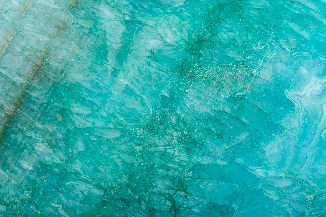
What is turquoise?
Turquoise is a brighter, more saturated blue-green named after the opaque turquoise mineral. The common web value is #40E0D0, a vivid mid-tone that sits squarely between blue and green with a slight blue lean. Compared with aquamarine, turquoise is deeper, more pigmented, and far more assertive — it holds its own as a feature color rather than a wash. That gemstone vibrancy gives turquoise a Southwestern, bohemian, and coastal-resort association, and it pops strongly against white, coral, and warm neutrals.
The defining contrast: aquamarine is a pale tint and turquoise is a vivid mid-tone. For the full spread of related blue-greens, our shades of turquoise guide maps how the family shifts from pale to deep.
What’s the difference between aquamarine and turquoise?
The defining differences are lightness, saturation, and lean. Aquamarine is pale, soft, and slightly more green; turquoise is brighter, more saturated, and slightly more blue. Aquamarine whispers; turquoise speaks up. Here is a side-by-side with representative values — neither is a fixed brand standard, so exact hexes vary.
| Property | Aquamarine | Turquoise |
|---|---|---|
| Hex code | #7FFFD4 | #40E0D0 |
| RGB | 127, 255, 212 | 64, 224, 208 |
| CMYK | 50, 0, 17, 0 | 71, 0, 7, 12 |
| Undertone | Cool, slight green lean | Cool, slight blue lean |
| Hue family | Blue-green (pale tint) | Blue-green (vivid mid-tone) |
| Best used for | Spa/wellness, pastel backgrounds, airy accents | Coastal/boho branding, statement accents, packaging |
| Mood/feel | Calm, watery, fresh, delicate | Vibrant, lively, bold, coastal |
When should you use each?
Use aquamarine when you want softness, calm, and a clean, watery feel. Its high lightness makes it ideal for spa and wellness branding, pastel backgrounds, baby and beauty products, and airy seasonal designs where the color should soothe rather than shout. Aquamarine pairs gracefully with white, sand, soft coral, and warm gold.
Use turquoise when you want vibrancy and a confident pop of blue-green. Its saturation suits coastal, bohemian, and Southwestern branding, statement accents, jewelry and packaging, and call-to-action elements that need to stand out. Turquoise pairs boldly with coral, white, navy, and warm browns.
To tell them apart in practice, check brightness first. Aquamarine is clearly paler and more transparent-looking; turquoise is deeper and more pigmented. Both are cool, but if you are balancing them against warm accents, our guide to warm vs cool colors explains how to keep a blue-green palette from feeling cold.
How are aquamarine and turquoise used across design?
In branding, aquamarine signals calm, cleanliness, and care — it appears in wellness, skincare, and medical brands that want a gentle, reassuring identity. Turquoise signals energy, adventure, and creativity, favored by travel, lifestyle, and artisan brands that want a lively, memorable mark. The choice maps onto whether a brand wants to read soothing or spirited, a distinction explored in our color psychology guide.
In fashion and jewelry, aquamarine is a soft, romantic stone for delicate pieces and pastel palettes, flattering in spring and summer collections. Turquoise is a statement color — bold beaded jewelry, resort wear, and Southwestern styling — that commands attention. Both are gemstone hues, but aquamarine reads dainty while turquoise reads confident.
In interiors and web design, aquamarine works as a calming wash for walls, linens, and large UI areas because its lightness is easy to live with. Turquoise works better as a vivid accent — a tile detail, a feature wall, or a hero button — that pops against neutral surroundings. Print behavior differs too: aquamarine’s pale tint can wash out on uncoated stock, while turquoise’s saturation renders brilliantly in RGB but may dull slightly in CMYK, so brand-critical uses sometimes need a spot color.
Do aquamarine and turquoise go together?
Yes — because both belong to the blue-green family, they harmonize naturally in a tonal, monochromatic scheme. Aquamarine provides a pale, airy base while turquoise adds a brighter, deeper highlight, creating depth without clashing. Add white or sand to keep the pairing fresh, and let a clear hierarchy do the work: use aquamarine for broad areas and reserve turquoise for accents. The combination reads coastal, clean, and cohesive.
Frequently Asked Questions
Is aquamarine the same as turquoise?
No. Aquamarine is a pale, soft blue-green (around #7FFFD4) that leans slightly green, while turquoise is a brighter, more saturated blue-green (around #40E0D0) that leans slightly blue. Both are gemstone-named cyans, but aquamarine is a light tint and turquoise is a vivid mid-tone, so turquoise reads noticeably bolder.
Is aquamarine warm or cool?
Aquamarine is a cool color. It sits in the blue-green range with a gentle green lean, giving it a fresh, watery character. Turquoise is also cool but slightly more blue. Both belong on the cool side of the wheel, which is why they feel calming and refreshing rather than energizing.
What is the hex code for turquoise?
A commonly cited value is #40E0D0, a vivid blue-green with a slight blue lean. Turquoise is not a fixed color standard, so brand and paint versions vary around this value, sometimes deeper or greener. Aquamarine is the separate, paler #7FFFD4. Always confirm against brand guidelines for production work.
Which is better for backgrounds?
Aquamarine is generally better for large backgrounds because its pale, high-lightness tint is easy on the eye and recedes gently behind content. Turquoise is brighter and more saturated, so it works best reserved as a vivid accent against neutral surroundings rather than spread across large areas where it can overwhelm.
Do aquamarine and turquoise go together?
Yes, very well. Because both belong to the blue-green family, they form a natural tonal pairing. Aquamarine provides a pale, airy base while turquoise adds a brighter, deeper highlight. The combination reads coastal and cohesive; add white or sand as a neutral and keep a clear light-to-dark hierarchy for the cleanest result.


