Peridot vs Green: What’s the Difference?
The peridot vs green question is a category-versus-member comparison: peridot is a particular yellow-green shade, while green is the whole hue family. Peridot is a bright, warm, yellow-leaning green tied to the olivine gemstone, sometimes rendered softer at #9ACD32. Pure green is the balanced reference hue with no blue or yellow bias. Side by side, peridot looks warmer and more yellow, while pure green looks neutral.
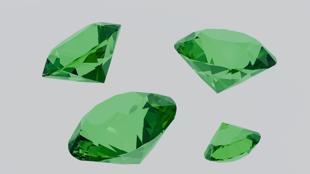
What is peridot?
Peridot is a bright, warm green with a strong yellow lean, named after the olivine gemstone. A vivid representative value is #B4C424, while a softer, more familiar reading sits near #9ACD32 (close to yellow-green). The defining quality is its yellow-green, olive-adjacent warmth, which gives peridot a fresh, springtime, slightly zesty character rather than a deep or cool one. That brightness makes it lively and youthful, pairing well with white, cream, coral, and warm browns.
If you are weighing peridot against other yellow-greens, our comparison of chartreuse vs lime covers how warmth and brightness shift across the yellow-green range.
What is green?
Green in its pure form is the secondary hue made from equal blue and yellow, sitting opposite red on the color wheel. The HTML/CSS keyword “green” is #008000 — a mid-dark, balanced green with no obvious lean toward blue or yellow. As a hue family, “green” spans everything from mint and lime to forest and olive; peridot is one warm, yellow-leaning point within it. Pure green is foundational and neutral, which is why it serves as the reference against which we call other greens “warmer,” “cooler,” “brighter,” or “darker.”
The defining contrast: peridot is one specific, warm, yellow-green shade, while green is the entire hue category. For the full range, our shades of green guide maps how greens shift from yellow-leaning to blue-leaning.
What’s the difference between peridot and green?
The defining differences are scope and temperature. Peridot is a narrow, warm, yellow-leaning, high-brightness shade; pure green is the broad, balanced parent hue. Peridot reads fresh and zesty; pure green reads neutral and natural. Here is a side-by-side with representative values — neither is a fixed brand standard, so exact hexes vary.
| Property | Peridot | Green |
|---|---|---|
| Hex code | #B4C424 (or #9ACD32) | #008000 |
| RGB | 180, 196, 36 | 0, 128, 0 |
| CMYK | 8, 0, 82, 23 | 100, 0, 100, 50 |
| Undertone | Warm, strong yellow lean | Balanced, neutral |
| Hue family | Green (yellow-green jewel tone) | Green (the parent hue) |
| Best used for | Spring palettes, fresh accents, youthful branding | Natural/eco branding, signage, broad fills |
| Mood/feel | Fresh, zesty, lively, springlike | Natural, balanced, grounded, universal |
When should you use each?
Use peridot when you want freshness, energy, and a warm spring-green pop. Its yellow-leaning brightness suits seasonal and youthful branding, beauty and wellness accents, fresh-food packaging, and designs where the green should feel lively and zesty. Peridot pairs cheerfully with white, cream, coral, gold, and warm wood.
Use pure green when you want a balanced, universally readable color that signals nature, growth, or “go.” It suits eco and outdoor branding, wayfinding and signage, success states in UI, and any context where the green should feel grounded rather than zesty. Pure green pairs reliably with white, brown, and earthy neutrals.
To tell them apart in practice, check warmth and yellow content. Peridot is clearly more yellow and brighter; pure green is darker and more neutral. If you are balancing peridot against cool accents, our guide to warm vs cool colors explains how to keep a yellow-green palette balanced.
How are peridot and green used across design?
In branding, peridot signals freshness, optimism, and youthful energy — it appears in wellness, organic, and lifestyle brands that want a bright, modern identity. Pure green signals nature, health, and trust, favored by eco, grocery, and outdoor brands that want an honest, approachable feel. The choice maps onto whether a brand wants to read fresh-energetic or grounded-natural, a distinction explored in our green color meaning guide.
In fashion and jewelry, peridot is a bright, flattering spring-summer tone and a popular birthstone for statement pieces. Pure green is a more versatile, everyday hue for knits and casual wear that reads natural rather than zesty. Both are greens, but peridot commands attention while pure green blends comfortably.
In interiors and web design, peridot works as a lively accent — cushions, glassware, or a feature detail — that brightens neutral surroundings. Pure green can carry larger areas like accent walls and signage because its balanced tone is easy to live with. Print behavior differs too: peridot’s bright yellow-green can shift toward lime or olive in CMYK, so brand-critical uses may need careful adjustment, while pure green converts more predictably.
Do peridot and green go together?
Yes — because peridot is a member of the green family, it harmonizes naturally with pure green in a tonal scheme. Pure green provides a grounded mid-tone base while peridot adds a brighter, warmer highlight, creating depth without clashing. Add cream or gold to enrich the combination, and keep a clear hierarchy: use pure green for broad areas and reserve peridot for fresh accents. See our color psychology guide for why layered greens feel both natural and lively.
Frequently Asked Questions
Is peridot the same as green?
No. Peridot is a specific warm, yellow-leaning green (around #B4C424 to #9ACD32), while “green” is the broad hue family and its pure reference value (around #008000). Peridot is always green, but most greens are not peridot. The difference is scope and warmth: peridot is one yellow-green, jewel-toned member of the larger green category.
Is peridot warm or cool?
Peridot is a warm green. Its strong yellow lean places it on the warm side of the green family, giving it a fresh, zesty character. Pure green is more balanced and neutral. In direct comparison, peridot looks noticeably warmer, brighter, and more yellow than pure green.
What is the hex code for peridot?
A vivid value is #B4C424 and a softer reading is near #9ACD32 (yellow-green). Peridot is not a fixed color standard, so gemstone and brand versions vary around these values. The CSS keyword “green” is the separate, darker #008000. Always confirm against brand guidelines for production work.
Which is better for backgrounds?
Pure green is generally better for large backgrounds because its balanced, mid-dark tone is easy on the eye and predictable in print. Peridot is brighter and more yellow, so it works best reserved as a fresh accent against neutral surroundings rather than spread across large areas where it can feel acidic.
Do peridot and green go together?
Yes, very well. Because peridot belongs to the green family, the two form a natural tonal pairing. Pure green provides a grounded base while peridot adds a brighter, warmer highlight. The combination reads fresh and cohesive; add cream or gold as a neutral and keep a clear light-to-dark hierarchy between the greens.


