Chartreuse vs Lime: What’s the Difference?
The chartreuse vs lime question is really about where a color lands on the yellow-to-green slider. Chartreuse sits closer to yellow with a sharp, electric quality; lime pushes toward green and reads brighter and fruitier. Both are high-energy attention-grabbers. Below we compare hex values, undertones, and how to use each without overwhelming a design.
What is the difference between chartreuse and lime?
The split is hue position. Chartreuse — named after the French liqueur — sits roughly at the midpoint between yellow and green, with a definite yellow lean that gives it an acidic, almost neon glow. Lime leans further into green, taking its cue from the lime fruit’s brighter, juicier color. Both are intensely saturated, but chartreuse reads more yellow and edgy while lime reads more green and lively. Note that “lime” spans a range from the very yellow-green #BFFF00 to the more balanced #32CD32, and none of these names is a fixed standard.
| Attribute | Chartreuse | Lime |
|---|---|---|
| Hex code | #DFFF00 | #32CD32 |
| RGB | 223, 255, 0 | 50, 205, 50 |
| CMYK | 13, 0, 100, 0 | 76, 0, 76, 20 |
| Undertone | Yellow, acidic | Green, fresh |
| Hue family | Yellow-green | Green-yellow |
| Best used for | Bold accents, sports, fashion edge | Energetic branding, food, CTAs, signage |
| Mood/feel | Electric, daring, modern | Lively, fresh, zesty |
What does chartreuse look like?
Chartreuse is the more provocative of the two. The web value #DFFF00 (sometimes called chartreuse yellow) is so close to pure yellow that it almost vibrates, while traditional chartreuse can sit slightly more balanced between yellow and green. Either way, it carries a sharp, acidic energy that feels distinctly modern and a little rebellious.
Because it is so intense, chartreuse works best in small, deliberate doses — a single accent in fashion, a highlight in sports branding, or a daring pop against black and charcoal. Overused, it overwhelms; placed precisely, it commands instant attention. For a softer end of the green spectrum, contrast this with our mint vs seafoam comparison.
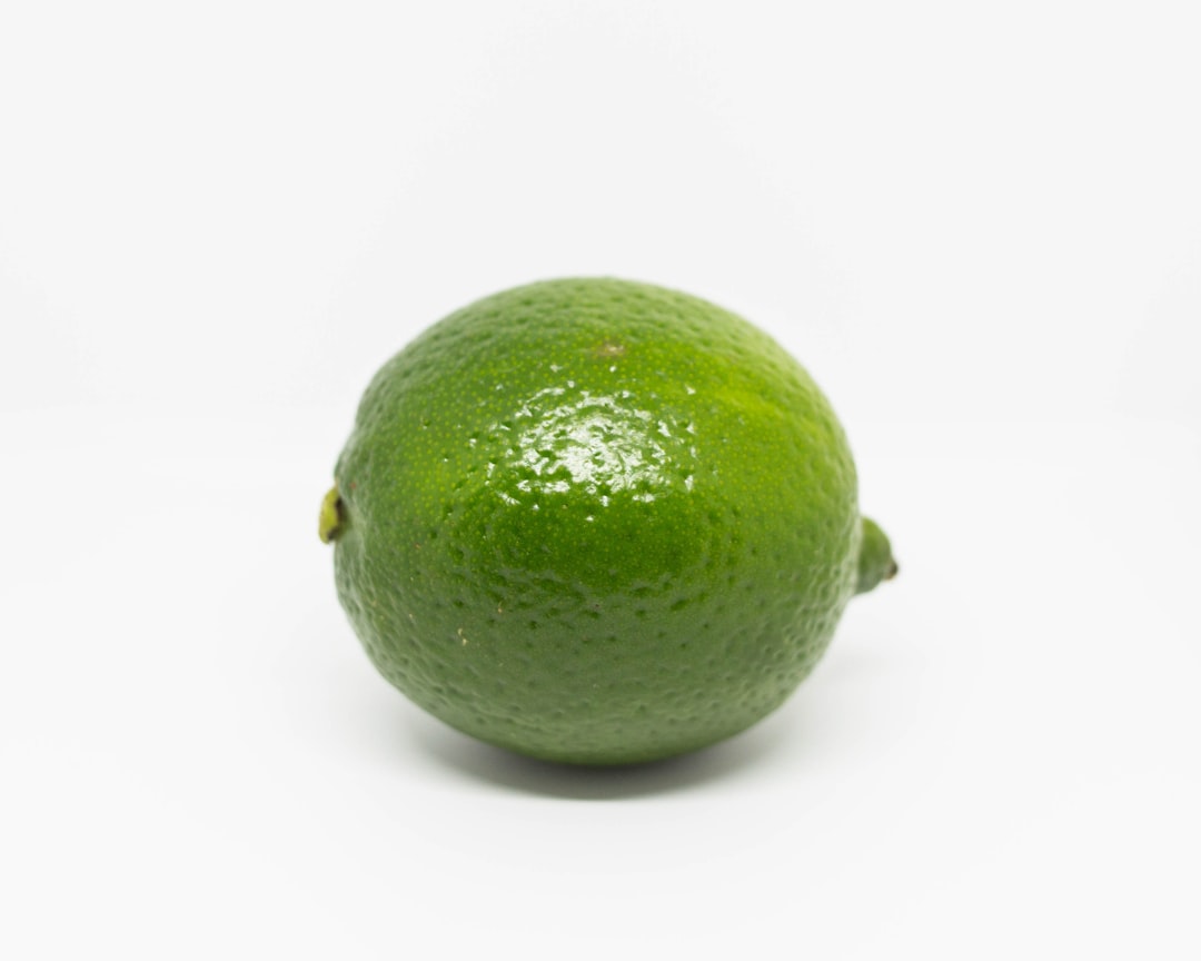
What does lime green look like?
Lime reads as a brighter, fruitier green. The web “lime green” #32CD32 is clearly green with a yellow lift, giving it a fresh, zesty, energetic feel — like the fruit it is named for. Some palettes use a more yellow-green lime closer to #BFFF00, which sits nearer chartreuse, so context matters.
Lime is friendlier and more approachable than chartreuse while still being high-energy. It is popular for food and beverage brands, fitness and sports, eco-tech startups, and high-visibility CTAs or signage. It pairs well with white, navy, and gray, and it photographs vividly in product and social graphics.
When should you use chartreuse vs lime?
Choose based on how much edge you want. Chartreuse is the bolder, more yellow, more avant-garde option — use it when you want to look daring and contemporary. Lime is the brighter, greener, more universally cheerful option — use it when you want energy that still feels fresh and inviting.
- Use chartreuse for: fashion accents, sportswear, edgy modern branding, high-contrast highlights on dark backgrounds.
- Use lime for: food and beverage, fitness brands, eco-tech, call-to-action buttons, and signage that must pop.
- Use them together: a gradient from chartreuse to lime creates a vibrant, citrus-energy ramp — striking but best used sparingly.
Both are extremely saturated, which makes them poor choices for large body-text backgrounds (they strain the eye). For guidance on balancing such high-energy hues within a fuller palette, see our warm vs cool colors guide. At the deeper, more grounded end of green, compare emerald vs forest green.
How do chartreuse and lime perform in print and on screen?
Both colors are near the edge of the RGB gamut, so they look spectacular on screen but are notoriously hard to reproduce in CMYK — print versions often look duller and more muted than the display. If a vivid yellow-green is critical to your brand, specify a spot or Pantone color rather than relying on four-color process. On the web, use them as accents with dark text or against dark backgrounds, and always check contrast, since bright yellow-greens can fail legibility tests with light type.
Which colors pair well with chartreuse and lime?
Both are high-voltage yellow-greens, so their partners need to either ground them or get out of the way. Chartreuse is most striking against deep, dark neutrals: black, charcoal, and dark plum make it glow like a highlighter, which is exactly the edgy, modern effect designers want from it. It also pairs with cool grays for a tech-forward look. Avoid surrounding chartreuse with other saturated colors, since competing brights make the whole composition vibrate uncomfortably. One bold chartreuse accent in a restrained layout is worth more than chartreuse everywhere.
Lime is friendlier and pairs cleanly with white, navy, and medium gray for an energetic, fresh feel. It works well with a complementary magenta or hot pink for a playful, citrus-soda palette, and it grounds nicely against dark green or black for high-visibility signage. Because lime reads as fresh and appetizing, it is a natural partner for whites and light neutrals in food and fitness branding.
When choosing a lead, remember neither color is built for large body backgrounds — both strain the eye at scale. Treat chartreuse and lime as accent colors that punctuate a neutral-led system. The neutral does the heavy lifting; the yellow-green delivers the jolt of energy exactly where you want attention.
Frequently Asked Questions
Is chartreuse more yellow than lime?
Yes. Chartreuse leans further toward yellow and sits near the midpoint between yellow and green, giving it an acidic, electric quality. Lime leans more clearly green, especially the common #32CD32 value. That said, some lime variants (like #BFFF00) are very yellow-green and sit close to chartreuse, so check the specific hex.
Which is better for a call-to-action button?
Lime is usually the safer CTA choice because it reads as energetic and fresh without the eye-straining edge of chartreuse. Lime pairs cleanly with white or dark text and feels inviting. Chartreuse can work for daring, design-forward brands, but its intensity can overwhelm and hurt legibility if overused.
Do chartreuse and lime go together?
They can, but carefully. Because both are highly saturated yellow-greens, combining them works best as a gradient or with neutral space between them. Used together in equal amounts they can clash or vibrate. Pair either with neutrals like white, gray, or navy to let the bright green breathe.
Are these hex codes official standards?
Partly. “Lime” is an official CSS/web color at #00FF00, while “lime green” is #32CD32, and chartreuse exists in both web (#DFFF00) and traditional forms. Because usage varies so widely, treat all listed values as representative and confirm against your brand or print reference for production.


