Colors That Go With Dusty Rose
Dusty rose is a muted, grayed-down pink — romantic but understated. The most dependable colors that go with dusty rose are sage green, navy, cream, gold, gray, and charcoal, because each respects the color’s softness while supplying the contrast it needs. Below are exact hex codes, the color logic, and ready palettes for weddings, branding, and interiors.
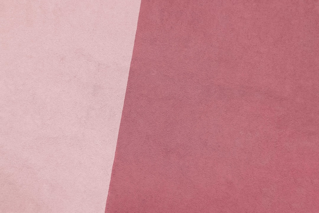
Dusty rose is easy to confuse with neighbors, so it helps to read mauve vs dusty rose and rose vs pink before committing to a base value.
What colors go with dusty rose?
Because dusty rose is a warm, muted tone, it pairs best with other muted colors and cool, grounding neutrals. The strongest partners are:
- Sage green (#B2AC88) — the signature muted pairing; rose and sage share a soft, dusty quality.
- Navy (#1B2A4A) — deep cool contrast that makes rose look refined.
- Cream (#F5EFE6) — warm neutral that keeps the palette light and airy.
- Gold (#C9A66B) — soft metallic warmth for an elegant, celebratory feel.
- Gray (#9E9E9E) — neutral anchor for a modern, minimal look.
- Charcoal (#36454F) — the deepest neutral, for high-contrast sophistication.
Best color combinations for dusty rose
The defining pairing is dusty rose and sage green — two muted, slightly grayed tones that feel calm and timeless together, which is why they dominate wedding palettes. For more contrast, dusty rose and navy adds backbone, and dusty rose and charcoal reads as quietly luxurious. To understand why a muted green and a muted pink harmonize, see warm vs cool colors — they sit on opposite sides of the wheel but at matched, low saturation.
Two more combinations are worth singling out. Dusty rose and gold is the celebratory route: a soft antique gold (#C9A66B) rather than a bright yellow-gold keeps the pairing tasteful, which is why it appears constantly in invitations and beauty packaging. Dusty rose and cream is the minimalist’s choice — almost tonal, very soft, and a natural fit for editorial layouts and product photography backdrops. When you want dusty rose to feel grown-up rather than sweet, swap cream for a cool gray or charcoal and the whole palette shifts from romantic to refined. If you’d rather pick a partner by the color wheel, dusty rose’s near-opposite lands in muted green territory — see complementary colors for the underlying logic.
Dusty rose palettes with hex codes
| Pairing color | Hex | Why it works |
|---|---|---|
| Sage green | #B2AC88 | Matched muted tone — calm, timeless harmony |
| Navy | #1B2A4A | Deep cool contrast that refines the pink |
| Cream | #F5EFE6 | Warm neutral base for a light, airy look |
| Gold | #C9A66B | Soft metallic warmth for elegant accents |
| Gray | #9E9E9E | Neutral anchor for modern, minimal designs |
| Charcoal | #36454F | Deep neutral for high-contrast sophistication |
Ready palette 1 — Wedding classic: Dusty rose #C9A9A6 · Sage #B2AC88 · Cream #F5EFE6 · Gold #C9A66B.
Ready palette 2 — Modern contrast: Dusty rose #C9A9A6 · Navy #1B2A4A · Gray #9E9E9E.
Ready palette 3 — Moody & chic: Dusty rose #C9A9A6 · Charcoal #36454F · Gold #C9A66B.
How to build a balanced dusty rose palette
Apply the 60-30-10 rule. Let a neutral — cream or gray — fill about 60% of the space, dusty rose carry 30% as the romantic lead, and an accent like sage, gold, or navy take the final 10%. Because dusty rose is low in saturation, it works as a large background field without overwhelming, which is rare for a pink.
For branding, decide whether rose is your hero or your soft support, then map the supporting tones to text, backgrounds, and accents using our guide on how to choose brand colors. Pair dusty rose with charcoal or navy for body text contrast on web — never set small text in dusty rose itself, since its low contrast against light backgrounds fails accessibility checks. Reserve the rose for fills, dividers, illustration, and large display type where its softness is a feature.
To grow a single dusty rose into a full system, build a small ramp: lighten it toward a barely-there pink for backgrounds and lighten further to near-white for cards, then deepen it toward a muted mauve-brown for borders and hover states. Combined with one neutral (cream or gray) and one accent (sage or gold), that gives you a complete, cohesive palette without ever introducing a clashing bright.
Colors to avoid with dusty rose
Avoid bright, saturated colors — hot pink, electric blue, or pure red — which make dusty rose look washed out and accidental. Skip cool, icy pastels too; they fight the rose’s warm gray base. The trick is to keep partners at a similarly muted saturation, or to use deep, grounded neutrals as the counterweight.
Dusty rose in branding vs interiors
In branding, dusty rose signals warmth, femininity, and approachable luxury — common in beauty, wellness, and lifestyle. Pair it with gold and cream for a soft premium feel, or with charcoal for something more grown-up. In interiors, dusty rose walls or upholstery feel cozy and calming; sage green plants, brass fixtures, and cream textiles complete the look. For the green side of this pairing, see colors that go with sage green.
Frequently Asked Questions
What is the hex code for dusty rose?
Dusty rose commonly uses the hex code #C9A9A6 — a muted, grayed pink with a warm undertone. You’ll also see lighter variants like #DCAE96 or #D8A7B1; choose one base value and keep it consistent so your supporting colors read correctly against it.
Does sage green go with dusty rose?
Yes — sage green (#B2AC88) is the single best match for dusty rose. Both are muted, slightly grayed tones, so they harmonize without clashing, creating the soft, romantic, timeless feel that makes the pairing a favorite for weddings, stationery, and calming interiors.
What colors make dusty rose look more elegant?
Gold (#C9A66B), navy (#1B2A4A) and charcoal (#36454F) elevate dusty rose. Gold adds celebratory warmth, while navy and charcoal supply the deep contrast that makes the soft pink read as intentional and sophisticated rather than merely sweet.
Is dusty rose a warm or cool color?
Dusty rose is a warm color with a gray undertone, which is what separates it from cooler pinks like blush or mauve. Its warmth is why it pairs so naturally with cream, gold, and other muted earthy tones, and why icy pastels tend to clash with it.


