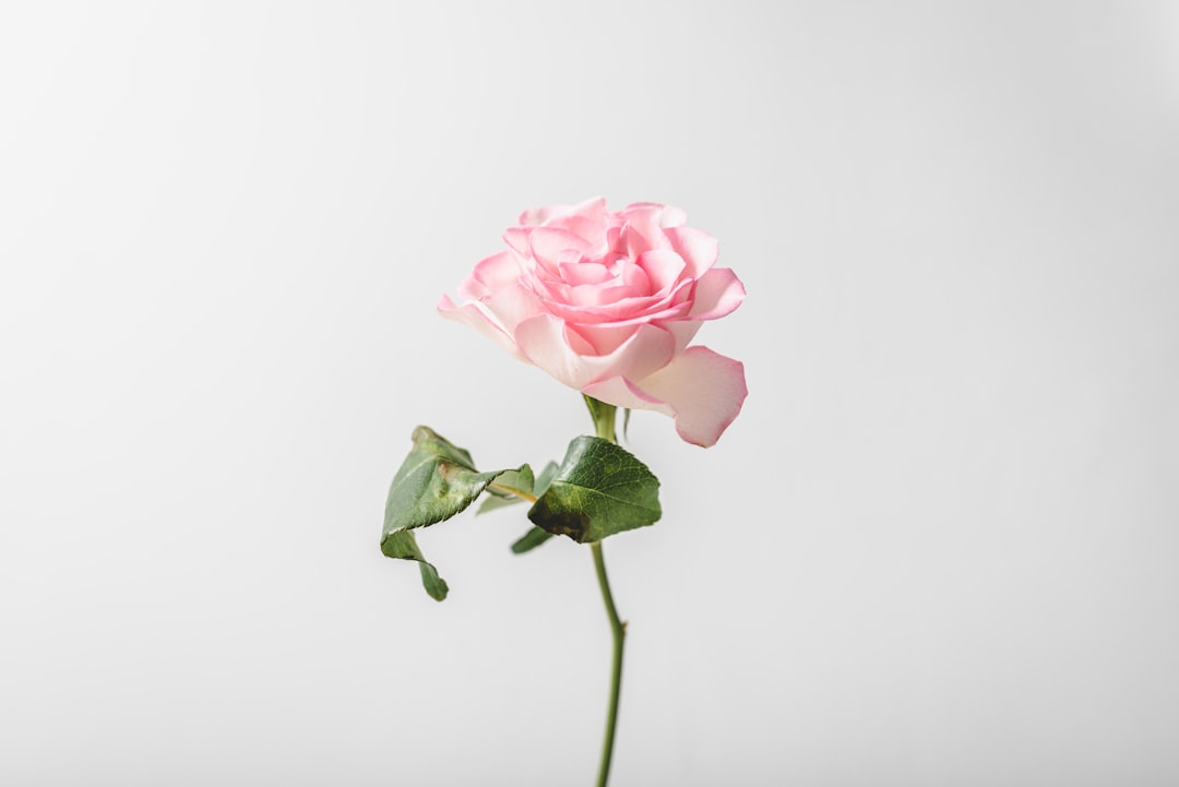
Rose vs Pink: What’s the Difference?
The rose vs pink question is about depth and temperature. Rose is a deeper, more saturated pink named after the flower, leaning slightly cool and blue-red. Pink is the broader family of light red tints, with the common version reading much paler and softer. Rose feels grown-up and rich; standard pink feels light and sweet.
What is rose?
Rose is a deep, rich pink with a cooler, blue-red lean. Representative values include #C21E56 for a muted, sophisticated rose and the vivid #FF007F sometimes called rose or bright rose. What unites them is saturation and depth: rose is far more intense and darker than a pale pink, which gives it a jewel-like, romantic, and mature quality. It is the color of the flower it is named for — vivid, slightly cool, and never washed-out.
Because rose is so saturated, it behaves like a true statement color rather than a soft tint, holding its own as a primary brand or fashion shade.
What is pink?
Pink is a light tint of red — red mixed with white. The common CSS web color “pink” is #FFC0CB, a pale, soft light pink. As a family, pink spans many values, but the everyday reference is light and gentle. Compared with rose, standard pink is lighter, less saturated, and reads sweeter and more delicate. Where rose is deep and cool, common pink is pale and softer.
For the cultural and emotional weight of the family, our pink color meaning page covers how pink signals warmth, romance, and approachability.
What’s the difference between rose and pink?
The defining differences are depth, saturation, and temperature. Rose is darker, more saturated, and slightly cooler; common pink is lighter, paler, and softer. Rose reads rich and mature; pink reads sweet and gentle. Here is a side-by-side with representative values — both terms span ranges, so these are reference points.
| Property | Rose | Pink |
|---|---|---|
| Hex code | #C21E56 (vivid #FF007F) | #FFC0CB |
| RGB | 194, 30, 86 | 255, 192, 203 |
| CMYK | 0, 85, 56, 24 | 0, 25, 20, 0 |
| Undertone | Cool, slightly blue-red | Neutral to slightly cool |
| Hue family | Deep pink (rose) | Light red tint (pink family) |
| Best used for | Luxury, fashion, romance, statement accents | Beauty, youthful design, soft backgrounds |
| Mood/feel | Rich, romantic, mature, bold | Soft, sweet, gentle, playful |
When should you use each?
Use rose when you want a pink with depth and confidence. Its richness suits luxury and fashion branding, romantic statements, beauty packaging that wants drama, and accents that need to feel grown-up rather than girlish. Rose pairs beautifully with cream, charcoal, gold, deep green, and navy.
Use pink (in its lighter form) when you want softness and approachability. Pale pink suits gentle backgrounds, youthful and playful brands, and designs that should feel light and friendly. Pink pairs well with white, sage, gray, and other soft tints.
To tell them apart in practice, judge depth and temperature: rose looks deep, saturated, and slightly cool, while common pink looks pale and soft. Our guide to warm vs cool colors explains how a blue-red lean shifts a pink toward cool.
How are rose and pink used across design?
In branding, rose signals sophistication and romance with backbone — it appears in beauty, fashion, and luxury identities that want pink without looking juvenile. Lighter pink signals softness, youth, and friendliness, dominating gentle consumer and wellness brands. The depth and saturation of rose is what reads as premium, while pale pink reads approachable.
In fashion and weddings, rose is a perennial favorite for its flattering richness — it photographs deep and romantic and works as a true accent color. Lighter pinks act more like soft neutrals or playful highlights. Rose makes a statement; pale pink sets a mood.
In web and digital design, rose works well as a confident accent, button, or heading color because its saturation commands attention. Pale pink performs better as a large background tint, where its low intensity is easy on the eyes. Because rose is so saturated, using it across big surfaces can feel intense, so designers often reserve it for emphasis while pink fills the calmer areas.
How can you tell rose and pink apart?
The clearest test is depth. Rose is noticeably darker and more saturated than common light pink — held side by side, rose looks like a concentrated, jewel-toned version while pink looks pale and diluted. If a swatch reads rich and almost berry-like, it is rose; if it reads soft and washed with white, it is light pink.
A second check is temperature. Rose tends to lean cooler thanks to its blue-red tilt, so it can look slightly purple-pink, whereas common light pink sits closer to neutral. Hold both against a true neutral gray and rose will appear deeper and cooler, while pink stays pale and gentle. Context helps too: rose is the color of the flower at full bloom — vivid and saturated — while everyday pink is the color of the petal’s palest edge. When a brand or palette wants a pink that reads grown-up and confident, it is almost always reaching for rose rather than a soft baby pink.
Do rose and pink go together?
Yes — because rose is essentially a deeper, cooler member of the pink family, pairing a pale pink base with rose accents creates a tonal, monochromatic palette with built-in depth. Add cream, gold, or charcoal to keep it elegant. For a related soft-pink comparison, see our rose vs blush breakdown, browse the full range in our shades of pink guide, and explore color psychology for why rich pinks read romantic.
Frequently Asked Questions
Is rose the same as pink?
Not exactly. Rose is a deeper, more saturated, slightly cooler pink (around #C21E56), while pink is the broad family of light red tints, with the common version being much paler (#FFC0CB). All rose is a kind of pink, but rose is distinguished by its depth, intensity, and cooler blue-red lean.
Is rose warmer or cooler than pink?
Rose usually reads slightly cooler. Its blue-red lean gives it a jewel-like, cool-leaning character, while everyday light pink sits closer to neutral. That cooler depth is part of why rose feels mature and rich compared with the softer, sweeter feel of pale pink.
What is the hex code for rose?
There is no single standard. A muted, sophisticated rose sits around #C21E56, while a vivid version is #FF007F (sometimes called bright rose). Because rose describes a deep, saturated pink rather than one fixed value, it spans a range from rich berry-pink to bright magenta-pink.
What colors go with rose?
Rose pairs beautifully with cream, charcoal, gold, navy, and deep green. Its richness lets it act as a statement color against neutrals, while metallics like gold amplify its luxurious feel and cool greens balance its warmth-leaning depth.
Is rose a feminine color?
Rose carries romantic, floral associations and is often used in feminine-coded design, but its depth and saturation also make it read mature and confident rather than girlish. Many luxury and fashion brands use rose precisely because it feels sophisticated rather than overtly sweet.