Pastel Color Palettes (With Hex Codes)
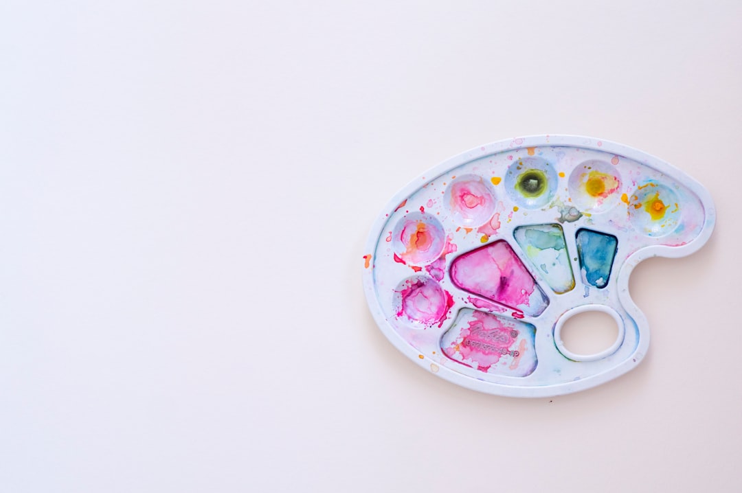
A pastel color palette is built from pale, desaturated tints that feel soft and approachable. The guiding principle is high lightness with low saturation: every color reads as a whisper of its bolder parent hue.
What makes a color palette “pastel”?
Pastels are created by adding large amounts of white to a base color, producing high-value, low-chroma tints. The result is a gentle, airy feel — pinks become blush, blues become baby blue, greens become mint. Because no single pastel dominates, these palettes feel harmonious and calming, which is why they’re favored for wellness, beauty, stationery, and children’s products.
Blush Bloom
Soft rosy pinks with a warm undertone — ideal for beauty, florists, and wedding brands.
Hex: #F7D6E0, #F2B5C4, #E89AB0, #FBEFF2 — use the lightest tint as background and deeper rose for accents.
Lavender Mist
Calm, dreamy purples that feel serene and modern. Great for spa, meditation, and tech-wellness brands.
Lavender sits at an unusual psychological crossroads: it inherits the calm of blue and the creativity of purple, which is why it reads as both soothing and quietly premium. Build the system with #F4F1FB as your background, #E6E0F8 for large panels, and the deeper #A593E0 as your accent for buttons, headings, and links — it is the only tint here with enough weight to anchor an interface. Pair it with a warm neutral or a single pop of soft peach if the all-cool scheme starts to feel clinical, and keep your saturation low so the palette stays restful rather than candy-bright.
Hex: #E6E0F8, #C9BBF0, #A593E0, #F4F1FB — the mid purple makes an elegant button or heading color.
Minted Sky
Fresh mint green paired with baby blue for a clean, breezy feel — perfect for health, fintech, and SaaS brands.
Hex: #C7EFE0, #A8E0D4, #BFE2F2, #9CCBE8 — alternate mint and blue across sections for gentle rhythm.
Peach Sorbet
Warm peach and apricot tints that feel sunny and inviting. Lovely for cafés, lifestyle blogs, and packaging.
Hex: #FFE0CC, #FFC9A8, #F7A579, #FFF3EC — let the deepest apricot carry your calls to action.
Cotton Candy
A playful mix of pink, blue, and lilac — cheerful and youthful for kids’ brands, events, and creative studios.
Hex: #FBC4D4, #C4D9FB, #E0C4FB, #FFFBF0 — keep the trio balanced so no single tint takes over.
Butter & Sage
Soft buttercup yellow with muted sage green — fresh, natural, and a little nostalgic. Ideal for organic and home brands.
Hex: #FCEFC7, #F5E08A, #C5D1A5, #9FB081 — yellow warms the page while sage grounds it.
How to use pastel palettes in your designs
Because pastels are low-contrast, pair them with a deeper neutral — charcoal or a muted version of one hue — to keep text legible and accessible. Use plenty of whitespace so the soft tones can breathe, and limit yourself to two or three pastels plus a near-white. A reliable structure is the 60-30-10 split: let a near-white tint own about 60 percent of the layout, a primary pastel carry 30 percent across panels and shapes, and a deeper accent handle the final 10 percent on buttons and links. Be aware that pastels can shift noticeably between screen and print — RGB renders them luminous, while CMYK tends to mute and slightly gray them, so always proof on the final medium. If a pastel feels too sweet, nudge it toward a dustier, more grown-up tone by lowering its lightness a few points rather than adding saturation. To understand the mood each tint communicates, see our guide to color psychology, and if you love these soft blues, the shades of blue reference goes deeper. For a more grounded, natural alternative, explore earth tone color palettes.
Frequently Asked Questions
What are pastel colors?
Pastel colors are pale, soft tints created by mixing a base hue with a large amount of white. This produces high-lightness, low-saturation versions of colors — blush instead of red, baby blue instead of navy. The result is a gentle, calming appearance widely used in beauty, wellness, and children’s design.
What pastel colors go well together?
Pastels that share a similar lightness level harmonize naturally, so blush pink, lavender, mint, and baby blue blend beautifully. For contrast, pair a cool pastel with a warm one — like mint with peach. Keeping the palette to two or three tints plus a near-white prevents the design from feeling washed out.
Are pastel colors good for branding?
Yes, especially for beauty, wellness, baby, food, and lifestyle brands where softness and approachability matter. Pastels communicate calm, care, and gentleness. The main caution is contrast: pair pastels with a darker accent for text and buttons so the brand remains legible and accessible.
How do I keep pastel designs accessible?
Pastels alone rarely meet contrast requirements for body text, so use a dark neutral — charcoal, deep plum, or a saturated version of one palette color — for type and key actions. Reserve the pastels for backgrounds, large shapes, and decorative elements where lower contrast is acceptable.
What’s the difference between pastel and muted colors?
Pastels are light and made by adding white, so they stay bright and airy. Muted colors are made by adding gray, which lowers saturation but not necessarily lightness, giving a dustier, more subdued look. Pastels feel fresh and youthful; muted tones feel vintage and sophisticated.


