App Icon Design: Sizes and Best Practices
App icon design is high-stakes work compressed into a tiny square: it is the first thing a user sees in the store, the thing they tap dozens of times a day, and the symbol that has to read clearly at the size of a fingernail. Get the concept and the technical specs right and your app looks credible before anyone opens it. This guide covers the exact sizes for iOS and Android, the rules each platform enforces, and the design principles that make an icon work.
Icon work is one slice of the larger discipline covered in our complete app design guide — start there for the full picture, then come back here for the icon specifics.
The Two Platform Models
iOS and Android treat icons fundamentally differently, and you must design for both rather than scaling one into the other.
On iOS, you provide a single high-resolution master and the system handles the rest. As of recent Xcode versions you supply one 1024×1024 px PNG (no alpha, no transparency) and the toolchain generates the required sizes. The system applies the rounded-rectangle mask itself, which leads to the single most important rule: never pre-round your corners. Ship a full square; let iOS round it.
On Android, modern launchers use adaptive icons. You design two layers — a foreground and a background — on a 108×108 dp canvas. The launcher masks them into whatever shape the device uses (circle, squircle, rounded square, teardrop), and the outer edges can be cropped or animated. Because of that masking, only the central 72×72 dp safe zone is guaranteed to be visible; keep your logo and key shapes inside it.
App Icon Sizes Reference
You rarely export every size by hand anymore, but you should know what the platforms expect.
| Platform / use | Size | Notes |
|---|---|---|
| iOS — App Store / master | 1024×1024 px | No transparency, no pre-rounded corners |
| iOS — iPhone app (@3x) | 180×180 px | Generated from master |
| iOS — iPhone app (@2x) | 120×120 px | Generated from master |
| iOS — Settings / Spotlight | various smaller | System-generated |
| Android — adaptive canvas | 108×108 dp | Foreground + background layers |
| Android — visible safe zone | 72×72 dp | Keep key content inside this |
| Android — Play Store listing | 512×512 px | 32-bit PNG, full square |
The practical takeaway: design at large size, define a clear safe zone, and let each platform’s tooling produce the variants.
Design Principles That Make an Icon Read
Technical correctness keeps your icon from being rejected; good design is what makes it get tapped. A few principles do most of the heavy lifting.
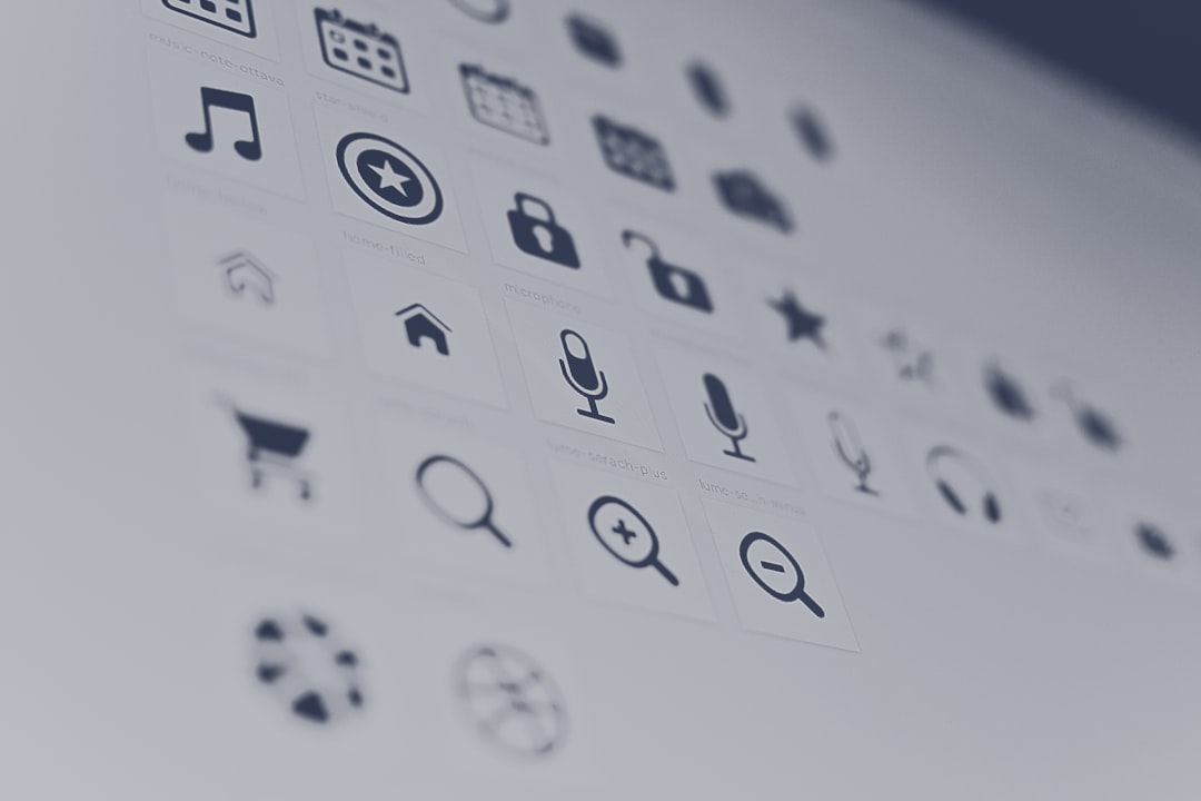
- One idea, one shape. An icon is a symbol, not an illustration. Pick a single recognizable mark or letterform and commit to it.
- Test it small. Preview at 60 px on a busy home screen. If it turns to mud, simplify until it reads.
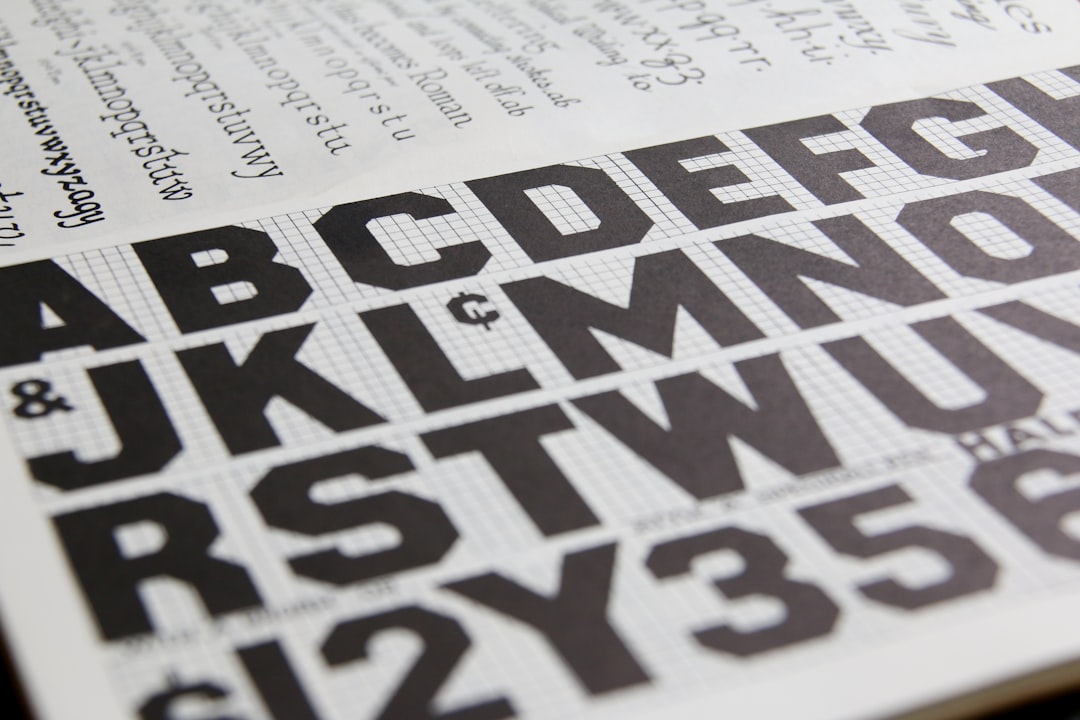
- Avoid words. Text is unreadable at icon scale. Drop the wordmark; keep the symbol.
- Use strong, simple color. A confident two- or three-color palette beats gradients that muddy at small sizes. Ensure contrast against both light and dark wallpapers.
- Fill the frame deliberately. Either fill the square edge-to-edge with a background color or center a mark with consistent padding — avoid a tiny logo floating in white.
- Stay on-brand. The icon should feel related to your splash screen and in-app identity, not like a different product.
Backgrounds, Padding, and Safe Zones
A common failure is designing an icon as a transparent logo and dropping it onto whatever the system provides. Instead, treat the background as part of the composition. On iOS, fill the full 1024 px square with an intentional color or subtle texture. On Android, design the background layer as its own deliberate surface, and place the foreground mark so it survives aggressive circular and squircle masks — anything outside the 72 dp safe zone may be clipped.
Optical centering matters too. A geometrically centered shape can look low or off-balance once masked. Nudge the mark until it looks centered, not just measured as centered.
Export Workflow in Figma or Sketch
You can produce production-ready icons entirely in Figma or Sketch. A reliable workflow:
- Build the artwork in a 1024×1024 px frame using vector shapes so it scales cleanly.
- Add a guide layer marking the iOS corner radius and the Android 72 dp safe zone, then hide it before export.
- Export the iOS master as a flattened 1024×1024 PNG with no alpha channel.
- For Android, export foreground and background as separate layers, or hand the source to engineering to assemble the adaptive icon.
- Preview on a real device against light and dark wallpapers before you finalize.
Keep the source file editable and tokenized where possible, so brand color updates propagate without redrawing the icon.
Designing for Light and Dark Mode
Home screens are not a neutral backdrop. Users set their own wallpapers, switch between light and dark system themes, and arrange icons in dense grids. An icon that looks crisp on a white mockup can vanish against a dark photo wallpaper or wash out against a bright one. Test your design against several real wallpapers in both themes before you commit. If your mark is a thin dark logo, give it a solid filled background so it never disappears; if it is light, make sure the background is dark enough to hold it. The goal is an icon that reads with the same confidence regardless of what surrounds it.
Both platforms now also support tinted and themed icon variants in certain modes. You do not have to design every variant by hand, but you should make sure your core mark survives a monochrome treatment — another argument for a single bold shape over fine detail and gradients that only work in full color.
Common App Icon Mistakes
- Pre-rounding iOS corners, which produces an ugly double-rounded result after the system mask.
- Adding transparency to the iOS master, which the store rejects.
- Cramming a full logo and tagline into the square so nothing reads at small size.
- Ignoring the Android safe zone and watching key shapes get clipped by circular masks.
- Heavy gradients and fine detail that collapse into noise at 60 px.
- An icon that looks unrelated to the app’s actual brand and splash screen.
Your icon is the first handshake; your second is the launch sequence. Pair this work with a strong splash screen design so the brand moment carries straight into the app, and plan the welcome flow with our guide to onboarding screen design.
Frequently Asked Questions
What size should an iOS app icon be?
Provide a single 1024×1024 px PNG master with no transparency and no pre-rounded corners. Modern Xcode generates the smaller sizes automatically, and iOS applies the rounded-rectangle mask itself. The same 1024 px artwork serves as your App Store listing icon.
What is an Android adaptive icon?
An adaptive icon is built from separate foreground and background layers on a 108×108 dp canvas. The device launcher masks them into its preferred shape — circle, squircle, or rounded square. Only the central 72×72 dp safe zone is guaranteed visible, so keep your logo inside it.
Why should I not round my iOS icon corners?
iOS automatically applies a rounded-rectangle mask to every app icon. If you pre-round the corners yourself, the system mask rounds them again, leaving a visibly clipped, double-rounded edge. Always ship a full square and let the platform handle the corner radius.
Can I use the same icon for iOS and Android?
You can share the same visual concept, but you should not ship the identical file. iOS needs a full-square master with no transparency, while Android needs layered artwork respecting the 72 dp safe zone for masking. Adapt the composition per platform so it survives each system’s rendering.
Should app icons include text?
Avoid text in app icons. At typical home-screen sizes around 60 px, words become unreadable and clutter the mark. Use a single recognizable symbol or letterform instead, and let the app name displayed beneath the icon carry the wording.