Apricot vs Orange: What’s the Difference?
The apricot vs orange comparison is a pastel-versus-pure question: apricot is a light, muted tint, while orange is the bold reference hue. Apricot is a pale orange softened with white and a pink lean, named after the fruit’s blush; pure orange is the vivid, fully saturated hue between red and yellow. Side by side, apricot looks gentle and creamy while orange looks loud and energetic.
What is apricot?
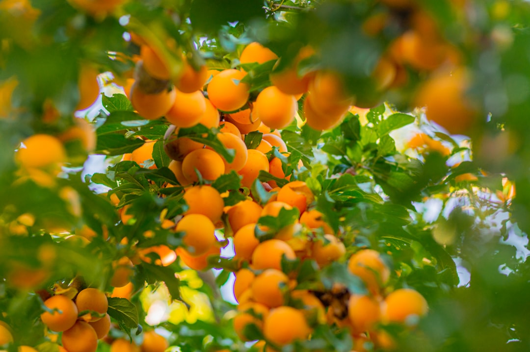
Apricot is a pale, warm pastel named after the blushing skin of the fruit. A common value is #FBCEB1, a light orange that has been softened with white and tilted slightly toward pink. The result is gentle, creamy, and approachable rather than vivid. That softness is why apricot is a favorite for delicate, romantic, and modern-warm palettes: weddings, beauty packaging, soft UI backgrounds, and cozy interiors where a full-strength orange would overwhelm. As a pale tint, apricot works well over large areas as well as accents.
If you are weighing apricot against neighboring pastels, our comparison of peach vs apricot covers how these soft, fruity warm tones differ in pink-versus-orange lean.
What is orange?
Orange in its pure form is the secondary hue made from red and yellow, sitting between them on the color wheel. The CSS keyword “orange” is #FFA500 — a bright, fully saturated color that reads energetic, confident, and attention-grabbing. As a hue family, “orange” spans everything from pale apricot and peach to deep burnt and rust tones; apricot is one light, pinkish point within it. Pure orange is the vivid reference against which we describe other oranges as paler, deeper, warmer, or more muted.
The defining contrast: apricot is one soft, pastel tint, while orange is the bold parent hue. For the full spectrum, our shades of orange guide maps how oranges shift from pale to deep and pink to red.
What’s the difference between apricot and orange?
The defining differences are lightness, saturation, and undertone. Apricot is pale, muted, and slightly pink; pure orange is bright, saturated, and balanced between red and yellow. Apricot soothes; orange energizes. Here is a side-by-side with representative values — neither is a fixed brand standard, so exact hexes vary.
| Property | Apricot | Orange |
|---|---|---|
| Hex code | #FBCEB1 | #FFA500 |
| RGB | 251, 206, 177 | 255, 165, 0 |
| CMYK | 0, 18, 29, 2 | 0, 35, 100, 0 |
| Undertone | Warm, slight pink lean (pale) | Warm, balanced red-yellow |
| Hue family | Orange (pale pastel) | Orange (the parent hue) |
| Best used for | Soft branding, weddings, beauty, calm backgrounds | CTAs, signage, energetic branding, accents |
| Mood/feel | Gentle, warm, romantic, creamy | Energetic, bold, friendly, confident |
When should you use each?
Use apricot when you want warmth without intensity. Its pale, slightly pink tint makes it ideal for soft branding, wedding and event design, beauty packaging, and calm UI backgrounds where a strong orange would feel aggressive. Apricot pairs especially well with sage green, cream, terracotta, and soft gray.
Use pure orange when you want energy, visibility, and a confident pop. Its high saturation suits call-to-action buttons, sale and signage graphics, sports and food branding, and anywhere the color should command attention. Pure orange pairs strongly with navy, teal, white, and black.
To tell them apart in practice, check lightness and saturation. Apricot is pale, creamy, and slightly pink; pure orange is vivid and balanced. If you are balancing these warms against cool accents, our guide to warm vs cool colors explains how to keep an orange palette from feeling overheated.
How are apricot and orange used across design?
In branding, apricot signals softness, warmth, and modern calm — it appears in beauty, wellness, and lifestyle brands that want approachability without loudness. Pure orange signals energy, friendliness, and confidence, favored by food, sports, and tech brands that want to stand out. The saturation difference maps onto whether a brand reads gentle-warm or bold-energetic, a distinction explored in our orange color meaning guide.
In fashion, apricot is a flattering, soft choice for spring and summer pieces and bridal palettes, reading romantic and easy to wear. Pure orange is a statement color for standout pieces and athleisure. Both are warm, but apricot whispers while orange shouts.
In interiors and web design, apricot works beautifully over large areas — walls, bedding, soft UI backgrounds — because its paleness is restful. Pure orange is best reserved as an accent: a button, a cushion, a graphic highlight that pops against neutrals. Print behavior is worth flagging: apricot’s pale tint reproduces gently but can wash out on bright screens, so check contrast for text, while pure orange is vivid in RGB and can shift duller in CMYK, so brand-critical oranges may need proofing.
Do apricot and orange go together?
Yes — because apricot is a light tint of orange, the two form a natural tonal, monochromatic pairing. Pure orange provides a vivid focal point while apricot offers a soft, restful base, giving a palette built-in light-to-dark contrast within one hue. Add cream or sage green to round it out. Keep a clear hierarchy: let apricot carry broad areas and reserve orange for accents. See our color psychology guide for why warm oranges feel friendly and energizing.
Frequently Asked Questions
Is apricot the same as orange?
No. Apricot is a pale, soft tint of orange with a slight pink lean (around #FBCEB1), while “orange” is the bright, fully saturated parent hue (around #FFA500). Apricot is always in the orange family, but it is light and gentle where pure orange is vivid and bold. The difference is mainly lightness and saturation.
Is apricot a shade of orange?
Yes. Apricot is a pale, pinkish tint of orange — orange softened with white and tilted slightly toward pink. It belongs to the orange family but sits at the light, muted end. Depending on the exact value, apricot can read more peachy or more pink, but its base is unmistakably orange.
What is the hex code for apricot?
A commonly cited value is #FBCEB1, a pale, creamy orange-pink. Apricot is not a fixed color standard, so versions vary around this value, some lighter or more pink, some deeper toward peach. The CSS keyword “orange” is the separate, vivid #FFA500. Confirm against brand guidelines for production work.
Which is better for backgrounds?
Apricot is better for large backgrounds and fills because its pale, soft tint is restful and easy on the eye. Pure orange is too saturated for broad areas and works best reserved as a vivid accent. If you use apricot behind text, check contrast, since very pale tints can reduce readability.
Do apricot and orange go together?
Yes, very well. Because apricot is a light tint of orange, they form a natural tonal pairing with built-in light-to-dark contrast. Pure orange gives a vivid focal point while apricot provides a soft base. Add cream or sage green to round out the palette, and keep a clear hierarchy between the two.


