Baskerville Font: The Most Trustworthy Typeface
The Baskerville font holds a distinction that no other typeface can claim: it has been scientifically demonstrated to make people believe what they read. In a 2012 experiment conducted through The New York Times, readers were more likely to agree with a statement when it was set in Baskerville than when the same words appeared in any other font tested. That finding alone would make Baskerville noteworthy. But the typeface’s significance runs far deeper — it represents one of the most important moments in the history of Western typography, the transition from the warm irregularities of old-style type to the precise rationalism of modern letterforms.
Designed by John Baskerville in Birmingham, England, around 1757, the Baskerville typeface was revolutionary in its time and remains one of the most widely used serifs in the world. This guide covers its history, the science behind its credibility, its design characteristics, the best digital versions, pairings, and practical advice on when and how to use it.
Baskerville Font: Quick Facts
- Designer: John Baskerville (1757); modern revivals by various foundries
- Classification: Transitional serif
- Weights: Varies by version — Roman, Italic, Bold, Bold Italic; ITC New Baskerville offers a fuller range
- Best For: Books, editorial, corporate, academic
- Price: Bundled with macOS; Libre Baskerville free on Google Fonts
- Notable Users: Canadian government, many universities, book publishers
The History of John Baskerville and His Typeface
The story of the Baskerville font is inseparable from the story of the man who created it — a self-made industrialist who became one of the most important figures in printing history, despite spending the first half of his career in entirely unrelated trades.
The Businessman Turned Printer
John Baskerville (1706-1775) was born in Wolverley, Worcestershire, and spent his early years as a writing master and stone-letter cutter before moving to Birmingham, where he made a considerable fortune manufacturing japanned goods — decorative lacquerware that was hugely fashionable in eighteenth-century England. By his mid-forties, Baskerville was wealthy enough to pursue a passion that had been growing for years: the art of printing.
Unlike most printers of the era, Baskerville was not primarily a businessman seeking commercial output. He was an aesthetic perfectionist who approached printing as a total art form. He was not content to simply design new letterforms and set them with existing equipment. Instead, he reimagined every element of the printing process, from the type itself to the ink, the paper, and the press.
Innovations Beyond Type
Baskerville’s contributions to printing technology were as significant as his typeface. He developed a new ink formulation that was blacker and more consistent than anything available at the time, allowing his fine letterforms to print with the crispness they demanded. He pioneered the use of wove paper — a smoother, more uniform stock that replaced the textured laid paper that had been standard for centuries. The smoother surface preserved the delicate serifs and refined stroke modulation of his type, details that would have been lost on rougher sheets.
He also improved his printing press, developing a heated copper plate method that pressed the printed sheets between heated plates after printing. This process smoothed the paper further and set the ink more evenly, producing pages with a brilliance and uniformity that astonished his contemporaries.
A Mixed Reception
When Baskerville published his first major work — an edition of Virgil in 1757 — the response was divided. Many English printers and critics found his types too sharp, too refined, too different from the comfortable warmth of William Caslon’s old-style types that had dominated English printing for decades. Some complained that the increased contrast and the glossy paper caused eye strain. The famous letter-founder William Caslon’s types were considered the English standard, and Baskerville’s departure from that tradition was met with suspicion.
But Baskerville found admirers where it mattered. In France, the great typographer Pierre-Simon Fournier praised his work, and after Baskerville’s death, the French playwright Beaumarchais purchased his punches and matrices to produce a landmark edition of Voltaire’s complete works. In America, Benjamin Franklin — himself a printer by trade — was an enthusiastic champion of Baskerville’s types. Franklin famously defended Baskerville against his English critics, once tricking a detractor into praising a sample of Caslon’s type by telling him it was Baskerville’s, then revealing the deception to demonstrate that the criticism was driven by prejudice rather than genuine aesthetic judgment.
The Baskerville Legacy
Baskerville’s types did not achieve wide commercial success during his lifetime. He printed relatively few books — all of them beautiful — and his perfectionism made the enterprise financially unsustainable. After his death in 1775, his widow sold his typographic materials to Beaumarchais, and they eventually ended up in France.
But Baskerville’s influence was enormous. His typeface established the transitional serif classification — the crucial bridge between the calligraphically rooted old-style types of Caslon and Garamond and the geometrically precise modern types of Bodoni and Didot that would arrive a few decades later. Without Baskerville, the evolution of Western type design would look very different. His insistence on precision, his innovations in printing technology, and his uncompromising standards set a template that printers and type designers have aspired to for over two and a half centuries.
The New York Times Credibility Study
In 2012, filmmaker and writer Errol Morris conducted an experiment through The New York Times that gave the Baskerville font a remarkable new claim to fame: it was proven to be the most believable typeface.
The Experiment
Morris published an article titled “Are You an Optimist or a Pessimist?” that presented readers with a passage by the physicist David Deutsch about the likelihood of large-scale catastrophes. Readers were asked whether they agreed or disagreed with the statement, and whether they agreed or disagreed strongly. What readers did not know was that they were part of a controlled experiment. The passage was displayed in one of six typefaces — Baskerville, Computer Modern, Georgia, Helvetica, Comic Sans, or Trebuchet — randomly assigned to each reader.
The experiment, designed in collaboration with the Cornell psychologist David Dunning, attracted approximately 45,000 responses — a sample size that most social science researchers can only dream of.
The Results
The results were striking. Readers who saw the passage in Baskerville agreed with the statement at a statistically significant higher rate than those who read it in any other typeface. Baskerville increased agreement by about 1.5 percent compared to the average — a modest-sounding figure that, given the sample size, was highly significant. Comic Sans, predictably, performed worst, reducing agreement. But the key finding was not that Comic Sans was untrustworthy (most designers already assumed that); it was that Baskerville actively enhanced credibility.
What This Tells Us About Typographic Trust
The study suggests that typography influences perception at a level below conscious awareness. Readers did not know which typeface they were reading, and they almost certainly did not factor the font into their assessment of the content. Yet the typeface shaped their response. Baskerville’s combination of formality, tradition, and refined legibility appears to activate associations with authority and seriousness — the kind of typography readers associate with books, academic journals, and institutional documents.
This finding has practical implications for anyone working in design, publishing, or communications. When the goal is to persuade, to convey authority, or to earn trust, the choice of typeface is not merely aesthetic — it is strategic. And Baskerville, among all the typefaces tested, proved to be the most strategically effective. [LINK: /what-is-typography/]
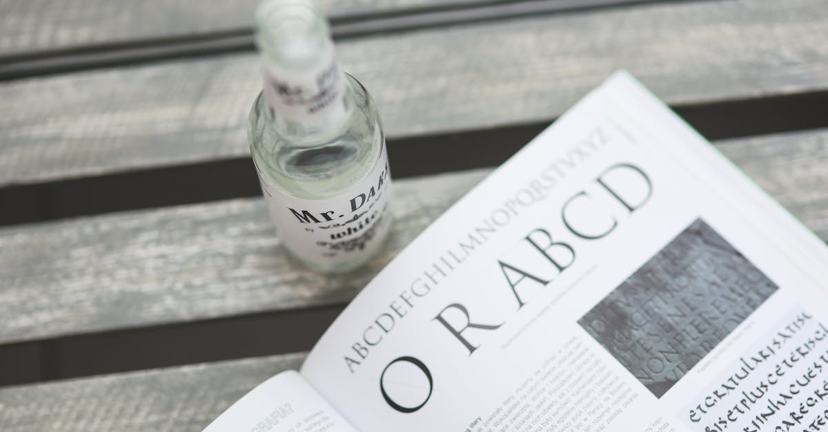
Design Characteristics of the Baskerville Font
The Baskerville typeface sits at the midpoint of serif type history. Its design characteristics reflect its transitional status — more refined than old-style types, but warmer and more organic than the modern types that followed.
Increased Stroke Contrast
Compared to old-style types like Caslon, Baskerville features noticeably greater contrast between thick and thin strokes. The thick strokes are bolder, and the thin strokes are finer, creating a more dynamic visual rhythm on the page. This contrast is one of the features that gives Baskerville its crisp, elegant appearance. However, the contrast is far less extreme than in Didone types like Bodoni or Didot — Baskerville’s thin strokes remain substantial enough to reproduce reliably at small sizes and on lower-quality paper or screens.
Sharper, More Refined Serifs
Baskerville’s serifs are sharper and more precisely tapered than those of old-style typefaces. They are still bracketed — the serif connects to the main stroke through a gentle curve rather than meeting at a hard angle — but the brackets are more refined, and the serifs themselves are thinner and more crisply defined. This sharpness contributes to Baskerville’s overall impression of clarity and precision.
Vertical Stress Axis
In old-style types, the axis of thick-thin contrast is tilted, reflecting the natural angle of a calligrapher’s pen held at an angle. Baskerville moves the stress axis closer to vertical. The thickest parts of round letters like “o” fall almost directly at the sides, while the thinnest parts align at the top and bottom. This vertical emphasis gives the letterforms a more constructed, rational quality — less handwritten, more engineered. [LINK: /serif-vs-sans-serif/]
Generous Proportions
Baskerville’s letterforms are generously proportioned, with open counters (the enclosed or partially enclosed spaces within letters) and comfortable spacing. The capitals are wide and stately. The lowercase has a moderate x-height that balances readability with elegance. These proportions make Baskerville highly legible at text sizes and give it a sense of spaciousness that many other serifs lack.
Elegant Italic
Baskerville’s italic is one of the most admired in the history of type design. It is more inclined and more calligraphic than the roman, with a flowing, almost cursive quality that adds a layer of refinement to any composition. The italic “g,” “f,” and “z” are particularly distinctive, with graceful curves and carefully considered proportions that make the italic feel like a true companion to the roman rather than a mechanical slant.
Baskerville vs. Caslon vs. Times New Roman
Baskerville is often compared to two other widely used serifs: Caslon, the old-style type it was designed to improve upon, and Times New Roman, the ubiquitous twentieth-century workhorse. Understanding the differences helps clarify when each is the right choice.
Caslon is an old-style serif with moderate stroke contrast, an angled stress axis, and a warm, slightly irregular character rooted in calligraphic tradition. It is the comfortable, familiar choice — often described as the typeface you use when you cannot decide what to use. Caslon’s warmth makes it excellent for long-form reading, but its relative informality limits it in contexts that demand authority or precision.
Baskerville takes Caslon’s basic framework and sharpens it. The contrast is higher, the stress more vertical, the serifs more refined. The result is a typeface that retains the readability and warmth of the old-style tradition but adds a layer of formality and sophistication. Baskerville says “this is serious, this is considered, this is authoritative” in a way that Caslon does not.
Times New Roman, designed by Stanley Morison and Victor Lardent for The Times of London in 1932, is a utilitarian serif optimized for newspaper production. Its letterforms are relatively narrow and compact, designed to fit more text into less space. Times New Roman is economical and legible, but it carries the associations of default software settings and undergraduate term papers. For professional design work, it rarely communicates the care and intentionality that Baskerville does. [LINK: /best-serif-fonts/]
Best Baskerville Font Pairings
Baskerville’s refined, authoritative character pairs well with clean sans serifs that provide contrast without competing for attention. The goal is to complement Baskerville’s classical elegance with a modern, readable companion. [LINK: /font-pairing/]
Baskerville + Futura
This pairing combines two pillars of typographic history. Futura’s geometric simplicity creates a sharp, clean contrast with Baskerville’s organic refinement. Use Baskerville for headlines and body text, Futura for captions, navigation, and supporting elements. The combination balances eighteenth-century elegance with twentieth-century modernism. [LINK: /futura-font/]
Baskerville + Gill Sans
Gill Sans is a British humanist sans serif with warm, slightly quirky letterforms that share Baskerville’s English heritage. The pairing feels cohesive and sophisticated — two products of the English typographic tradition working together. Gill Sans works well as a secondary typeface for subheadings, captions, and interface elements alongside Baskerville text.
Baskerville + Montserrat
For digital-first projects, Montserrat offers a geometric sans serif with excellent screen rendering and a contemporary feel. It is clean and neutral enough to let Baskerville take the lead while providing strong legibility for UI elements, navigation, and smaller text. Both are freely available, making this a practical choice for budget-conscious projects. [LINK: /montserrat-font/]
Baskerville + Open Sans
Open Sans is one of the most widely used web fonts for a reason: it is neutral, highly legible, and available in a full range of weights. Paired with Baskerville, it provides a reliable, screen-optimized companion for body text, navigation, and other functional typography. The combination is well suited to editorial websites and institutional digital platforms.
Baskerville + Helvetica
The classic serif-sans contrast. Helvetica’s neutral precision provides a counterpoint to Baskerville’s warmth and character, creating a pairing that feels both authoritative and modern. This combination is effective for corporate communications, annual reports, and professional publications where clarity and credibility are paramount.
Baskerville + Proxima Nova
Proxima Nova bridges the gap between geometric and humanist sans serifs, making it a versatile partner for Baskerville in digital contexts. Its generous x-height and carefully tuned letterforms ensure excellent screen readability, while its subtly geometric character complements Baskerville’s precision. This is a strong choice for web design, brand identities, and digital publications.
Baskerville + Inter
Inter was designed specifically for screens, with features optimized for legibility at small sizes in user interfaces. Paired with Baskerville for headings and editorial content, Inter handles the functional typography with quiet efficiency. This pairing is ideal for digital products that need to balance editorial authority with interface usability. [LINK: /inter-font/]
Digital Versions of the Baskerville Font
Because Baskerville is a historical typeface from the eighteenth century, no single definitive digital version exists. Instead, multiple foundries have created their own interpretations, each with different strengths and trade-offs.
Baskerville (macOS System Font)
Apple bundles a version of Baskerville with macOS, making it freely available to all Mac users. This version, based on work by the Czech designer Frantisek Storm, is a solid and faithful interpretation that includes Roman, Italic, Bold, and Bold Italic styles. For designers working exclusively on Apple hardware, it is a convenient and high-quality option — though cross-platform projects should account for the fact that it is not available on Windows by default.
Libre Baskerville (Google Fonts)
Libre Baskerville is a free, open-source interpretation designed by Pablo Impallari specifically for web use. It features a larger x-height, wider counters, and adjusted proportions that improve screen readability compared to traditional Baskerville digitizations. Available in Regular, Italic, and Bold, Libre Baskerville is one of the best free serif fonts for web design. Its optimization for screen rendering makes it a practical choice for digital projects, though purists may find its proportions depart from the historical model. [LINK: /libre-baskerville/]
ITC New Baskerville
The International Typeface Corporation’s New Baskerville is one of the most widely used commercial versions. Designed by John Quaranda based on the original Baskerville types, it offers a more extensive weight range than most other versions, including Roman, Italic, Semi Bold, Bold, and Black with corresponding italics. ITC New Baskerville is available through major font distributors and is a strong choice for projects requiring multiple weights within the Baskerville family.
Mrs Eaves
Designed by Zuzana Licko for Emigre in 1996, Mrs Eaves is not a strict Baskerville revival but an imaginative reinterpretation named after Sarah Eaves, John Baskerville’s wife and collaborator. Mrs Eaves features looser spacing, a lower x-height, and a gentler overall character than standard Baskerville digitizations. It became one of the most popular typefaces of the late 1990s and early 2000s, admired for its warmth and personality. It is a commercial typeface best suited to display use and projects where a softer, more literary tone is desired.
When to Use the Baskerville Font
Baskerville’s combination of readability, elegance, and credibility makes it appropriate for a wide range of professional applications. Its strength is in contexts where trust, authority, and refined aesthetics matter.
Academic Publishing
Baskerville’s association with scholarship and its proven readability make it an excellent choice for academic books, journals, dissertations, and research publications. Many universities use Baskerville or Baskerville-derived typefaces in their institutional branding and official documents.
Editorial and Book Design
Baskerville is one of the great book typefaces. Its generous proportions, elegant italic, and comfortable reading rhythm make it superb for sustained text, from novels to essay collections to biographies. Its transitional characteristics give it a formality that old-style types sometimes lack, while its warmth avoids the coldness of modern types.
Corporate Communications
Annual reports, white papers, brand guidelines, and executive communications benefit from Baskerville’s authority. It communicates seriousness and professionalism without the stiffness of more utilitarian serifs. For organizations in finance, law, consulting, and government, Baskerville is a reliable choice that signals competence and trustworthiness.
Any Context Requiring Trust
Given the findings of the Errol Morris experiment, Baskerville is a strategic choice for any context where persuasion and credibility are goals — proposals, fundraising materials, opinion pieces, advocacy documents, and legal briefs. When you need readers to believe what they are reading, the evidence suggests that Baskerville gives you a measurable advantage.
Alternatives to the Baskerville Font
If Baskerville is not available or not quite right for your project, several alternatives offer related qualities.
Libre Baskerville: The most direct alternative and the obvious choice for web projects. It is free, screen-optimized, and available on Google Fonts. It captures the spirit of Baskerville with adjustments that improve digital performance. [LINK: /libre-baskerville/]
Georgia: Designed by Matthew Carter for Microsoft, Georgia is a screen-optimized transitional serif that was influenced by Baskerville and Scotch Roman types. It is available on virtually every operating system and renders beautifully at small sizes on screen. For web projects where font loading is a concern, Georgia as a system font offers Baskerville-adjacent aesthetics with zero performance cost.
Merriweather: Another free Google Fonts option, Merriweather was designed by Eben Sorkin specifically for screen readability. It shares Baskerville’s generous proportions and transitional character, with a slightly heavier weight and larger x-height that enhance legibility on digital displays. It is a practical choice for content-heavy websites. [LINK: /best-serif-fonts/]
Charter: Designed by Matthew Carter for Bitstream, Charter was created to perform well on low-resolution output devices. Its sturdy, no-nonsense character offers some of Baskerville’s readability and authority with even greater robustness across reproduction methods. Charter is available in a free version (Charis SIL) and is an excellent choice for documents that need to look professional under any printing or display conditions.
Frequently Asked Questions
Is the Baskerville font free to use?
It depends on the version. If you use a Mac, Baskerville is bundled with macOS and available at no additional cost. Libre Baskerville is a free, open-source alternative available on Google Fonts that works across all platforms and is licensed for both personal and commercial use. Commercial versions like ITC New Baskerville and Mrs Eaves require paid licenses. For most web projects, Libre Baskerville provides an excellent free option.
Why is Baskerville considered the most trustworthy font?
The claim comes from a 2012 experiment conducted by Errol Morris through The New York Times, in which approximately 45,000 readers evaluated a statement displayed in one of six different typefaces. Readers who saw the statement in Baskerville agreed with it at a statistically significant higher rate than those who saw it in Helvetica, Georgia, Comic Sans, Computer Modern, or Trebuchet. The study suggests that Baskerville’s formal, classical appearance activates unconscious associations with authority and credibility, influencing how readers perceive the content itself.
What is the difference between Baskerville and Libre Baskerville?
Baskerville refers to the original eighteenth-century typeface by John Baskerville and its various commercial digital revivals. Libre Baskerville is a specific free interpretation designed by Pablo Impallari for Google Fonts, optimized for screen readability. Libre Baskerville has a larger x-height, wider counters, and adjusted proportions compared to traditional Baskerville digitizations, making it better suited to web use but slightly different in character from the historical design. [LINK: /libre-baskerville/]
What fonts pair well with Baskerville?
Baskerville pairs best with clean sans serifs that provide contrast without competing for attention. Strong pairings include Futura, Gill Sans, Montserrat, Open Sans, Helvetica, Proxima Nova, and Inter. The general principle is to pair Baskerville’s refined serif character with a neutral or geometric sans serif that handles functional typography — navigation, captions, UI elements — while Baskerville takes the lead for headlines and body text. [LINK: /font-pairing/]


