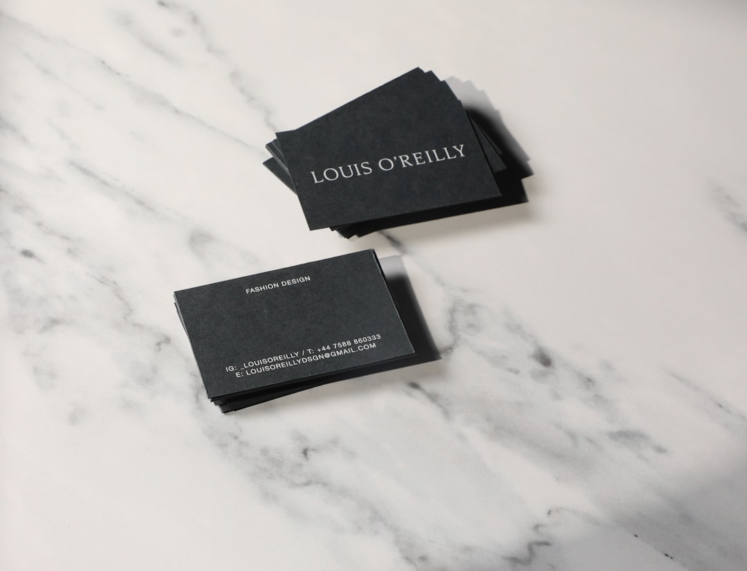
Best Fonts for Business Cards
Choosing the best fonts for business cards comes down to one constraint: everything has to stay legible on a 3.5 × 2 inch card where contact details print at 7–9pt. That rules out delicate scripts and thin display weights, and it rewards clean, sturdy typefaces with open letterforms. The fonts below all hold up at tiny sizes and look professional in print.
A business card is a typographic miniature — a name, a title, and a few lines of contact information. The craft is in restraint: one or two fonts, clear hierarchy, and generous spacing. For the full layout picture, see our stationery design guide, and for combining two faces well, our font pairing guide.
What makes a good font for business cards?
Small-size legibility is everything. Look for open counters, a moderate-to-tall x-height, and even stroke weight that does not thin out when printed small. The font must reproduce cleanly at 7–9pt for contact lines and remain crisp on coated and uncoated stock. Sturdy sans-serifs and well-cut serifs both work; ultra-light weights and high-contrast display faces (with hairline thins) tend to break up or fill in when printed at size.
Personality matters too — the card represents a brand. A geometric sans like Futura reads modern and confident; a refined serif like Garamond reads established and premium. Match the typeface to the brand voice, the same way you would for a logo.
Best business card fonts
Helvetica (paid; free alt: Arial/Inter)
Helvetica is the neutral, professional default — clean, balanced, and legible at any size. It is a paid font from Monotype, but free, near-identical alternatives include Arial (system) and Inter (Google Fonts). Use it when you want the card to feel modern and understated, letting the layout and stock do the talking.
Futura (paid; free alt: Jost or Century Gothic)
Futura is a geometric sans-serif with perfect circles and crisp angles — confident, modern, and a favorite for fashion, architecture, and design brands. It is paid (Linotype/Adobe Fonts), but Jost on Google Fonts is a strong free geometric alternative. Set the regular or medium weight; avoid the light weight at small sizes.
Garamond (free via EB Garamond)
Garamond is the classic old-style serif for premium, traditional, and professional services brands — lawyers, consultants, boutique studios. The free open-license EB Garamond on Google Fonts gives you the same elegance. Its refined serifs print beautifully on quality stock and signal craftsmanship.
Montserrat (free, Google Fonts)
Montserrat is a free geometric sans inspired by old Buenos Aires signage. Its uppercase looks excellent for names and titles, and its even weights stay legible small. It is one of the most popular free fonts for modern, clean cards, and it pairs well with a quieter sans for body details.
Lato (free, Google Fonts)
Lato is a free humanist sans-serif that feels warmer and friendlier than Helvetica while staying professional. Its tall x-height and open shapes make it highly readable in small contact-detail text, which is exactly where many cards fail. It is an excellent all-purpose body font for a card.
Baskerville or Georgia (a refined serif)
For a serif with more contrast and elegance, Baskerville (paid; free alt Libre Baskerville on Google Fonts) adds a literary, sophisticated tone. If you need a serif guaranteed to be legible small, Georgia (free, system) was designed for exactly that and is a dependable choice for contact lines.
Proxima Nova and Gotham (paid display options)
Proxima Nova (Adobe Fonts) and Gotham (Hoefler&Co.) are premium geometric sans-serifs widely used in branding. They look polished and contemporary on a card. If budget is a concern, Montserrat is the closest free stand-in for both.
Source Sans 3 (free, Google Fonts)
Source Sans 3 is Adobe’s open-source sans-serif, free on Google Fonts. It is clean, neutral, and engineered for clarity at small sizes — which makes it an excellent body font for the contact details on a card, where a quiet, legible companion to your display font matters most. It is also a natural match if your brand already uses Source-family fonts elsewhere.
Bodoni and Didot (paid, luxury accents)
For premium and fashion-adjacent brands, Bodoni and Didot bring high-contrast elegance to a name set large on a card. They are paid (Adobe Fonts), and their hairline strokes can drop out below about 12pt, so reserve them for the name or logo and pair them with a sturdy sans for the small contact lines. Playfair Display on Google Fonts is a free alternative for a similar luxury feel.
Business card fonts comparison table
| Font | Style | Free/Paid | Why it works for business cards |
|---|---|---|---|
| Helvetica | Sans-serif | Paid (free alt: Arial, Inter) | Neutral, clean, legible at any size |
| Futura | Geometric sans | Paid (free alt: Jost) | Modern, confident, strong display |
| Garamond / EB Garamond | Serif | Free (EB) | Premium, traditional, prints elegantly |
| Montserrat | Geometric sans | Free (Google) | Great caps for names; clean and modern |
| Lato | Humanist sans | Free (Google) | Warm, very legible in small contact text |
| Libre Baskerville | Serif | Free (Google) | Elegant, sophisticated, screen-tested |
| Proxima Nova | Geometric sans | Paid (Adobe) | Polished, contemporary branding standard |
How to pair fonts on a business card
The reliable formula is one display font plus one readable sans-serif. Use the display font (Futura, Montserrat, Garamond) for your name and perhaps your title, then a quiet, legible sans (Lato, Helvetica, Source Sans) for the contact details. The contrast creates hierarchy without clutter. Keep your name around 10–14pt, your title around 8–10pt, and contact lines at 7–9pt — never smaller than 6pt, or the print may fill in. Limit yourself to two fonts and two or three sizes.
Two reliable pairings: Montserrat (name, in semibold or bold) with Lato (details) for a clean, modern card; or Garamond (name) with Source Sans 3 (details) for a refined, traditional one. When you pair a serif with a sans, let the serif carry the personality and the sans carry the small text. Use weight rather than a third font to separate your title from your contact lines, and keep consistent alignment — a single left edge for the text block usually reads cleanest at this size. For more combinations that work, see our font pairing guide.
Fonts to avoid for business cards
Avoid script and handwriting fonts for contact details — they are hard to read small and can look unprofessional. Skip Comic Sans and Papyrus entirely. Be cautious with ultra-thin or high-contrast display fonts (hairline weights of Didot or Bodoni), which can drop out or break up when printed at small sizes. Also avoid using more than two fonts; crowding a tiny card destroys legibility.
Frequently Asked Questions
What font size should business card text be?
Keep your name at 10–14pt, your job title at 8–10pt, and contact details at 7–9pt. Do not go below 6pt, as fine print can fill in or break up depending on the stock and printing method. Test a proof at actual size before ordering a full run.
How many fonts should a business card use?
One or two fonts maximum. A single font with weight and size variation is cleanest; two fonts (a display face for your name and a readable sans for details) adds tasteful hierarchy. Three or more fonts on a card that small looks cluttered and unprofessional.
Should business card fonts match my logo?
Yes — using your brand font or a font that complements your logo creates a cohesive identity. If your logo uses a distinctive display font, pair it with a neutral, legible sans-serif for the contact details so the card reads cleanly while staying on-brand.
Are serif or sans-serif fonts better for business cards?
Both work; it depends on brand tone. Sans-serifs like Helvetica, Futura, and Montserrat read modern and clean. Serifs like Garamond and Baskerville read traditional and premium. Choose a serif for law, finance, and luxury; a sans-serif for tech, design, and startups.
What is the best free font for a business card?
Montserrat and Lato are the best free options on Google Fonts — Montserrat for a strong display name, Lato for readable contact details. EB Garamond is the best free serif. All three are professional, well-made, and legible at small print sizes. For licensing details, see our font licensing guide.
From the same cluster, compare the best fonts for branding and logos and the best fonts for resumes.