Best Fonts for Headings and Titles
The best fonts for headings earn their keep by adding character and hierarchy without sacrificing legibility — they are the first thing a reader sees and they set the tone for everything below. The typefaces here are all free on Google Fonts, all genuinely strong at large sizes, and grouped by style so you can match one to your project. Each is noted with where to get it and why it works as a headline face.
A heading font is a display choice: you can use more contrast, more weight and more personality than you ever would in body text, because headlines are short and large. For a wider catalogue of statement faces, see our best display fonts guide.
What makes a good font for headings?
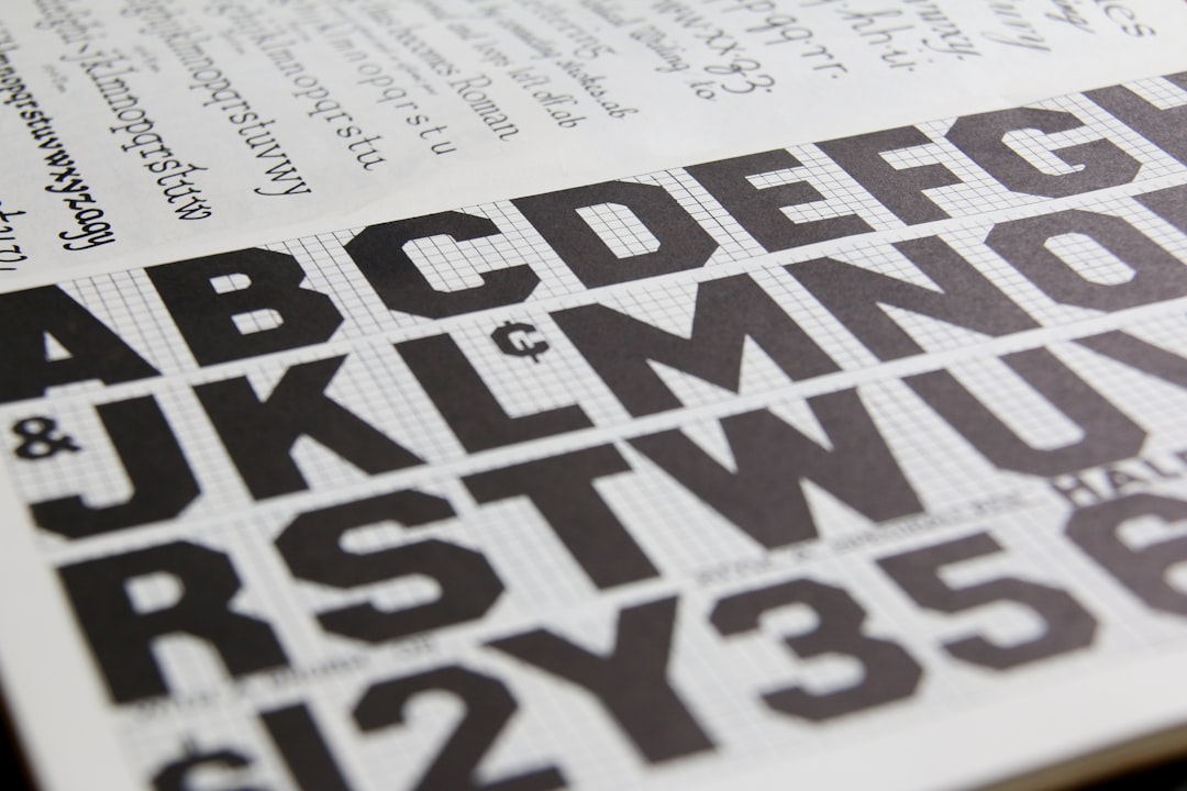
A good heading font has visible personality and strong presence at large sizes, clear letterforms that read instantly, and enough weight to anchor a page. Display faces shine here because their distinctive details (high contrast, condensed proportions, bold strokes) come alive when set big. The key constraint is contrast with your body text: a heading should feel different enough from the body font to create clear hierarchy, which usually means pairing a display or serif headline with a neutral sans body, or vice versa.
Set headings with tighter line spacing and consider slightly reduced letter-spacing on large display type. To build a consistent size hierarchy across H1, H2 and H3, use a type scale calculator.
Best heading fonts
Playfair Display — free (Google Fonts)
Playfair Display is a high-contrast transitional serif with elegant hairlines and ball terminals that signals sophistication and editorial quality. It is a premier headline serif for fashion, lifestyle, weddings and luxury brands. Set it large so the thin strokes hold, and pair it with a clean sans body.
Montserrat — free (Google Fonts)
Montserrat is a geometric sans whose Bold and Black weights make clean, modern, confident headings. The huge weight range lets you build a full hierarchy from one family, and its neutral-yet-distinctive character suits startups, agencies and product sites. A reliable, versatile default.
Oswald — free (Google Fonts)
Oswald is a condensed gothic with a newspaper-headline feel. Its tall, narrow letters fit long titles without shrinking and project a punchy, editorial energy. Excellent for news, sports and bold marketing headlines, and it includes lowercase for mixed-case titles.
Bebas Neue — free (Google Fonts)
Bebas Neue is a tall, all-caps condensed sans built for impact. It stacks into clean poster-style title blocks and reads as modern and assertive. Caps-only, so reserve it for short headlines rather than running titles with mixed case.
Anton — free (Google Fonts)
Anton is a single ultra-bold condensed weight — almost a poster face — that fills space with thick, dominant letters. When a headline needs to shout (hero sections, big statements, sale banners), Anton delivers maximum weight in minimal width.
Archivo Black — free (Google Fonts)
Archivo Black is a heavy grotesque sans with squared, industrial letterforms and dense, even strokes. It makes a bold, grown-up headline statement that holds up at any size — strong for tech, finance and editorial headlines that want weight without decoration.
Cormorant — free (Google Fonts)
Cormorant is a refined display serif inspired by Garamond, with delicate high-contrast strokes and elegant proportions. It is gorgeous in large display sizes for luxury, editorial and literary projects. Like Playfair, set it big — the fine details disappear at small sizes — and pair it with a quiet body font.
Abril Fatface — free (Google Fonts)
Abril Fatface is a dramatic display serif with heavy, high-contrast strokes drawn from 19th-century advertising. It makes a bold, characterful headline with vintage-editorial flair — ideal for magazines, culture and storytelling brands. Headline-only, never body text.
Comparison table
| Font | Style | Free/Paid | Why it works |
|---|---|---|---|
| Playfair Display | High-contrast serif | Free | Elegant, editorial; luxury headlines |
| Montserrat | Geometric sans | Free | Clean, modern, full weight hierarchy |
| Oswald | Condensed gothic | Free | Punchy, fits long titles, mixed case |
| Bebas Neue | Condensed caps | Free | Tall, assertive poster titles |
| Anton | Ultra-bold condensed | Free | Maximum impact for hero headlines |
| Archivo Black | Heavy grotesque | Free | Industrial weight at any size |
| Cormorant | Display serif | Free | Refined Garamond-style elegance |
| Abril Fatface | Display serif | Free | Dramatic vintage-editorial character |
Heading fonts by context
Where the heading appears should shape your choice. On a website, favour fonts that stay crisp on screen and load fast — Montserrat, Oswald and Archivo Black are reliable, and they coordinate well with the best fonts for websites on the body side. For editorial and print layouts, the high-contrast serifs Playfair Display, Cormorant and Abril Fatface come into their own at large sizes. For marketing and social graphics, the heavy condensed faces Bebas Neue and Anton dominate a frame and read at a glance. Always set high-contrast serifs large enough that their hairlines survive.
Whatever the context, the discipline is the same: one characterful heading font, one calm body font, and a consistent scale binding them together. Get those three decisions right and almost any layout will feel intentional.
Fonts to avoid for headings
Avoid thin and light weights for headlines — they lack the presence a heading needs and look timid at large sizes. Do not set high-contrast serifs like Cormorant or Playfair at small heading sizes, where the hairlines vanish. Skip novelty faces (Comic Sans, Papyrus) that undercut credibility, and resist using your body font at a larger size as a “heading” — without contrast, the hierarchy reads weakly. Finally, never set long headings in all-caps condensed faces; they become hard to scan.
How to pair heading and body fonts
- Contrast the categories. Pair a serif heading (Playfair, Cormorant) with a sans body (Inter, Open Sans), or a display sans (Oswald, Anton) with a humanist sans body.
- Keep the body neutral. Let the heading carry the personality; the body font should be calm and highly readable.
- Build a clear scale. Use a consistent type scale so H1, H2 and H3 step down logically.
- Limit to two families. One for headings, one for body, keeps any layout coherent.
For tested combinations, see our font pairing guide and the curated best Google Fonts list. Confirm any commercial use via Google Fonts commercial use.
Frequently Asked Questions
What is the best font for headings?
There is no single best font, but the strongest heading choices are display faces with clear personality: Playfair Display and Cormorant for elegant serifs, Montserrat and Oswald for modern sans, and Bebas Neue, Anton or Archivo Black for high-impact headlines. All are free on Google Fonts.
Should headings and body text use the same font?
They can, but pairing two fonts usually creates clearer hierarchy. A common approach is a characterful display or serif for headings and a neutral, highly readable sans for body text. If you do use one family, create contrast through weight and size instead.
What font pairs well with a serif heading?
A serif heading like Playfair Display pairs beautifully with a clean sans body such as Inter, Open Sans or Source Sans 3. The contrast between an elegant serif headline and a neutral sans body creates clear hierarchy and keeps long-form text comfortable to read.
Are these heading fonts free for commercial use?
Yes. Every font listed is on Google Fonts under an open license that permits commercial use, including websites, branding and print. Keep a record of each license; our font licensing guide explains exactly what to retain for commercial work.
How big should heading fonts be?
Heading size depends on your layout, but a consistent type scale keeps hierarchy clear — for example, stepping H1 down to H2 and H3 by a fixed ratio. Display serifs like Cormorant and Playfair need larger sizes so their fine details survive; use a type scale calculator to set the steps.


