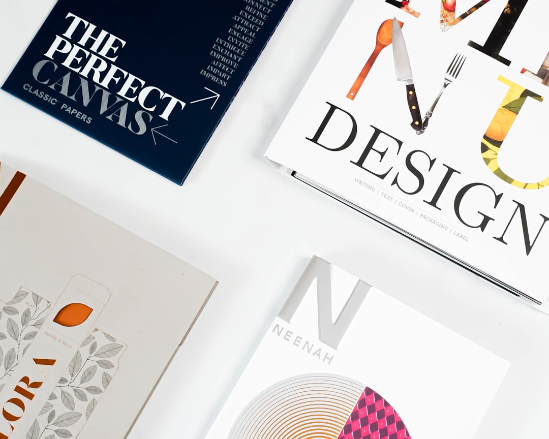
Best Fonts for Magazines
Choosing the best fonts for magazines is an exercise in contrast: a dramatic, high-contrast display face for headlines and a calm, space-efficient face for columns of body copy. Editorial design lives or dies on that tension between glamour and legibility. This guide names the typefaces art directors actually use on covers and features, notes free versus paid and where to get them, and shows how to pair them into a coherent system.
If you are building a heading-and-body system, our font pairing guide covers the balance. For the page itself, see our notes on magazine layout design, and for related editorial work our roundup of the best fonts for newspapers.
What makes a good font for magazines?
Magazine typography works on two levels. Display type — mastheads, cover lines, feature headlines — wants drama: high stroke contrast, refined hairlines, and elegant terminals that read as sophisticated at large sizes. Body type wants the opposite: moderate contrast, a sturdy build, and a tall enough x-height to stay readable in narrow multi-column grids at 8–10pt. The art is in the pairing — a Didone or contrast serif headline over a calm transitional or slab body — and in a consistent type system across decks, captions, pull-quotes, and folios. A complete family with optical sizes, true italics, and small caps gives you the range to set every level cleanly.
Best magazine fonts
Playfair Display (free)
Playfair Display is the free, accessible Didone — high contrast, thin hairlines, and elegant ball terminals that nail the fashion-magazine masthead look. It is drawn for display sizes, so use it large for headlines and cover lines. Free on Google Fonts (OFL); pair with a clean body sans or serif.
Didot (paid)
Didot is the archetypal high-fashion headline face — extreme contrast and flat, unbracketed serifs that read as pure luxury (think Vogue-era covers). Paid via Linotype/Monotype; macOS ships a cut. Use only at large sizes, where the hairlines hold.
Bodoni (paid; free: Bodoni Moda)
Bodoni is the other great Didone, slightly warmer than Didot, a staple of glossy headlines for two centuries. The paid cuts (Bodoni 72, ITC Bodoni) are workhorses; the free Bodoni Moda on Google Fonts (OFL) offers optical sizes for display use.
Tiempos (paid)
Tiempos by Klim Type Foundry is a contemporary text-and-headline serif built for editorial work — readable in body sizes, handsome in display. Its Tiempos Headline cut is a modern magazine standard. Paid; among the most-used editorial faces today.
Canela (paid)
Canela by Commercial Type sits between serif and sans, with flared, calligraphic terminals that feel modern and editorial without the coldness of a Didone. A favorite for lifestyle and food magazines. Paid.
Freight Text (paid)
Freight Text is a versatile, slightly old-style serif with optical sizes spanning micro body copy to display. It sets long features comfortably and pairs naturally with a Didone headline. Paid via the Freight superfamily (which also includes sans and slab cuts).
Archivo (free)
Archivo is a grotesque sans with an Expanded display variant, drawn for highlights and headlines in editorial use. It gives a clean, contemporary counterpoint to a serif body — ideal for decks, captions, and modern cover lines. Free on Google Fonts (OFL).
Libre Caslon Display (free)
Libre Caslon Display is a free, high-contrast display cut of Caslon for headlines that want a more traditional, literary feel than a Didone. Pair with Libre Caslon Text for body. Free (OFL).
Source Serif 4 (free)
Source Serif 4 is Adobe’s open-source serif with optical sizes — a reliable, free body face for features and front-of-book columns when budget rules out Tiempos or Freight. Free (OFL).
Lora (free)
Lora is a contemporary serif with brushed curves and moderate contrast that reads warmly in body sizes — a strong free pick for feature columns and online editions of print titles. It pairs cleanly under a Playfair Display or Bodoni Moda headline. Free on Google Fonts (OFL).
Inter (free)
Inter is a neutral humanist sans with a tall x-height, ideal as a free body, deck, or caption face for modern and digital-first magazines. It gives a clean, contemporary counterpoint to a high-contrast serif masthead. Free on Google Fonts (OFL).
| Font | Style | Free/Paid | Why it works |
|---|---|---|---|
| Playfair Display | Didone display | Free | Fashion-masthead contrast, free |
| Didot | Didone display | Paid | Luxury headline standard |
| Bodoni Moda | Didone display | Free / Paid | Warm high-contrast headlines |
| Tiempos | Editorial serif | Paid | Body + headline in one family |
| Canela | Flared serif | Paid | Modern, calligraphic editorial feel |
| Freight Text | Old-style serif | Paid | Optical sizes, comfortable features |
| Archivo | Grotesque sans | Free | Clean decks and cover lines |
| Source Serif 4 | Transitional serif | Free | Free, pro-grade body text |
Fonts to avoid for magazines
Avoid setting body copy in a Didone — Didot and Bodoni hairlines disintegrate at 9pt and shimmer in columns; keep them for display only. Skip default office fonts like Times New Roman and Arial, which read as unstyled and undercut a premium look. Steer clear of novelty scripts and over-condensed display faces for running text, and resist mixing three or more headline styles on one spread. Geometric sans like Futura can work as accents but slow extended reading as a body face.
Tips and pairing for magazines
Build a small system: one display serif for headlines, one text face for body, and optionally one sans for decks, captions, and infographics. Classic pairings include Playfair Display over Source Serif 4, or a Didone headline over a humanist sans like Archivo. Set body at 8.5–10pt in 2–4 column grids with tight, even leading, and reserve high-contrast type for sizes where the hairlines survive. Use real small caps for kickers and old-style figures in text. For more contrast-serif options see our best serif fonts guide, and confirm commercial terms in our font licensing guide.
Frequently Asked Questions
What font do magazines use for headlines?
Most magazines use high-contrast Didone display serifs for headlines and mastheads — Didot and Bodoni are the classics, with Playfair Display as the free alternative. Fashion and lifestyle titles lean into that extreme contrast; some modern magazines use flared serifs like Canela or bold grotesque sans like Archivo for a contemporary feel.
What is the best free font for a magazine?
Playfair Display and Bodoni Moda are the best free display serifs for magazine headlines, both with the high contrast the look depends on. Pair either with Source Serif 4 or Archivo for body and decks. All are free on Google Fonts under the Open Font License, so they are safe for commercial print.
What font size is magazine body text?
Magazine body text is typically set between 8.5pt and 10pt, smaller than book text because of narrow multi-column grids. Pair it with even leading around 120% and a readable text face such as Tiempos, Freight Text, or Source Serif 4. Captions and folios drop to 7–8pt.
How do you pair fonts for a magazine?
Pair a high-contrast display serif for headlines with a calmer text face for body — for example Playfair Display over Source Serif 4, or Didot over a humanist sans. The contrast between dramatic headline and quiet body is the editorial signature. Add one accent sans for decks and captions if needed, and stop there.
Is Times New Roman okay for a magazine?
Not for a polished magazine. Times New Roman was drawn for narrow newspaper columns and signals “default document,” undercutting a premium editorial look. Use a dedicated editorial serif such as Tiempos or Freight Text for body, paired with a proper display face for headlines, to get a professional result.


