Best Fonts for Restaurant Menus
The best fonts for menus have to do two things at once: set the mood of the restaurant and stay perfectly legible by candlelight or under a heat lamp. A menu is read quickly, often in poor lighting, by guests who shouldn’t have to squint at the prices. That favors typefaces with clear letterforms and enough contrast, paired with a display face that signals whether you’re a white-tablecloth bistro or a neighborhood café. This guide covers the faces that hit that balance, free versus paid.
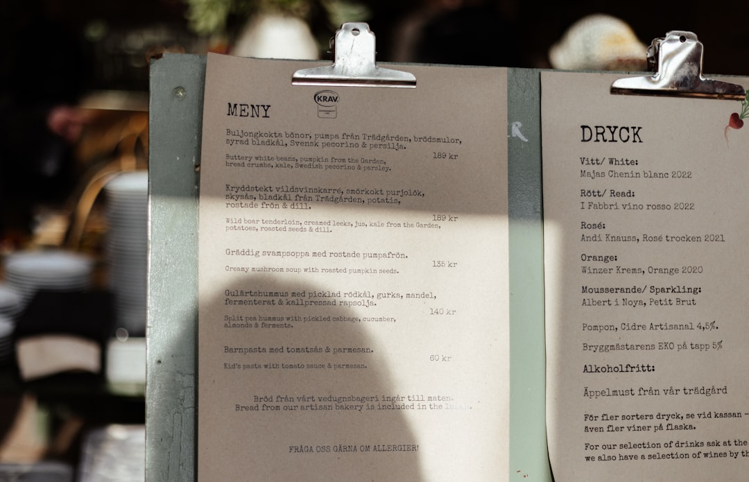
Pairing an elegant heading face with a readable body is the core menu decision — see our font pairing guide. For layout, sectioning, and pricing presentation, our overview of menu design covers the structure around the type.
What makes a good font for menus?
A good menu face is legible at small sizes in low light — that rules out hairline-thin and overly decorative type for body copy. Item names and descriptions need clear, open letterforms with steady weight; prices need figures that line up. The display face carries the brand voice: a refined serif for fine dining, a friendly sans for casual spots, a touch of script for a bakery or wine bar. Crucially, you mix character and clarity by role — decorative for headings, readable for the dishes and prices.
Lighting is the variable most menu designers underestimate. The same typeface that looks crisp on your bright monitor can turn muddy under warm, dim restaurant lighting, where thin strokes and tight spacing collapse. That is why menu body type tends to run a touch larger and a touch heavier than book or brochure text, and why the safest body faces are serifs and humanist sans with sturdy, even strokes rather than fashionable high-contrast designs. Always proof a menu under the room’s actual lighting before it goes to print.
Best restaurant menu fonts
Garamond (free: EB Garamond)
Garamond is the classic menu body face — elegant, warm, and effortlessly readable. The free EB Garamond covers most needs with proper italics for dish descriptions. It signals quality without trying too hard, suiting bistros and fine dining alike.
Playfair Display (free)
Playfair Display is the go-to elegant heading serif — high-contrast, Didone-flavored, and refined. Use it for restaurant names and section titles. Free on Google Fonts; pair with a quieter body face for descriptions.
Cormorant (free)
Cormorant is a graceful, high-contrast display serif with a fashionable, upscale feel — ideal for menu titles, wine lists, and tasting menus. Free on Google Fonts. Keep it to headings, as its delicate strokes read small only on bright stock.
Lato (free)
Lato is a warm humanist sans that keeps menus clean, modern, and highly legible — strong for cafés, brunch spots, and casual-contemporary restaurants. Free, with a full weight range for headings and body.
Libre Baskerville (free)
Libre Baskerville is a refined transitional serif drawn with a tall x-height that reads well at small body sizes — excellent for dish descriptions in lower light. Free on Google Fonts.
Cormorant Garamond / Sabon (free / paid)
Cormorant Garamond (free) blends Garamond’s warmth with display elegance for titles, while Sabon (paid) is a steady, even body serif for text-heavy prix-fixe menus.
Montserrat (free)
Montserrat gives a clean, geometric, modern voice — good for street-food, fast-casual, and design-forward concepts. Its caps make tidy section headers. Free on Google Fonts.
A tasteful script (e.g. Tangerine, Pinyon Script) — free, accents only
A script face adds personality to a logo line, a “Specials” flourish, or a bakery’s signature — use free options like Tangerine or Pinyon Script sparingly. Never set dish names or prices in script; reserve it for one or two accent lines.
| Font | Style | Free/Paid | Why it works |
|---|---|---|---|
| Garamond (EB Garamond) | Old-style serif | Free / Paid | Elegant, warm, readable body text |
| Playfair Display | Didone serif | Free | High-contrast elegance for titles |
| Cormorant | Display serif | Free | Upscale, fashionable headings |
| Lato | Humanist sans | Free | Clean, modern, casual-contemporary |
| Libre Baskerville | Transitional serif | Free | Tall x-height, reads in dim light |
| Montserrat | Geometric sans | Free | Modern, tidy section headers |
| Sabon | Garalde serif | Paid | Even body text for long menus |
| Script (Tangerine, etc.) | Script | Free | Accents and flourishes only |
Fonts to avoid for menus
Avoid ultra-thin and hairline weights for body text — they disappear in low restaurant lighting. Skip overused novelty faces like Papyrus and Comic Sans, which undercut a quality dining impression instantly, and don’t set descriptions or prices in a full script, which slows reading. Avoid cramming the menu with three or four display faces; the clutter reads as disorganized. Keep decoration to headings and let the dishes stay legible.
Tips and pairing for menus
Use a two-font system: an elegant display serif for the restaurant name and section titles (Playfair Display, Cormorant) and a readable face for dish names, descriptions, and prices (Garamond, Libre Baskerville, or Lato). Set descriptions at a comfortable size — bigger than you think, since lighting is often dim — and right-align or dot-lead prices so figures stay scannable. Keep one accent script at most. If you want a serif body with a refined serif display, our roundup of the best serif fonts lists strong, legible options.
Frequently Asked Questions
What font do restaurants use for menus?
Upscale restaurants commonly use old-style serifs like Garamond for body text with elegant display serifs such as Playfair Display or Cormorant for titles. Casual and modern spots favor clean sans-serifs like Lato or Montserrat. The exact choice signals the restaurant’s style, but legibility in dim light is the common requirement.
What is the best free font for a menu?
EB Garamond and Libre Baskerville are the best free body fonts for menus, paired with Playfair Display or Cormorant for headings — all on Google Fonts and licensed for commercial use. For a modern look, Lato works for both headings and body. Use a free script only for small accents.
Should menus use serif or sans-serif fonts?
Both work depending on the brand. Serifs (Garamond, Baskerville) read as classic and upscale and suit fine dining; sans-serifs (Lato, Montserrat) feel modern and clean for cafés and casual spots. Many menus combine them — a serif display for titles with a sans or serif body for legibility.
Can I use a script font on a menu?
Yes, but only for accents — a logo line, a “Chef’s Specials” flourish, or a bakery’s signature. Scripts are hard to read at body size and slow guests down, so never set dish names, descriptions, or prices in one. Pair a single tasteful script with a clear, legible body face.
What font size should a menu be?
Set menu body text larger than typical print — often 10–12pt or more — because dining rooms are frequently dimly lit and guests read quickly. Section headers and the restaurant name scale up from there. Test the menu under your actual lighting before printing to confirm everything stays comfortably legible.


