Best Fonts for Signs and Signage
The best fonts for signs are chosen for one measurable property: how clearly they read at a distance and a glance. Signage and wayfinding typography is a specialist field — the faces that dominate airports, hospitals, highways, and transit systems were specifically engineered for legibility under motion, glare, and poor angles. This guide covers those proven wayfinding typefaces, notes free versus paid, and explains the letterform traits that make type readable from far away.
Sign type is almost always a clean sans; for how to combine it with other type in a sign system, see our font pairing guide. For materials, contrast, placement, and accessibility specifics, see our signage design guide.
What makes a good font for signs?
Distance legibility comes from a few concrete traits: a high x-height (so lowercase letters stay large and readable when scaled), open apertures and counters (so the “a,” “e,” “c,” and “s” don’t close up into blobs at distance), generous spacing, and clear differentiation between similar shapes (capital I, lowercase l, and the numeral 1). Even stroke weight reads better than high contrast under glare. Humanist sans-serifs like Frutiger excel because their open, slightly varied forms stay distinct at speed and distance — which is exactly why they were created for airports and roads.
Two further factors matter for signage that text on a page never faces: motion and viewing angle. Drivers and walkers often read a sign while moving and at an oblique angle, which compresses letterforms and reduces the time available to recognize a word. Faces with open counters and clear word shapes tolerate that compression far better than tightly-spaced or condensed designs. This is also why the best sign type is set in mixed case and at generous spacing — both choices preserve the word silhouettes the eye relies on when reading quickly from a distance.
Best signage fonts
Frutiger (paid)
Frutiger is the wayfinding classic — Adrian Frutiger designed it for Charles de Gaulle Airport precisely for legibility at distance and angle. Its open apertures and high x-height make it the default for airports, hospitals, and public buildings worldwide. Paid (Linotype). A free near-relative is Frutiger-inspired humanist sans like the open-license Mukta or Source Sans 3.
Helvetica (paid)
Helvetica is the neutral grotesque used in transit systems like the New York City Subway. Its clean, even forms read clearly on signs, though its more closed apertures are slightly less ideal at long distance than Frutiger. Paid; see our Helvetica deep dive.
DIN (paid; free: Oswald-adjacent / D-DIN)
DIN (notably DIN 1451) is the German engineering standard sans used for road signs and technical signage — crisp, no-nonsense, and highly legible. FF DIN is the refined paid family; D-DIN is a free, open-license cut of the classic standard.
Clearview (paid)
Clearview (Clearview Highway) was engineered specifically to improve nighttime road-sign legibility, with a taller x-height and more open forms than the older highway standard. It is licensed for signage use. Paid.
Transport (paid)
Transport is the typeface of UK and Irish road signs, designed by Jock Kinneir and Margaret Calvert for mixed-case legibility at speed — a landmark of functional wayfinding design. Paid.
Univers (paid)
Univers by Frutiger offers a systematic family of widths and weights, useful for large sign programs that need consistent type across many sign types and sizes. Paid (Linotype).
Source Sans 3 (free)
Source Sans 3 is Adobe’s open-license humanist sans with a tall x-height and open forms — a strong, free choice for interior wayfinding and budget sign systems. Free on Google Fonts.
Open Sans / Mukta (free)
Open Sans and Mukta are free humanist sans-serifs with open apertures and good legibility, suitable for interior signage, directories, and small business signs where licensed wayfinding faces aren’t in budget.
| Font | Style | Free/Paid | Why it works |
|---|---|---|---|
| Frutiger | Humanist sans | Paid | The wayfinding standard, open at distance |
| Helvetica | Neutral grotesque | Paid | Clean, even, proven in transit systems |
| DIN (D-DIN) | Engineering sans | Paid (D-DIN free) | Crisp, technical, road-sign legible |
| Clearview | Highway sans | Paid | Engineered for nighttime road legibility |
| Transport | Wayfinding sans | Paid | Mixed-case legibility at speed |
| Univers | Grotesque family | Paid | Consistent widths for big sign programs |
| Source Sans 3 | Humanist sans | Free | Tall x-height, open forms, free |
| Open Sans / Mukta | Humanist sans | Free | Legible interior signage on a budget |
Fonts to avoid for signage
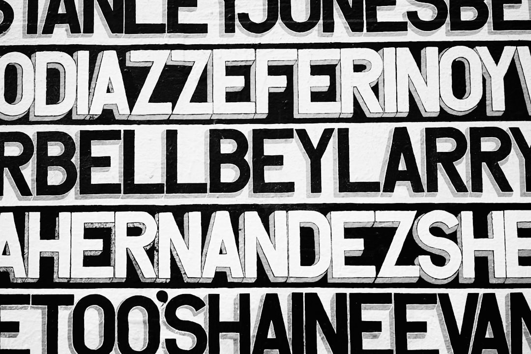
Avoid serifs for distance wayfinding — fine serifs and contrast break up at distance and under glare. Steer clear of condensed, light, and high-contrast display faces, which lose legibility when viewed from an angle or in motion. Don’t use scripts, decorative novelty faces, or all-caps light type on directional signs. And avoid faces with closed apertures and ambiguous characters (where I, l, and 1 look alike), since they slow recognition exactly when speed matters most.
Tips and best practices for sign type
Use mixed case (not all caps) for directional and place-name signage — research behind Transport and Clearview found mixed case reads faster at distance because word shapes help recognition. Maximize contrast between text and background, give letters generous spacing, and size type to viewing distance (a common guide is roughly 1 inch of cap height per 25–30 feet of reading distance, adjusted for conditions). Stick to one humanist or grotesque sans across a sign system for consistency. For the full picture on contrast, placement, and accessibility, see our signage design guide.
Frequently Asked Questions
What font is used on road signs?
It varies by country. UK and Irish road signs use Transport; many US highways use the FHWA “Highway Gothic” series, with Clearview adopted in some states for better nighttime legibility; German signs use DIN 1451. All are sans-serifs engineered specifically for legibility at speed and distance.
What is the best font for signage?
Frutiger is widely considered the best general wayfinding font — designed for airport signage with open apertures and a high x-height that stay legible at distance and angle. Helvetica, DIN, and Univers are strong alternatives, and Source Sans 3 is a capable free choice for interior signs.
Why are sans-serif fonts used for signs?
Sans-serifs read more clearly at distance and under glare because they have even stroke weight and clean, simple shapes without fine serifs that break up far away. Humanist sans-serifs add open apertures that keep letters distinct, which is why they dominate wayfinding and road signage.
What is the best free font for signs?
Source Sans 3 is the best free signage font for most uses — a humanist sans with a tall x-height and open forms, licensed for commercial work. Open Sans and Mukta are also good free options for interior and small-business signage when licensed wayfinding faces aren’t in budget.
Should signs use uppercase or mixed case?
Mixed case is generally better for directional and place-name signage. Studies behind Transport and Clearview found mixed case reads faster at distance because distinctive word shapes aid recognition, whereas all-caps removes those cues. Reserve all-caps for short, high-emphasis words like EXIT or STOP.


