Colors That Go With Mauve
Mauve is a muted purple-pink with a gray undertone, which makes it behave almost like a soft neutral. The best colors that go with mauve include sage green, gray, navy, cream, dusty blue, and gold. Below are exact hex codes, ready palettes, and notes on using mauve in branding and interiors.
What colors go with mauve?
Mauve (around #915F6D) is desaturated and slightly cool, so it sits beautifully beside muted greens, soft blues, and warm neutrals. Because it’s so grayed, it pairs more like a dusty neutral than a bright pink. The strongest partners are:
- Sage green (#9CAF88) — a muted green that gives mauve a fresh, botanical, near-complementary contrast.
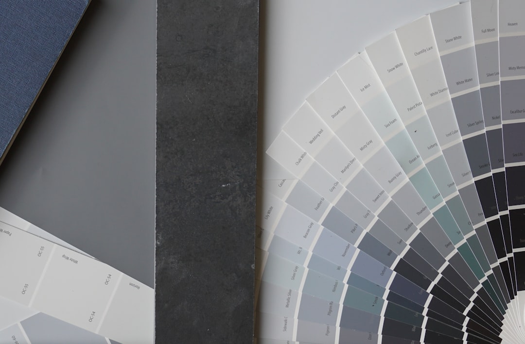
- Gray (#9AA0A6) — a quiet neutral that echoes mauve’s own gray undertone for a tonal, elegant look.
- Navy (#1B2A4A) — a deep anchor that grounds mauve and adds contrast for branding and web.
- Cream (#F5EFE6) — a warm off-white that keeps mauve soft and romantic instead of cold.
- Dusty blue (#8DA9C4) — an analogous muted blue for a serene, harmonious palette.
- Gold (#D4AF37) — a warm metallic that lifts mauve and adds a touch of luxury.
Best color combinations for mauve
Mauve’s strength is that it’s a grayed purple-pink, so it never fights its partners. Sage sits roughly opposite mauve on the color wheel, making it a natural complementary color that feels balanced rather than loud. Dusty blue is an analogous cool that blends seamlessly, while cream, gray, and gold act as supporting neutrals. Because mauve is so close to dusty rose, it helps to know the difference — compare mauve vs dusty rose before you build a palette. Mauve also sits beautifully on a warm light base, which is why it works in the same schemes covered in our colors that go with ivory guide.
Mauve + sage + cream (botanical soft)
The most popular wedding and editorial pairing. Mauve and sage are both muted, so together they read calm and organic, with cream keeping everything light.
Mauve + gray + gold (elegant tonal)
A refined, grown-up scheme. Gray echoes mauve’s undertone for a quiet base, and gold adds just enough warmth and luxury to keep it from feeling flat.
Mauve + navy + cream (modern contrast)
For more structure. Navy gives mauve backbone and legibility, making this combination dependable for brand systems and web design.
Mauve color palettes (with hex codes)
| Pairing color | Hex | Why it works / mood |
|---|---|---|
| Sage green | #9CAF88 | Muted complement; fresh and botanical |
| Gray | #9AA0A6 | Echoes undertone; tonal and elegant |
| Navy | #1B2A4A | Deep anchor; contrast and structure |
| Cream | #F5EFE6 | Warm off-white; soft and romantic |
| Dusty blue | #8DA9C4 | Analogous muted blue; serene and calm |
| Gold | #D4AF37 | Warm metallic; lift and luxury |
| Charcoal | #36454F | Deep neutral; modern, graphic anchor |
Three ready palettes to copy:
- Botanical soft: Mauve #915F6D · Sage #9CAF88 · Cream #F5EFE6 · Gray #9AA0A6
- Elegant tonal: Mauve #915F6D · Gray #9AA0A6 · Gold #D4AF37 · Cream #F5EFE6
- Modern contrast: Mauve #915F6D · Navy #1B2A4A · Cream #F5EFE6 · Dusty blue #8DA9C4
How to build a balanced mauve palette
Mauve’s advantage is that it’s desaturated, so it can carry a large share of a palette without becoming sweet or overwhelming. A dependable structure is roughly 60% mauve and light neutrals, 30% a muted partner (sage or dusty blue), and 10% a deeper anchor (navy or charcoal) for contrast and legibility.
Check mauve’s undertone before pairing. Cooler mauves lean purple-gray (closer to #915F6D) and love sage, dusty blue, and gray; warmer, pinker mauves tip toward dusty rose and sit better with cream, gold, and terracotta. If you’re unsure which you have, hold it next to a true gray swatch to see whether the pink or the purple comes forward.
Light matters too. Mauve shifts noticeably between daylight and warm lamplight, sometimes reading grayer or pinker than expected, so always test it in the actual room or on the actual screen. For digital and brand work, confirm contrast: pale mauve backgrounds need navy or charcoal for legible body text, since mauve-on-cream often fails accessibility ratios.
Mauve also rewards a layered, tonal approach more than a high-contrast one. Because it’s so close to neutral, you can stack two or three closely related dusty tones — mauve, dusty rose, and a grayed lilac — and let a single deeper accent do the heavy lifting. This “tone-on-tone with one anchor” method is why mauve looks so polished in stationery, packaging, and soft-goods photography: nothing shouts, but the palette still reads as deliberate. If you want a touch of energy, introduce it through texture or a small gold detail rather than a brighter color, which tends to break mauve’s quiet mood. This restraint is exactly why mauve photographs so well and why it has stayed a wedding and editorial staple: it gives a palette a sense of softness and maturity that a brighter pink simply cannot, while still feeling warmer and more human than plain gray.
Colors to avoid with mauve
Mauve is forgiving, but a few pairings work against it:
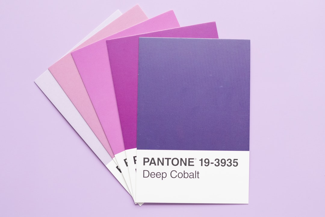
- Bright, saturated purple — overpowers mauve’s muted, dusty character and makes it look washed out.
- Warm orange or rust — clashes with mauve’s cool purple base; if you want warmth, use gold or soft terracotta sparingly.
- Neon or hot pink — fights mauve’s quiet sophistication. Stick to blush or dusty rose for a pink accent.
Using mauve in branding vs interiors
In branding, mauve signals calm, elegance, nostalgia, and gentle femininity, which is why it appears in beauty, wellness, and lifestyle brands that want softness without being overtly pink. Pair it with gray and cream for legibility, and use sage or gold as a single accent. Building a system? Our guide on how to choose brand colors explains anchoring on a muted hue like mauve.
In interiors, mauve is a popular wall and upholstery color because it’s restful and warm without being cold. Layer it with sage foliage, cream linen, and warm wood; add gold or brass accents for a refined finish. For a flexible base to build around mauve, see our neutral color palette guide.
Frequently Asked Questions
What is the best color to pair with mauve?
Sage green (#9CAF88) is the best all-around partner for mauve because it sits near mauve’s complement and adds a fresh, botanical balance. For a quieter look, gray (#9AA0A6) echoes mauve’s own undertone, while gold (#D4AF37) adds warmth and a touch of luxury.
Does mauve go with gray?
Yes, very well. Because mauve already contains a gray undertone, soft and mid grays (around #9AA0A6) blend with it for an elegant, tonal scheme. Charcoal works too as a deeper anchor, adding modern contrast for branding and web layouts.
What green goes with mauve?
Sage green is the standout green for mauve. Both are muted, so together they feel calm and organic rather than loud, which is why mauve-and-sage is a favorite for weddings and editorial design. Dusty or olive greens also work for a slightly warmer mix.
Is mauve a warm or cool color?
Mauve is generally a cool color because it’s purple-based, but its gray undertone keeps it close to neutral. That softness is why it pairs easily with both cool tones like sage and dusty blue and warm accents like cream and gold.