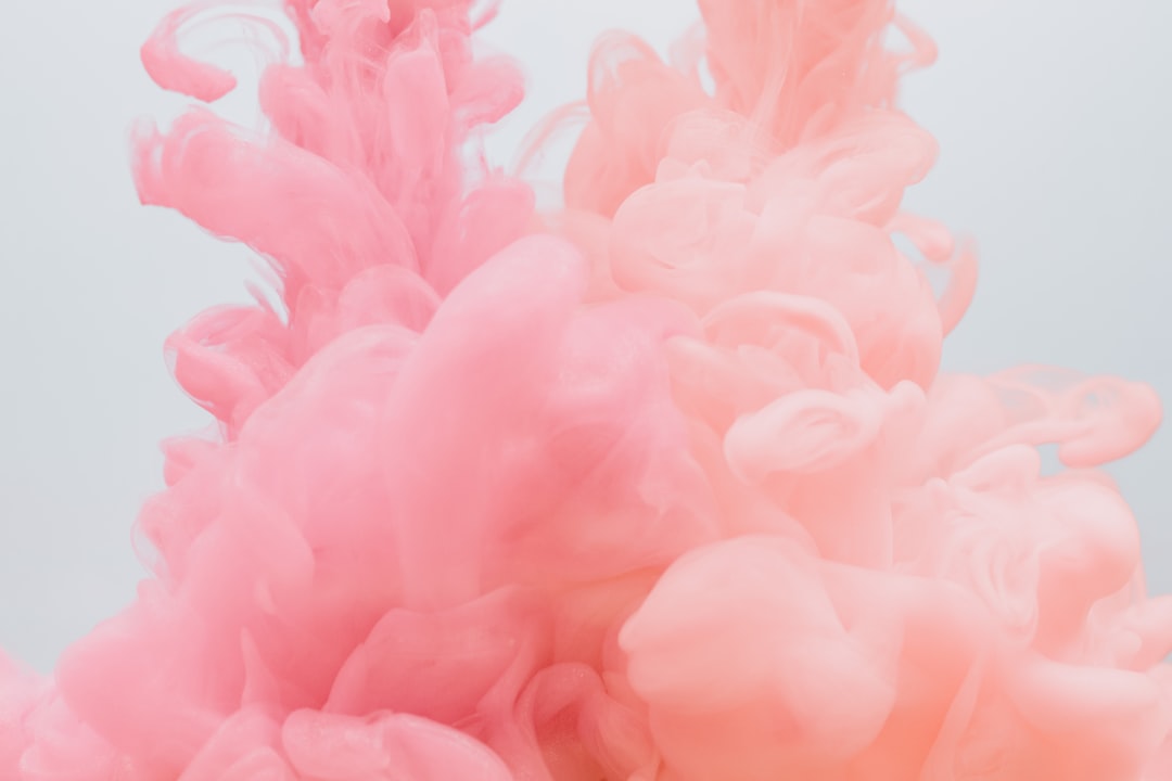
Colors That Go With Pink
Pink has shed its purely sweet reputation and is now one of the most adaptable colors in modern design, capable of reading playful, luxurious, or sophisticated depending on its partners. The best colors that go with pink range from grounding navy and gray to fresh sage and luxurious gold. Below you’ll find exact hex codes, ready-to-use palettes, and guidance for using pink in branding versus interiors.
What colors go with pink?
A balanced mid pink (around #F49AC1) is warm and friendly, so it pairs best with cooler, deeper partners that keep it from tipping saccharine. Here are the strongest matches:
- Navy (#1B2A4A) — the best grown-up partner. Deep navy grounds pink and makes the pairing read confident and modern.
- Sage green (#9CAF88) — a muted near-complement. Sage cools pink into something botanical and current.
- Gray (#B0AEB8) — a quiet neutral that lets pink lead. Pink and gray is a designer-favorite for soft, modern schemes.
- Gold (#C9A227) — a warm metallic that turns pink luxurious and editorial.
- Burgundy (#6E1E2E) — a deep analogous red that gives pink richness and a tonal, monochrome-ish depth.
- Teal (#2A9D8F) — a cool blue-green that makes pink feel fresh, tropical, and confident.
Best color combinations for pink
Why these work comes down to basic color theory. Pink is a warm tint of red, so cool partners (navy, sage, gray, teal) create satisfying warm-vs-cool contrast. Green sits near pink’s complement on the wheel, which is why sage and teal feel so balanced — see our guide to complementary colors. Burgundy and coral stay close to pink for an analogous tonal feel, while gray and gold add neutral and metallic structure. For more on pink’s psychology, see our guide to pink color meaning.
Pink + navy + white (confident modern)
The most reliable “grown-up” combination. Navy grounds, white opens space, and pink becomes a polished accent rather than a sugary one.
Pink + sage + cream (soft botanical)
Calmer and more lifestyle-oriented. Sage cools pink while cream warms the whole scheme — ideal for wellness, beauty, and contemporary interiors.
Pink + gold + burgundy (rich editorial)
The most luxurious option. Gold and deep burgundy give pink depth and polish, perfect for premium packaging and fashion.
Pink palettes with hex codes
| Pairing color | Hex | Why it works / mood |
|---|---|---|
| Navy | #1B2A4A | Grounding contrast; confident and modern |
| Sage green | #9CAF88 | Near-complement; botanical and current |
| Gray | #B0AEB8 | Quiet neutral; soft and modern |
| Gold | #C9A227 | Luxe metallic; editorial and warm |
| Burgundy | #6E1E2E | Tonal depth; rich and grounded |
| Teal | #2A9D8F | Fresh, tropical, confident contrast |
| Cream | #F5EFE6 | Warm space; elegant and soft |
Three ready palettes to copy:
- Confident modern: Pink #F49AC1 · Navy #1B2A4A · White #FFFFFF · Gray #B0AEB8
- Soft botanical: Pink #F49AC1 · Sage #9CAF88 · Cream #F5EFE6 · Charcoal #2E3440
- Rich editorial: Pink #F49AC1 · Gold #C9A227 · Burgundy #6E1E2E · Cream #F5EFE6
How to build a balanced pink palette
Start by deciding which pink you mean, because the undertone steers the whole palette. A cool, blue-leaning pink (fuchsia, magenta) wants navy, gray, and teal; a warm, peachy pink wants gold, cream, and sage. Hold your pink against a cool partner and a warm one before committing to see which direction reads cleaner.
A reliable rule: deep cool partners (navy, burgundy, charcoal) make pink feel sophisticated and grown-up, while soft neutrals (gray, cream) keep it gentle. The fastest way to make pink look cheap is to pair it only with other pastels and no anchor — always include one darker or cooler color to give the scheme a backbone. Use pink as roughly 60% of the composition for a soft look, or as a 10% accent for a punchier one, with a neutral carrying the middle ground in the classic 60-30-10 split.
Pink also benefits from a clear hierarchy of saturation. A single bright pink accent against muted neutrals reads intentional; three competing pinks at full saturation read busy. If you want a layered, tonal pink scheme, keep one pink saturated as the lead and dial the others down toward dusty rose or pale blush, so they support rather than fight the focal hue. If you’re choosing between rosy options, our comparison of rose vs blush helps you pick the right pink before you build the palette around it.
Colors to avoid with pink
Pink is flattering but a few combinations undercut it:
- Bright red — a saturated red beside a bright pink fights for the same warm territory and looks unrefined. Shift the red to burgundy for harmony.
- Orange at full strength — unless it’s a deliberate sunset palette, saturated orange can make pink look loud and unbalanced.
- Only pastels — pink with nothing but mint, lavender, and baby blue reads juvenile. Add a dark anchor like navy or charcoal.
Pink in branding vs interiors
In branding, pink signals approachability, creativity, and confidence, and the right pink can feel anywhere from playful to luxurious. Pair it with navy or charcoal to read premium, or with sage and cream to read soft and natural. If you’re building a system from scratch, our guide on how to choose brand colors walks through anchoring on a pink and layering grounded accents.
In interiors, pink works as a warm neutral when muted (think plaster and blush) or as a bold accent when saturated. Pair it with sage, gray, and brass for a calm, contemporary room. For a flexible base, see our neutral color palette guide. If you love soft, romantic schemes, our piece on colors that go with purple shows how pink and purple blend into a modern, feminine palette.
Frequently Asked Questions
What is the best color to pair with pink?
Navy (#1B2A4A) is the best color to pair with pink because it grounds pink’s warmth and makes the combination read confident and grown-up rather than sweet. For a softer scheme, sage green or gray are the strongest alternatives, adding freshness and calm while letting pink stay the focal color.
What is the complementary color of pink?
Green is the complement of pink, since pink is a tint of red and red’s opposite is green. In practice, a muted sage green (#9CAF88) is the most flattering version of that pairing, giving pink a botanical, modern contrast that avoids the harshness of a bright primary green.
Does pink go with gold?
Yes. Pink and gold (#C9A227) are a luxurious pairing common in beauty, weddings, and premium packaging. The warm metallic elevates pink and makes it read editorial rather than childish. Use gold as a thin accent — in type, foil, or hardware — against larger fields of pink and a neutral.
What two colors go well with pink?
Navy and white are the two strongest companions for pink: navy grounds it into something sophisticated while white opens clean space. For a softer look, swap navy for sage green. This base of pink plus one deep color and one light neutral works across branding, web, and interiors.


