Coral Color Meaning and Symbolism
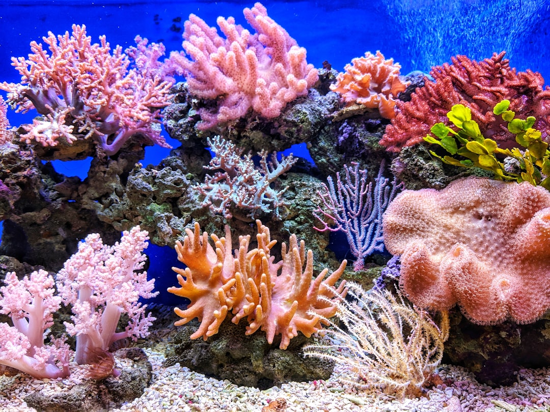
Coral is a warm pink-orange color named after the marine invertebrates whose skeletons take on similar hues. It blends the vibrancy of orange with the gentleness of pink, sometimes with a touch of red, giving it an energetic yet soft character. Its representative hex code is #FF7F50 . The coral color meaning springs from this mix: it carries orange’s enthusiasm and warmth alongside pink’s compassion and playfulness, producing an approachable, optimistic, and vivacious hue.
What does coral symbolize?
Coral symbolizes warmth, friendliness, and joyful energy. As a blend of orange and pink, it represents enthusiasm and vitality softened by compassion and nurturing. It is associated with playfulness, youth, sociability, and optimism, evoking sunny moods and lively interaction. Coral also carries connotations of the ocean and natural beauty thanks to its namesake reefs, lending it a sense of vitality and life. Overall it conveys approachability and positive energy without the intensity of pure red or orange. Because it balances a warm, outgoing hue with a tender one, coral feels generous and emotionally open, the color of hospitality and easy conversation. To understand how mixing orange and pink produces this character, our primer on color theory explains how blending neighboring warm hues moderates their intensity. Coral’s link to living reefs also gives it a subtly natural, organic quality, suggesting growth, abundance, and the lively color of sunsets and tropical shores.
The psychology of coral
Psychologically, coral is uplifting and welcoming. The orange component stimulates warmth, sociability, and energy, while the pink component adds softness, kindness, and emotional reassurance. The result is a color that feels friendly and encouraging rather than aggressive or demanding. Coral tends to lift mood, invite connection, and convey enthusiasm, making it feel both energetic and comforting. People often perceive it as fresh, modern, and cheerful. For a broader look at how warm, blended hues shape feeling, see our guide to color psychology. Unlike red, which can raise tension, coral keeps its warmth playful and unguarded, so it encourages people to relax and engage rather than feel pressured. Brighter, more saturated corals feel youthful and exuberant, while softer, dustier corals feel romantic and serene, giving the color an adaptable emotional range. This combination of liveliness and gentleness is why coral so often reads as friendly, optimistic, and easy to be around.
Coral symbolism across cultures
Coral has carried protective and life-affirming meaning across many cultures. In ancient Rome and the Mediterranean, coral amulets were believed to protect children from harm and ward off the evil eye. In several Asian traditions, including parts of India and Tibet, red coral is regarded as auspicious and protective, often used in jewelry and adornment. Because natural coral comes from living reefs, the color also broadly symbolizes life, vitality, and the sea. While the precise meanings differ by region, protection, vitality, and good fortune are recurring themes tied to coral.
Positive and negative associations of coral
| Positive | Negative |
|---|---|
| Warmth and friendliness | Can seem overly casual |
| Playfulness and optimism | May feel trendy or fleeting |
| Energy and vitality | Too soft for serious contexts |
| Approachability and joy | Overuse can feel saccharine |
Coral in branding and marketing
Coral is used by brands aiming to feel warm, modern, and approachable. It is common in lifestyle, beauty, food, hospitality, wellness, and youth-oriented products, where it signals friendliness, freshness, and energetic optimism. Coral stands out as a softer, more contemporary alternative to bright orange or red, making brands feel inviting rather than aggressive. It appeals strongly to audiences seeking positivity and playfulness, and it works well in digital interfaces where a cheerful, human accent color helps a brand feel welcoming and current.
Colors that go well with coral
Coral pairs beautifully with teal #008080 and turquoise #40E0D0, its cool near-complements, for a fresh, balanced contrast — see related notes on turquoise. It also works with navy #1B2A4A for grounding, with cream #FFF5EE for a soft, beachy look, and with gold #E0B973 for warmth. The coral-and-teal pairing is especially popular; learn why in our guide to complementary colors.
Shades and variations of coral
Coral ranges across pink-orange tones. Standard coral is #FF7F50, while light coral #F08080 is softer and pinker. Coral pink #F88379 leans toward rose, salmon #FA8072 is slightly paler, and deep coral #FF4040 is more saturated and red. Living coral #FF6F61 is a vivid, contemporary version. Each variation shifts the balance of orange, pink, and red while keeping coral’s warm, lively glow.
Frequently Asked Questions
What does the color coral mean?
Coral means warmth, playfulness, optimism, and friendliness. As a blend of orange and pink, it combines orange’s energy with pink’s softness, producing an inviting, cheerful color linked to vitality, youth, sociability, and a sunny, approachable mood.
What emotions does coral evoke?
Coral evokes cheerfulness, warmth, and welcoming energy. It uplifts mood and invites connection, feeling friendly and reassuring rather than aggressive, and is often experienced as fresh, lively, modern, and optimistic.
What colors go with coral?
Coral pairs well with teal and turquoise as cool complements for fresh contrast, navy for grounding, cream for a soft beachy look, and gold for added warmth. The coral-and-teal combination is especially balanced and popular in design.
Is coral warm or cool?
Coral is a warm color, sitting between orange and pink with a touch of red. Its warmth makes it energetic and inviting, and it contrasts strongly with cool tones like teal. See our guide to warm vs cool colors.
What is the difference between coral and salmon?
Coral (#FF7F50) is a brighter, more orange pink-orange, while salmon (#FA8072) is paler and pinker with a softer, more muted quality. Coral feels livelier and more vivid, whereas salmon reads as gentler and slightly more subdued.


