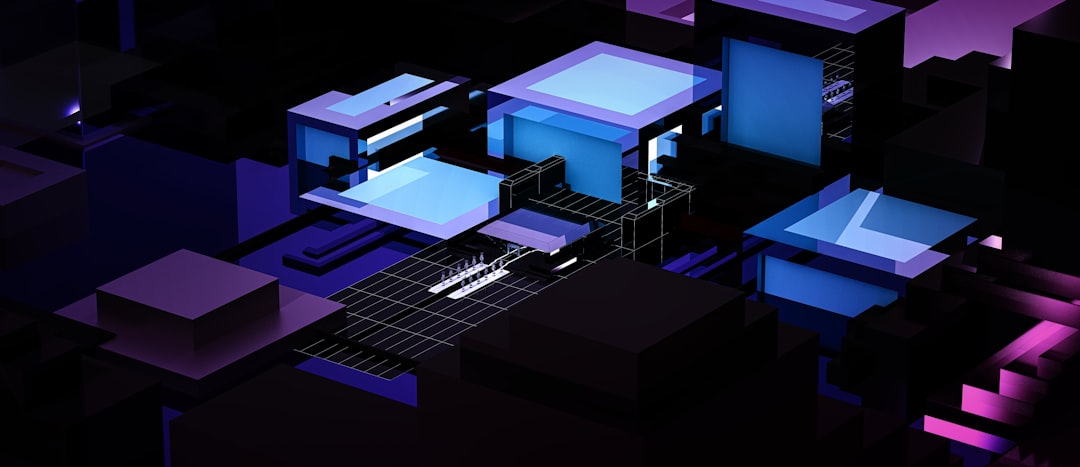
Dark Mode Design: Best Practices
Dark mode design is harder than inverting your colors, which is exactly why so many dark themes feel cheap or strain the eyes. A good dark interface is its own design system: a tuned palette, contrast that meets accessibility targets, and elevation expressed in light surfaces rather than shadows. This guide gives you the rules that separate a considered dark theme from a CSS filter.
Dark mode is now a standard expectation rather than a novelty, and it sits inside the broader shift we cover in our overview of web design trends for 2026. Get the fundamentals here, then apply them alongside your light theme.
Why Dark Mode Matters
Dark mode earns its place for three concrete reasons. First, comfort: in low-light environments, a dark interface produces less glare than a bright white page. Second, power: on OLED and AMOLED screens, true dark pixels draw less energy because the display can dim or switch off individual pixels. Third, perception: a well-built dark theme signals a polished, modern product and gives users control over how they experience your site.
None of those benefits arrive automatically. A dark theme with low-contrast grey text on a near-black background is more tiring than a clean light theme, and it can fail accessibility outright. The benefits depend entirely on execution.
Never Use Pure Black
The single most common mistake is building on #000000. Pure black behind bright white text creates halation, a smearing or vibrating effect where letters bleed into the background, especially for readers with astigmatism. It also leaves you nowhere to express elevation, because shadows are nearly invisible on black.
The established fix, drawn from Material Design, is to base your darkest surface on an elevated dark grey such as #121212. From there, elevation is communicated by making surfaces progressively lighter rather than by adding shadows: a card sits on a slightly lighter grey than the page, a dialog lighter still. This gives depth that reads clearly in the dark.
- Base surface: #121212, not pure black.
- Elevated surfaces: apply translucent white overlays (roughly 5 to 12 percent) to lighten as elevation rises.
- Shadows: de-emphasize them; lightness, not shadow, signals height in the dark.
Contrast and Readability
Accessibility targets do not relax in the dark. Aim for WCAG 2.2 AA: at least 4.5:1 contrast for normal body text and 3:1 for large text and UI components such as icons and input borders. The catch is that very high contrast hurts in dark mode: bright white text on dark grey can be as fatiguing as halation. Instead of pure white, use an off-white like #E0E0E0 or a high-emphasis white at around 87 percent opacity for body copy.
Material’s opacity convention is a reliable model for text hierarchy on dark surfaces:
| Text role | White opacity | Use for |
|---|---|---|
| High emphasis | 87% | Body text, headings |
| Medium emphasis | 60% | Captions, secondary labels |
| Disabled | 38% | Inactive controls |
Always verify with a contrast checker against your actual surface color, not against pure black, since elevated surfaces change the math.
Desaturate Your Colors
Brand and accent colors that look right on white often glow or vibrate on dark. Saturated, fully bright colors against a dark background create visual buzz and can fail contrast. The fix is to desaturate and lighten accent colors for the dark theme: take the saturation down and raise the lightness so the color reads as a calm tint rather than a neon. Reserve your most saturated tones for small accents, never large fills or long text runs.
This is why a token-based system matters. Define semantic roles (primary, on-primary, surface, on-surface, error) once, then give each role a separate value per theme. You are not maintaining two stylesheets; you are mapping the same roles to two palettes.
Implementing Theme Switching
Respect the user’s operating system setting first using the CSS prefers-color-scheme media query, which exposes light and dark preferences. Drive your theme with CSS custom properties so a single set of variables flips values between themes. Then layer a manual toggle on top for users who want to override the system default, and persist their choice in local storage so it survives reloads.
- Define tokens as CSS custom properties for color roles.
- Set defaults for light, then override inside a
prefers-color-scheme: darkblock. - Add a toggle that sets a data attribute on the root element to force a theme.
- Persist the choice and apply it before first paint to avoid a flash of the wrong theme.
Also honor prefers-reduced-motion when animating the transition between themes, and avoid a jarring full-page flash by transitioning background and text colors smoothly.
Building a Reliable Dark Palette
A dependable dark palette starts from the base surface and works outward. Begin with #121212 as the lowest surface, then define two or three lighter surface steps for elevated components by layering translucent white overlays rather than picking arbitrary greys, which keeps the relationship between levels consistent. Body text sits at roughly 87 percent white opacity, secondary text at 60 percent, and disabled elements at 38 percent.
For accent colors, take your light-theme brand color and adjust it: reduce saturation, raise lightness, and verify the result against your actual surface for the 3:1 component contrast minimum. A practical starter set looks like this:
- Surface: #121212, lightening to roughly #1E1E1E and #242424 for raised elements.
- On-surface text: #E0E0E0 for body, dimmed to 60 percent opacity for captions.
- Primary accent: a desaturated, lightened version of your brand color, tested for contrast.
- Error: a softened red that meets 4.5:1 against the surface it appears on.
Define each of these as a semantic token so a single variable change updates the whole theme, and so the light theme maps to the same roles. This is the difference between a dark mode you can maintain and one that drifts out of sync every release.
Don’t Forget Images and Elevation Cues
Photography and illustration need attention too. Pure-white logos and screenshots can blaze against a dark surface; provide dark-theme asset variants or apply a subtle dimming so images do not dominate. Borders that were nearly invisible in light mode may need to switch to lighter, low-opacity strokes to remain perceptible. Test every component, including focus states and disabled controls, in the actual dark palette rather than assuming they carry over.
Accessibility runs through all of this, so pair these practices with our web accessibility designer’s guide. And because dark mode interacts heavily with small screens and battery-conscious devices, build it in step with mobile-first design.
Frequently Asked Questions
Should dark mode use pure black backgrounds?
No. Pure black (#000000) causes halation, where bright text smears against the background, and leaves no room to express elevation. Use an elevated dark grey such as #121212 as your base surface, then lighten surfaces progressively to show depth instead of relying on shadows.
What contrast ratio does dark mode need?
The same WCAG 2.2 AA targets apply: at least 4.5:1 for normal body text and 3:1 for large text and UI components. In dark mode, avoid pure white text, which can be fatiguing; use an off-white around #E0E0E0 or 87 percent white opacity for body copy to stay comfortable and compliant.
How do I detect a user’s dark mode preference?
Use the CSS prefers-color-scheme media query, which reports the operating system setting as light or dark. Drive colors with CSS custom properties so values flip per theme, then add a manual toggle that overrides the system default and persist the user’s choice so it survives reloads.
Why do my brand colors look wrong in dark mode?
Fully saturated colors that work on white tend to glow or vibrate against dark surfaces and can fail contrast. Desaturate and lighten accent colors for the dark theme so they read as calm tints, and reserve the most saturated tones for small accents rather than large fills.