Mobile-First Design Explained
Mobile-first design means designing for the smallest screen before the largest, then progressively enhancing the layout upward. It sounds like a sequencing detail, but it changes how decisions get made: when your starting canvas is a 360-pixel column, you are forced to rank content by importance and cut anything that does not earn its place. That discipline, more than any breakpoint, is the real value.
This guide explains the method, the breakpoints and touch-target specs that matter, and the mistakes that quietly break mobile experiences. It sits within our wider overview of web design trends for 2026, where mobile-first is treated as a baseline rather than an option.
Mobile-First vs Desktop-First
The traditional approach designed for a wide desktop layout, then tried to squeeze it onto phones, usually by hiding elements and hoping nothing important got lost. Mobile-first inverts this. You begin with the core experience on a narrow screen and add complexity, columns, and secondary content as space allows. In CSS terms, this maps cleanly to min-width media queries: base styles target mobile, and each breakpoint adds enhancements for larger viewports.
The practical difference is prioritization. Desktop-first invites clutter because there is room for everything; mobile-first forces you to decide what matters most. Since mobile traffic dominates for most consumer sites, designing for it first means designing for your majority audience first.
Breakpoints That Make Sense
Breakpoints should follow your content, not specific devices, but a sensible default set covers the common viewport classes. A widely used starting framework looks like this:
| Breakpoint | Width | Typical target |
|---|---|---|
| Base | ~360px | Small phones (mobile-first default) |
| Small | 768px | Tablets, large phones landscape |
| Large | 1024px | Small laptops, tablets landscape |
| Extra large | 1280px+ | Desktops, wide monitors |
The modern refinement is container queries, which let a component respond to the width of its container rather than the whole viewport. That makes components genuinely reusable: a card behaves correctly whether it sits in a narrow sidebar or a wide grid, without needing to know the page layout.
Touch Targets and Thumb Zones
On a phone, the finger is the cursor, and it is imprecise. Touch targets must be large enough to hit reliably: Apple’s Human Interface Guidelines recommend a minimum of 44 by 44 points, and Material Design recommends 48dp. Targets smaller than this produce mis-taps and frustration, especially for users with motor impairments.
Size is only half of it; spacing matters too. Adjacent tappable elements need enough gap that a fingertip cannot trigger the wrong one. Place primary actions within the natural thumb zone, the lower and center portion of the screen that a thumb reaches comfortably on a held phone, and avoid burying important controls in the hard-to-reach top corners.
- Minimum size: 44 by 44px (Apple) or 48dp (Material) for any interactive element.
- Spacing: generous gaps between adjacent targets to prevent mis-taps.
- Placement: primary actions in the reachable thumb zone, not the top edge.
Fluid Typography and Layout
Fixed pixel font sizes do not adapt gracefully across the range from phone to desktop. Use fluid typography with the CSS clamp() function, which sets a minimum size, a preferred size that scales with the viewport, and a maximum size, so text grows smoothly between breakpoints without sudden jumps. The same fluid thinking applies to spacing and layout: relative units and flexible grids beat rigid pixel widths.
For UI body text on small screens, choose a typeface with a high x-height and clear letterforms; Inter (free, open source, available from Google Fonts) is a dependable default because it stays legible at small sizes and covers many languages. Keep line length comfortable even on mobile, and never push body text below about 16px, where it becomes hard to read and can trigger unwanted zoom on iOS.
A Step-by-Step Mobile-First Method
- Inventory and rank content. List everything a page must do, then order it by importance. The top of the list is what mobile users see first.
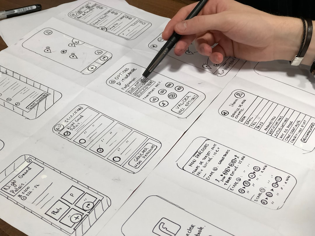
- Design the narrow layout. Build the single-column mobile view in your design tool, such as Figma, before any wider layout.
- Set the base CSS. Write your default styles for the smallest screen with no media query.
- Enhance upward. Add
min-widthmedia queries (and container queries) to introduce multi-column layouts and secondary content as space allows. - Test on real devices. Emulators miss touch ergonomics, performance, and how a layout actually feels in the hand.
Navigation on Small Screens
Navigation is where mobile-first discipline is tested hardest. The default reflex is to stuff the entire desktop menu behind a hamburger icon, but that hides your most important destinations behind an extra tap and out of sight. A better approach starts from the question mobile-first always asks: which destinations actually matter most? Surface those, and reserve the collapsed menu for the long tail.
Several patterns work well depending on the product. A bottom navigation bar keeps three to five primary destinations permanently visible and within thumb reach, which suits app-like sites. A priority-plus pattern shows as many top-level links as fit and tucks the rest under a “more” control. Whatever you choose, make sure the current location is clearly indicated, the controls meet touch-target minimums, and the menu is fully operable by keyboard and screen reader. Navigation is also a frequent accessibility weak point, so build it with assistive technology in mind from the start.
Performance Is a Mobile-First Discipline
Mobile users are disproportionately on slower, less reliable connections and less powerful devices, which makes performance inseparable from mobile-first work. A layout that feels fine on a fast laptop can be painfully slow on a mid-range phone over a weak signal. Designing mobile-first naturally pushes you toward lighter pages: fewer fonts, optimized images, and no autoplaying hero video that would tank load time on exactly the devices most of your users hold.
Treat the mobile experience as the performance baseline you must meet, not the cut-down version you tolerate. Prioritize loading the content that appears first, defer everything below the fold, and serve appropriately sized images for small viewports rather than shipping desktop-resolution assets to phones.
Common Mobile-First Mistakes
Even teams that say they design mobile-first slip into desktop habits. Watch for these: hiding important content on mobile instead of reprioritizing it, which signals it was never essential; cramming desktop navigation into a hamburger menu that buries primary actions; and ignoring performance, since mobile users are often on slower connections and a heavy hero image punishes them most. Performance is a mobile-first concern, which is why it overlaps with the broader push for fast, lightweight pages.
Forms deserve special care on small screens, where a clumsy layout kills completion. Pair this guide with our form design best practices to keep input painless on mobile, and use our dark mode design guide to handle theming on the battery-conscious devices where it matters most.
Frequently Asked Questions
What does mobile-first design actually mean?
Mobile-first design means designing and coding for the smallest screen first, then progressively enhancing the layout for larger viewports. In CSS this maps to min-width media queries with mobile as the default. Its real value is forced prioritization: a narrow canvas makes you rank content by importance and cut anything non-essential.
What are standard mobile breakpoints?
A sensible default set is roughly 360px for small phones (the base), 768px for tablets, 1024px for small laptops, and 1280px and up for desktops. Breakpoints should follow your content rather than specific devices, and container queries let individual components respond to their own width regardless of the viewport.
How big should touch targets be?
Interactive elements should be at least 44 by 44 points per Apple’s guidelines or 48dp per Material Design. Smaller targets cause mis-taps, especially for users with motor impairments. Spacing matters too: leave generous gaps between adjacent targets and place primary actions within the comfortable thumb zone.
Is mobile-first the same as responsive design?
They are related but distinct. Responsive design means a layout adapts to any screen size. Mobile-first is the strategy of building that responsive layout starting from the smallest screen and enhancing upward. You can build responsively desktop-first, but mobile-first generally produces leaner, faster, better-prioritized results.